
Hello Hello!
I'm Jay, and today I'll be teaching you everything you need to know when you're designing icons for social media!
I've also made a video version of this tutorial if you prefer learning that way!
So, let's get started.
An Introduction To Icons
How many times have you followed an artist or creator because their icon caught your eye and you wanted to see more of their work?
This is why icons are the most popular and common option people will commission from artists. It's what makes you well, YOU!
This tutorial is actually split into two parts "Concepts" and "Exporting" so if you're more interested in the exporting size to icons go ahead and skip to the section that says
"Canvas Size & File Size Limitations On Social Media"
Aesthetics
If you want to work with clients, no matter how hard you try to explain, everyone will have different ideas and concepts in their mind. So you'll have to learn the best way to communicate those amazing ideas to others!
Aesthetics help you decide on the elements you want to have in your design. Nowadays most people have heard of the various "cores" which makes your job as an artist much easier!
And if you're working on your own branding and voice as an artist, aesthetics can help you decide how you want to present yourself. However! Aesthetics should be used as a jumping off point and shouldn't turn into restrictions.
Are you a fan of bright colors? Or maybe you enjoy natural colors, mushrooms, and cottages. No matter what your interests are, there's an aesthetic for you!
I highly recommend Unsplash as a Copyright free image source or Pinterest to create various mood boards to use!
Here's a list of aesthetics you can also look up to help get you started!
Cottagecore
Dark Academia
Fairycore
Indie
Softcore / Kawaii
Spacecore
Vaporwave
There's so many more aesthetics to look up, much more than what I've listed here so try looking up some of these terms!
Storytelling In Icons
When it comes to overall design if you decide to do an up close shot of the face, think about the expressions you can use. Whatever expression you choose will drastically change how people will perceive the character or persona in your icon.
Icons can tell a story and, speaking of storytelling-
Icons should be easily recognizable from afar and up close. There are many ways to do this and most of the time artists will choose an up close shot of the face or whatever is the most visually interesting in a design.
It's better to simplify as much as possible instead of making things too complex to visually understand.
This doesn't mean you should skip out on the emotions and story your icon can tell! It can be a simple smile or a character bursting out with tears. As you're drawing, think about how you can push the emotion in your icon design.
The more you can push the design the better the outcome!
Squares VS Circles
So debate time, should you draw your icons in circles or squares?
As someone who's drawn icons both ways, I can confidently recommend drawing in squares first.
WHY "first"? Let me explain
You're better off having extra parts of a drawing to crop out off than none at all. It will 100% save you heartache in the long run. In fact I recommend drawing a square version of the icon THEN turning it into a circle.
By having a bit of extra image to work with, you can do last minute adjustments and other edits without having to create extra work for yourself. It also allows your client a bit of wiggle room when it comes to using the icon you've provided for them.
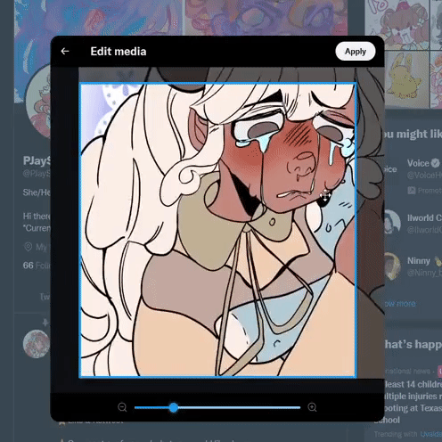
One problem with circle icons I've found, is that it doesn't allow for different kinds of crops. You might find later on that you want to zoom in or use a slightly different angle of your icon. Especially as you start to upload on multiple platforms.
In the example below you'll see that I don't have as much of an image to work with when uploading.

In the end it's up to you how you design your icons, both methods have their pros and cons and I'm only talking about them so you can keep those limitations and benefits in mind.
Canvas Size & File Size Limitations On Social Media
Even though icons appear as very small sizes (as low as 100px by 100px) on different social media platforms you should never use those sizes to draw on because they won't give you a good image to work with. You also don't need to shrink your icons down to this size as all social media platforms will automatically do it for you.
Although for higher pixel sizes it doesn't matter what canvas size you use as long as it's a square.
The most common size used is 800px by 800px
Though I really recommend 1000px by 1000px or even 2000px by 2000px, as it allows you to make better looking lineart and image. If you really need it, you can save your bigger sized image and shrink it down to smaller sizes. In the example above you can see how each size looks right next to each other.
The only limitation you'll have will be the different requirements on various social media platforms. Keep in mind that file size limits will increase and change over time so to not risk putting outdated information in this tutorial I won't say specifics for each platform.
If you ever worry that you'll give your client an icon that has a file size is too big to upload, try uploading it yourself on your own social media page! You don't have to save the image, just watch for that warning that says the file size is too big, if it doesn't say anything you're in the clear!
Make Your Own Icon Template
Let's make a super easy icon template that you can use! First make a new canvas, I'll be using 1000px by 1000px.
Then go to "Figure" and click on the Ellipse tool
Make sure the brush size is 0.50
While holding shift, create a circle that will make sure it is evenly shaped. It doesn't have to fit the whole canvas at first, it's more important that it's even.
Next scale the circle to almost touch the edges. Make sure that it's centered and has the same amount of space on all sides and as close to edge as possible
with the paint bucket tool, fill the outer edges of the circle.
It should look like this-
Make sure you have the layer selected,
Go to "EDIT"
Then "Register Material" and click "Image"
After clicking "Image" a panel called "Material property" will open.
For what we need you can ignore most of these settings.
All you have to do is name your material,
Click on the area you want to save it to,
Then in the "Search Tag" settings click the icon and type in "Icon" This will make the template easier to find.
And hit "OK" and you're done!
All you have to do is click and drag your template onto your canvas hold shift and drag it to the correct spot, lower the opacity, and you're good to go!!

If you want to crop your icon to the circle.
Go to the layers panel and
Hold CTRL and click the preview square in your of your template layer to make a selection,
(this will select everything within your template layer)
Then use the shortcut "CTRL SHIFT I" to Invert the selection,
and hit the layer mask option to crop your icon.

Should You Use JPEGS Or PNGS?
This topic deserves a whole tutorial itself but to keep this section brief and simple,
It really depend on what you need. In fact it's better to say, WHEN you should use JPEGS and PNGS. I tend to send clients a JPEG and a PNG version because of the reasons listed below.
JPEGs:
Save as a small file sizes, making them easier to share and upload online. The downside to this, is that over time you lose more data and quality. Not too great for long term use.
While,
PNGs:
Use a type of compression that doesn't lose data over time making PNGs perfect for logos. However they will save as higher file sizes making it harder to upload on websites with different file size limitations.
Most of the time people will use JPEGS before PNGS but as graphic designers and artists who share a LOT of files online it's good to keep these differences in mind.
Backgrounds
Finally, let's talk about backgrounds!
The Clip Studio Paint asset store has so many materials you can use to add to your icon backgrounds. There's so much content being uploaded by other artists every day and I even found this adorable plaid texture pack while collecting images for this tutorial!
if you want to download it here's the Content ID: 1922139
I also have some favorite backgrounds that come with clip studio that I like to use as well such as,
This material called the "Soft flower lace 02"
This glittery sky texture called "Glitter 01"
and this colorful square texture called "Pop style_IS"
So if you're ever stuck on figuring out the backgrounds for your icons try looking at different materials! It's an easy way to try out different looks for your icons without having to spend hours creating them all yourself!
There are free materials and paid ones so consider checking the asset store every so often if you feel like you need that little extra spice to your work!
Conclusion
Thank you so much for joining me
Make sure to like and favorite this tutorial to save it for later. It also lets me know to make more tutorials in the future! Feel free to leave some suggestions as well!
If you want to see more of my artwork you can find it here on my Linktree where you can find my Instagram, Tiktok, Twitter, and Youtube channel where I post even more content like this!
and with that I'll see you next time buh bye!
Users who liked this post


Comment