
Hello Hello, I'm PJayscribbles.
Today I'm going to teach you how to color eye-catching manga illustrations in the most efficient way using various features within clip studio, So! Let's get started!
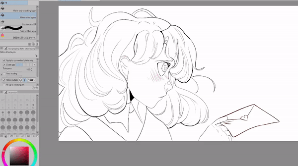
Flats
Before I go in and place any of my flat colors, I'll create a base to utilize during the coloring process. Why a base? Well I'll use this base for many reasons,
Any areas that need to be colored white, I'll be able to easily see if I've missed any spots. Since the background of the canvas is white it's really easy to forget to color in areas. This is especially important if you plan to export as a PNG, trust me you're saving yourself a lot of extra work in the long run.
I always advise artists to use a base especially if they have a painterly style of shading.
There's nothing worse than exporting your final image just to find that you missed spots! Creating a base makes sure that there is always a fully filled color underneath your shading so you can avoid having to do extra work later on!
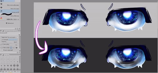
I highly recommend this fill tool asset to use for quick and easy base coloring. As clip studio updates over time, you might find yourself changing the settings of this tool to get better results.
Here's a general overview of some settings you can adjust for both this asset and the default enclose and fill tool!
For the asset above,
go to the tool property menu and you'll see "close gap" and "area scaling"
Depending on the version of clip studio paint you're using, some settings might be slightly different.
In general you want to turn the area scaling up when you have lots of gaps in your lineart. However, this is a setting that you'll need to adjust depending on your needs. If you notice that you get too much overflow, turn down this setting until it works best.
When it comes to area scaling the slider will either work in decimal increments of 1 [0.10, 0.50, -1]
or it will adjust from 0-20
For those with decimal increments I recommend setting the area scaling to "-0.10" and for those with 0-20 you'll find that 1 works best.
Using a negative number will scale down the fill, in contrast putting in a positive number will scale up the fill. For this tool I notice that it will avoid the edges of the canvas when it's set to -1 changing it to 1 will fix that problem.
If you want to edit the default enclose and fill tool the settings are relatively the same
For those who can change the area scaling from 0-20 I found that any number under 10 works best without too much overflow [4, 3 ,2, -4, -3, -2,]
I'll also change the tolerance to anywhere between 20 and 50. The tolerance settings change the error margin of color, the higher it is the more pixels will be detected. This is important when we want to keep our fill between our lines. You'll find yourself using higher settings if your lineart has texture.
For both version types change the target color box to "all enclosed areas including transparency"
Now for those with decimal settings I found that changing the tolerance settings won't give you that drastic of a change
Just like before we'll also change the area scaling to "-0.10"
The biggest difference I've found between version types of clip studio are the close gap settings.
While you have the squares you can click to make the close gap higher or lower there is a way to increase the close gap up to 50 if you click the arrow and type in a value you can check how high you can set the close gap.
As a general test I'll put in 100 then if you go back you'll see that clip studio will automatically set the close gap at the maximum value. If you can't set the settings up to 50 then it's because of your version type.
I hope this clears up some confusion when it comes to these settings. It's something that I've noticed a great deal of users get frustrated with.
With this tool we can also fix the example shown earlier! This is great if you've realized later on that you've forgotten to fill in an area of your artwork. I tend to use this a lot when I'm creating artwork for manufacturing and I need to make sure there are no areas that are left transparent.
If you're brand new to the fill bucket tools I would check out the "Color Your Illustrations Like A Pro" Tutorial I've made, since today I'd like to focus on other kinds of tips for coloring I'll be skipping over any explanations for all the fill tools.
I also talk more about the benefits of using a base in this tutorial as well so if you're interested here's the link!
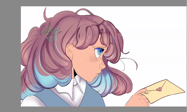
Now that we've put down our flat colors let's talk about shading!
Smart Shading Tips
We've all heard the saying "Work smarter not harder.” As someone who stubbornly worked harder for most of my artistic career I understand why we choose to do so many things painstakingly by hand. Over time I've learned a bunch of ways to save time as I've worked on projects that had tight deadlines.
Of course there are millions of ways to approach shading and for this tutorial I can only focus on so many. But! I've found this method works great for web comic creation and cell shade based workflows.
When it comes to deciding how much or how little you want to shade in areas I find that it's best to put more shading in the areas I want the viewer to focus on, and less shading for the areas that are not as important.
When it comes to shading the hair I get to choose how much time I spend on shading each area. Less is usually more, for the areas that I want to put less detail in I'll go in with an airbrush tool with my shading color and lightly add depth.
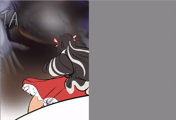
[image text "what you see, what we see"]
It's very easy as artists to worry about every little detail in our work, however the truth is most people never see half of the tiny details you put into each section. So, if you want to create eye-catching illustrations, focus on the parts that make it eye-catching!! Bold shadows and highlights will pop out a lot more than the million specks of tiny highlights you place down.
Speaking of saving time, here's some really amazing assets I use to quickly create highlights in the hair and eyes! These are great to use all by themselves or to use as a base to paint over.
Using Photos To Create Color Palettes
I've heard so many artists avoid coloring backgrounds because it's difficult to find the right colors that look good together. And they're right!! It takes a good amount of studying and understanding of color to translate real life tones into digital ones for painting.
Today I'm so excited to show you something that will help you learn how to put beautiful colors together for your illustrations. This will help ease the stress of putting colors together and hopefully motivate you to color more backgrounds!
We're going to be using this photo that I took of these yellow flowers to create a nice color palette for the leaves in our illustration.
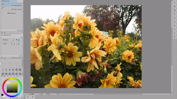
Your first instinct might be to just use the eyedropper tool but wait! There's actually a better way to simplify the thousands of possible colors you could pick.
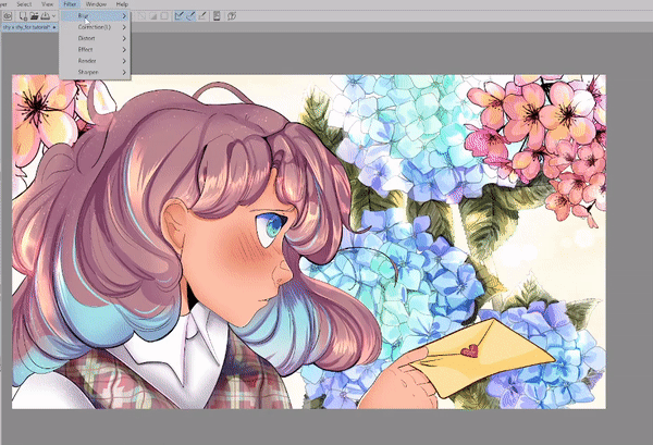
Go to Filter
Effect
and click mosaic
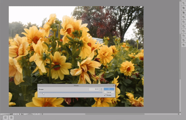
From here you can simplify the image as much as you want! In the next step we'll use a new feature that's been added to Clip Studio, the color mixing palette.
Once you have the color mixing palette open, go ahead and drag it to wherever suits your workspace best. Then click on the option that says "use the same tool as canvas"
next we'll go to our shape tools,
Go to figure,
rectangle,
and then select create fill.
We can use this tool to create colored squares in the color mixing palette. These colors will stay in the palette even if you close and reopen clip studio or even if you start working on a whole new canvas!

Now that I've made a color palette that I'm satisfied with, I'm going to change the selected tool in the color mixer palette to the eyedropper. This will keep me from accidentally adding colors as I'm working.
Using Primitives To Make Color Palettes
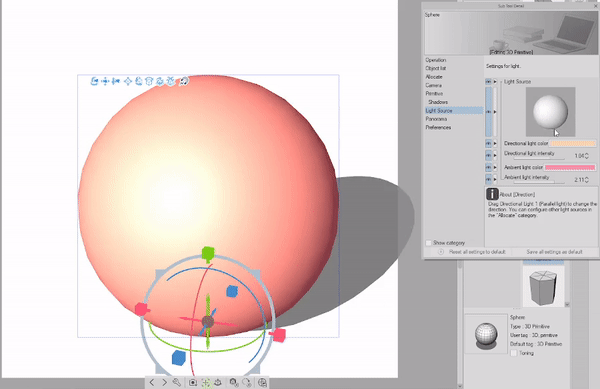
While we're on the topic of using the mosaic filter to create color palettes, did you know you could also use the 3D primitives to create skin tones?
I'll be using this free asset as a starting point but, you're free to choose whatever color you want!
In the Material Panel,
Go to 3D
and click Primitive.
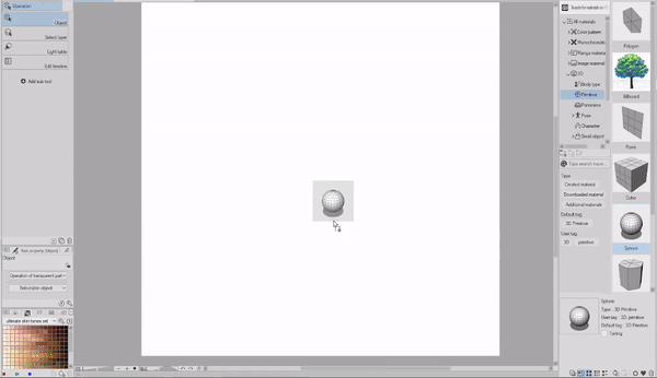
From here we'll click and drag in the "Sphere" model
Once you have the sphere on the canvas you'll want to open the Sub tool Detail menu, Which is the wrench Icon at the bottom of the model.
After that, go to "Primitive" turn off the wire frame and change the object color.
Right now our primitive's shadows are really dull.
To change these settings go to "Light source" and change the directional and ambient light until you're satisfied with the result.
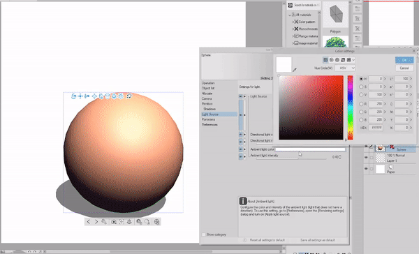
You can also adjust the placement of the shadows by clicking and dragging on the sphere icon.

Before we can use the Mosaic filter we'll have to rasterize our 3D sphere first,
Right click on the 3D layer and hit Rasterize. Now it'll be a flat image we can work with.

Coloring Backgrounds With AI
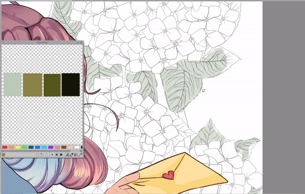
In this section I'll be using the color palette I made from my photo.
For all the leaves I used the lasso fill tool, this tool is such a staple in my workflow. I use it for shading, lighting effects, quick coloring, and even sketching! I always seem to find new and unique ways to use this tool.
Since we're going to be using the auto colorize feature to color in our lines based of the colors we placed down, we have to do a bit of prep work first.
make sure that your lineart layer is set to a reference layer. You can tell that it's a reference layer because of the little lighthouse icon that appears next to the layer.
Then we'll make sure we have our color layer selected.
to find the colorize feature, go to edit
colorize (technology preview)
and click hint image and colorize
this is the result I got after letting the program process. Keep in mind I didn't even color in the flowers and yet, I got a perfect base to work with.
Keep in mind that the auto colorize feature adds a white fill in addition to the colors. There's a few ways you can quickly get rid of this white fill. I personally make a selection of the flower layer
(this is why it's nice to have a base color under your art)
To make a quick selection of everything on a layer you can hit CTRL on the layer icon, then you can invert the selection and delete everything outside your base.
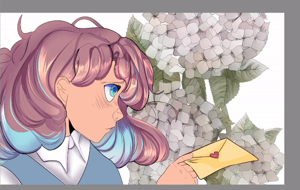
The colorize feature automatically turns off the color layer that you made, to get my final effect I'll turn it back on. After that I'll change the colors and tones of the flowers and using the lasso fill from earlier I'll add some simple shading to make the flowers feel more 3 dimensional.
I'll repeat the process for the pink accent flowers.
Liquify Tool & Textures
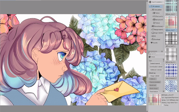
For the pattern on the clothes I'll use this checkered texture asset, once I place down the texture I'll clip it to the base that I made for the shirt.
After I'm satisfied with the size of the texture. I'll rasterize it so it's no longer an image file.
To rasterize a layer, right click on the layer, then click rasterize.
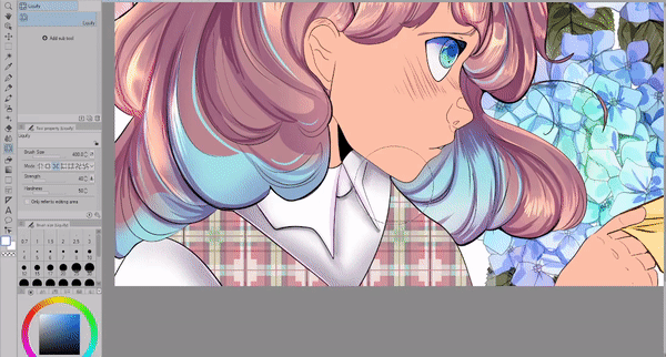
To create a fabric effect I'll use the Liquify tool to push and pull parts of the texture. After I'm done I'll duplicate the layer set it to multiply, and edit the shadows.
Post Processing
Now we're at the fun part!! Post processing involves final touches, I always try to keep a raw copy of my files because I have to merge a lot of layers down for these effects. You never know if you want to go back and edit something so it's better safe than sorry!
I want to create a sun backlit effect, since I already have a lot of blue I'll avoid using sky colors instead, I'll add a very faint yellow hue to the background. On another layer I'll use the same yellow and use the airbrush on the edges of the leaves and flowers.
For extra texture I'll also add some glowing dust. This mimics the lens flare that cameras will pick up, it's a really nice detail that makes the glow effect feel more realistic and appealing.
Finally I'll merge my background layers and create two copies. The first one I'll use the Gaussian blur filter, after I blur the whole image I'll erase the sections that I want to be in focus. The second layer will show underneath, giving the image a pleasant atmosphere.
Final Thoughts
Annnnd that's all! I hope you've learned a few new tricks to use in your workflow! Thank you so much for joining me
Make sure to like and favorite this tutorial to save it for later. It also let's me know to make more tutorials in the future! You can also find more tutorials that I've made on my profile page!
If you want to see more of my artwork you can find it here on my Linktree where you can find my Insta, Tiktok, and Youtube where I post even more content like this!
and with that I'll see you next time bye bye!
Wanna read another? Check out my How to Draw Legs and Feet Tutorial!
Users who liked this post


Comment