
Hello Hello! I’m PJayScribbles,
Today I’m going to teach you how to UPGRADE Your ART in Clip Studio Paint, because making backgrounds should be FUN and not stressful!! All these tips and tricks are beginner friendly so don't worry if you're brand new to using Clip Studio.
Alright with the introductions out of the way, let's get started!
[ Simple Backgrounds For Webtoons ]
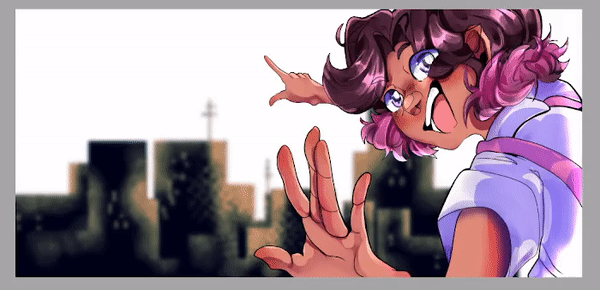
Now I'm sure you're excited to make your backgrounds like the one shown in the thumbnail, BUT! In order to understand how to make complex backgrounds you need to know how to make simple ones first.
This section will cover all the basics for using frames, masks, tones, gradients, and making custom brushes.
✧ Setting Up Frames
For this section I'll be drawing within a comic frame. Now, frames themselves deserve their own tutorial but if you're wondering how I'm able to work outside the border without having any bleeding colors this is why.
Here's a brief introduction to get you started.
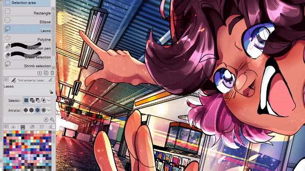
You'll find the frame tools under this cut up square icon. In the sub tool section you'll see a few tools, I'll be using the Rectangle frame tool.
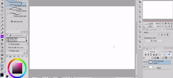
With the frame tool selected, click and drag on the canvas. Once you let go you'll create a frame.
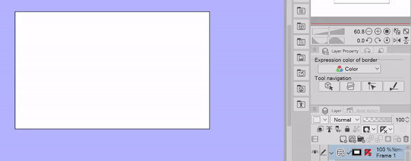
Two major things happened,
1. A frame layer folder was created
2. A blue border appeared outside of the frame.
Everything within the frame layer folder will be affected by the frame mask. If you drag any layers outside of the folder it will no longer be a part of the frame.
Speaking of the frame mask-
Everything that has been highlighted in blue is the "Frame Mask." This is a visual aid to show you which areas will not be affected once you start drawing within the frame. This mask is what keeps all your lines within the frame, however I find that I don't always need the visual as I'm working.
If you want to turn off the mask view go to the frame folder and right click on the mask icon. Then click on the section that says "show mask area" You can always turn it back on by going back and clicking on it again.
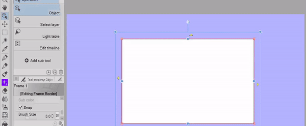
If you ever want to change the line width or color of the frame, make sure you have the frame selected
then go to the object tool (the icon is a square with an arrow) and go to the tool property menu.
From here you'll be able to change the frame settings.
✧ Solid Color Backgrounds
Alrighty! Now that I have a frame set up and some artwork to work with, Let's make our first background.
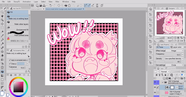
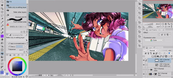
If you're brand new to the fill tools, let me explain the differences between the "Refer only to editing layer" and "Refer to other layers" paint bucket tools.
The "Refer Only to Editing Layer" paint bucket will fill in everything even with other layer elements on the canvas.
In contrast the "Refer to Other Layers" paint bucket tool will do the opposite. Both of these tools are very useful.
HOWEVER in this situation it's not very helpful to have blank spaces in our fill especially as we start to move elements around.
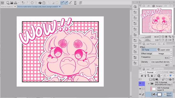
By looking at the example at the start of this section you might assume our next step is to bring out our eraser tool and just start chipping away at our solid color layer.
You'd be right! To an extent... We are going to erase sections of the layer BUT instead of just using an eraser, We're going to use a layer mask.
Make sure the background layer is selected
[you can tell it's selected because it's highlighted in blue!]
Next click on the icon "Create Layer mask"
This will create a blank layer mask on our layer.
[Top Text "Mask Selected" Bottom Text "Layer Selected"]
Alright this is the most important step. Make sure you have the MASK selected and not the LAYER selected. If you have the LAYER selected the mask will be pretty pointless aha.
You can tell that the mask is selected if it has a black outline around the layer icon.
Why are we using masks in the first place? Well, this workflow is called "Non Destructive Editing"
Which means that we're editing the layer in a way that isn't permanent
(erasing parts of the layer on its own is considered destructive since the parts you've erased are completely gone and can't be brought back unless you undo your actions)
With the mask layer selected you can use any tool you'd like to erase! I personally used the selection tool brushes because it was easy for me to add parts to the selection or take it away.

Now we have a pretty cute panel! If you were working on a comic panel this background could be all you need.
Though, I'll admit you really haven't seen the benefits of using masks just yet...so! Let's take it a step further.
Remember how I said you could use ANY tool to erase with? You might've assumed I was only referring to eraser tools...

NOPE! Any and all brushes you will EVER download and use can be used like an eraser.
The secret? It is this little checkered icon below your color swatches.
Instead of drawing with a solid color, you're working with transparency. Just like an eraser! With this setting on I can paint all kinds of textures onto my background and even create layered mask effects like the example below!

With one mask layer selected, I'll paint a gradient effect with various texture brushes.
After I'm satisfied with the effect, in a new layer I'll make a second masked layer and erase sections with the shape tools.
Then I'll turn the bottom layer back on and you'll see that the texture I painted will show through the areas I cut out!
Using masks in this way allows you to paint back and forth textures without actually painting anything permanent on your layer. If you want to paint colors back onto the canvas, simply switch your color to a solid (black/white/ etc.)
We'll see more benefits for using masks later in the tutorial.

Sometimes you don't want a see-through effect on your background. In those cases you can create layers above the masked layer and clip it.
By creating effects in this way, I can change the colors of my textures to whatever I'd like without disturbing my masked layer.
When I clip the textures to my mask layer the textures won't bleed outside of the mask bounds. This is extremely helpful when you don't want texture to bleed into other parts of your background.
✧ Tone Layers
If you're looking to create a simple cute background. Look no further than tone layers!
In the material panel, go to "Monochromatic" and then click the "Basic" section.
Click and drag the tone you want to your canvas. At first the tone will be really small.
To edit the tone go to the "Layer Property" panel and then adjust the settings to your liking.
The "Frequency" settings will change the size of the tone.
[higher the settings will make the tone small, low settings will make the tone larger]
"Dot settings" will change the shape of the tone.

You can't directly change the color of the tone as is. You have to either rasterize it or create a new layer above and then clip it to the tone layer.
If you use a clipped layer you can change the tone however you like and it will still have the fill you placed.
You also can't change the position of the tone unless you rasterize it as well.
Keep in mind after rasterizing the layer you won't be able to change the shape or any other settings.
✧ Custom Brushes
You can also bring a bit more personality into your backgrounds by making custom brushes!
Create a new square canvas. A nice starting point is 3000 x 3000 px
Then Set the resolution to anything between 300 - 600 (I prefer 600 but it's not required)
Today I'll be showing you how to create a simple stamp brush that can't change colors.
So my "Base expression color" will stay as "color"
For brushes that can change color you'll want to set the canvas to "grey" this tutorial won't cover complex brush settings although if you want to see a more complex brush you can check out this brush I made!

This part is all up to you! You can draw as many shapes as you'd like, if you want a consistent looking brush I recommend drawing your shapes to roughly be the same size.
Next we'll save our drawings as a material so we can use them in our custom brush.
Make sure to turn off the paper layer so that the only layer visible on the canvas is the drawing you want to save.
then, go to "edit" and find the section "register material"
from here you'll click the option that says "image"
This is the "Material Property" menu. In here you'll name the material, choose where to save it,
and most importantly you'll see a checkbox that says "Use for brush tip shape" make sure this is selected, otherwise you won't be able to use it for your brush.
To create a new brush from scratch right click on a brush
click "Create Custom Subtool" and name it what you'd like.
Automatically after creating a new brush the "sub tool detail" menu will open up. This menu changes the brush settings.
If for whatever reason it doesn't open
go to "tool property" panel and then click on the wrench icon
[Scaled up image for clarity]
In the Sub tool Detail menu under the section "brush size"
un-check the "pen pressure and tilt" boxes.
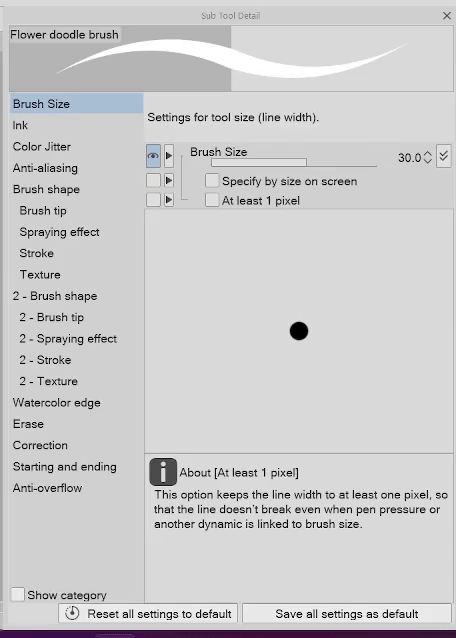
In the "Brush Shape" section, We'll also change the brush tip shape to a default shape
[This could be the dotted line, heart, or star shape. since the result will be the same]

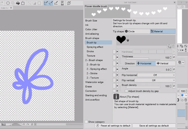
Finally we'll add the drawings we saved as a material in the "Brush Tip" section. Once you've added all of your images you can just delete the default material.
That's it!! You've just made your own custom brush. There's so much more you can do with custom brushes, so please experiment and have fun!
If you want to save your brush as a material. Right click on the brush and then click "Register sub tool as material" You'll open up the same menu as the one we looked at when saving our drawings.
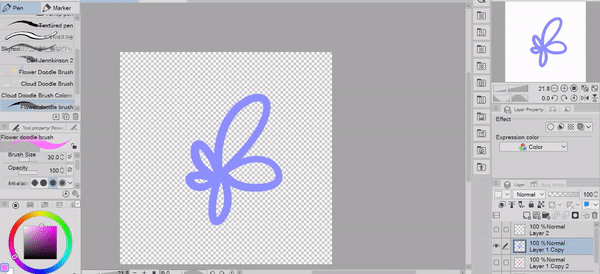
I'll also leave some links for some brushes that I've made myself! Below you can see a demonstration of two doodle brushes I made for comic panels.
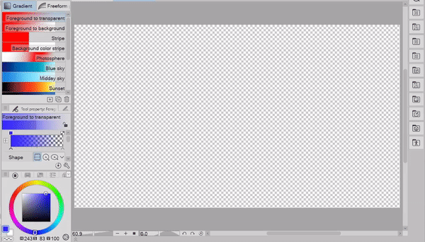
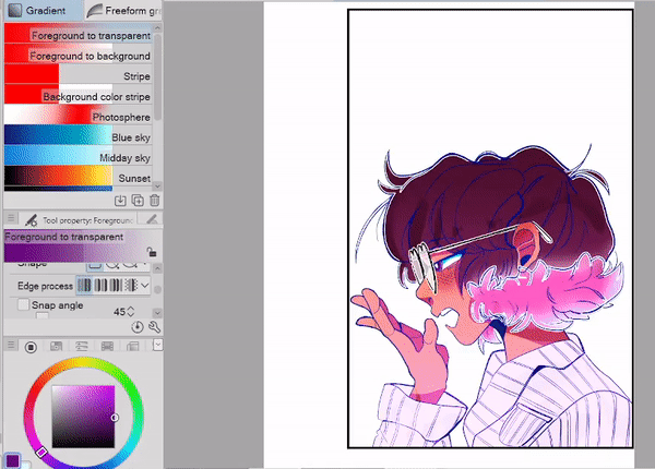
✧ Simple Gradient Effects
Gradients! They are great for simple backgrounds. I highly recommend playing around with the gradient tools since you'll learn a lot just by doing that.
Below is a demonstration of all the different default gradient tools.
If you feel a little lost when it comes to deciding how or when to use gradients, as a general rule of thumb uplifting emotions [Happiness, Excitement, Surprise] try to have the color of the gradient move upwards!
To create the opposite effect [Sadness, Getting bad news, Sleepiness] have the colors of the gradient move downwards!
Here's just a small snippet of what you can do with gradients, and that's not including all the methods we used earlier!!
So be crazy with them!! Add texture, stickers, plants, tones, anything that comes to mind!!
[ Rendering And Camera Effects ]
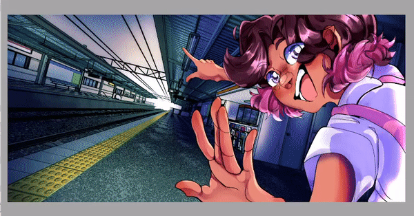
Yay! We've made it to the really fun part of this tutorial "Rendering And Camera Effects"
This whole section is about taking a background from "alright cool" to "WHOAAAA"
These are my go to methods when finalizing an illustration, and honestly it's one of my favorite steps!
The first half will go over methods to enhance a background that you already have,
then the second half will talk about some shortcut ways to make stunning backgrounds from scratch.
✧ Before We Get Started
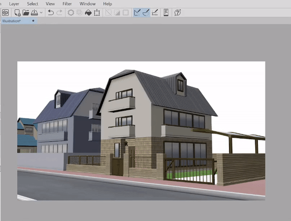
If you're someone who wants to practice lighting, you should try using Clip Studio's built in 3D models. These models are a great jumping off point without the stress of drawing a new background from scratch.
I've made a whole guide to 3D models that will take you from the basics all the way to advanced techniques. There's no way I could explain what I covered in my 3D tutorial in a timely manner for this tutorial so! If you liked this tutorial you can check this one out as well.

I also made a tutorial for coloring backgrounds using the auto colorize feature. This tutorial is great for those who struggle with figuring out colors and just want a jumping off point to work with.
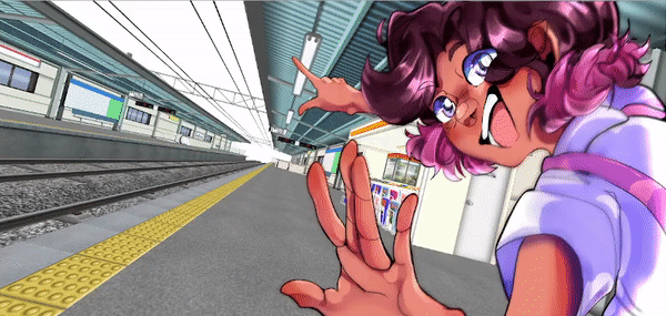
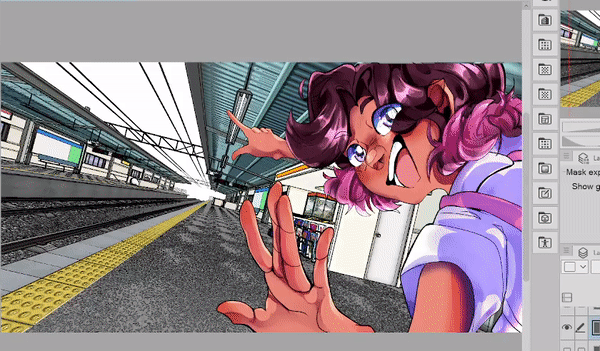
Using the tips from my 3D tutorial I took this train station model and prepped it for our next section.
psst if you want to follow along with a 3D model you can go to my 3D model tutorial and jump to the chapter.
" [Stage 8: Getting more out of 3D] Extracting Lines From 3D Models (PRO & EX) "
then come back once you're done. Ok? Alright, Awesome.
✧ Correction Layers
CORRECTION LAYERS!! My #1 trusted companion in digital art.
If this is the first time you're hearing about them OH MY, it's an honor to introduce you to a new best friend.
"How can I make a correction layer?"
To create a new correction layer right click on any layer
[it really doesn't matter what layer you click on since we're not selecting anything that would affect the layer you selected]
then you'll see an option that says "New Correction layer"
Once you hover over this option you'll be met with a bunch of different options.
BUT WAIT! Doesn't this menu look the same as the drop down options you'll see in the "Tonal correction" tab from the "Edit" bar at the top of the program?
Yes they are! BUT they function in completely different ways. Now don't freak out, I know that is super confusing to tell you.
While the options are the same, if you use any of the options through the "Tonal Correction" menu you will apply an effect DIRECTLY on ONE layer.
All of the effects you can select from the "Correction layer" menu will create a new layer that will apply the effect to MULTIPLE layers at once. Unless you clip it to a specific layer.
So why do we care about these differences?? Well, the big perk to using correction layers is the ability to edit/delete/move the effect at any point in time.

Let's say I somehow completely destroy my layer. Maybe a random cat jumped in through my window and sat on my keyboard, who knows. Either way my image looks like it's been through a blender.
Since I'm using a correction layer I can simply double click on the layer icon and change my settings.
NOTE: Make sure you are clicking on the correction layer icon. Otherwise you'll just keep opening the option to change the layer name and just make yourself mad aha. I can only laugh now because I've done the same thing SO MANY TIMES
When it comes to editing your own backgrounds it's completely up to you! Everyone has their own preferences when it comes to editing their images.
So everything in the rest of this section are my own personal preferences and workflow methods.

Before I do any color editing, I like to make my colors stick out a bit more using a "Brightness and Contrast" correction layer. I try not to make it too strong otherwise it'll start to create unwanted effects. [You saw what happened when I had all the settings to the max it's not pretty haha]
This gives me a good color base to work with as I go into changing the overall image.
For this illustration I plan to make my light source very bright and warm [oranges, reds, and yellows]. Which means I want my shadows to be very cold [blues, purples]
So I'm going to apply some correction layers to my background. I tend to jump back and forth using the "Tone Curve" and "Level Correction" correction layer types.
Both of these types will roughly work the same. It really comes down to personal preference and what you are the most comfortable working with.
✧ Shadows and Using Masks
Remember how I introduced you to layer masks in the first section of this tutorial? WELL THEY'RE BACK~
I love to use masks for shading, it allows me to be bold with my shadows without worrying about how much I take away or paint in.
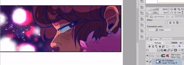
[Image text "Blending Modes For Shading" followed by an image with the blending modes listed below]
When it comes to blending modes, your shading types are
"Darken"
"Multiply"
"Color Burn"
"Linear Burn"
and "Subtract"
Depending on your shading goals you might have to cycle through these types to get the result you want.

I'll create a general shadow layer first and then I'll create another layer in a darker color to make my shadows pop. In my new layer I'm thinking about the source of my light [the sun] and how it would shine on the objects in my scene.
[Image Text "This is bright" followed by "This Is brighter]
Have you ever felt like the light in your scene wasn't bright enough?
That's because we can only tell how bright an object is based on the shadows around it. It doesn't take a lot of shadow to show the intensity of a light. In fact, the lighter the shadow the brighter the light is.
If you've taken a photo outside with the sun in the background you'll notice that the brightest part of the image is white. Which is great for when we want to add convincing light in our artworks. However if a whole scene is white the light source will appear less intense. That's because we have nothing to base the light on!
This is why I start with shadows first and then move to highlights.
✧ Lighting Effects
When it comes to lighting I use a mask just like I did with the shadows.
My Base light layer is set to Overlay. For the rest of my highlights I'll use a glow dodge layer.
Some highlights I'll draw by hand, but for scenes that need a lot of effects at once I'll use brushes that I downloaded from the asset store!
Here's a list of my favorites.
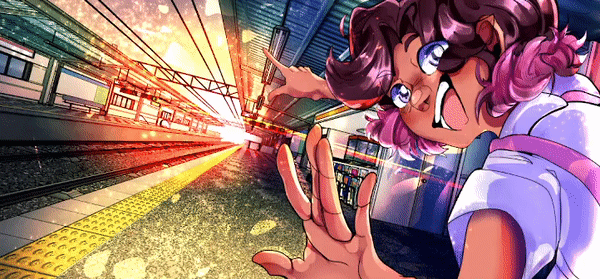
✧ Lens Flares
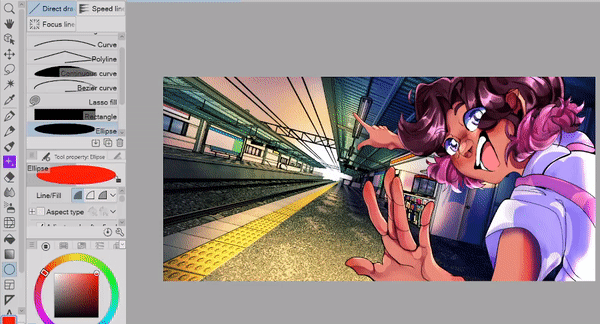
For the final touches in this illustration I'll show you how to add a lens flare!
In the figure section, select the "Ellipse" tool and then set it so the fill is solid. I'll also set the layer blending mode to "Color Dodge" but you can set yours to whatever looks best to you.
To soften the edges of the circle go to "Filter" and then click "Gaussian Blur"
Then with a normal brush, add extra lines to the flare.
If you'd like to tone down the harshness of the edges you can use an airbrush and erase the tips of the lines.
You can use the same techniques on character's faces to create a bloom effect as well!!
Additionally you can also create a rainbow glow effect by locking the transparency of the layer and then paint various colors on top!

✧ Creating Focus & Depth
I like to mimic camera effects in my work which means I'll add a bit of depth using blurs!
Before I can blur my image I'll create a copy of my background folder and merge all the layers so I have one solid layer to blur. After that I'll blur the solid layer then use a mask to erase the areas I don't need.
A little bit of blur goes a long way. Here's the before and after of my image after adding a bit of blur!
✧ City Backgrounds using Blur
Phew! We've discussed a lot so far. In these last few sections we'll go over some extra things you can do using the tools and tips we've talked about!
If you want to create a quick city background. Take the square figure tool and set it so it is a solid file, then create a silhouette of a city.
Once you have a silhouette you can lock the transparency of the city layer and use a textured brush to create light shining through the buildings.

When you're satisfied with the texture, go ahead and blur the layer and then duplicate it. With the duplicated layer you can offset it to create a multilayered building effect.
And that's it!! For extra details like birds, I'll use the lasso fill tool and draw the rough shape of the birds.
Instead of using the Gaussian blur on the birds, I'll actually use the Motion Blur filter to make it look like the birds are moving in the scene.
To wrap everything up I'll add some glow and dust effects just like I explained earlier!
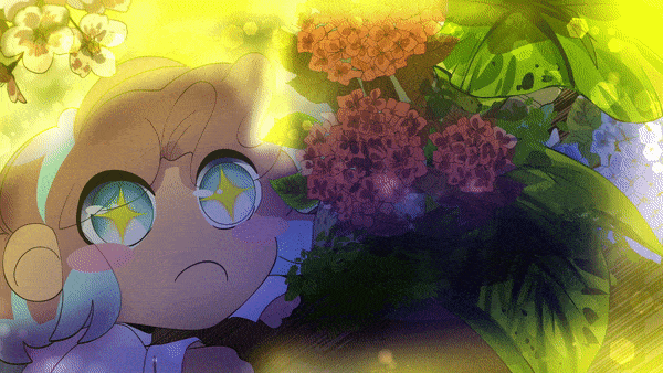
✧ More Examples
You can create SO many backgrounds using blur, gradients, and correction layers. Just to show off a few more examples you can see my process for putting together these 3 different backgrounds.
Everything I've talked about has been used in these! Feel free to study them for your own backgrounds.

✧ Animated Examples
These tips can be used for animations as well! I used everything I talked about in this tutorial for these animations.
I hope by showing you these it'll inspire you to create more backgrounds if you enjoy animation as well!!

[ Finishing Thoughts ]
I hope you've learned a few new tricks to use in your workflow! Thank you so much for joining me
Make sure to like and favorite this tutorial to save it for later. It also lets me know to make more tutorials in the future!
If you want to see more of my artwork you can find it here on my Linktree where you can find my Insta, Tiktok, and Youtube where I post even more content like this!
and with that I'll see you next time buh bye!
✧ Wanna Read Another Tutorial? ✧
Users who liked this post


Comment