Turn Photos Into Background for Manga
Video
Intro
Hello there! This is Tamil.
I love manga art style and how skilled the artists are who work on them. There is a huge pressure on those artists to draw so many pages and release chapters very fast. They use every possible tricks to speed up their process, so I love learning from them.
Today I wanted to focus on background art in manga. A lot of times you can use real life photos for backgrounds to save time and get realistic images.
( This technique works in Clip Studio Paint EX only )
Let’s get into it!
Taking a photo
When choosing photos manga, there are many things to keep in mind:
- Take your own photos when you can! I took this photo I visited an abandoned factory. ( feel free to use it to test this tutorial, it’s free ) I took a picture with my phone that is 3 years old, but the image is still good! Don’t feel like you have to have the best camera for photos. If you do not have an opportunity to take pictures, make sure the pictures you take are free to use.
- Clear contrast and well-lit subjects. It’s important to have images that is not too noisy and dark. Simple background is way better than too busy. Make sure there are not too many details. My photo is a bit too noisy, but I was able to clean it up later.
- Make sure it is not blurry and over exposed. For example when there are no clouds, it’s easy to get pictures that are too bright. Nothing wrong with that, but it will be harder to pull details from it.
- Make sure you have enough resolution. If you are going to print the manga, make sure your picture is not too low in quality. Anything that is above 3000 pixels will be more than enough. If it is a little lower, that’s okay.
Import ( iPad )
I just wanted to show a quick way to drop a photo in clip studio paint on ipad. If you are not on ipad, then you can skip to the next chapter.
Main thingy I do is split my screen in half by using the photo app. Then I just drag and drop. If you want to use an official import then you can just do File > Import > Image

If you do it this way you will have a separate canvas opened. Sometimes it’s great to work on a photo separately before dropping it in your drawing. To transfer it you can always Select>Select All and then Edit>Copy
Navigate to your original canvas and do Edit>Paste
Editing Photo
Depending on your photo quality and your style. You can do many things to edit your image to make it easier to convert it to manga. For example, you could sharpen or blur the image! Playing with amount of details is very important depending on your style.
You can always go to Filter>Gaussian Blur to soften the image. You don’t have to go too far to make it work. Even a 2-5 pixels will be good. We can always draw on top when we finished with filters.
If you want your image to pop and be more vibrant, then you can do Filter>Sharpen>Unsharp Mask
Pushing the sliders a little more will give your image a more detailed look, and give clip studio paint a chance to grow define edges.
ALWAYS make back up. Before editing your image, you can duplicate the layer by going to Layer>Duplicate or Ctrl+J. This way you don’t have to worry about not getting things right the first time. You can always go back and fix it.
Convert to Manga
Now, for the best part! You have your image and adjusted. It’s time to use the secret weapon!
This functions only works in Clip Studio Paint EX. I saw a sale recently that it was only around 5$ a month for the full year on ipad, which is a steal if you use it every day for drawing.
To access this function you need to go to Layer > Convert to Line and Tones
This will bring us to the main menu. Make sure to select the layer you want to adjust.
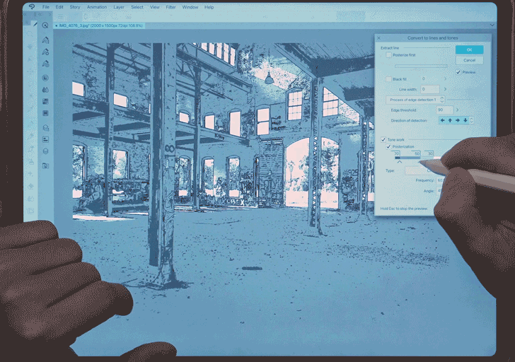
First button I usually click on is Preview of course. I want to see what I am working on and how it is affecting the image. Then I usually go for Process of edge detection 1. It is the easiest way to extract line work from the image. It looks a little busy at the moment, but that is because our Edge Threshold is at 0. That means everything will be a line. If you want to have less sensitivity, then you can drag the slider up.
For me the sweet spot was Edge 42 and I also removed the Top and Bottom arrows to simplify the image. This will give us some space to work on the image in the future.
Then we can add Tone Work to our image. This will divide our image into sections for shading. At the moment I have a total of 3 points as you can see.
The higher the number, the more dark it will be. Left side is darker part of the image. So, naturally you want to place a few dark spots on the left and some lower number on the right. You can always play around with them and take them out by just dragging it out. If you click the number, you can type a your own numbers in there too!

Do you want even more crust in your art? MORE details? MORE STYLE? Where I got 2 major buttons for you. One of them is Posterize First. It will make your image even darker and emphasize even more details. It it is similar to tone work. You can add points and change the number to make things stand out more.
Black fill is the second button. This will combine the darkest parts of the image together and make it pure black. If you are working on a horror manga, then it will be a great addition to your final result. It has a slider which will allow you to pick a number of how sensitive it will be.
Once you are happy with the result, you can click okay and get your image processed.
Cleaning
Once you click okay. Everything will be separated for you! This is the best part about this feature. Out line will be at the top. The 3 layers below are going to be the half tone shading that can be adjusted to your taste. And the bottom will be a white background that we can also change to any color.
Depending on how you want to revise your half tones, you can also go back into the layer panel and make small changes. Just pick the layer you want to change.
If you select the half tone you want to change, go to Layer Property and you will see many functions that usually come with half tone in clip studio paint. One of the main ones to change is frequency. That’s how big or small your pattern will be. I usually like to set it to a lower number just a little bit from the standard 60. Right now it is 5, which is extreme, but I just wanted to show how you can get different effects in there. Changing the angle and the dot settings will give you different results as well :)
Clean Up and Story
Once you have your image, it is time to clean up. I did a lot of small things to clean up this image. For example, removing details on the floor by removing it from half tone mask. I also drew on top with a new layer. I wanted to show more details in some specific parts. There is so much you can play with!
Simplifying the image is the key. Photos will always have too much details. Another super important thing is to create a story for your manga. In here I started playing around with an idea of a sword master who just finished a fight. Looking into the distance and reflecting on their past.
The middle felt too empty and I wanted to add more story. After some sketching I was able to add a few characters who are did not win the fight.
Finished! Adding more armor the warrior, cleaning the floor and adding more props helped a lot. If you noticed, I also cropped my image a lot on the right side. A lot of it was empty and I just removed all of it. Sometimes the best you can do is to get rid of things that do not add to your composition. Even if it looks really cool, less is more.
I also added a small panel on the top left for the face of our character. You can see a small cut on their face. Maybe they will survive? Maybe they will not. It’s a mystery :0
BONUS TIP
The same technique also works for 3D models! Any 3D scene can be turned into a manga background, which makes it so much more effective and faster. You can use any angle for the camera and make it your own. Same method can be applied here. This is a definitely a separate tutorial I need to make in the future. For now, I can link my old tutorial on how to use 3D for environments!
After settings up the camera, you can just use the “convert to lines and tones” in the end. Remember, playing with sliders and seeing what works is part of the process. It is okay to fail and make mistakes. That is how artists learn to be better :)
The end
Thanks for taking the time to read through this tutorial. I hope it was helpful. Drop a comment if you have any questions; I'll do my best to respond with helpful insights if I know the answer.
Keep the creativity flowing!
my socials in case you want to follow for more :3


Comentario