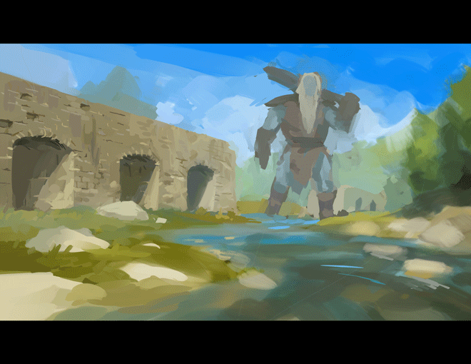
Fantasy Landscape with Fiend!
Canvas size:
5100 x 3000 at 300 Resolution.
Primary brush used:
Oil Paint Flat Brush-
Amount of paint 56, Density of Paint 66, Color Stretch 61, Brush Density 47, Stabilization 2.
Secondary Brush used:
Airbrush-
Many variations in hardness in brush density. Both of these should be low if you want a soft and low opacity effect.
Intro
So, what really is a fantasy landscape? A beautiful mountain, or frosty field can look so beautiful it seems unreal, quite like a fantasy. But I wanted to go farther in to what really makes something fantastical. For me that means some ruined architecture and a fiend!
After I decide on a specific concept I think would be fun to explore, I look for inspiring reference and plan my lighting. I try to keep my lighting consistent throughout the entire piece.
Rough Sketch
Next I get to sketching. I don't add details this early because the composition is likely to change and I would therefore have to delete any details added. I just want to get a general idea across.
Once I have a rough value sketch I move on to color studies.
Color Studies
My process for color studies is fairly simple.
I start with a Color Layer on top of my value study. I paint inside that layer, getting a rough idea of what I want without affecting my values.
After that I use a Normal Layer to add details and change things around as I see fit, Occasionally using Overlay layers to quickly add light or Multiply layers to quickly darken areas.
I found the mountain stream sketch to be the most enjoyable and decided to move forward with that.
So Why Flip the Canvas?
You may have noticed that the image below has flipped horizontally. Flipping your image can be extremely helpful as it can reveal errors that you may have missed previously. In this case, I realized that I had changed the original pose of the giant.
Many times changes of this type are okay, but in this case I found the original pose to be more engaging.
I had originally planned the giant being somewhat typical, but I made a decision while working on his pose to change him to a Frost Giant. Because of the saturated blue sky, the giants pink face against it appears very contrasted, this helps drawn more attention to him. Although many times this would be preferred I decided to make a personal decision to make him blue. I just thought it would be fun to paint blue skin!
Now that everything is in place I get comfortable in my chair and get to detailing, this is going to take a long time.
How to: Atmospheric Perspective
The key to making something look far in the distance is to make sure it looks affected by the atmosphere around it.
Typically in this type of lighting, things will look lighter and bluer the farther they recede into the distance. It is easy to over do this effect and difficult to get it right the first try. Luckily with digital tools you can always fix things as long as your patience allows.
Often, it can be easier to paint your details first, ignoring any atmosphere, and correct your shadows and colors last (bluer and lighter).

The "Lighten" Layer type
A simple gif illustrating how making the bricks lighter helps make them look slightly farther in the distance. For this I used a layer type called “Lighten” at 62 percent opacity. This layer type only affects values darker than the one you are painting at the time.
The difference in this gif is subtle, but things like this go a long way in the end. You may lose some detail, but I believe the atmospheric effect is more important.

Finally the Final Details !
And now it’s time for those last details. Some final touches include adding thicker mist near the giant's feet for further atmosphere, more detailed water, rocks, trees, and greyer clouds near the giant's head for some added interest.

And there you have it!
If you have any questions feel free to comment, or email me at Crossan.Art@gmail.com
https://www.leannacrossanart.com/
https://twitter.com/CrossanArt
https://www.instagram.com/crossanart/?hl=en
https://leannacrossan.tumblr.com/


Commentaire