
Introduction
Hello and welcome! This is a guide to Clip Studio Paint's gradients.
This tutorial will explain gradient layers, the gradient tool, gradient maps, toned gradients, the contour line paint tool, and a few ways we can use these effectively in an illustration.
This was written with beginners in mind. Information is given in steps, from basic to advanced, so certain topics may be split into different sections. (For example, this guide explains customizing gradient colors in 3 different sections.) This is to let beginners practice using what is introduced before moving onto new information.
🧭 This is a LONG tutorial!
** ⚠ NOTE * This tutorial uses Clip Studio Version 1.9.7, which has updated user interface graphics, including tool kit icons. If you can't find the matching icons for examples shown in the tutorial, you might be running an older version (or newer version, if you're reading this from the future).
What are Gradients?
In illustration, a gradient is a way to smoothly transition from one or more colors, values, or textures to another, or to something else (other images, etc.). Gradients can define forms, show the direction of light, blend colors, or add visual interest.
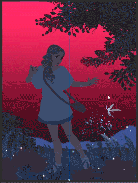
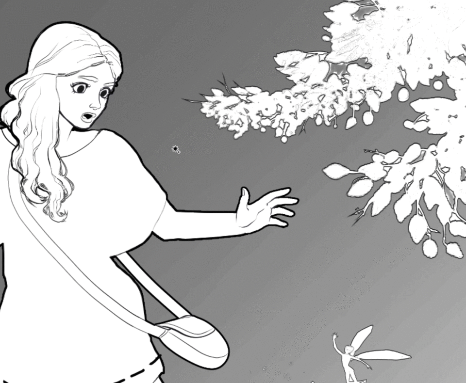
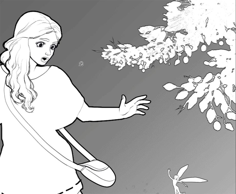
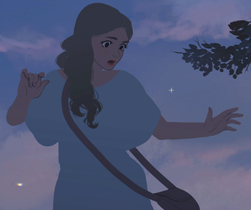
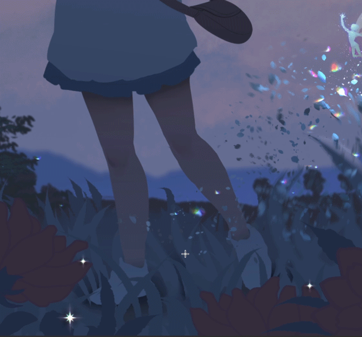
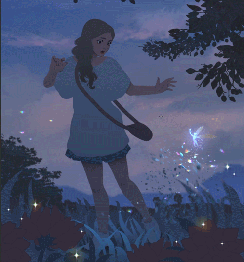
Below is an unfinished illustration which I'll use to demonstrate how gradients can be applied in artwork. I have given each shape or area its own layer (i.e. the girl has her own layer, as do the flowers, and so on.) This makes it easier to apply gradients in my opinion, but you can do it by selection or however you like.
We'll start by creating the sky with a Gradient Layer!
Gradient Layers
A Gradient Layer is an editable "Object"which always lets you change its colors, direction, and position using the [Operation] tool. The changes are updated in real time which is helpful if you need to correct it quickly later on.
Here are 2 ways to create a Gradient Layer:
( 1 ) From the main menu at the top of the program, click on "Layer" > "New Layer" > "Gradient".
( 2 ) Alternatively, you can right-click anywhere inside the Layer window and the same menu will pop up.
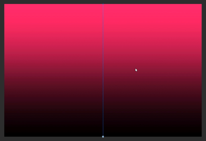
The created Gradient Layer should cover the canvas in a two-color gradient using the current main and sub colors. There will be a vertical blue line in the middle.
You'll also notice it creates a new layer in your Layer window called "Gradient 1".
--------------------------------------------------
Immediately after creating a Gradient Layer, the [Operation] tool will be selected in the "Tool" window, and Object in the "Sub Tool" window. These allow you to edit the Gradient Layer.
(Note: If you cannot see the Tool window, Sub Tool window, or any other visual element mentioned in this tutorial, try this: Go to the top menu and click "Window". This drop-down menu lists the program's windows and whether they are currently on-screen or not. The ones with a check-mark are visible, so if you cannot find a window that's mentioned, or you need to turn one on again, look here. Click the one you need and a check-mark will pop up next to it as the window appears somewhere on-screen. You can move the window wherever you'd like from there.)
While using the [Operation] tool set to "Object" click and hold the small circle at the bottom of the vertical blue line. Moving left or right changes the direction of the gradient, and moving up or down adjusts the amount of each color.
If you need to make changes to the Gradient Layer later, or can't determine why you're unable to change it, select the [Operation] tool again. The blue vertical line will appear, indicating that its active for editing.
-----------------------------
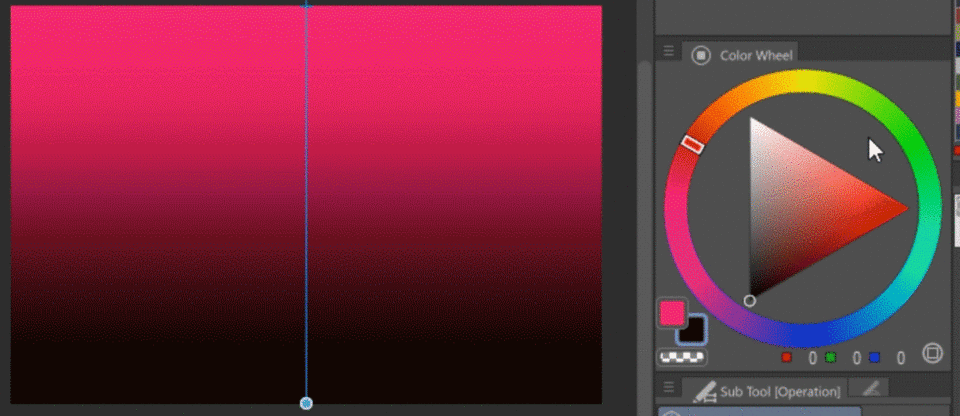
You can change the colors of the gradient by changing your main and sub colors to the lower left of your Color Wheel. These will apply to the gradient instantly as you change them.
-----------------------
Clicking and dragging the small x at the top of the vertical blue line will move the gradient's position.
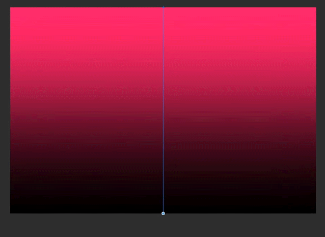
This is particularly useful for radial gradients!
💡 TIP: Create a Masked Folder for the Gradient Tool
Let's darken a couple things with the [Gradient] tool.
First, let's make it easier by preparing a defined shape for the gradient, instead of painting on-top of things we might want to change later. We will do this by making a masked folder, and to start we need a selection.
Select the area or shape for the shadow, in this illustration I've selected the girl. A selected area will have small moving white lines around the edges.
Since I've put the girl in her own folder, selections will be effortless.
You can select whatever is painted on a layer or is contained in a folder by right-clicking the layer/folder and choosing "Selection from Layer" > "Create Selection".
WINDOWS SHORTCUT: Hold CTRL and left-click the layer preview or folder icon. (I cannot find this exact modifier in the menu, so I'm unsure what it is for Mac.)
----------------------------------------------------
If you only have a line drawing or sketch, you can also use the [Auto-Select] or [Marquee] tools in the Tool window to select an area.
Click on the spaces between the lines you'd like to shade with the [Auto-Select] tool. You may need to do this several times.
Alternatively you can choose the Lasso, Polyline, or Selection Pen in the [Marquee]'s "Sub Tool" window to draw the shape for what you want to shade.
Here I'm using the Lasso:
----------------------------------------------------
(1) Once you have a selection active, create a new folder ABOVE the layer(s) you want the gradient to affect (or BELOW the line-work if you have it) by clicking the "New Layer Folder" button at the bottom of the Layer window.
(2) After that, click the "Create layer mask" button near it.
You should now have a folder with a mask in the shape of the selection. This masked folder works by making everything you put in that folder adhere to the folder's mask shape, and it's nice for organization if you use many layers, since you can close folders.
Finally, while the folder is selected, change it's Blending Mode to "Through", as this allows any layers in the folder using different Blending Modes to display properly.
You can find more general information about masks here:
The Gradient Tool
Another way to create a gradient is with the [Gradient] tool. Unlike the Gradient Layer, the tool creates a rasterized gradient on whichever layer is currently selected.
-----------------------------------------
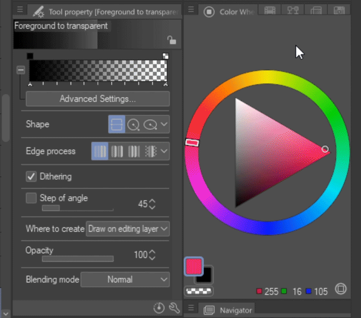
Now let's make a large shadow. Select the [Gradient] tool and make sure both the Sub Tool and Tool Property windows are displayed.
Look at the Sub Tool window. There are several gradients, but we'll focus on the one called "Foreground to Transparent".
Click it and look at the Tool Property window. The top of the window displays the currently selected gradient, and in this case there is a bar with a checkered pattern at one end, and either black or white opposite from it. This is the "Foreground to Transparent" gradient.
The checkers represent transparency, so when you use this gradient anything below its layer will show through gradually.
Let's test it out. Select the masked folder in the Layer window and create a layer.
Click at the end you'd like to start at, hold, and drag up in the direction you want it to fade to, then let go.
This creates a simple but effective general shadow. Notice the masked folder keeps the gradient in the shape of the girl. If the mask were not used the gradient would instead cover the entire canvas.
Changing the Gradient's Color (Basic)
The shadow isn't natural looking with this lighting, so let's adjust it. It would be better using a blue or cool color since her environment uses shades of blues. Here are three ways to change the color:
(METHOD 1)
You will notice that if you try to change your Main and Sub colors next to your color wheel that they do not change the colors on the canvas like they did with the Gradient Layer. They also do not change in the gradient preview.
One way to change the color is by using the little squares above the gradient preview. The squares represent the colors or transparent colors being used.
Pick a Main or Sub color using the Color Wheel. Hover over one of the small squares above the gradient preview, and the icon should change into a tiny bucket. This means the current color selected will be used to fill the square, changing that color in the gradient. Click the square to change it.
Now the gradient will be blue to transparent. Erase the black gradient you made on the layer and make it again using the new blue gradient.
(METHOD 2)
Make sure the layer with the gradient is selected, and use the main menu to navigate to "Edit" > "Tonal Correction" > "Hue/Saturation/Luminosity". A window will appear called Hue/Saturation/Luminosity.
HUE: the color
SATURATION: the intensity or vividness of the color
LUMINOSITY: the lightness or darkness of the color
Adjust all of the sliders until you find a color that works. It's easy to use and you'll see the results on the canvas immediately.
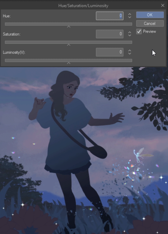
- NOTE: Normally you ONLY need the Hue/Saturation/Luminosity window to change the color of a gradient, but if the color is black, white, or gray it will require an additional correctional window since these lack any hue.
Since the color we need to change in this gradient is black, the LUMINOSITY will need to be brightened so HUE can be applied. Drag the arrow to the right on the luminosity bar to lighten the gradient. The color will change in real time on the canvas.
To apply hue, navigate to the main menu again under "Edit" > "Tonal Correction" > "Color Balance". The Color Balance window will appear. Make sure "Half tone" is selected at the bottom, and move any arrows needed to create the color desired. For this illustration the yellow-blue arrow moved towards blue, and the red-cyan moved a little towards cyan, in order to make it more blue AND more cyan.
You can go back to "Edit" > "Tonal Correction" > "Hue/Saturation/Luminosity" to quickly adjust the new color if needed.
(METHOD 3)
Create a new layer above the gradient layer, and click the Clipping Mask button on the top of the Layer window. This will add a vertical line on the layer indicating it is now a Clipping Mask.
Now, fill that layer with the color you want using the [Fill] tool in the Tool window. Click the bucket icon and then click on the canvas. The gradient should change colors.
Finally, with the new layer selected, click the Combine to Lower Layer button at the bottom of the Layer window.
This will combine the blue-filled layer and the gradient layer into one layer, and it's done!
--------------------------------------
What if you accidentally click the transparent square with the bucket, or maybe you need to make one of the ends transparent, or change how transparent it is?
If that's the case, right below the gradient preview is a button that says "Advanced Settings". Click that to open the Edit Gradient window.
There will no longer be small squares above the gradient. Instead, to select the color you want to change, click on the tiny arrow BENEATH the color you want to change on the gradient.
Once you click the arrow beneath the color, you'll need to edit the box labeled "Opacity". Either click the number and type in your own, or click the arrow to the right to find a percentage you like, then hit OK. If you want it completely transparent, set it to "0".
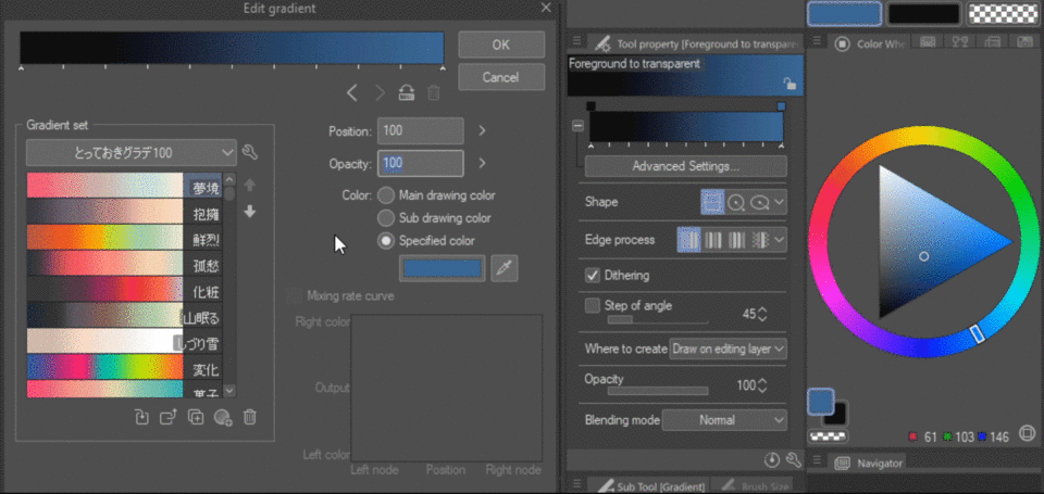
The blue color is now changed back to full transparency.
💡 TIP: Blending Modes - Shadows
Blending Modes are ways to alter whatever is beneath them or mixed with them. They are incredibly useful, and sometimes can take you in a direction you didn't plan to go but want to explore further. You can find different ways to apply them, via layers, folders, tool settings, and correction layers. This tutorial can't go in depth about them, but it will include a few suggestions.
Here is the same gradient layer using different blending modes:
Gradients pair well with Blending Modes, especially when using them for shadows and lighting. Below is a couple useful ways to use them for shadows.
The left image is the unaltered gradient with it's color in the circle. The right image is the same gradient but its layer's Blending Mode is changed, in addition to its opacity.
This blending mode is MULTIPLY, which is often used for shadows. It is usually less desaturated, with a mid-value blend into whatever is beneath it. The gradient color stays visible. - This example is set to 40% opacity.
This blending mode is SUBTRACT. It tends to be extremely dark or contrasted. The colors below are darkened instead of the color used. You can get nice, natural colored shadows with lower opacity. - It's set to 31% opacity.
This blending mode is DIFFERENCE, and it's similar to "subtract". The darker the color you use, the more the colors beneath are seen and darkened. The lighter the color, the more the gradient's color is seen. You can get interesting results with it. - It's set to 47% opacity.
This blending mode is HARD LIGHT. Hard light makes the gradient color strong and vivid. If the color is dark enough, it is great to use for environments which have strong colors from light sources or rich ambient light. - It's set to 100% opacity.
Here are the blending modes together for comparison:
Multiply, Darken, Darker Color, Color Burn, Linear Burn, Subtract, Difference, Hard Light, and Overlay are nice ones to try out for different kinds of shadows.
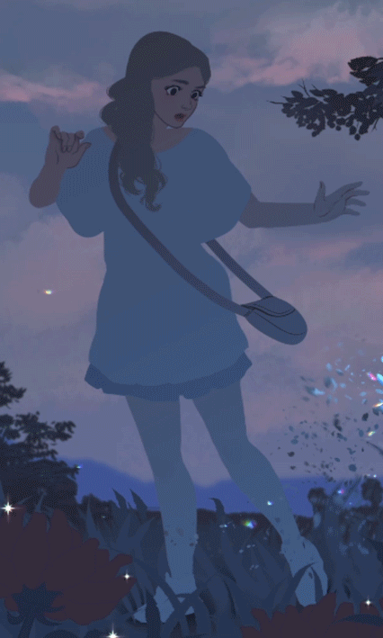
I'll add a saturated blue gradient, with the layer set to HARD LIGHT, and darken the corner of the sky for contrast.
- NOTE: If you are putting anything with Blending Modes other than "Normal" into folders, the folders should be set to "THROUGH", otherwise they will all change to the Blending Mode of the FOLDER (and won't display as intended).
Shape, Edge Process, and Other Settings
-----------------------------
Select the [Gradient] tool and open the Tool Property window. Below "Advanced Settings" are two sections with buttons.
-------------
STRAIGHT LINE: Creates a straight gradient from the line you draw.
CIRCLE: Creates a perfect radial gradient starting from the center. (Note: You must draw the line DIAGONALLY for it to work.)
--------------
DO NOT REPEAT: Creates one seamless gradient.
REPEAT: Creates a repeating gradient, where the number depends on the length of the line, and one repeating edge is hard.
REVERSE: Creates repeating bands of the gradient color(s) with soft edges.
-----
Here is a visual chart of GRADIENT LAYERS made by Straight Line and Circle gradients, using the different Edge Processes:
Here is a visual chart of the FOREGROUND TO TRANSPARENT GRADIENT TOOL making Straight Line and Circle gradients, using the different Edge Processes:
-------------------
These are other settings listed in the [Gradient]'s Tool Property window.
DITHERING: Adds noise to gradient transitions, making them look smoother. Below is Dithering on and off.
-----
WHERE TO CREATE: "Draw on editing layer" uses the tool on whatever layer you have selected, and "Create gradient layer" creates a Gradient Layer with the Gradient tool instead of using menus.
OPACITY: Control the opacity (overall transparency) of the gradients you create using the tool.
BLENDING MODE: Lets the tool use any of the Blending Modes available (plus there are a few extra ones that aren't usable as layers or folders).
STEP OF ANGLE: Creates a temporary ruler based on the number you choose, which acts as a guide for Straight Line and Ellipse gradients. (I don't use it, but it might be good for perspective work.)
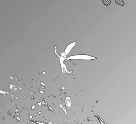
Radial Gradients and Lighting
Now lets try out radial gradients by creating small shadows.
I have created another masked folder, this time having selected her skin. I've selected the [Gradient] Tool, set to "Circle" and "Do Not Repeat", with a color chosen for shadows.
Now the same is done for the grass, but this time with a color for light using the Ellipse.
Radial gradients are perfect for creating a glow coming off of something. Here are yellow Circle gradients with their layer's Blending Mode set to "Overlay":
Many of the Blending Modes work to convey different lighting effects. It's best to try each of them for every lighting type. These include Lighten, Overlay, Screen, Color Dodge, Glow Dodge, Add, Add Glow, Soft Light, Hard Light, Vivid Light, Linear Light, Pin Light, Lighter Color, Exclusion, and Divide.
Make Fireflies! - Creating a New Gradient in the Sub Tool Window
Let's make use of radial gradients for light effects by making some fireflies.
There are two ways to create gradients. First we'll make one in the Sub Tool menu.
With the Foreground to Transparent gradient selected in the Sub Tool window, press "Create copy of currently selected sub tool" button. The icon has a square with a plus symbol in the middle.
A new window will pop up. You can change the name, the icon, and the color for the icon, if you'd like. I'm going to change the name to "Firefly", then hit OK.
A duplicate of the former tool will pop up at the bottom of the list in the Sub Tool window.
Make sure it's selected and look at the Tool Property window. Click on "Advanced Settings" and the "Edit Gradient" window will appear.
The gradient is white at the moment. Now to add more colors.
Click directly underneath the gradient preview bar where the ruler lines are. A new arrow should appear.
Now click on the rectangular box on the right under "Specified color". This will open the color wheel where you can pick a color.
You can adjust where the colors are by clicking the arrow and sliding it left or right.
To remove a color from the bar, click and hold the arrow, pull it down and release. You can also click the trash can icon right below the gradient bar.
I've added two more colors and adjusted them all for the firefly gradient. Here it is with the colors and opacity numbers listed:
Because I've re-positioned the color nodes, the gradient will form differently.
--
Let's try it out!
Create a new layer and set it's Blending Mode to "Pin Light". Make sure the gradient's Shape is set to "Circle", and the Edge Process is set to "Do not repeat".
Now create some radial gradients.
The size of the circles you make will determine how large the fireflies are.
The proportions of colors and opacity in the gradient bar changed the the gradient from a large circle of color to a small ball of light.
Gradient Maps - How They Work
Gradients can also be used as more than shapes on the canvas. They can serve as a color scheme for a specified shape or area, or the entire artwork. It's called a Gradient Map.
Gradient Maps use gradients to assign colors to VALUES, based on where colors are on the gradient bar, and their opacity.
One end of the gradient is for the DARKEST VALUE, the opposite end is for the LIGHTEST VALUE, and the MIDDLE VALUES transition in-between accordingly.
- Note: I'm unsure which end is dark or light by default. You will have to test it to find out. You can flip how the gradient is applied to values by using the "Reverse Gradient" button any time.
Let's look at a simple version of this.
Here are 4 values, black at the left end and a light grey on the right.
I've created a gradient which will not blend colors as a Gradient Map, that way we can see ONE COLOR APPLIED PER VALUE. (Note: This Gradient Map is applied only to the circles, and not the entire canvas.)
The gradient is applying the red-brown to the DARKEST VALUE. We know this because the black is now red-brown. The cool green is applied to the LIGHTEST VALUE, and so on.
If we flip the circles on the canvas, the gradient map still applies the same colors to the same values.
However, if we FLIP THE GRADIENT with the Reverse Gradient button it will reverse how the colors apply to values. Now the darkest value is cool green and the lightest value is red-brown.
Notice that it doesn't matter that the cool green is naturally lighter than the red-brown. It still made the DARKEST VALUE a LIGHT COLOR, and the LIGHTEST VALUE a DARK COLOR.
That's because Clip Studio Paint uses a dark-to-light spectrum to determine how to apply the colors. The program assigns colors to values based on a spectrum, which is similar to a gradient.
Whatever the VALUE of a color is will determine what the gradient map changes that color to. Here is a general representation of how it works:
Here it is in the first example.
Here it is once it was flipped.
If you're unsure what the value of a color is, it's HOWEVER LIGHT OR DARK A COLOR IS. Here are the values of this red, yellow and blue color:
Here is a better example of a Gradient Map being used, and then how it looks when reversed:
Creating a Gradient Map
There are two ways to create a Gradient Map.
GRADIENT MAP AS AN EDIT
Select a layer you want to apply a gradient map to, then in the main menu navigate to "Edit" > "Tonal Correction" > "Gradient Map". This will open the Gradient Map window.
-----
GRADIENT MAP CORRECTION LAYER
Select a layer or folder you want the Gradient Map to apply to, then right-click that layer/folder. In the menu that pops up navigate to "New Correction Layer" > "Gradient Map". This will open the Gradient Map window. You can also find this in the main menu under "Layer" > "New Correction Layer" > "Gradient Map".
This method creates a Gradient Map Correction Layer, which lets you adjust the Gradient Map or remove it at any time. You can edit the Gradient Map by double-clicking the grey box icon on the layer.
-----
Once the Gradient Map window is open the canvas will display a preview of the current gradient. If you adjust the colors, opacity, and proportions of the gradient the canvas will update immediately.
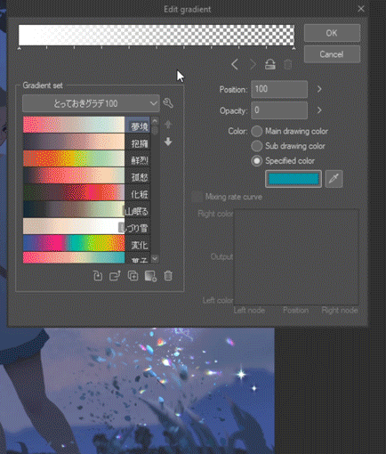
Creating and Importing Gradient Sets
On the left side of the window are your gradient sets. Click on the light gray bar to see a drop-down menu of the gradient sets you currently have. Click any name on the list to load that set.
It won't automatically load a new gradient into the preview bar. To do that, double-click on a gradient within a set, or click the "Load to Gradient Bar" button at the bottom.
-----------------------------------------
To create a new gradient set click the wrench icon to the right of the Gradient Set list menu, then select "Create new gradient".
A small window will pop up where you can enter a name for your Gradient Set.
The new set will be listed in the Gradient Map window, and from there click on the only lit up button at the bottom called "Create new gradient".
Another window will pop up to enter your new gradient's name. After you enter that, it will now be listed under the new set with whatever gradient was in the main preview bar.
If the gradient shown under your Gradient Set isn't what you want, select and customize the new gradient using the large gradient bar at the top of the window.
Once you've made all the changes you want, click the "Replace saved gradient" button at the bottom. This will overwrite the listed gradient in the set with the large gradient at the top of the window.
You can rearrange your gradients using the up and down arrows under the wrench icon.
--------------------------------------------
If you don't want to spend all of your time making gradients but want more options, you can import new gradients.
The easiest way to get new gradients is downloading them from Clip Studio Assets using Clip Studio's manager application.
Open Clip Studio and click the button on the left side labeled "CLIP STUDIO ASSETS". When that loads in the main window, click the "Detail" button on the right side of the search bar.
Click either "Gradient Set" or "Gradient"from the keywords listed, then click the "close" button to see the search results.
Once you find one you like, click the "Download" button in the upper-right corner of the selected gradient or gradient set. (You must be logged in.) A message will appear on screen about the download.
Return to the Gradient Map window, click the wrench icon, and select "Import material set". The Import Material Set window will appear.
Simply double-click the gradient set or gradient to import it, and it will show up in your Gradient Set drop-down menu!
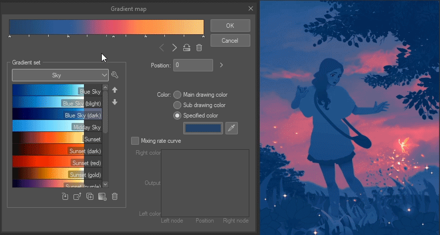
💡 TIP: Effective Use of Gradient Maps
You can get pretty creative with Gradient Maps. Let's go over a few ways to use them.
COLOR HARMONY
One quick way to create color harmony for your illustration is to add a Gradient Map.
Create a Gradient Map Correction Layer and move it to the top of the layers in the Layer window. Pick or make a gradient you think fits your artwork's mood. You can also pick colors which match the environment and lighting.
For this color harmony I made a gradient with sunrise colors, then set the Gradient Map's Blending Mode to "Vivid Light" at 32% Opacity. Below is what the Gradient Map Correction Layer looks like on NORMAL Blending Mode, and what it looks like in the Layer window when changed to "Vivid Light".
Here is the original image is on the left, and next to it is what it looks like with the Gradient Map active above it.
-----
SEPARATE AREAS USING MASKS
Add specific gradients to a specific shape, or groups of shapes.
If the thing you want to use a Gradient Map on is painted on ONE layer, right-click the layer it's on to create a Gradient Map Correction Layer directly above it. (TIP: If you don't know which layer something is on, holding CTRL and SHIFT lets you click anything on the canvas to switch to it's layer!)
Turn the Gradient Map Layer into a Clipping Mask with the button at the top of the Layer window. Now it will only affect whatever is on the layer it's attached to.
In this case, it is the tree.
Here the Gradient Map's blending mode is set to "Color".
--
If you want the gradient map to affect MANY things, like all of the plants in the background, do this: Select parts of your artwork with a selection tool of your choice. Right-click anywhere in the Layer window and create a Gradient Map Correction Layer, then move it so it is ABOVE everything you have selected. The Gradient Map should have a mask in the shape of the things you selected!
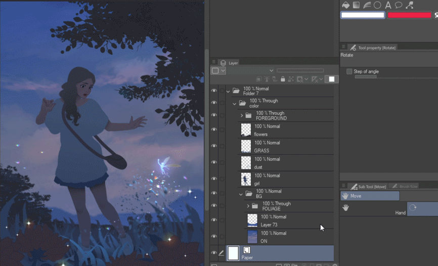
Here are the 4 different MASKED areas I used to change the colors of the illustration. The top two are Gradient Map Correction Layers, one for the sky and one for the plants. The bottom left has color edits for the girl, and the right one has a teal gradient added across her and the grass.
This is what it would look like in the Layer window:
Here they are combined:
-----
PATTERNS
Gradient Maps and patterns are perfect for each other. You can add one or many Gradient Maps with different blending modes to create various versions of the same pattern.
If the materials window isn't already open, look at the top of your other windows. There will be single arrows and double arrows at the top. These show and hide the vertical stacks of windows, including the Materials window, which has the patterns. Look for a double arrow that's pointing LEFT and click it.
This should open the Materials window. (If it didn't, try a different double-arrow.) On the left side under "All materials", click either "Color Pattern" or "Monochromatic Pattern". Scroll through the patterns on the right to find one you like, then click and drag it onto the canvas.
The pattern is an Object so you can resize it as needed. Select the area which needs the pattern, then add a mask to the pattern's layer.
Create one or more Gradient Map Layers directly above it, adjust the colors until you like the results, then set them as CLIPPING MASKS for the pattern layer. Here is one pattern changed with different Gradient Maps:
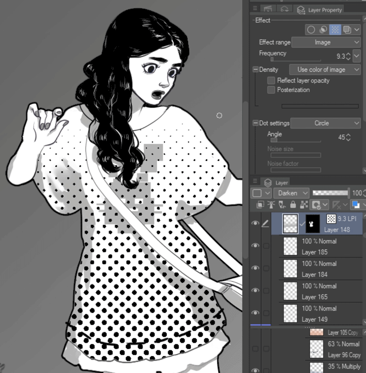
Toned Gradients
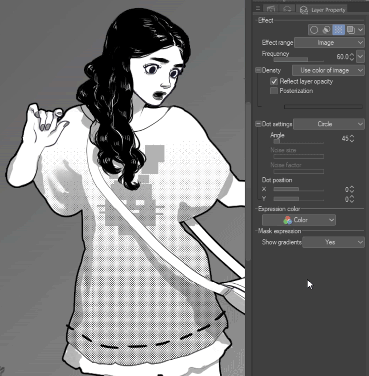
You can also apply gradients as tones for comics.
To do this, create a gradient, and with the gradient's layer selected open the Layer Property window. Under "Effect", click the checkered icon.
The gradient should now be a TONED gradient.
Once you've activated Tone for the layer, the Layer Property menu will display options available to customize it.
---------
You can change the scale of the tone by sliding the Frequency bar left or right.
---------
If you don't want circles for the tone pattern, you can change that as well. Alter the shape with Dot Settings, then adjust the angle and position below. You can also change how "noise" appears.

---------
The setting Reflect Layer Opacity determines how the tone will change when you alter the LAYER'S OPACITY. It has two settings. You can change it from one to the other by clicking the box on the left.
WHEN IT'S ON: The tone will change in size and closeness.
WHEN IT'S OFF: The tone will stay the same but the opacity will change.
-----------------
This works for all the gradients shapes!
The Contour Line Paint Tool - Part 1
[Contour Line Paint] works differently than other gradients. Instead of using a LINE to direct a gradient, it uses something more akin to the Fill tool. It fills the space between colors with an effect that blends them together.
To use [Contour Line Paint], select it, and click a spot on the screen between colors. That's it.
-------------------
[Contour Line Paint] REQUIRES anti-alias to be TURNED OFF on ANY TOOL YOU USE INTENDED TO MAKE GRADIENTS WITH CONTOUR LINE PAINT. Most artwork is made with tools that have anti-aliasing enabled.
What is anti-alias?
Digital art displays everything in pixels. Brushes and blenders must use pixels effectively to look realistic. In order to do this the pixels lose opacity as they transition to the edge. If they don't, marks and blends will look jagged.
In this case, the jagged lines are good.
Basically, turning anti-alias off allows pixels to be at full opacity. If you've ever seen pixel art, especially in early gaming graphics, that's what it's like to have no anti-alias. This is needed for the [Contour Line Paint] tool to create gradients.
If a tool has a way to disable anti-aliasing, it will be listed in its Tool Property window, or Sub Tool Detail window by clicking the small wrench in the bottom right corner.
Here is an example of [Contour Line Paint] being used on a drawing done with anti-alias off and then on:
The tool can't create a seamless gradient when anti-alias is on because it only blends the lowest opacity pixels, which are a different color than the full opacity pixels. (This is explained further down in "Two Neighbor Colors".)
-----------------------------------------
One of the most important things to understand is this tool requires a DEFINED AREA TO FILL. This area can be a SINGLE SHAPE or the SPACE BETWEEN ENCLOSED LINES.
Any line or shape which CREATES A NEW ENCLOSED BORDER will change or prevent the gradient. It might create a new gradient by MIXING WITH THE OBSTRUCTING SHAPE OR LINE.
If it is a black line, and black is set to "Do not cover black" in the Tool Property, it will ONLY FILL EACH NEW ENCLOSED AREA.
----------------------------
These are two ways to ensure an efficient area for the tool to work:
1. SET LINE-WORK AS REFERENCE LAYER: Create gradients on new layers while the line-work defines the areas.
-----
2. SET SEPARATE SHAPES AS REFERENCES: Create gradients on new layers using many shape areas as reference layers.
-----
You can also use masks to create extra areas within areas.
- Note: Initially I included making gradients on one layer with "Lock Transparency"as a third option, but the results were inconsistent, enough to be frustrating. Separating your gradients from your actual work, in my opinion, is the best way to use [Contour Line Paint]. Create gradients on the artwork layer at your own risk!
💡 TIP: Setting a Reference Layer
Setting a layer as a Reference Layer makes whatever is on that layer the boundaries by which the tool using it adheres to. In other words, it lets you color or draw on a layer in selective areas without having to select them all.
It only works with tools that use Reference Layers, like [Contour Line Paint], [Fill], [Auto-Select], Colorize, etc. If a tool uses Reference Layers it will be an option in the Tool Property window.
"Set as Reference Layer" is a button which toggles. Select a layer to be the reference and click the button. The button will turn blue, and a lighthouse icon will appear on the left side of the layer indicating it's active. Click it again when done, or choose another Reference Layer by repeating the same thing on a different layer.
While the Reference Layer is active, anything you do on a new layer (with a proper tool) will use it as a guide. [Contour Line Paint] will use a reference layer to DEFINE AREAS. It can fill both inside and outside of lines, depending on if the layer is above or below the Reference Layer.
In the illustration above, the Reference Layer is a layer with lines, which is below the layer with colors. Therefor [Contour Line Paint] can also color OVER the lines.
The Contour Line Paint Tool - Part 2
-----------------------------------------
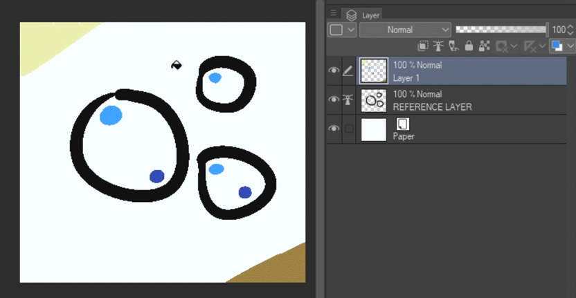
Make sure every area you intend to add a gradient to has TWO LINES OR SHAPES, EACH A DIFFERENT COLOR. A gradient will only be formed by TWO SPECIFIC COLORS. They can be any colors, but no more than two will form a gradient (or a section of a gradient).
-----
Multiple instances of the same color will blend, but these colors must be EXACTLY the same two colors.
-----
A gradient CAN be made with SEVERAL colors, but they will ONLY blend BETWEEN TWO NEIGHBORING COLORS THAT CREATE AN ENCLOSED AREA.
The yellow-green and teal are color neighbors, so they will blend together.
The teal and blue are another set of neighbors, so those will blend together separately .
And so on...
The dark blue DOESN'T have a neighbor color, so it will fill the area with the solid blue color.
[Contour Line Paint] REQUIRES two colors. This also includes the ENDS of mutli-colored gradients. If a second color isn't added to an ENCLOSE AREA the gradient will use something else to blend with, or fill the area with one solid color.
If the gradient needs to fade into the background color, add the background's color to the end of the gradient.
-----
The gradient below wont blend everything. Can you see why?
The yellow didn't make an ENCLOSED AREA. This means that there are THREE colors (green, yellow, and red) in ONE DEFINED AREA, and it will only use TWO to make a gradient. The tool blended yellow and green, and filled the space between yellow and red, so now red cannot blend with yellow.
If you close the space with yellow it will work properly.
The Contour Line Paint Tool - Part 3
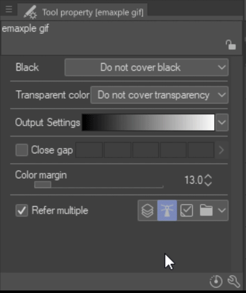
Most of the information thus far has been made using the [Contour Line Paint] settings in the image below. "Black is set to "Do not cover black", and "Transparent Color" is set to "Do not cover transparency".
---------
The settings under "Black" only apply if (1) you're using the tool on a layer WITH black lines, or (2) you put any black on a layer intended for this tool.
DO NOT COVER BLACK: Ignores black when making gradients around it. It will remove black if you click on a black color however. (This is the setting used in first half of the tutorial.)
COVER BLACK: Colors will blend with black instead of ignoring it. The TWO COLOR NEIGHBOR RULE still applies however, and black is considered 1 of 2. (If there is MORE than ONE color in a DEFINED AREA with or next to black, it will always blend black.)
REPLACE BLACK WITH DRAWING COLOR: Instead of acting like a colorless blender, it will now add whatever color you have selected to mix with whatever is on the layer. TWO COLOR NEIGHBORS applies here also, and the color you have selected is 1 of 2.
-----------------------------------------
The last two in the Transparent Color setting only apply if you are adding colors on a FILLED AREA on the SAME layer.
DO NOT COVER TRANSPARENCY: Creates a blend between two neighbor colors. (This is what has been used in the first half of the tutorial.)
COVER TRANSPARENCY: Creates a TRANSPARENT blend if used near 1 color, meaning it REMOVES color. If used between 2 colors, it blends those 2 colors together at full opacity, as if set to "Do not cover transparency".
REPLACE TRANSPARENCY WITH DRAWING COLOR: Creates a blend with 1 color by using whatever color you have selected. If between 2 colors it blends those 2 colors together at full opacity.
-----------------------------------------
This is the mixing rate for the gradients.
Clicking the arrow will open a small graph where you can customize the algorithm.
Click anywhere on the line and drag it in a direction. Release it and a square pin will stay there. Clicking and dragging a pin out of the graph will remove it.
There are 3 presets listed in the Sub Tool window: Normal paint, The lightest shadow, and The deepest shadow. The sphere is colored using these 3 settings in the order listed, pictured below.
These illustrate how the gradient changes based on each Output Setting.
Here are 3 custom settings I made:
You can even use different settings for each segment.
-----
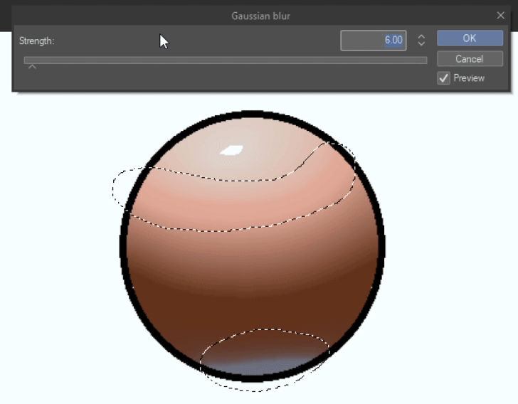
If even after trying different settings there is still visible banding, you can blur it.
Here are the steps:
1. Select the layer w/the gradient(s)
2. Set the layer to "Lock Transparency" (the small lock and checkers icon at the top of the Layer window)
3. Select the areas you'd like to blur with the [Marquee] tool (or don't, if you'd like to blend the entire thing)
4. Go to the main menu and navigate to "Filter" > "Blur" > "Gaussian blur", and move the arrow until it is an appropriate amount
----------------
This is used if you have broken lines, or areas which are not closed off entirely.
Instead of having to fix where there are openings, this option will treat them as if they are closed. This setting is helpful if you have a lot of detailed line-work to color.
Click the box on the left to enable it, and a check-mark will appear. You can control how large of an opening is considered "closed" by adjusting the scale of boxes on the right. Click the arrow on the right to manually enter a number up to 50.
If you don't have Close Gap enabled when filling an open-ended space, it will fill the entire canvas.
This is the same example, only now it has been turned on. Notice how it creates borders between the gaps?
You will need to adjust the bar/number so that it works for each drawing or area depending on the size of each gap.
All of this said, if you use line-work and DO have all of your gaps closed, it might be better to keep it turned off. There have been times when using [Contour Line Paint] with Close Gap enabled where it would create "closed gaps" in parts of an enclosed area, instead of filling it entirely.
--------------------
Color Margin determines how DIFFERENT one color is from another, and whether to consider two or more colors to be the same or not.
We can see how these versions of purple are different, and that they are individual colors. The program can as well. However, depending on the settings, the program may see these same colors like this:
Or like this:
The tool takes this into consideration so that it knows whether or not a color is meant to be part of the gradient.
To illustrate this, here are three circles drawn on the same layer next to each other. Contour Line Paint was only used on the upper left circle on each version, with Color Margin set to the numbers below them.
-----------------------------------------
This is a very helpful setting. Earlier in the tutorial I discussed how to define areas by using Reference Layers. This is how you enable[ Contour Line Paint] to use them. It's also how you enable it to refer to other layers to determine how and where it makes gradients.
ALL LAYERS: It considers everything drawn on ALL LAYERS to determine where or how it will make the gradient.
REFERENCE LAYER: This lets you set a Reference Layer to determine where and how the gradient is made, which can be changed to any layer an unlimited amount of times, . (This is the one I use most.)
SELECTED LAYER: This seems to be the same as if this setting were disabled. It applies to the layer you currently have selected, which if you noticed, is always the layer the tool will be used on. I can't find a reason to use this option, nor do I know why it exists.
LAYER IN FOLDER: The tool applies to the selected layer in a folder, but any OTHER layer in the folder remains VISIBLE regardless if they are below the affected layer or not.
Here is an example for Layer in Folder:
In a folder I have created 4 layers. Each set of touching colors are on their own layer, as well as the single pink color.
The layer that has the two colors in the upper right (green and purple) is the target layer for the tool. This layer is also ABOVE the other 3 layers in the folder.
If the tool is used OUTSIDE of the colored circles in the empty space, this happens:
It blends the two circles out into their defined area, which happens to be the entire canvas. If you remember, all other colors are on layers BELOW the target layer, therefor they SHOULD be covered up by the gradient. They are not.
Instead, this setting created the gradient while also MASKING OUT everything else in the folder. If you turn off the other layers below, you will see it made this:
---------------------------------------
Another setting I'll go over is in the Sub Tool Detail window. To access that, press the wrench icon in the bottom right of the Tool Property window.
In the new window, click on "Reference" on the left, and it's the last option.
-----
An example: Create a layer and fill it with green, then fill the "Do not start filling for this color" box with the same green in the settings window.
Set Refer Multiple to "All Layers", or alternatively set that layer as the Reference Layer.
Now create a new layer above and make a mark with the same green color and a mark of a different color, then try to blend them with [Contour Line Paint].
-----------------------------------------
This setting is on by default. Turning it off lets you use [Contour Line Paint] on one color no matter how many instances of it there are, or where they are.
I've created several blue circles and a couple differently-colored circles on the same layer, and used [Contour Line Paint] on the upper-right blue circle.
Here it is with this option ON (default state):
Here are the results with it off:
-----------------------------------------
In my opinion, this tool seems ideal for coloring line-work, which makes sense for a program specializing in comics. If you plan to incorporate line-work in illustrations, this could be a tool worth trying.
Creating any gradients which shift in shape, such as folds in a fabric, might benefit from this tool.
It also might save time when coloring spherical objects rather than using radial gradients when trying to get specific lighting.
In general, [Contour Line Paint] seems best for small areas where you need quick simple gradients.
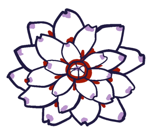
💡 TIP: Coloring Flowers with Contour Line Paint
It's time to put all this information together and color something! Let's color flowers.
I'll be coloring two flowers to show different coloring styles. Both of these examples will use line-work, but in one I will color beneath it, while in the other I blend the line-work into the gradients.
First, draw a flower with a pen or brush with anti-alias turned off. Duplicate this layer so there is one for each example.
---------------------------------
1. Set the flower line-work as the Reference Layer.
2. Create a new layer directly beneath it.
3. Pick two colors, preferable a dark and a light color.
4. On the bottom layer, using a brush without anti-alias on, apply a dot of one color (the darkest color) to the INNERMOST part of each petal. After that, draw a circle with the same color around the edge of the center mass.
5. On the SAME layer, add dots of the other color to the OUTERMOST parts of each petal, then a large enough dot in the very center of the flower. EVERY petal needs BOTH colors.
6. Select the Contour Line Paint tool and on the same layer touch each petal or space between the two colors.
----------------------
1. Pick two colors, one must be lighter than the other.
2. Select the flower line-work layer and press the "Lock Transparency" button.
3. With the line-work layer still selected, select your lightest color and push the canvas Fill button near the main menu.
The entire flower should be that color now. (Because "Lock Transparency" is turned on for the line-work layer, anything you do on this layer will only change or apply to the line-work.)
4. Select a brush (anti-alias off) and use the DARKER color to color the pistil (the circle in the middle of the flower).
5. Create a new layer below, and on this layer add spots of the darker color to the innermost part of every petal. Select your lighter color, and in the center make an appropriate-sized spot.
6. Select the line-work layer and merge it with the layer below.
7. Use the Contour Line Paint tool to touch each petal/space between the two colors.
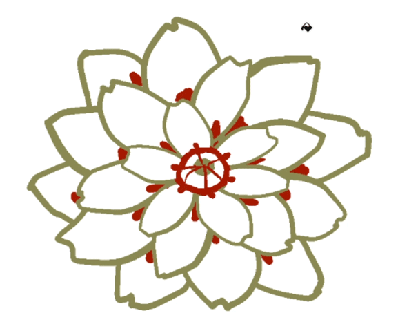
I'll color the flowers in the illustration using the second method.
Final Illustration
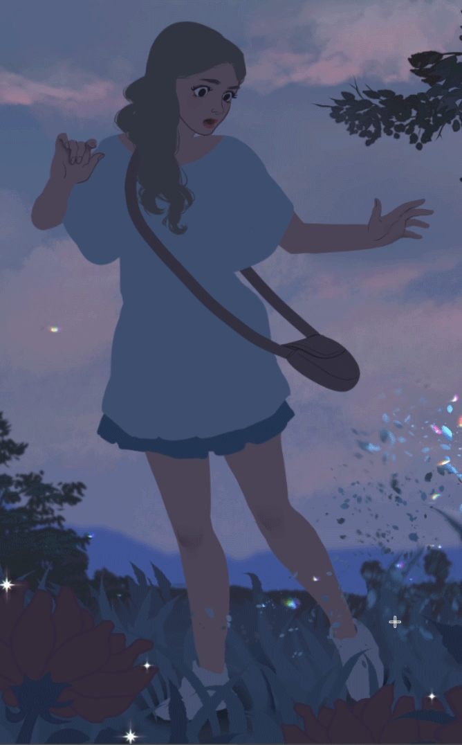
All of these techniques with Gradients, Gradient Maps, and Contour Line Paint have helped polish the illustration into something more appealing.
Below are different versions of the illustration with things added from the tutorial.
Here is a simplified version of the illustration so you can see how line-work might look with gradients:
Here is how the colored illustration looks with obvious use of gradients:
Here is another colored version with subtle gradients, which still have a large impact on the artwork!
----------------------------
I hope this helped anyone new to gradients, or curious about finding additional information on them! Have fun painting and exploring!
- Salacia
Les utilisateurs qui ont aimé cette publication


Commentaire