
01. Intro
Heyo. My name is Josh Godin. I'm a concept artist and illustrator based in New York City, NY. In this article I'll be going over a process for using Clip Studio and Blender to create stylized concept art. This is an in-depth step by step guide where you'll gain the most by following along and focusing on overall goals- though there are a lot of specific technique/software tricks throughout. The focus is split equally between traditional art theory, concept art generals, and software know-how. I won't be teaching 3D, but rather using Clip Studio to show you how to take advantage of 3D skills when designing and painting. If you don't know 3D, that's fine too. You can work from a simple sketch base, and I'll mention that as we go. Let's get into it!
Here's the final product:
02. Why 3d?
Let me quickly go over why I keep 3D handy when I’m working. The simple answer is: any amount of 3D knowledge will level up your capabilities. For example:
What I have is essentially a rectangle and some cylinders. We’re talking “first day in Blender” level skills. Yet just with that, I have the underdrawing for any angle I want. This is super powerful! As a concept artist, I can now easily sketch designs on top of this base- and I can do it from every angle without starting from scratch or worrying about proportional consistency. As an illustrator, I can now move the camera around and experiment with angles for free- zero extra work. But that’s just the start. What happens if I add materials and sunlight?
Now we’re really getting somewhere. I clicked literally one button that added the sky, which filled in highlights, shadows, and ambient light. Changing colors of objects is as simple as selecting it, adding a material, and changing the material color. This all took less than one minute and now I can render out a super robust underpainting with light/shadow information and a whole spectrum of colors to sample while painting.
Though I didn’t need to, I also created a very simple lowpoly character to observe proportions along with the vehicle- and to sample for skin tones later. He’s amazingly doofy, check it out.
Usually you wouldn’t show someone that. In fact, forget you ever saw that! That’s it for 3D in this tutorial... probably. If you want to see this portion in the video, check it out here: https://www.youtube.com/watch?v=Ba3-bwI-bf8&t=48s
Onto Clip Studio!
03. Design Stage: Van
In this section I'll be mainly drawing. No trickery, just grab your favorite brush and get to work. So now I drag the 3D renders into Clip Studio, where they’ll be the “underdrawing.” Then I add a layer of white on top and drop the opacity so that it’s easy to see the linework I'll be creating.
(Here is where to draw an undersketch if you're not making use of 3D)
It’s easy to get excited and just start noodling. Which is fine, I use that feeling to do warm up sketches. In this case, I just did some loose gestures of what the character would be, to make sure my assumptions for the vehicle were lining up with his style
With the drawing hand grogginess gone, I pause and reexamine WHY or HOW the design would service the purpose. Here I pull up my vehicle reference and take some mental notes- then dive into sketching. I try to have a dialogue with myself and let the design needs be the moderator. AKA “what if this went there? Ah, no that wouldn’t hold weight and it would get caught on bushes.”
To follow along in the video, head here: https://www.youtube.com/watch?v=Ba3-bwI-bf8&t=300s
I’m being pretty loose and simple here but I do have some literal needs: a rollcage, redundant headlights, some sort of external platform for hauling hazardous materials, and I want to keep the early 80s style van feel intact. Aside from that, I’m just trying to be kinda playful. Design choices are based on function (“this needs to hold weight”) or “feel” (“bowing this makes the van feel bouncy”) or “tone” (“tubing around headlights looks like glasses”). Since I’ve thought about the character a lot already, many of these choices serve to unify him and this vehicle.
So there’s a few things going on that I like. I found this version of the base van that I really like, for instance.
But I feel I’ll tread the same waters if I keep just sketching like this- so I break up my process. This is something I do continuously while working. It gives you a sort of mental “fresh start” and switching up techniques results in designs which may not have happened otherwise. In this case, I moved from linework to shapes.
This felt like a much better way to observe the design. I’m just using a big chunky gouache brush and blocking out shapes instead of drawing them in linework. The read is super clear and the visual “weights” of elements are more apparent. So I went ahead and dropped in shapes on the prior lineart sketches as well. I then lined both sets up to decide on a final.
I chose this one, but with some modifications after swapping bits and pieces from other designs.
I also do a quick sketch for the back view. I really wanted him to have an electric motorcycle as well. The setting is in the desert and the character finds himself in all sorts of precarious situations. Having this sturdy, nimble, smaller vehicle makes certain maintenance jobs way easier (and more fun!) for him. I stuck to the lineart process here because I needed to make it mechanically functional- which means noodling with some specific details.
To follow along with the video, head here: https://www.youtube.com/watch?v=Ba3-bwI-bf8&t=960s
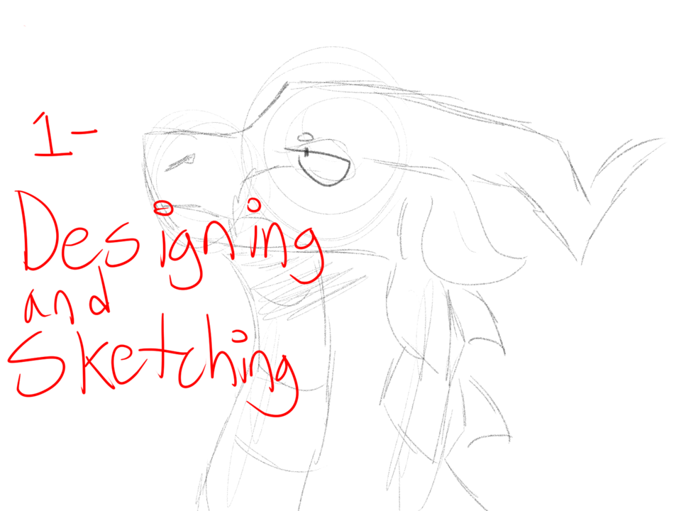
04. Design Stage: Character
Onto the character sketch! We have our little lowpoly guy, but that’s strictly for proportions (character blockins in 3D are not quick and easy, typically). I already have my warm up sketches from earlier, so it’s easy to jump right in. I start with an anatomy sketch.
To follow along with the video, head here: https://www.youtube.com/watch?v=Ba3-bwI-bf8&t=1340s
I always have a backstory for the character. I try to make it based on two factors: purpose and personality. In this case, I’m creating a character for a pre-existing Solarpunk personal project. He’s a member of a post-collapse decentralized community which runs on greentech and salvaged machinery. He’s a sort of “gadget guru” who zips around fixing any-and-everything- that’s his purpose. His personality can be literally anything. So I imagined when he was a kid he found a broken old DVD player. His parents explained to him what it is (a long abandoned tech) and being a natural tinkerer, he got the thing running. Low and behold, there was a DVD inside: 25th anniversary edition of Grease. He immediately identified with the tinkerer nature of greaser culture, and went on to find rockabilly and even punk. All that in mind, I get to work. I switched over to the rough indian ink brush and tackled the final drawing.
The mashup of purpose and personality came out pretty well! He’s a burly large man covered in tattoos, but his life is structured around community and keeping his people safe. It would have been easy to reference some mechanics and call it a day- but would it be interesting?
05. Painting: Van Start
So, into painting! Much like the purpose/personality breakup of the character design, I often break down painting into easily observable parts. I just want to get the design painted over so I have a sort of “canvas” for a final detail layer. I do this for both the van and the character. I also switch back and forth between them as I work. I find that helps me keep “fresh eyes” and spot problems earlier.
Van first. To start, I need to clean up the shapes and separate them into layers. Like many people, I’ll be using clipping layers for the painting process (There are hundreds of tutorials on the clipping mask methodology, like this one: https://www.youtube.com/watch?v=AX52B_6af-A). Since this is a hard surface object, I won’t be using my favorite tool (lasso fill). Instead I’ll be using the pencil tool. When using it you can easily create straight lines with this process: 1) click/tap a start point, 2) hold shift, 3) click/tap an end point, 4) release shift. The pencil tool will connect the two points with a perfectly straight line. This lets you quickly trace straight lines.
If you find the Shift key triggers a brush size shortcut, hit up this menu at File>Modifier Key Settings and change "shift" to "none."
Onto the paint job. The van is mostly painted already, thanks to the render. I do want to add some technicolor stripes down the side. I’m not sure of the shape I want, nor the color. So I decide to work non-destructively to allow experimentation.
Non-destructive editing is a HUGE part of my workflow. When you work in games, someone can and will request fundamental changes which require a ton of work if you didn’t expect them. So I crafted this simple example to show the kind of thinking which avoids that issue (it’s also great for letting you experiment easily). I need to figure out the shape of the stripes and the color, but i won’t be able to effectively judge either until I see them on the van and with reflections/shading/etc present. Luckily we have the power of 3D at our disposal! I can simply render out the van in different colors and then paint in masks for the shape of the stripes.
1) I hop back in Blender and render the van out twice more with a new body color each time (once pink, once orange). These images will create the “stripes” when I’m done.
2) Back in clip Studio Paint, create a shape for the side stripe.
3) Bring the two new renders into Clip Studio, and line them up with the old van.
4) Clip them to the stripe shape (see the layers in the screenshot).
5) Hold Control/Command and click/tap the paint stripe shape layer (created in step 2) to create a selection from it. Then go to Selection > Shrink > Shrink Selection Area and shrink the selection by about 50 pixels. Shift the selection down and to the left with the the arrow keys while a selection tool is active (M key). Lastly, hit the create layer mask button (greyed out in the screenshot below, as it's active).
6) Hit Control/Command and "i" before doing anything else to invert the mask, since we want the pink stripe to be the small stripe.
7) Paint into the layer mask to complete the effect however you wish (I've added another pink stripe for example, by painting out a section of the orange stripe by using the eraser on the mask of the orange stripe layer). Use the brush to reveal the layer contents (paint more pink areas) and eraser to hide the layer contents (reveal more orange areas). If painting is not working, make sure you have the layer mask not the layer data selected- note the mask thumbnail on the layer. The TLDR for painting on masks is: 1) make sure the mask is selected not just the layer, 2) paint with white to reveal layer contents, 3) erase to hide layer contents.
Done! We can change those masks as much as we want and it’ll always reveal the alternate color van body layer. This technique has near infinite uses and it can be implemented in many ways for many effects. You can use the mask on a tonal correction adjustment layer to automatically paint the shadows of your character, for instance.
To follow along with the paintstripe process in the video, head here: https://www.youtube.com/watch?v=Ba3-bwI-bf8&t=1880s
Next up is the windows. Windows can be tricky in some settings but the desert isn’t one of them. The only things being reflected are a clear blue sky and the sun. So the process is quite simple.
To follow along with the window process in the video tutorial, head here: https://www.youtube.com/watch?v=Ba3-bwI-bf8&t=1750s
1) Create the window shapes with the Marquee tool and fill them with color so we can select them when necessary by simply holding Control/Command and clicking/tapping on the layer preview (highlighted below). You can even hide the windows after creating them, the Control/Command click will still work.
2) Paint the interior objects and put them into a group.
3) Select that group. Now Control/Command click/tap the windows layer to make a selection in the shape of the windows. Hit the create mask button to create the mask on the group, hiding all contents outside of the window area and effectively putting our objects “inside.”
4) Add some ambient lighting for the interior too, since it is obstructing the light.
5) Drop in a dash real quick so our window doesn’t look too odd. Now we’ll add the reflections themselves. Create a new layer above your interior group. Control/Command and click/tap the window shapes layer to again. Hit the create mask layer button to ensure we’re painting only “inside” the windows. Now it’s just as simple as adding some blue tint at the top of the window from the sky, a blurry highlight for the sun, and some slight warmth at the bottom of the window from the desert. You can overstate this at first and then push it down with opacity or erasing.
That’s it!
Onto the tubes. I had an idea of how to do them, and boy did it not work out. I painted a sample tube section, and then copied it all over the tube structure to quickly “paint” in the tube form. It looked awful. It does work quite well for some things. Not this! You can view it in the process videos if you enjoy watching people fail ha.
I tried a few fixes, but nothing worked. At this point it became clear the problem was me. I closed everything down, put on some music and started gathering more particular references. I found images of black tubing on jeeps in the desert and I made a semi-matte black tube in Blender to observe it directly in my scene. When I opened my painting up again, the issues were very obvious. I highly, highly suggest that when you’ve been noodling for a while, you take a moment to double check that you know what you’re doing. I thought I knew how a black metal cylinder would look in a desert setting. I didn’t, but now I do. That’s one more thing in the ol’ mental visualpedia. I also added some texture and color throughout the image as I was picking away at the tubes. Nothing is final yet, but the overall feel is definitely getting there.
06. Painting: Character Start
After sorting the tubes, I switch to something easy: shape tracing the character. I find that the best time to slow down is actually right after figuring out an area which was giving you trouble. Think of it like coasting down the backside of a steep hill. Your brain enjoys breaks no matter what, but a break with a fresh supply of dopamine leaves you feeling energized and ready to work.
I used the lasso fill tool for that entire process. I typically use lasso tool a LOT more when I’m working in Clip Studio. If you haven’t picked that particular toy up yet, get into it! There are many ways to make raster shapes in every app. I’ve tried them all and Lasso Fill is absolutely the best. Turn on stabilization, no quivery lines. Turn on anti-aliasing, no pixely edges. You’re free to casually trace every shape in your drawing and know it’ll be clean and usable with no edits- and auto-fill just icing on the cake.
I also duplicated the linework, blurred it, then clipped it to his silhouette (the group in this screenshot is all of his individual shapes I traced, which combined make his silhouette). Resulting in this minor tweak:
This is a super easy trick for adding instant suggestive light and form. I keep the original lines on top, but tint them slightly to push them down. Makes him less distracting and it’ll be a nice base for the painting stage. We can set him aside for now.
07. Painting: Finish the Van
The base of the van is in place- now some details and we’ll make it his.
Headlights are surprisingly easy to paint. Just remember that they’re a mirror, but curved. Imagine a basketball, but the inside of it is coated with mirrors. Cut that ball in half, and you have two headlights. The bottom of the headlight will reflect the sky (it’s pointed upwards), wrapping around until the top of the headlight reflects the ground (and whatever might be directly in front of the headlight, such as a bumper). Otherwise, just keep it a bit messy and let painstrokes show- since the surface is actually quite irregular and the glass further warps it. Here’s the initial block-in.
To see the headlight painting process in the video tutorial, head here: https://www.youtube.com/watch?v=Ba3-bwI-bf8&t=2615s
Now onto this little pendant, which my character crafted himself. I use a trick here that always comes in handy- painting flat and distorting into perspective. Here's the process.
1) I use the circular Marquee to create the shape, and paint it in as though it's a flat round piece of chrome (the setting reflected- so sand and sky).
2) Keep the selection but make a new layer. Fill it with a flat color and shrink it down with the Transform tool (Control/Command + T).
3) Paint some values in, then duplicate it and shrink it again. Paint it as concave chrome this time (essentially the environment reflected but inverted and more subtle)
4) Paint the skull shape for our emblem (what? He’s a punk!)
5) Add a layer and clip it to the skull shape, then chrome that up as well.
6) Flatten it all down then initiate a Free Transform (Control/Command + Shift + T). Raise the right side so it looks as though the emblem is angled down the side of a wall. Shrink it down, place it on the front of the vehicle.
7) Lastly, add thickness and some variation for how it connects to the vehicle. Add some shadow around/under it and we’re done! This technique will come again when we do the rims for the wheels.
Last thing for the van body is FX. FX I consider to be anything which sits “on top” of the base design. In this case, stickers, dust, scratches, etc. The process for stickers is super easy. I just create the shape of them randomly and then lock the transparency (“/” key) and paint into them with random colors.
For the dust I use a photo texture. A quick search for creative commons images of dust nets a simple “dust on black” image. There are a few ways to separate this out in layer modes, but I want to simplify it by changing the black to transparency. So I open the dust image and:
1) Duplicate the background layer. I want to make selecting all the black easy. So I desaturate the image with Edit > Tonal Corrections > Hue/Saturation/Luminosity and drag the saturation all the way to the left.
2) Next go to Selection > Select by Color Gamut and click on the black of the image to select that range.
3) Hit Control/Command + "i" to invert the selection (so we can duplicate our dust off the main layer). Hide the desaturated layer then go back to the main background layer and hit Control/Command + C to copy the dust, Then of course Control/Command + P to paste it. Hide the main layer if you want to see just the dust before moving on.
Then I head back to my painting. I know I want to paint some dirt onto the tubes later too, so I go ahead and create a group to hold both the dust texture and whatever painting I might add. Now with that group selected, I prep it for the dust and drop the dust in.
1) Do a Control/Command + click/tap on each of the layers for the bumper/rollcage to create a selection of their shape, then hit the "create layer mask" button with the dust group selected.
2) Paste in the dust texture, copy it around as needed.
08. Photobash: The Wheels
I have a very specific feel in mind for the tires. I’ve covered a lot of painting related techniques- but Clip Studio has many tricks up the sleeve. For this part, we’ll use another super powerful approach: photo bashing. In illustration, photo bashing is a touchy subject. In concept art, it’s a studio standard approach implemented by every studio I’ve ever worked with. I’m not just dropping in a photo and calling it a day of course, I’ll use it as a base and build what we need.
Check this link to see the process in the YouTube video. The general idea is: 1) use the free transform tool (Ctrl/cmd + shift + T) to warp the source to fit your perspective, 2) use mesh transform to further warble it into place, 3) paint it into your light setup on a separate layer, 4) add grime/mud/dust/etc.
https://www.youtube.com/watch?v=Ba3-bwI-bf8&t=3145s
As I last step, as seen in the above video, I paint in the rims by hand with occasional help from the marquee tool to help keep the lines clean. I use a similar trick to how I accomplished the skull emblem from the front of the van. It’s a good example of when and how to use that sort of thinking- and in this case I distort before painting instead of after.
09. Painting: Finish Character
Alright. Onto our main guy. When it comes to characters, I have a pretty straight forward workflow I can easy replicate any time I need a reliable methodology. With all his shapes sorted individually (jacket, skin, shoes, etc) I can group them and clip layers to them. Data on those clipped layers only effect what lies inside his silhouette, allowing us to shower him in light above all his base local color tones.
I discuss all of this along with the painting in the video tutorial. To follow along, head here: https://www.youtube.com/watch?v=Ba3-bwI-bf8&t=3705s
This approach requires a fundamental understanding of light as opposed to a 2D recreation of how light appears. It’s pretty straight foward, but if anything sounds unfamiliar then definitely do some google studying for the principles. Here are the layers I set up as clipped, and I’ll explain each one.
cast/form shadow
highlights
falloff
tone/adjustment layers
rim light
bounce/sky light
details
CAST/FORM SHADOW - I’m combining two different kinds of shadow to accelerate the process, since this painting is a bit loose. Cast shadows are created when light is blocked and a shadow forms from that obfuscation (think a baseball cap blocking the sun from the face). Form shadows are created when the shape of an object or plane turns “away” from the light. What happens is light gets gradually less harsh as the shape turns away from it until a point where light no longer directly hits the object (the terminator edge), from there it rolls into pure shadow. Here's that layer in action.
HIGHLIGHT - I keep this kinda subtle, cause I intend to paint it in with more deliberate intention later. It’s a pretty simple thing- add some brightness to areas which would receive it. At this stage, you can just use one value and set it to a layer style like Overlay or Soft Light. We’re just pushing for a bit of contrast out of the shadows, nothing heavy.
FALLOFF - In this scene, this effect is rather subtle. The light is so general (bright sun, bright desert bounce) that the effect is nearly imperceptible. In a scene where there’s a more direct light or less powerful light, the falloff will be much more dramatic (think one bulb in a dark room).
TONE/ADJUSTMENT - This layer can be included or not and it depends on many factors. For this painting, I wanted to knock him into shadow a bit because 1) he’s standing in the van’s shadow mostly, and 2) I want him in the dark/mids range when I start painting on top so I have more light values to play with. If you go too bright too early, there's no way to get highlights to really pop later on- they'll just disappear in your high values. I also do random subtle things like adding yellowish tones to the forehead, red tones to the nose/ears where blood gathers, desaturated tones to the chin where stubble reduces subsurface, warmth in the tones by the dirt, etc. Think of this as a way to continue the push to make him a part of his setting AND to plan for your finishing stage.
RIM LIGHT - This is the juicy light. It can occur various ways, but in this case I hit the planes of his face at roughly the same angle as the rimlights on the van itself. It’s a bit arbitrary- and I chose it for visual interest. Rimlight wows viewers, plain and simple. One trick, don’t just rely on the light shapes to get the work done. Think about the material they’re hitting and the effect they have. For instance, this area of the face. The subsurface scattering inherent to skin (light bouncing around under the surface) causes harsh light to create vibrant colors as it takes on the tint from skin tone and blood flow. In this instance, I did it most deliberately on his shoulder for some reason ha.
BOUNCE/SKY LIGHT - This layer is one I consider “secret sauce” territory. It combines a lot of subtle effects that result in a much stronger image. It allows the character to sit “in” the scene instead of “on” it. First, the bounce light. The sand is casting a lot of light, so we can go into the shadows and add a warm glow coming from below. Second, skylight. Any plane facing upward (think: top of shoulders) can receive a cool soft tint. We don’t see it as much in the shadow because it’s been occluded. This process adds variation of all types, including warm vs cool which is a fantastic form of contrast to give a piece “pop.”
OPAQUE DETAIL - Once I have the light/shadow layers working, I jump to the top and paint opaquely over everything. This stage is fun and important. I try to think in terms of shapes, planes, materials, and light flow. It’s a lot to juggle but it is exponentially easier with all of the information we blocked in with our light and FX layers. Don’t worry if it looks ugly or weird at first. Always keep an eye on the zoomed out version, and keep reference handy. I also take a few minutes to break up edges with a loose brush. I’m a big fan of lost edges and loose brushwork, so I always find ways to incorporate that feel, even in a crispy digital concept like this one.
Lastly, I introduce more light and push around the values a bit. I’m not going for realness here as this is simply a stylized concept for reference by a 3D artist or myself. If the goal was a finished illustration for publication or similar than all those decisions would be paramount up front.
10. Hello Moto
Last asset, the motorcycle and loading platform. The bike is mostly battery (as electric motorcycles tend to be), so I was pretty free to just play. I had all sorts of ideas headed into this one since I have a long history with motorcycles,. I modeled the look after classic scramblers mixed with a bit of cafe racer flavor and a lot of dirt-bike influence.
I create this sort of quick concept when I want to kind of pass along a suggestion to the 3D team or other artists. It’s not as mechanically figured out as the main concept, nor as polished in presentation. That’s cool, it’s just an idea. If they dig it, we’ll chat and I’ll present a refined and final version.
Since this is pretty loose, I didn’t use any tricks or excessively polish any areas. I really just made some shapes for the main areas and started painting, making it up as I went along. It’s as simple as: sketch, shapes block-in, opaque details. Here’s a link to the timestamp in the YouTube video to watch it time lapsed: https://www.youtube.com/watch?v=Ba3-bwI-bf8&t=4710s
This process can be used for painting just about anything, if you’re in the mood to just dig in and get some painting done without any tricks.
11. Presentation, Wrap Up
With all the assets painted and finished, it’s time for presentation.
Despite the fact that I have these things on layers, I flattened everything down and started a fresh file. Definitely not what I would usually do, but I wanted to create a common scenario which can be problematic: I need to add some background elements, but I have no layers. There are a lot of selection tools to help this process, however, I want to show a manual version so you can replicate even if selection tools fail you. It’s a very simple process.
1) The goal is to divide your elements apart for easy selection using the Auto Select Tool (W key). I know my guy and my van are darker than my BG, so I’ll be separating by values (dark assets on bright background). I start by converting to black and white because I don’t want color data interfering with the process. In other images, other methods may work better. For instance, if your background is blue dominated and your foreground is red dominated, you can oversaturate all the colors to create high contrast transitions between them.
2) Next I run levels to separate elements more deliberately.
3) If you start trying to select with the Auto Select Tool and find that some areas did not fill in as needed, the easiest fix is often to grab a brush and fill them in. Of course it can be more complicated than that and in those cases you’ll have to re-examine your needs and try again. In my case, it’s just the rimlight (I can Control/Command + Click/Tap my rimlight layer to select it) and a van highlight, which I just paint out real quick.
4) Now I can select my BG well enough to paint into it.
5) With that selection active- make a new layer group and then create a new mask on that group. Now any layers you make in that layer group will appear only in the background.
From there just paint in the background very loosely. We don’t want a lot of detail. We don’t want hard edged shapes. We don’t want high contrast colors/values. Think of it like a portrait with the background blurred out. And since this is a stylized image, we can get away with just playing back there. I used a big brush and I chose colors mostly on what I like versus what is accurate- relying on values to ensure it all ties together regardless. I also added foreground elements to let the vehicles “sit” in their environment- still staying quite loose.
And there you go, the final!
Hope you enjoyed this tutorial! I know it’s a long one, glad you made it ha. I tried to talk about art as much as technique so you can level up across the board instead of just software capabilities. I’ll be releasing another part to this series where I take a more polished version of the 3D van and bring it for a proper illustration of our guy making a daring cliff side delivery. Thanks for reading, and keep up with me via the following channels!
Instagram: https://www.instagram.com/sourgasm
YouTube: https://www.youtube.com/channel/UC6SPwDRzcaYn9OzJGdqxSdw/
Concept Art Portfolio: https://www.joshgodin.net
Sour Planet (coming soon!): https://sour.org
Les utilisateurs qui ont aimé cette publication


Commentaire