
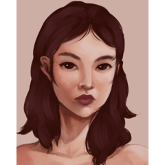
Introduction
Hello! I'm Starr, and in this tutorial I'll be showing you my process for painting skin on characters!
Before we begin, it's important to keep in mind that this is how I go about things personally, and it by no means needs to be how you go about painting skin!
However, feel free to take whatever you find useful here and be sure to experiment with different ways of doing things.
Flat Colours
Of course, before we can apply shadows or light, we have to have our base colours!
It helps to have each colour in the drawing on a separate layer, I like to lock the transparent pixels and paint directly on the layer in question as this helps with blending colours, but an alternative is to create a clipping layer.
Clipping layers are very helpful as they provide a lot more flexibility than simply painting directly on the layer. It all depends on you and your workflow!
To help us later on down the line, it's quite useful to choose a background colour from now, if you plan on adding a colour in the background.
Applying Gradients
Before I shade, I generally like to shift the base colour to a slightly darker, more red hue, and use this colour to apply gradients to the skin. Skin is very soft, and as such using gradients helps a lot with conveying this look.
I usually like to apply the dark red colour to the cheeks, fingertips, ears and the top of the neck and forehead.
I usually blend it out using the 'Paint and Apply' brush, as it acts like an airbrush and blending brush at the same time, depending on how hard you press.
Applying Base Shadows
Using the 'Opaque Watercolour' brush with the Colour Stretch setting decreased and the Amount and Density of Paint settings increased, we can begin by applying our base shadows!
To make sure that the skin doesn't look muddy, I made sure not to decrease the saturation of the skin colour too much and I shifted the hue towards red to make it look more visually interesting, rather than simply darkening the base skin tone.
I decided here that my light source would be roughly from the top right.
Reflected Light
This is where choosing our background colour comes in very useful! To make the character look more immersed in their environment, whether this is a simple geometric shape, or an entire painted background, it helps to add reflected light!
Reflected light happens when the light bounces off the environment and reflects back onto the character. So because of this, the reflected light will be the colour of the background.
Because the light is reflected, it isn't very strong, so when we paint in the reflected light it will be quite subtle.
Sharp Highlights (+Other Details)
Generally when applying highlights I tend to make them small, sharp but sparce.
I personally don't add too many highlights since the shiny looking skin doesn't fit for me, but feel free to test it out on your own art and see what works for you!
Since the shadows are tinted more red, I tend to make the highlight colour more on the yellow side to contrast.
I also added some shadows under the hair strands. I usually leave these for last as they tend to be the more solid shadows.
Checking Values
Completely removing all saturation from an image is a great and simple way to check the values your drawing. You can do this in Clip Studio Paint with the shortcut CTRL + U, to access the Hue, Saturation, Luminosity tab.
By completely reducing the saturation of the skin layer, I noticed that there wasn't a lot of contrast in the values, so I decided to darken up the shadows a little bit.
If your preference is simpler shading, you can probably finish up here! However, I'd like to keep going and add a bit more detail.
Additional Lighting/Colour Fixes
To help the character more three dimensional and part of their environment we can do a few more things.
The first is to apply a sky colour to their skin in places that face roughly towards the sky, such as the nose, cheekbones, etc.. I applied it roughly at first, then blended it out to be smooth. Once again, since this isn't a direct light source, it is rather subtle, but it makes the character look quite 3 dimensional.
This second effect helps with making the colours and lighting look more vibrant.
If you'd like a more in depth look at how to do this part, I actually learnt this technique from this tutorial: https://tips.clip-studio.com/en-us/articles/4119 however I slightly altered the layer mode used.
To begin, we create a new layer on top of the colour layers that includes a flat fill of the colour layers. I chose a simple dark blue.
I then lightly airbrushed a light red colour roughly around where the light would hit, like the top of the head and the nose and cheeks on the face.
I then airbrushed a bright yellow on top of the red.
It helps to experiment with a few different layer modes, colours and opacities, but I found that using the Glow Dodge layer mode on 31% opacity looked the best in my case.
Final Details
Skin is very complex! And so if you'd like it to look more realistic it helps to add small details such as pores and moles!
You can also add scars, acne, etc. to vary up your characters.
While they may be considered 'flaws', it's things like this that make characters really beautiful and unique!
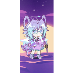
Finished!
And here's the final result!
I hope this tutorial was helpful in some way, thank you so much for taking a look!
Stay safe and have a great day! :)
Les utilisateurs qui ont aimé cette publication


Commentaire