
The Lasso Fill Tool
Hello! I hope everyone is well and feeling creative!
In this tips article, I'm going to cover a shading technique I recently started using.
This tutorial largely covers the use of the Lasso Fill Tool.
It's a very useful tool that combines the actions of making a lasso selection, and filling that selection into one motion. It's a simple combination, but can save a lot of time.
Here's a quick example of how the tool works.
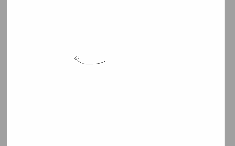
There are, of course, ways to create this tool yourself, but if you would like, you can download the version I made below.
Side Note:
If you have any trouble seeing these screenshots, right click on them and "open image in a new tab" to see it in full view.
Since we are covering how to shade, let's start with a completed sketch.
I will be using this drawing I made of a girl making a wish. I want the image to be bright, and maybe a little surreal.
Prepare Your Sketch
I will not be cleaning up all of my sketch. Instead, I drop the opacity of the sketch layer to about half, and change the layer mode to "multiply".
Next I change the color of the entire layer using the "layer color" option in the "Layer Properties" window. This is set to blue by default.
I click inside of the blue swatch, and change the color to something I am more comfortable with. I find the blue to be a little distracting, but if you prefer it, then feel free to skip this step!
Click OK when you find a color you are happy with.
I like to use a brown or dark red to for my sketches, especially when my subject is human.
Flats explained
Create a new layer underneath of your sketch. You can use your preferred technique for breaking down the image into separations, also known as "Flats".
These are commonly used in coloring comics, but I've made a habit of using them for just about every digital drawing.
There are several tools available for this creating flats, but my favorite technique is selecting an area and filling it with a lasso marquee. Each additional area is created on a new layer underneath of the previous filled separation. This eliminates the need to be very precise as you progress.
Once everything is filled, merge the layers into one.
Here is a popular selection tool for flatting that pays attention to a referenced line art layer. It's wonderful to use with clean line art or inks.
It's a little to fine tuned for my super messy sketch though!
Here is how my flats layer looks without the sketch. For this image, I wanted to make sure it still reads clearly and the shapes are identifiable by themselves as I'll be completely removing the sketch during the coloring process.
Flats are incredibly useful for creating selections from, and consequentially, layer masks.
Because of this, it's very important to only use one color per area, and, if you plan on making a lot of repeated fine selections, not to repeat colors across a single image.
Once you have your flats neatly all in one layer, you can set it as a "reference layer". After set as a reference, you can use the selection wand to get selections from other layers quickly. Make sure to also set "refer multiple", and to check the reference layer icon. (you can see this setting below)
You can also use flats to modify the line art when desired.
Here I have selected the green background.
I then move to the line art layer and delete the sketch lines within that selection.
Under Painting and Clean up Using Layer Masks
Before adding shadows, I want to create some variation in the skin tone. I also want to define the lines in the skin area.
Because I only want to work in the skin area, I make a selection of it from the flats to create a layer mask from.
Once you have a selection, the option to create a mask will be available. Without something selected, the icon will be grayed out. Above is how the icon looks when it is available.
You will want this on a new layer, or else everything outside of the selection will be hidden.
It's a good habit not to modify your flats layer once it's created.
Here is the layer with the newly created mask. Everything in the white area will be seen, whereas everything in the black areas will be hidden.
You can click the mask to modify it. For regular painting and drawing, you want to click on the transparent pixels icon instead.
I like to unlink the mask and the layer pixels. This will make it so you can move and transform your drawing while not affecting the mask.
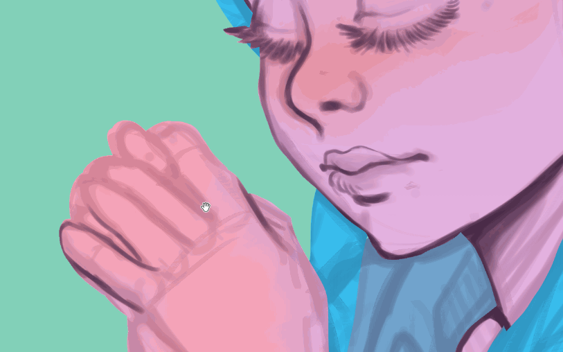
Time to paint! For this part I lightly blush parts of the skin that would have more red tones. Areas like noses, cheeks, ears, and fingers tend to have more small blood vessels and can appear more pink. It's become part of my style to also blush the elbows (even though they are not naturally more pink).
I apply these shades with my "soft" brush. This is a just a simple airbrush I created. You can download it, along with my sketching and lining brush, at the link below.
I add define the lines for the skin with my sketch brush.
You can see in the .gif how the brush strokes stay inside of the masked area.
Once done I temporarily hide the sketch to check clarity.
Now it's time to start shading!
Creating Shadows with Multiply
To add shadows, I'll be using the lasso fill tool on a multiply layer. I place this above my under painting layer.
I could have created a mask like before, but I wasn't sure which areas I wanted to shade at this point. The background was also unplanned. All I had in mind was the mood that I wanted to convey.
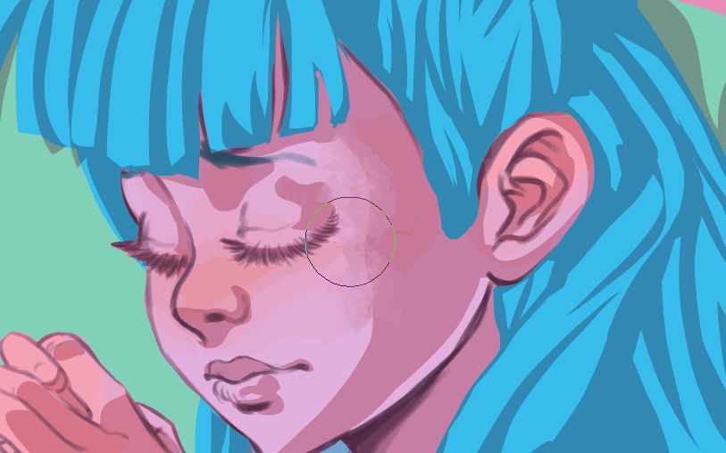
Considering this, I started shading the overall character. I use this pink color for the shadows on everything so it appears that the light source is the same.

Using the lasso fill tool, I make selections that automatically fill with the pink shadow color.
It's a good idea to decide early into shading your painting, where the light source is coming from. For this, I picked a light far off into the distance from the middle left of the canvas. I was also entertaining a light emitting from her hands as she made her wish.
When shading, try to think about the form of the object you are adding shadows to. Where is the light hitting? Where are the crevices where no light gets to at all? Shadows can be darker on sharp edges that meet a lit side. For example, the inside of her hair bows will have a deeper shadow than the ribbons flying behind her.
I make these deeper shadows in a second pass, but I make sure to cover them in this pass as well.
It gave a nice warm feeling to have all of the shadows a warm tone, especially against the cooler flat colors.
Everything is currently a little sharp. The lasso tool by itself has a hard edge. It's perfect for cell shading, but I also wanted to have some softer shadows for this piece.
To soften the edges I like to use the "blur" blending tool. This is a tool that comes with CSP preinstalled. If you don't want such soft edges, feel free to experiment with different types of blending tools! Some are good for creating texture or for pulling colors around the canvas.
If you dislike blending tools, then a soft airbrush set to a transparent color also works well for this!
And if you want to keep the hard edges of your shadows, that's fine too! I keep some of my edges hard.
The variation between hard and soft shadows can add visual interest.
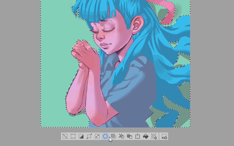
Because I didn't create a mask for my shadows, I want to clear the overflow from the background. To do this, simply switch back to your flats layer, and select the solid background color with the magic wand/auto select tool. Then go back to the multiply layer and hit the delete button or icon.
It's important to do this after you are done softening your shadows. If you clear outside of your shaded area first, and soften next, you will end up with transparent pixels mixed into your shadows. Part will end up lighter than you originally intended and you may end up needing to redo portions.
Add Deeper Shadows
Now that I have my overall lighting set up, I need to add the deepest shadows. These are created in folds, where there is a sharp edge, or where two edges meet.
I chose a brighter blue for the additional shadows. This doesn't follow any logic with physical lighting. My thoughts were that it would pull the color theme of pink and blue together, and harmonize the painting.
I create a new multiply layer over the existing one. I want to keep my current shadows as they are. I also want my new shadows to build on the previous ones, making them even darker by stacking them.
The actual process of doing this is exactly the same as with the first pass of shadows we made. Block in your shadows with the lasso fill tool, then soften where desired.
These deeper shadows are used more sparingly and will help finish defining the forms.
It's not really a "shadow" but I also give the girl blue lipstick in this step.
You can always add other cosmetic flourishes as you work!
Add Depth Fog with Screen Layers
With the shadows finished, I want to try and push some of the character back into the background a bit.
I'm mostly going to be painting her hair here. It has the most ability to move away from my character's body.
I'm going to achieve this by painting some "depth fog". Typically when an object moves away from the viewer it loses definition and gets lighter, or looks a little foggy.
I create a new layer set to "screen".
Using my soft brush, I paint over the ends of her hair I want to appear farther away.
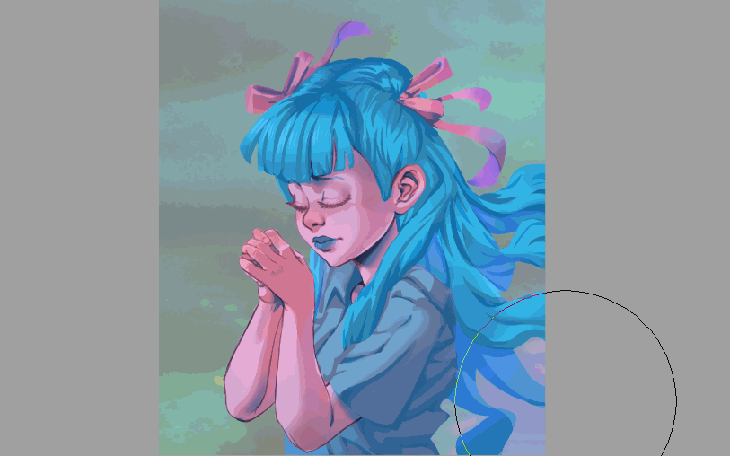
I painted a little too much, however, and use the lasso fill tool to erase where I don't want the lighter colors. This is mostly on the upper layers of her hair, where more light is falling directly.
Create the Background
The next logical step might be the highlights, but not quite in this case. If we add highlights now, before creating the environment she's in, it will be too easy to take them too far, making the brights too bright, or adding too many. If your painting has more than just a character, it is important to consider the the environment before putting on finishing touches.
The girl and the action she is taking is the main focus of my painting, so I want to keep the background relatively simple to not distract from that. For this a sky is perfect. Having my character "floating above" also fits the mood I'm looking to achieve.
There are quite a few pre-made backgrounds ready to use in Assets. I downloaded this evening sky and dragged it into my canvas.
I also select the background color from my flats layer again, and apply this as a mask to the sky material.
If you want to modify a material like this directly, you might have to rasterize it first. Just right click on the material thumbnail in the layer window, and select "rasterize".
After placing the background where I wanted it, I flipped through the layer modes until I found one that I felt had the right look. I ended up choosing pin light. This layer mode alters the colors. The result was much less oppressive than the feeling the black and red sky in the original material gave.
It's still a little intense so I drop the opacity to about 50%.
Much better! This eliminates most of the stark reds, but it still feels a little ominous for what I'm trying to achieve. It feels a bit like she's in front of the green sky instead of being "in" it. We can fix this by airbrushing in some atmospheric fog.
I want to affect a large area so I bump up the size of my brush, then lightly airbrush this in with a blue color. Some of this will go over my character, although for the most part I'm painting over the bottom edges and sides of the sky.
I don't clear the parts where I went over the character because leaving this overflow in helps to ground her in the scene. My goal here is to make her feel like she's really there and not just "pasted in".
We could go even farther and merge everything, then blur some of the edges of the character so she fades into the background. I didn't do this here, but it can be a useful painting technique and, especially used with textures, looks pretty interesting!
The result is a nice ethereal atmosphere.
Add Highlights and Finishing Effects
Now that we have the background colors set, and the shadows complete, we can add some sparkles!
I create a new add glow layer and use the lasso fill tool to place the specular lights. These are the bright shines you get in eyes, on very shiny hair, or on metal surfaces. Anything very reflective will have these highlights.
I also use a blue color to create some rim lighting. This is light that comes in on the edges or the "rim" of an object.
Before adding the effect brushes, I create a new add glow layer and paint in some dark green in the area I'm going to "light up" with the girl's wishes.
Now I want to add some special lighting effects, so I create a new layer set to "add glow". I airbrush some shines in her hand, switching between a dark pink and turquoise color.
Then I dig through my effects folder to find some sparkly brushes. I paint these on an additional add glow layer so I can move them around, scale, and erase parts as desired. I want the light to look like it is coming from inside of her hands, and behind them so I can't place all of my shiny parts on top of her fingers.
I like having a large library of assets and materials to use in my work, even if I don't use everything very often. The lens flare and the rainbow shines here are also from Assets!
I noticed after all of my highlights were added in, that her shirt was a little too blue and seemed to become part of her hair. I selected it from the flats layer and just used hue and saturation sliders to adjust its color until I was satisfied.
I think that's everything! Please let me know in the comments if anything needs more clarification.
Thank you for reading and I hope you enjoy using the lasso fill tool to speed up your work!
About the author
My name is Rachel Marks, aka FalyneVarger. I have been drawing for most of my life. I started working commercially about 10 years ago and have created artwork for books, games, comics, and more non-commercial commissions than I can remember.
I'm @falynevarger in most places, but you can find me online at any of the links below!
この投稿を「いいね!」したユーザー


コメント