
Hello, everyone! Today I’ll present you with my process for making holiday illustrations. This is a tutorial intended for CSP’s tips of the month in the theme of Holiday Card Illustrations. It was conceived as a video tutorial, and this functions more as a transcript, so maybe it's best if you check the video first.
However, I'll have to apologise, I have a very thick accent. I should have done the tutorial in Spanish, but I grew to confident with my English, it's really embarrassing, please forgive me. Also, because my computer broke down, I had to make the art on a borrowed laptop, which means the video is only 720p. This is my first video tutorial, and even though I faced many challenges, it was more manageable than I thought, I'll make more after these. But I hope they have better video and audio quality than this! Je, je, je.
These illustrations can be used as holiday cards, but really for any visual asset you can come up with. The tutorial has two parts, the main part will be more of the interest of digital artist, and describes my process of illustrating from start to finish. I’ll be dividing my process in five stages:
1. Thumbnails of the illustration,
2. Defining the elements in the illustration,
3. Shading,
4. Details and finalizing, and
5. Lettering
Lastly, to conclude the tutorial, I’ll explain to you my process for editing traditional art in CSP, so that you can use your traditional art in the making of holiday cards.
Let’s begin!
Thumbnails
When you make a thumbnail, you want to focus on the composition of the elements, rather than the details of the piece. For this, it’s better if you do them in a smaller size.
You can make them in paper, or digitally, it doesn’t matter since all we want to see is the final composition.
In this one, I had a very clear idea of what I wanted the illustration to look like, so I made only two thumbnails.
In others, I had no clue, so thumbnails really helped picture the illustration in my head.
I like to keep my proportions when I thumbnail, but you don’t need to do this, it won’t affect the final result. I do these boxes by going to Figure > Rectangle > Aspect type, and filling in the proportions I want.
In this month, I’ve been painting on 6”x9” paper (~15.24x22.86cm), so I wanted the digital versions to be similar, and kept those proportions.
Just draw ideations of how you picture the illustration in your head. You can put the candle ring in the middle, or maybe if it cuts, and you only see half, perhaps a close up, whatever comes to mind. You can also mix and match ideas that you like.
You should always have in mind where the message of the front card is going to go, but in this piece in particular, I wanted the letters to be a big part of the composition, so I kept them in mind when I made the thumbnails.
Once you are satisfied, pick one and make a sketch with it. Since my style is very graphic, and this thumbnail is very clear, I will just enlarge them and use them as sketches, but you should do whatever you feel more comfortable.
Painting the elements
Again, since my style is very graphic, I just go ahead and create the elements of the drawing with either the Bezier curve figure tool, or the Polyline selection mode. For the skates, I painted in values, or grayscale, because I wasn’t very sure on what colors I wanted the illustration to have. So once I had the elements I used [Color Balance] and [Hue, Saturation, Luminosity…] and to color in the illustration. Both options can be found on the Edit > Tonal Correction menu. For the skate’s reflection, I just color picked the main skate colors and painted the reflection on those.
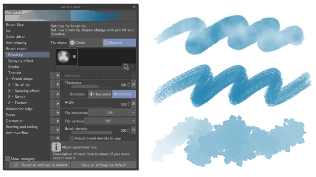
For the Candle ring illustration, I used the default Mili pen brush with color jitter activated for the ring. If you want to activate color jitter, just click on the [Sub tool design palette] option on the brush, select Color Jitter and choose your parameters. This allowed me to make the ring easily and hassle free. I also painted the berries and the lights with the Mili pen. The light’s halo was made with a watercolor brush.
Shading
I don’t tend to render my drawings very much, but I like using shadows and highlights to create deepness and add detail. For the skates, I shaded all the elements of the drawing. To do this, pick a light direction and paint shadows on the opposite side of the drawing as you think they would wrap the object.
For the candle ring, I kept the leaves as they were, but I added shadows to the berries, as well as highlights where the light shone, using the fairy lights as the light source.
Details
This next part is a little random, since it depends on what I want for the illustration and only stops once I’m satisfied. For example, I wanted to add some variation to the leaves, so I painted some green blobs in an overlay layer, or I wanted the lights to have corona so I gave them one. Or in the skates, I drew more blobs because I thought it’d look cute, and added gradients to the ice to give it some deepness, as well as the skating lines that you see on the surface of ice rings.
The point is to make the illustration look how you want it to look, and stop when you feel satisfied, however simple or complex it may be.
Lettering
So, you have your holiday illustration. It’s probably you’ll want to use it in a card. As I said, you should have in mind where in the drawing you’ll want your lettering to be, and leave space in your composition for it. I mentioned I wanted this illustration to have the lettering be a very important part of the composition, but I kind of forgot that I am not good with typography, and I’m a little underwhelmed by what came out, however, I’m happy I tried, and with enough tries, I’m sure I’ll get better at it.
I used a serif italic font for the “Merry Christmas and” but I wasn’t satisfied with any of the fonts I had available in my computer, so I decided to just make it on my own to later trace it in the computer. For most cards, however, I just used a font and modified it with Edit > Transform > Mesh Transformation.
Once traced, I painted them white by locking transparency and clicking on the fill bucket of the Command bar. Then, with a watercolor brush, I painted with any color, knowing that I could later edit them easily with Tonal Correction tools. I did the same with the other letters.
To give it a more watercolor look, I created some margins by Expanding the letters selection, Filling it on white and modifying it with the Liquify tool. You can also do this by hand, and I think this creates a better effect, but I wanted to experiment and see if Liquify did well in this too, je, je.
There are many things you can do to personalize your lettering, some of my favorites I have already shown in these tutorials, if you want to check them out
Sadly, I lost the file for this illustration and wasn’t able to finish it, so we won’t be seeing this one in it’s finished form, but at the time I had planned to add the lettering to the ice, as a reflection, just like the bottom skate. It’s a shame because I really liked how it was coming out, and now all I have left of it is this 720p footage, Oh, well, what can be done. Remember to backup your files, people, you never know what will happen.
Modifying traditional illustrations in CSP
This is a little off topic, but I have several physical Illustrations since I’ve been challenging myself to paint traditionally more often. I did an advent challenge and ended up with over 20 holiday illustrations, some better than others. I wanted to show you how I edited some of them to make them look closer to what I had in mind when I consieved them, maybe that’ll help you too, if you have any traditional art you want to use in your cards! My editing can be divided in four sections:
1. Overall color correction
2. Fixing and cleaning up mistakes
3. Changing colors
4. Lettering
I’ll be quick on this, don't worry!
1. Overall color correction
When you scan a traditional painting to your computer, it’s probably it’ll lose the colors that the original piece has. To fix this, I like to use correction layers. They’re the same tools from [Tonal Correction] but this time it affects all your layers and it remains reversible and editable. To use Correction layers, go to [Layer] menu > [New Correction Layer] > and select the mode you want to use, I like [Tone curve] and [Color balance].
2. Fixing and cleaning up mistakes
Let’s say you have a section of your illustration that has an ugly texture, like this one, where I used a marker that was drying and left these marks all over the large section I filled with it. To fix this, I’ll select the section I want to use, and use a blending tool to dissimulate the marks just a little. This greys the area a bit, so I’ll fix it by changing the color with [Hue, Saturation, Luminosity…]
Or what if you want to delete some elements altogether. If that’s the case, you can use [Copy stamp] to erase it without making a hole in the picture. Just change the brush size to a fitting one, not so big that you’ll delete the whole picture, not so small you’ll need several passes to delete the elements, click in an area close to the element while pressing [Alt] in your keyboard, and make a couple of passes over the element.
3. Changing colors
Because I was using acrylic markers with only 15 colors, I was sometimes forced to use colors I didn't think matched, like in this example where the purple and the oranges are very striking. I'll select this area using [Select color gamut], in the [Select] drop menu. Once I select the areas I want to change, with either a [New Correction layer] or [Tonal correction] I’ll alter the colors without losing the texture of the painting or making it look incohesive.
The area can be as big or small as you want, just play around with the options until you are happy.
4. Lettering
Lastly, because I’m just staring at this, I didn’t feel confident enough to add lettering by hand to the paintings, so I just left it to be done in Clip Studio Paint. I do the same process as if it was a digital drawing, trying to integrate it as well as possible into the painting.
These are the before and after of these illustrations, as well as the final version of the candle ring illustration:
Closing thoughts
That’s all I have to teach! I hope you learned something, and if you have any questions, leave me a comment in the article or in this video, and I’ll do my best to help you out. Good luck with your creations, bye!
이 게시물에 '좋아요!'를 누른 사용자


댓글