
This is a tutorial for Clip Studio Paint 3.0.
A Brief Historical Note
The Pop Art style emerged in the mid-1950s in both the United States and the United Kingdom, flourishing throughout the 1960s. It took inspiration from things like comic books, ads, and pop culture. Classic Pop Art is instantly recognizable by its use of bold outlines and vibrant, often clashing colours.
Key artists like Andy Warhol and Roy Lichtenstein defined the movement with their unique approaches—Warhol with his repeated imagery of consumer goods and celebrities, and Lichtenstein with his comic book-inspired aesthetics, including halftones, speech bubbles, and even onomatopoeia.
Think of Pop Art as art that doesn’t take itself too seriously—bright, eye-catching, and full of energy, turning the ordinary into something cool and iconic.
In this tutorial, I'll try blending some elements of Pop Art with the modern style of Anime to create a fresh, expressive illustration.
Doing Line Art
Sketch and Composition
Begin with a light sketch to plan the composition.
Try to create a balanced illustration at the sketch stage. Balance in composition means arranging objects evenly relative to the centre and format. Remember that large objects can be balanced by a group of smaller objects. Vary the size of the objects using the pyramid rule: 1 large object, 2-3 medium objects, and 4-9 small objects.
This rule applies not just to geometric shapes but to any complex objects as well.
Also, keep in mind that dark objects visually appear "heavier" than light ones. For example, take two figures of the same shape and size and colour one in black and the other in light grey. The black circle will clearly outweigh and draw more attention simply because of its colour.
Add grey tones to the sketch to balance the drawing not only in shape but also in colour. This helps decide which areas will be light and which will be dark. I usually draw the grey tones on a separate layer set to Multiply mode, so I can turn it off when I start working with colour. Don’t spend more than 5 minutes on this layer.
Accessories
When working on a sketch, pay special attention to details and accessories. Not only will these give your character personality, but they’ll also draw the viewer’s eye.
Here are some ideas that look great in anime illustrations: sunglasses (including heart or star-shaped ones), headphones, backpacks, old cassette players, jackets and jeans with patches, T-shirt designs, bracelets, tattoos, headbands, hairpins, rubber bands, earrings, necklaces, gloves, rings, ribbons, and bows in the hair.
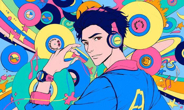
My character Andrei is associated with the world of music, so I gave him headphones and used a lot of gramophone records in the background.
Some playful doodles to fill the space.
Background
Pop Art is characterised by the use of comic elements and effects. So, you can boldly add them to the background if you’re sticking to the classic style. For my piece, I want to create a complex background full of small details—a mix of objects, paint splatters, halftones, and grunge brushes.
Here are some ideas for simple pop art backgrounds:
Radiallines
Brushsplatters
Halftones
Geometricpatterns
Outline
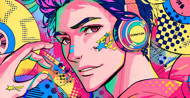
Use bold, clean lines: use thick, consistent lines for the final outline. Pop Art is known for its strong, graphic quality, so make sure the lines are sharp and well-defined.
Vary the line weight: while Pop Art often uses uniform lines, adding slight variations in line thickness can create depth and interest.
Choose whichever option suits your taste—I chose to vary the line weight, with thinner lines in well-lit areas and thicker lines in the shadows.
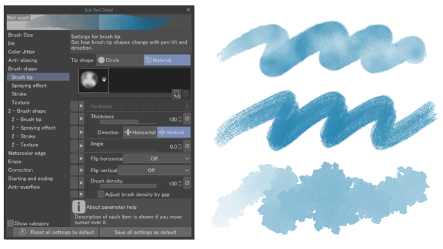
I used a standard Brush Pen at 100% opacity.
Colouring the Illustration
Choosing a Palette
Pop Art illustrations are known for their bold, vibrant color palettes that make the artwork visually striking and easily recognizable.
Primary Colors
A popular and recognizable palette in classic Pop Art includes red, bright yellow, and deep blue.
Bright and Bold Colours
These include green, orange, and pink. Orange adds warmth and energy to the artwork, while pink is often used for a playful or kitschy effect, emphasizing certain parts of the illustration.
Neon Colours
Neon colours like fluorescent pinks, greens, yellows, and oranges are sometimes used in Pop Art to add an extra level of brightness and intensity. These colours don’t just pop—they almost seem to glow, making the artwork stand out even more.
The use of neon colours can give Pop Art a modern, dynamic feel and can be especially effective in drawing attention to specific areas of the piece.
Other Palettes Suitable for the Style:
For my illustration, I chose this palette.
Now that we've decided on the palette, let's move on to colouring the line art.
Colouring Step by Step
Step 1
Start by giving the paper some colour—light blue, for example.
Use the Fill tool (Refer other layers), and make sure to tick the "Close gap" and "Refer multiple" checkboxes. "Close gap" will prevent the paint from spilling out, and "Refer multiple" will allow you to fill on a layer different from the one with the line art.
In this step, use only primary colours. In my case, that's pink, yellow, blue, and dark purple.
Switch the layer Colors to B&W from time to time to check the balance of light and dark tones. A good illustration shouldn't blend into a monotonous grey blur.
Step 2
Now, add any other colours you deem appropriate to the main colours. I used green, orange, and even brown for the eyes.
Step 3 (optional)
Add a gradient to the larger objects in the drawing. Keep the gradient subtle—it's better to underdo it than overdo it. Create a separate folder or layer for the gradients, as this will make it easier to edit them later.
Step 4
Shadows and highlights: Let's create shadows and highlights using halftone dots.
Use the Airbrush tool, set the transparency to 50%, and the hardness to 1.
Create a new layer, go to the Layer Properties tab, enable the Layer Color effect, set the same colour for Layer and Sub.
Turn on the Tone effect. Reduce the frequency of screentone to 5-8. Specify type of halftone dots: circle, square, star, line etc.
Now, when you draw with the airbrush on this layer, you'll get this effect:
I did the highlights using star halftone and the shadows with regular parallel lines.
Finally, add bold, contrasting colours in the shadow areas.
Step 5
Add bright strokes of different colours to the eyes. Heart- and star-shaped highlights are always very popular. Since Andrei’s eyes are quite narrow, I’ll just go with dots.
Step 6
This is the most fun part of colouring. I’m going to create some chaos in the background, so I made a set of halftone brushes specifically for this.
Here’s a preview of the brushes from the set:
Download link:
Now let your creativity run wild. Be spontaneous, be diverse, and don’t overthink which brush or pattern to use—let your subconscious take over. I’m serious, choose a pattern and colour quickly, without thinking. Imagine you’re sketching and your goal is to spend as little time as possible.
When you’re done, switch the image to B&W mode and evaluate your work. Your illustration should be high-contrast and shouldn’t blend into a grey blur, either on the canvas or in the preview window.
If there’s not enough contrast, keep working until you’re satisfied.
At this point, we can consider the illustration finished.
If you like, you can add a few more Pop Art effects, which I’ll discuss below.
Step 7 (optional)
Clip Studio 3.0 introduced the ability to apply chromatic aberration, which is a very fitting effect for Pop Art.
Apply this effect to the merged illustration.
Example of chromatic aberration using radial mode:
Step 8 (optional)
Merge all layers except the line art layer. Apply an interesting mask to the merged layer.
For example, this mask was created using the RR_Chessboard Decor brush from my set.
This concludes my tutorial. I hope you’ve learned something new.
By the way, I’d love to see your work if you’re willing to share it! :)
Brush Set
이 게시물에 '좋아요!'를 누른 사용자


댓글