effective contrast to create depth and emotion
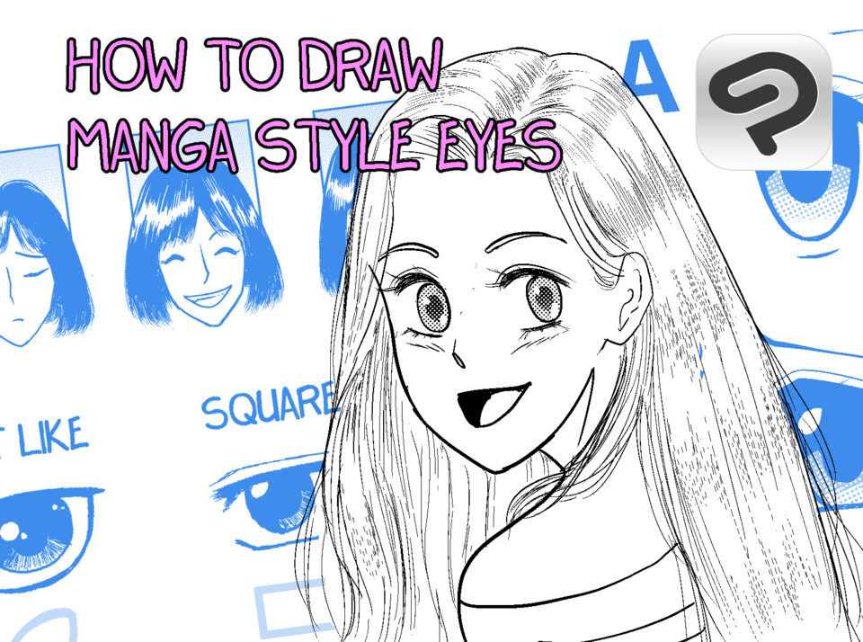
Building tonality in Clip Studio Paint (CSP) for black and white manga involves the use of screentones, shading techniques, and effective contrast to create depth and emotion. Here's a step-by-step guide on how to achieve this:
Step 1: Set up Your Canvas
Open CSP and create a new canvas sized appropriately for manga (commonly A4 or B5, at 600 DPI).
Ensure your canvas is in grayscale or monochrome mode since you're working in black and white.
Step 2: Inking
Start with clean, precise line art using the Pen Tool. CSP has several customizable pen settings, including the G-Pen for sharp, bold lines, and the Maru Pen for fine details.
Ensure your line weight varies to give your artwork depth, focusing on thicker lines for foreground objects and thinner lines for background elements.
Step 3: Adding Basic Shadows and Light
Use the Lasso Fill Tool or Brush Tool for blocking in large areas of shadows. These should define the major light sources in your scenes.
For a smoother look, you can also use a blending tool (e.g., Smooth Watercolor Brush) to softly blend shadows when appropriate.
Step 4: Screentones for Texture and Depth Select a Tone:
Go to the Material Library in CSP and browse through the screentones. CSP provides a large selection of patterns, gradients, and textures designed specifically for manga.
Choose screentones that match the mood or texture you're looking to achieve (e.g., dot screens for soft shading, hatching for more dramatic effects).
Apply the Screentone:
Select the area where you want to apply the tone using a selection tool (Marquee, Lasso).
From the Material Palette, drag and drop the screentone into the selected area.
Adjust the screentone’s size by scaling it up or down to fit the intensity of the tonality you need.
Masking for Precision:
After applying screentones, you can use layer masks to refine areas that should remain transparent or to blend the edges of the tone.
Step 5: Using Gradation and Layer Blending
For softer tonal transitions, use the Gradient Tool to simulate gradual shading (like a sky or a background element fading into the distance).
Experiment with Layer Blending Modes (Multiply, Overlay) to see how different tones interact with the ink. This can subtly alter how tones layer together to give more complex depth.
Step 6: Advanced Tonality – Customizing Screentones
You can create custom screentones by drawing patterns or grayscale gradients on a separate layer and then converting them into screentones by going to Layer > Convert Layer > Tone. Adjust the line frequency and dot size to your preference.
Step 7: Balance Tonality with Contrast
Always keep in mind that good tonality is about contrast—between light and dark, between characters and the background, and between foreground and midground.
Make sure that the focal point of the scene stands out. This can be achieved by using less tone or none at all in areas you want to emphasize, like a character's face, and concentrating more complex tones in the background.
Step 8: Refining with Gradations and Focused Highlights
For dramatic effects or scene transitions, use Gradient Maps to shift the mood. This can help simulate focus on certain characters or environments, giving the illusion of depth and distance.
Step 9: Check Tonality Consistency
Review the entire scene to ensure that your tonality is consistent throughout, meaning that the light source is reflected correctly in each element and that tones enhance the storytelling rather than distract from it.
Step 10: Final Adjustments
Use adjustment layers (Brightness/Contrast or Levels) to tweak overall contrast.
Fine-tune with brushes for highlights and shadows where needed to sharpen the focus or add a dramatic flair.
By mastering these techniques, you can effectively build tonality in your manga, giving it depth and dynamism even with the limitations of black and white.


Comment