
The Gradient Tool in Clip Studio is quite versatile and can be used in different scenarios. I’m going to try to apply this tool to an illustrations to create a realistic illumination, but first is necessary to explain it use in basic shapes to latter apply it in a complex one.
Using Gradients Basic Shapes
In figure 1 I create Four basic shapes, a cube, cylinder, sphere, and a cone. These figures are important because they can create a diversity of shapes when mixed, so when you solve the coloring using gradients you can apply the same principles in more complex shapes like cars, planes, or others industrial design drawings.
Figure 1
Clip Studio has different ways to solve the same problem, so to create a cylinder like the one in figure 2 one option is to use the «Contour Line Paint» tool, this allowed you to use simple lines or curves (work in raster layers) in the basic colors necessary for the gradient and clicking between the lines Clip Studio create the gradient among the two colors. An important tip is to create rather thin lines if not the lines are going to be visible and not a smooth transition.
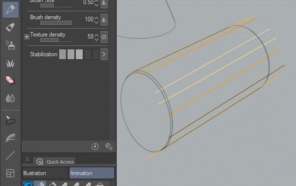
Figure 2
Another option is to use the «Gradient» sub tool, this tool has different options, like three different shapes, linear, radial and ellipse, I think their use is self-explanatory. There are four different edge process. “Do not repeat”, so the extreme colors will repeat to infinity. “Repeat” so at the extreme of the handle the same gradient will repeat to infinity. “Reverse” at the extreme of the handle the gradient will repeat but in a reverse fashion, so the end of one extreme of the handle will repeat at the other side. “Not Draw”, in this option at the end of the handle the gradient will finish.
But the most important option is “Where to create”, this has two options “Draw on Editing Layer” it means that it will create the gradient the raster layer selected, so after you finish there is no way to edit it. “Create Gradient Layer”, this option is the one I use, because it lets you edit the final result, by selecting the «Operation» sub tool it let you edit the angle, size and the colors of the gradient.
Figure 3
Figure 4 shows how to change the color of the gradient, just by picking the color you want and pasted to the specific color in the top gradient bar. You can add or delete colors by clicking at the bottom of the gradient bar or by dragging the arrow down.
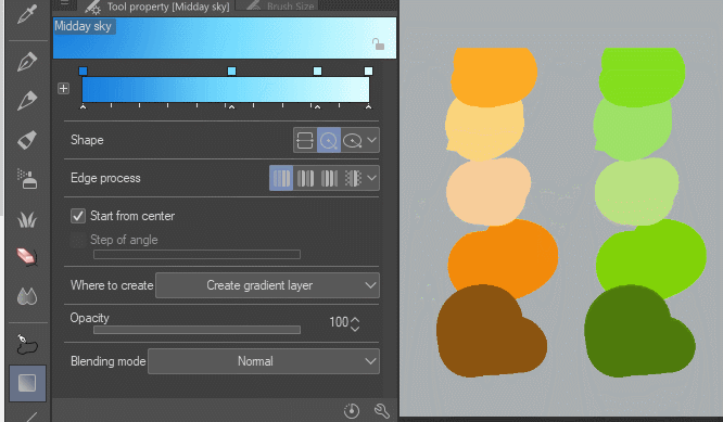
Figure 4
In figure 5 I create a “Selection Area” and using the “Create gradient layer” paint the gradient, the final result is not editable, so you need to be precise using this option.
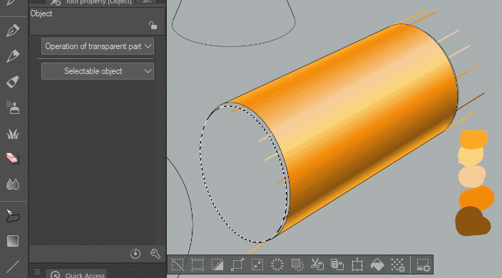
Figure 5
I really like to work in vectors so in figure 6 you can see the flats for the four shapes made with the “Fill Vector ColorFreeHand” this tool is located in the «Gradient» fill sub tool and because is vector you can easily edit it.
Figure 6
To make the gradient I create a selection from the layer (Ctrl + click over the shape thumbnail, in the layers) then, just drag over to create the gradient, once you finish, use the «Operation» sub tool, to edit to create the final result.
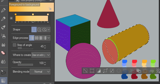
Figure 7
The sphere is created using the circle or ellipse shape, in my opinion, is better to use the ellipse. One thing to be aware of is that the color in the left is the initial concentric color, so in our case the brightest part. In almost all the shapes I place a bright color at the end of the gradient to make the illusion of the reflected light (the light reflected by the plane where the objects rest).
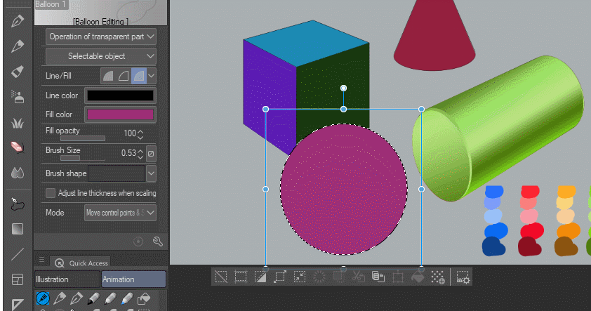
Figure 8
The figure 9 shows how to create a cube, in the cube, there are three clear planes visible so each must be treated individually because the light is in the top right the plane farthest from it will be the darkest one. Remember the light will be higher the closer it is to the object so, close to the ground is darker that at the top of the plane.
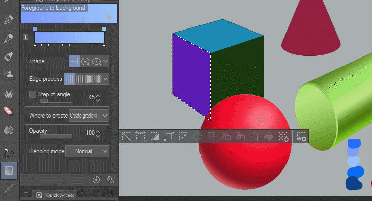
Figure 9
The cone shape is difficult to make because there is no cone shape gradient in Clip Studio. In order to make it you must understand that the cone reflects the light in a radial way to the vertex, you can't use the circle because it's concentric, so the only option is to use the linear shape. After use, you need to raster the layer and using the “Free transform” tool (Edit/Transform/ Free transform) you need to deform the layer until the top is close to a point to achieve the effect necessary, how is shown in figure 10.
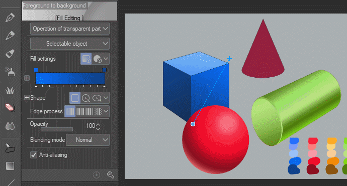
Figure 10
The final result is shown in figure 11, if you are interested in the file of this example downloaded it form the next link.
Figure 11
Cartoon Car Render
To apply the gradient in a real example, I decide to create a cartoon car, so using the perspective rulers I create this simple car shape (figure 12), then I used it to paint freehand the curves to understand the final shape of the car how is showed in figure 13.
Figure 12
Figure 13
After that I hand draw the car in the top, this is the first sketch (figure 14)
Figure 14
by lowering the opacity of the sketch layer, I paint the car more carefully, figure 15 shows the result… not to good in my opinion, the lines are too shaky.
Figure 15
In figure 16 I redo the car using the “curve” tool with the “Quadratic Bezier” in a vector layer. The result of the lines is colder, but I like it better.
Figure 16
After that, I create the flats using the “Fill Vector ColorFreeHand” tool. The flats are divided by the different planes of the object, if there is a big change of plane or color it will be treated separately.
Figure 17
To create a consistent color gradient for all the planes, I paint a color reference layers with all the color I’ll use in the car. In figure 18 you can see how I apply the gradient color, and edit the result afterward, changing the angle to adjust to the shape of the car. For the car I decided not to create a selection but to “clip the layer below”, this allowed me to edit the fill vector layer if necessary.
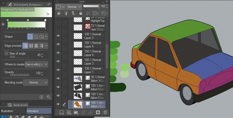
Figure 18
For the other planes, you need to be aware that the start color of a plane is the final color of the previous plane if not there will be a jump in color visible and the idea is to create the illusion of a continues form.
Figure 19
The color of the car is ready but to create the illusion of reflective paint is necessary to place highlight, this is normally the reflection of the sky or the lighting used to illuminate the object. In figure 20 the light is placed in the side and top of the car, but because the shape of the car is not regular the lighting is broken and irregular, to create this light I simply use a photo reference. The borders of the highlight are softened using an Air Brush line in the layer, you can simply lower the opacity and the result will be ok.
Figure 20
To create an even better result I decide to use a gradient highlight showed in figure 21, using the previous highlight I made a selection area and crate the gradient layer. The result is better because it gave the highlights a softer transition.
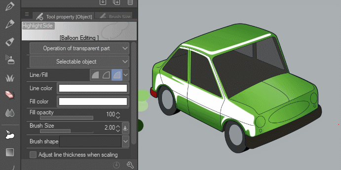
Figure 21
Continuing with the highlights I change the color of the internal lines to dark green and copy and paste the lines in which there is an indentation in the car like doors and hood to create the light for this area.
Figure 22
Figure 23 shows the lighting effect achieve with the copied lines colored in a bright green and shifted a little from the dark green lines.
Figure 23
The rim will be created with the ellipse in a grey gradient and to give shine to the wheels a linear gradient from grey to transparency is used, how is showed in figure 24.
Figure 24
The car lights are made with a simple chrome effect, the important part is to create a division between light and darkness, this represented a reflection of the sky and the horizon in the chrome paint, the angle is important but because it will be partially covered by the light crystal just part of the effect will be visible.
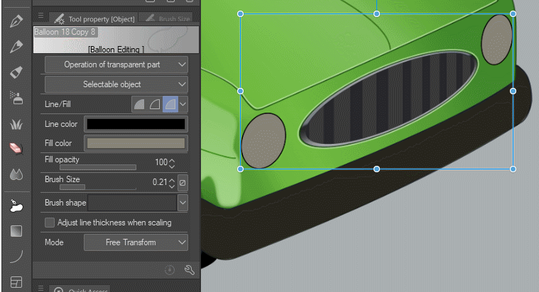
Figure 25
The bumper is special because the shape is irregular, so I create different lines following the shape of the bumper with the gradient I wanted, then I used the “Contour line paint” tool to fill between the lines. It is important to use line without Anti-aliasing, this gave better results, in figure 26 you can see the result.
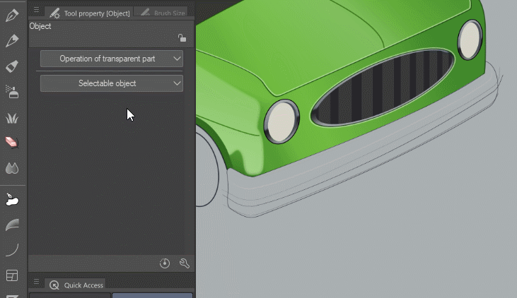
Figure 26
To finalize the car is important to create a reflection in the crystals of the car and maybe glowing for the lights. Figure 27 shows the car without this effect, you can compare the final result with figure 28.
Figure 27
Figure 28
Finally, I want to thank DadoAlmeida, the vector technique shown in this tutorial is based in the tip "Creating Vector Art for Print and Games" link below
If you are interested in analyzing the Clip studio file of this example, you can download the link below.
Thank you, I hope this tutorial is easy to follow, if there is any doubt please let me know.
Users who liked this post


Comment