
Introduction
Hi,
In this tutorial I will give some guidance on how to get out there and start painting landscapes, no matter how busy your schedule is! I will also share painting tips on how to plan an outdoor painting, what to watch out for, and some techniques to make your painting look more traditional. This month of April, I have painted a landscape everyday for the past 30 days, some traditional and some digital as part of the Plein Airpril challenge and in this article I hope to share some with you on what I have learned in that time!
One of the benefits of regularly painting outdoors or from life is that it gets you in the habit of seeing the world through the lens of a picture-maker. The things you see everyday on a routine can start to spring forth new life. Common thoughts that might come to you can include: “Hey, that would make an interesting scene for my comic/illustration/story” or “the mood over there, I think I’ll use that for inspiration for my next piece of art”.
[SECTION I] Convenience for Outdoor Digital Painting
I get it, you can be busy. You want to gain the benefits of painting outdoors but you might not have the time or materials. I have split this section up to describe the levels of convenience to still get some of the benefits of outdoor painting, even if you don't have enough time.
Convenience Level 1
Definitely one of the biggest hurdles to getting out there and painting your city, neighborhood, a local park, or even when you’re traveling is the time commitment and the materials.
With traditional paints this is an even bigger hurdle, bringing a heavy easel, physical paints, palette, physical paint brushes, canvases or sketchbooks and more with you! Thankfully, if you are going to be DIGITALLY painting Plein Air (outdoors) you will only need your drawing tablet and your lap! If you want to make it a bit more comfortable for your back, and also feel a bit more traditional, you can always set up a digital easel like I do here!
If you’re curious on how to make this easel it is simply just three things:
1. Your drawing tablet
2. A clamp for your tablet that can fit into a tripod
3. A tripod
You may be able to find these online, or at a local camera store.
Okay, if you’re ready and feel pumped up to go paint outdoors and just want some tips with landscape painting in Clip Studio Paint, feel free to skip over to Section 2 – Painting Tips. If you want to read more about how else you can reap the benefits and learn from outdoor paintings, without having to paint the entire picture on-location, read on!
Convenience Level 2
Okay, I hear you, the materials are definitely easier for digital plein air. However, you don’t have enough time to spend 1+ hours outside to paint. Perhaps you have somewhere you’re going to be late to, you want to avoid rush hour traffic, the weather is not great outside, you don’t want to accidentally damage your expensive tablet, etc, etc.
This is why one of the most important skills for any artist is learning how to do quick thumbnails (we will talk more about this in the next section!)
If you do not have the time to spare to paint the ENTIRE painting on location. Try to get down at least a basic block-in of the painting and come back to it later when you are at home. You can stop at any time, take a picture of the scene and finish it up later. The main goal if you are going to do this is to try to get the initial impression of the scene while you are still on-location, what made you stop and decide to paint this landscape? The mood the lighting created? The interesting architecture? The textures? The grandness of the scale?
If you don’t have your drawing tablet with you, or you’re scared of it getting damaged outside – that’s no excuse either! You can do simple thumbnails with very cheap and lightweight materials, just a small sketchbook and even a pencil or marker can suffice.
In fact, the nice thing about digital is that you can take a photo of your loose thumbnails that you do traditionally and import it into Clip Studio Paint, and then simply work on-top of it!
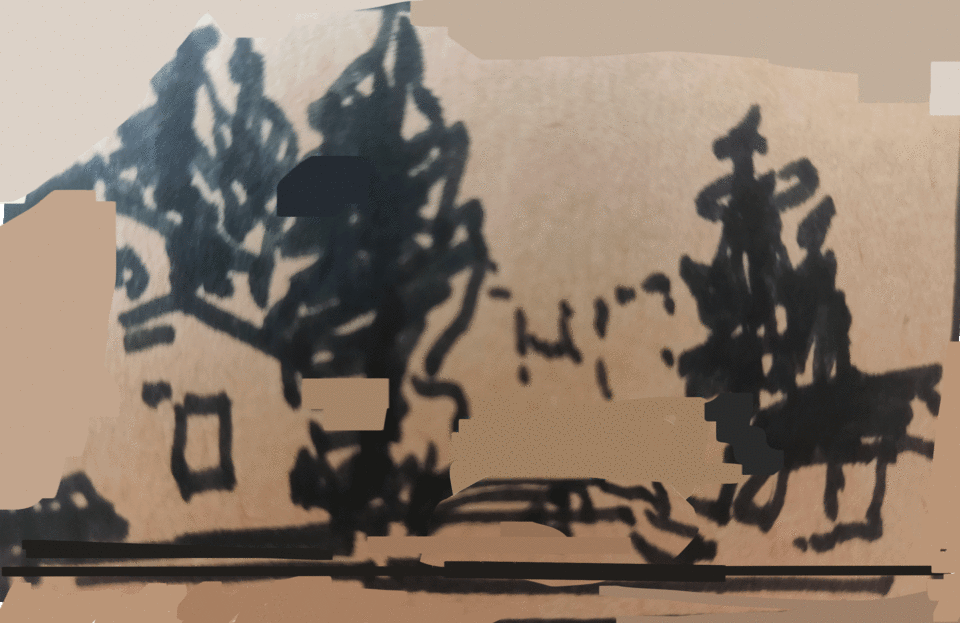
Below is a landscape I saw when I didn't have my iPad. I was in the car waiting for take out food at a restaurant. I sketched the landscape outside my car with marker in my brown scrap sketchbook. I took a picture of this very rough comp and brought it into digital to finish it!
Convenience Level 3
Okay, say you forgot your drawing tablet AND your small sketchbook at home, well you can still keep thinking and seeing like an artist while you’re outside. You probably have your phone on you, so why not just take a picture of the interesting scene that you see and come back to it when you have the materials.
You might ask, what’s the point? I can probably find better reference material at home. Well again, the point is to utilize that creative side of your brain, what is it that YOU see that personally draws you to this scene? Taking photographs and training your photography skills will train you in seeing the world as an artist and as well as help your composition skills when painting. Photographs are also framed by four walls, just like most of your pictures you will make!
During this month of painting a landscape everyday, I went back to photos I took while traveling a few years ago, revisiting those memories and painting them to try and get back the mood I felt when I first saw those scenes in real life! (More tips on this in the SECTION II - thumbnails)
Below is a picture that I took while traveling to Victoria in Canada. I painted the landscape from my own reference picture. It brought back memories, and I adjusted the composition to fit how I felt when I first saw the scene - much more exaggerated, grand trees, with brilliant light coming in.
Convenience Level 4
Okay, maybe you are stuck at home. You want to explore the outdoors and paint, but you cannot even go outside right now! Well, the final option I will share with you is to paint from reference images – BUT more specifically I suggest interactive panoramic views.
The most famous of these is Google Street View on google maps, but there are others as well if you look them up! You can explore the entire world from home, get inspired, and start painting!
Panoramic views you can interact with are nice because you can still practice a few of the same ideas and mindset as if you were on-location:
- Move the camera around to get a view you like; the one that evicts the mood you want to capture the best.
You are obviously much more limited than if you were there in person, but it is the best alternative if you want to paint and be inspired by unique real landscapes outdoors, but you are stuck at home!
Below is a landscape I made using this method, getting reference from Google Maps. When I was too tired to go outside this month and wanted to paint one of my favourite restaurants! I had to decide if I wanted to put the camera right infront of the store, or at an angle and still exercise my compositional skills.
[SECTION II] Painting Tips
Setting Up the iPad/Drawing Tablet
Great, now we are ready to get to some actual painting and Clip Studio Paint practical tips. First off, if you are going to be painting outdoors you should set up your Clip Studio Paint iPad or Android app to be most convenient for you! The benefit of the mobile version of Clip Studio paint is that it is extremely customizable, it matches the PC version very well and I can hardly notice a difference on the app itself.
There is one major difference though compared to using Clip Studio Paint at home – you most likely will not have a keyboard!
If you are used to using keyboard shortcuts on the PC version of Clip Studio Paint, but will not have a keyboard outdoors for the mobile app. I recommend you to spend some time researching and setting up a workspace that is comfortable for you to use. At the end of the article, you can find a link in "Recommended Content" section to help you set up your workspace.
Here’s my workspace on the mobile Clip Studio Paint App. The main idea is to keep as much drawing space as possible, while having the features you use often quickly and easily accessed with your non-drawing hand.
For me, the most important part is the Quick Access menu, labelled (A). On a small digital tablet, the toolbar buttons in Clip Studio Paint may be hard to click on and easily misclicked while you are concentrating on painting. Putting your most common tools (brushes, lasso, smudges, etc.) AND processes (flip canvas, resize brushes, free transform, etc) in the Quick Access bar as larger buttons makes it much easier to accurately switch to the tool you want without navigating through menus.
The second most important thing if you are a constant keyboard shortcut user is the Edge Keyboard, labelled (B). You can get this by swiping and holding from the edge of your screen on the iPad app, with this you can hold down a button as if you have a physical keyboard. Some things you can do include: shift + click with a brush to make straight lines, shift and click on layers to select multiple layers, option button to color pick with the eye dropper tool, and more if you set up the shortcuts you want!
The Importance of Thumbnails / Short Comps
In this article I may use thumbnail and comps interchangeably. Like I said earlier, learning to thumbnail and quickly jotting down your ideas is a very valuable skill for any artist, even if you want to paint characters rather than landscapes! Quick thumbnails will help you iterate an idea, to help you to try out many versions of the same idea in order to find the one you like the most.
When you’re painting outdoors, you can try to paint it exactly as you see it and that is definitely good practice to help your observation and technical skills, but I personally have more fun trying to train my creative side and get the scene to evict a stronger mood, or to emphasize whatever caught my attention in the first place. Learning to thumbnails are an easy way to try out these ideas, let’s get to it!
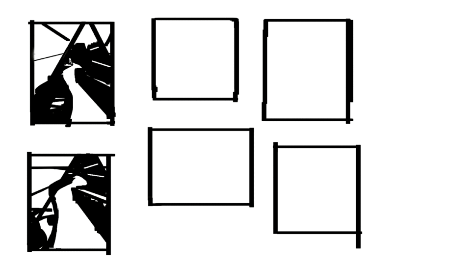
Here's an example of the landscape thumbnail to final painting process. This was from a photo from a hiking trip that I took of my girlfriend used with permission. I wanted to repaint and capture the memory. I made 6 mass thumbnails that took less than 5 minutes each to explore different framing and ideas. Notice some are more wide than others, and notice other differences such as the shape of the white spaces, the size of the figure, and more.
Afterwards, I chose the thumbnail I liked the most and continued to a final. Notice how if you squint your eyes, the final image looks a lot like the thumbnail - I followed through with my planning.
OK to start off, there is no ONE way to do thumbnails, but the main idea is to keep them quick (try to keep it from 30sec – 10mins) and to capture the general idea of the scene. I’ll go over the general thought process, and thumbnailing with line versus with mass.
Thumbnailing DO's and DON'Ts
DO. Think about the whole picture and take the whole scene in.
DO. Put in big shapes in the picture and the large relationships between one object and another.
DO. Work zoomed out, seeing the entire frame and the entire thumbnail at all times.
DO. Move on quick, once you have placed the main shapes, the horizon line (if it’s visible), move onto the next one!
DO NOT. Focus in on one part of the picture, even if you have already decided an area is going to be your focal point, the whole picture needs to make sense and be in good proportion in order to support that focal point.
DO NOT. worry about the tiny contours of a building, figure, or tree.
DO NOT. Zoom in, you should not be zooming in at this stage! You are just exploring ideas.
DO NOT. Stay “refining” the same thumbnail for too long, try out a few ideas and consciously decide which one you will take to a finish. Even some of the thumbnails above I feel like I stayed on for too long.
Thumbnailing in Mass vs. Line.
This is much easier to see through example. Both of these ways you still have the same goal: just trying to capture the big, overall picture. You can do whatever is comfortable for you, switch them up, or even combine them.
If you take a look at the left image in the above example, I did two thumbnails with line (above) and two thumbnails with mass (below) before deciding on the line thumbnail and taking it to a finish. I was exploring ideas like: How much sky should be shown? Should it be a wide angle shot or a more close up shot? Should both cars be there or should I take one out? Note that even in the line thumbnails things are very loosely sketched, no details yet in the faces, the sign boards, the cars - we want to explore ideas quick!
Thumbnailing: Tools
Thumbnailing with mass is what I tend to do most often, this is blocking in big shapes and thinking about value – dark vs. light areas of what I see. Grouping these areas that are similar in darkness or lightness together.
To do this, I tend to use a lot of the lasso tool, and a fully opaque, hard brush (I like flat brushes). We don’t want any gradual gradations. A good tool to use is just the 'G-Pen' or 'Calligraphy' pen, you don't need any fancy brushes to thumbnail!
To start off, try to keep it limited to just black and white, but you may want to add in another value, just don’t go too crazy at the thumbnailing stage, keep it at 4 or below I would say.
With line, again, you’re still thinking about the same DO’s and DON’Ts as above, for me it’s easier to get off track thumbnailing with line, because I start to want to draw in all the details. Try to instead think about how the whole picture connects to each other and remember to stay zoomed out. Tools I like to use for this is just a simple pencil tool -- I like the default 'Design Pencil' but again you can use any pen or brush you want. Lasso tool could also be helpful if you want to do some shading in your thumbnail to differentiate big shapes – but remember, keep it simple at this stage.
Thumbnails: Demonstration - Exploring Ideas
You may ask, OK I still do not understand the benefit of these thumbnails, why don’t I just jump right in to painting? All your thumbnails look repetitive and the same. Well, you can always start right into the painting if you are very sure of what you want to paint, but let me show you how thumbnails can help you make your best landscape painting with a more drastic example:
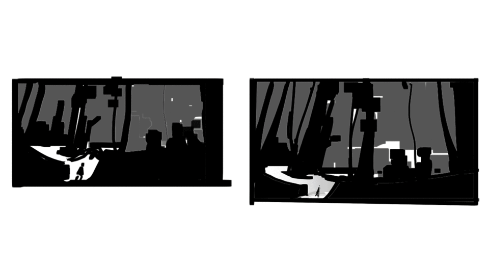
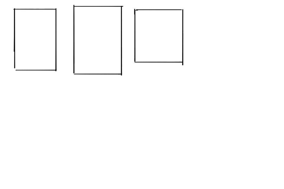
The above at A is a picture that I took while parked behind an abandoned school bus. At B is a composition trying to copy it very exactly, then at C are two drastically different thumbnails.
Can you see that with these quick thumbnails, I can quickly explore different ideas that might make a better picture?
For example at C on the left I was trying to focus in on the background, emphasizing the house that was there, I put the ground plane on the lower 3rd of the picture, leaving more room for the house in the back. On the right, I was focused on the foreground, emphasizing the bus as the focal point, notice I put the ground plane very high up near the top of the frame, and I also make it a curve to try to exaggerate the incline of the road.
This is one that I painted half-way on location. If I just copied what I saw like at B for the previous diagram, it might have made for what I think would be a boring picture. The horizon is in dead centre, the shapes are not drastically any different, this is definitely not the mood I got when I saw this scene.
Instead, because I did quick thumbnails I was able to get a better composition that I felt described the mood when I was there observing this outdoor landscape.
So keep this in mind when you do your thumbnail: is there something you want to emphasize? Is it the trees? The grandness of the buildings? Is it the sky? Maybe you like exactly what you see and don't want to change anything at all and that's fine too! With the thumbnail, you also get a quick solid foundation with the right proportions to get you started on your final painting.
They do not take long at all and I am positive if you aren’t doing them yet, if you start you’ll use more of your creativity and end up liking your end result much more often!
From Thumbnail to Final
Now with all that time spent talking about thumbnails for landscape painting, you might be thinking how to proceed from there to the final image. To me, there is no single formula to get to the final landscape painting, there are so many tools available in digital art and the techniques and possibilities are almost limitless! In fact, in these 30 days that I have been painting a landscape everyday I have tried out a few different techniques, and I encourage you to as well by looking at other tutorials and studying your favourite artists.
However, I won't leave you with nothing. The most common method that was comfortable for me was to go straight into filling in local colour, keeping a copy of the initial black and white thumbnail on a separate layer just to make sure I keep my value groupings correct. After that, adding in light shapes and continuing to slowly refine the image, adding smaller and smaller shapes. Here is a collection of processes from thumbnail to finish for this below:
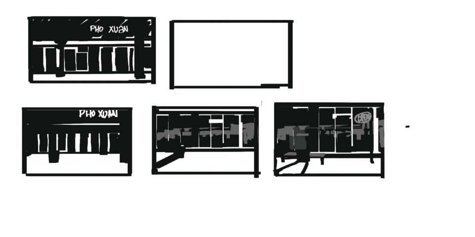
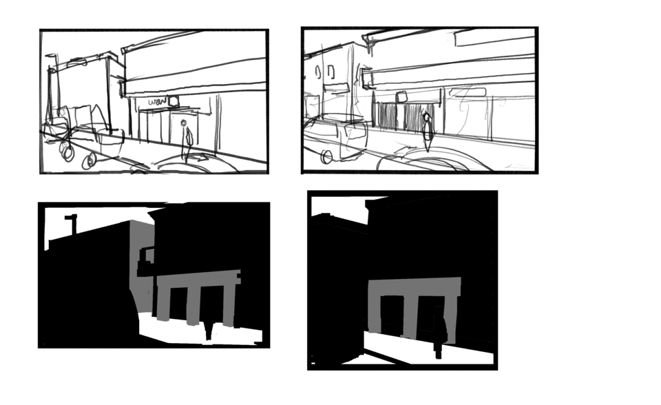
Example 1: Painting a storefront, refining initial thumbnail, keeping the shapes, adding colour and refinement.
Example 2: Painting landscape inside a garden, thumbnails deciding how I want the road to twist and turn, adding large shapes of colour, then adding smaller and smaller detail and texture.
Example 3: Scene right outside my door (snowing in April!!) this one I wanted to copy it exactly as I saw, only one thumbnail. There was a lot of architecture and straight lines so I spent a lot of the time refining the sketch before moving to colour.
Quick TIPS for Thumbnail to Final
I normally did this process of thumbnails, choosing the best thumbnail, adding colour, and refining smaller shapes because it felt the most comfortable and the “fastest” to me as I had to make one painting a day on top of other goals. Here are some tips if you wish to use this process as well:
1. In order to work fast, I recommend using the shapes from your black and white thumbnail and using the Auto Select tool in order to fill in colours of shapes very quickly. I also tended to keep things on one layer, just like traditional painting. Making confident and quick decisions.
This tool is under 'Auto Select' that looks like a magic wand. I find "Refer to all layers" to usually be helpful, it takes the information from all of your layers. I have this set to a shortcut "F" on my setup.
2. Make adjustments early on. If you notice something wrong with your chosen composition as you start to add in colour, make those adjustments early. This could be a perspective issue, or maybe a colour issue. For perspective issues, I transform the thumbnail or redraw it. To check if its a colour issue, after I lay in my local colours I evaluate the colours: is it conveying the mood I want it to? I make quick overall corrections with Hue/Saturation/Luminosity, Colour Balance, or Tone Curve before proceeding forward. Sometimes, it looks good and I do not need to make these corrections.
You can find tonal corrections at Edit -> Tonal Corrections. Try to get the colour right early on to set the mood and lead the rest of your painting
Again, this was my most common and comfortable method and I definitely experimented with others too. If it works for you that’s great! If you’re comfortable bringing your painting to a final in a different way then keep doing it your way, as long as you’re happy with the end result!
Misc. Specific Landscape Tips
Now that I’ve gone over the landscapes, from start to finish I wanted to dedicate a quick section on miscellaneous things you might run into in your own landscape painting.
Q: Are you painting an urban landscape with lots of architecture and houses?
Tip: I found I definitely needed to focus much more on perspective and straight edges in order to make these landscapes look right. Take advantage of perhaps a good line drawing as a base after your composition, or utilize the shortcut to make straight lines in Clip Studio Paint: holding shift with a brush tool selected. Don’t be afraid if you are taking a long time on the perspective, once you get it right the rest will usually be much more smooth sailing.
Q: Can you see far off into the distance in your landscape?
Tip: Take a look at the landscape you’re painting and see if you can notice atmospheric perspective effects. In the distance, things get much cooler in colour temperature. If your painting does not feel like it’s receding back enough, see if you can gradually get cooler in colour as you go back to the horizon.
Here notice the more cyan and cooler trees in the distance at A, they are also much softer which you can paint with a soft brush or using blur tools.
Then, notice at B, although it is still cool, its relatively warmer in the foreground - additionally we can see much more texture here. Try to keep your foreground where you see the most texture, and handle the background solidly - this will also help convey distance.
Q: Is the light changing and completely different from when you started painting your landscape?
Tip: Do not chase lighting effects! This is one of the challenges and rewards for painting plein air, it challenges and improves your painting from memory. If you’re mostly done the image and you start to change the lighting based on what you see now, the painting will not be unified and may not make sense! This is ANOTHER good reason to make thumbnails (if you needed even more convincing), refer back to it if you can in order to remind yourself about what the scene originally looked like.
[SECTION III]: (Bonus Section) A More Traditional Look
Traditional watercolour paintings can be very captivating and charming with the effects that the water produces on the paper. It can drip down, if you’re dry brushing it can show the texture of the paper, and often times it can be hard to control which can lead to happy accidents. I also find that the pigment in watercolour seems very saturated, the colours can really pop.
To achieve some of these effects in digital for our landscape paintings, here are some of the techniques that I used. Below is an example of a landscape painting I did of a restaurant that I attempted to make look a bit more traditional.
Here it is again labelled with a few techniques that I used to create it:
At (A) We see the water dripping effect that happens when watercolour drops down an inclined page to do this I used a very strong smudging tool. By default, the “Finger tip” brush in Clip Studio Paint works very well for this. Just make sure to keep the brush strokes downwards to mimic the effect of gravity on the paint.
At (B) we see very highly saturated colours in the light in the focal point. I think this helps give it more of a watercolour look. To add a bit more saturation to your picture one thing you can do is to experiment with Blending Modes. Create a new layer on top of your image and add in some highly saturated colours, thinking about the lighting your scene has – set this to different blending modes and experiment. Finding out what looks good and can vary from picture to picture, but I commonly use ‘Overlay’ with saturated colours and a textured brush to add in colour notes.
Finally at (C) we see textured brush strokes, like it was dry brushed with gouache or watercolour. There are definitely different ways to do this, such as carefully using a textured brush ontop. I like to use the default "Dry Gouache" brush.
Another interesting way to do this is to merge all your visible layers to a new layer, create a copy of it and distort it using filters such as the Filter -> Distort -> Wave filter. Then, simply mask in areas where you want a bit of texture.
Here you can see an example of adding in a bit of texture using the distortion filter method in point (C).
Here would be an example of the layers for a technique like the above to add in texture.
At (A) is your merged layer of all your work so far. You can do this by going to Layer -> Merge visible to New Layer
At (B) is a copy of layer (A) you can use Layer -> Duplicate Layer. Then, distorting this layer by going to Filter -> Distort -> Wave, but feel free to play around with other distortions. Finally on this layer, give it a layer mask with Layer -> Layer Mask -> Mask Outside Selection. Painting into this layer will show up white, like the picture on the right, and it will reveal the distortions you made giving a texture like effect.
There are many tutorials and many other techniques to make digital paintings look more traditional, I recommend you look some up on the Clip Studio TIPS website and try out a few more in your landscape paintings.
Conclusion
Okay, that’s all from me. Hopefully from reading this article you have the urge to go outside and paint landscapes, or take some pictures and paint them at home. I also hope you also learned a few new techniques that you might consider trying, and lastly the importance of thumbnails. Thanks for reading!
I will try to continue to post everyday for the next year, this month of April was all landscapes everyday, but I will switch that up in the coming months. If you want to check out my work you can look at
Recommended Content
Below is some recommended content that is OTHER peoples work.
A recommended guide to setting up Clip Studio Paint for the iPad
Users who liked this post


Comment