
Introduction
Hi again, I come with another Tip that I use and have been exploring lately, it is the "tone curve" tool. Well, it allows us to fix color levels or also experience very interesting ranges from the RGB numerical parameters. So I'm going to show you this Tip, let's continue!
Location
We are going to go to the "Edition" tab of our software and select here
In the options that it opens we will look for "tone curve"
We select this option and the following box will open
- Location: "edit" - "Tonal Correction" - and then "Tone curve"; it will be this same box.
Values tab
In the "RGB" values tab we can modify the curve from a general perspective or by selecting the individual RGB values as well.
Action Curve
The curve works as follows, here the idea is that we will modify vectors that appear on the slope
Personally, I place a median plane to start interacting, to activate a vector in this tool you place a point such as the ones I marked in the image, and you will have something like this

It is with the curve that we are going to interact, 😎.
RGB parameter (contrast)
In the RGB parameter selected by default in the curve, personally I have used it to play with the contrast, it gives a nice feeling, in my image I just took the curve and descended a bit, like this.
Here it modifies the RGB and general parameters, I want to add that I have avoided moving the ends since they postpone values and drastically modify their saturation levels, so in this case we avoid moving them, it could confuse you.
Independent values
Now we are going to play with the values of the tone curve tab, we select for example - Blue -
At this point we will only modify the ranges of blue that we have, taking into account the level of saturation. I know that in this tutorial I have spoken with a bit technical terms, but I think there is no other way to explain these types of tools, so I will show you and you will already intuit. In this case I generated two vectors in the slope as I am going to show you next.

You can see the subtle change I have generated here to give a nicer blue that blends with the green in my illustration, I generated two vectors here because I want it not to overexpose my blue level.
Have you understood then why the "tone curve"?
Final
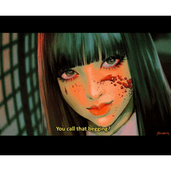
So finally, after having modified my parameters I have my illustration - Procyon - is the name of my character 😁, I hope you liked this tutorial, do not forget to give me a like below if you liked it and it has been useful. Thank you
Users who liked this post


Comment