

Hi, I'm Cherry!
I am the creator of my own webtoon. I have created all my chapters with the help of Clip Studio Paint and in this tutorial I will teach you how to create your own webcomics, and I will also give you tips and advice so that you can speed up your work.
All about webtoons
First of all, I would like to mention that the format that you will give to your webcomic is very important, because you must be clear that the sense of reading is no longer a "traditional" one, so to speak. Keep in mind that now the reading will be vertical, so there are a series of fundamentals to consider to guarantee the success of your work.
For example, my first recommendation is that you have prepared a sketch that you have previously worked on only for vertical reading.
Why vertical reading?
Because in this way it will be adapted to reading on the cell phone, which is fundamental within the webcomic, which was created for this purpose. In this way, people will have more access to read your webtoon, because they will be in contact with it through their mobile devices.
That said, it is also important that you ask yourself if you want your work to be printed in the future or not. Because of this, then you should also consider the size of your canvas in depth.
Format
Let's get started on how you can create a Webtoon format.
(New -> Show all comic settings).
The measurement that I have established, since I believe that it is an excellent format, both for viewing on Smartphones and for printing, is the following: 2150 pixels wide X 30,000 pixels high. With a resolution of 350 dpi
I also like to have margins added from my template because sometimes I prefer to fit my bullets within these margins, but this is a personal taste that you can overlook.
My margins are as follows: 1900px wide X 2999px tall.
Template
It's very easy to save your template.
Simply put the format that I recommended or some other much larger, if you consider that the template is not long enough (keep in mind that images that exceed 30,000 pixels high cannot be saved as a single image, so you will have than to divide your sheet).
After preparing your canvas, on the left side select the "Save" button, give your template a name and finally click "OK".
With this action you will have your template available from now on so you do not have to configure the canvas again.
Default templates
Fortunately, Clip Studio Paint offers us a series of default Templates. So if you choose some default template, you would be saving everything I mentioned above. Just pick your favorite template and start working on your chapter.
In that case, my recommendation would be Template Number 4 because its characteristics are similar to the ones I configured in my own template and I think it is a suitable size if you want to draw details.
Sketch and bullets
I will reiterate again the importance of reading vertically. Basically vertical reading is the essence and that is why it is important that your sketch is thinking about this fact.
The structure of your vignettes and the arrangement of your vignettes is just as important because they are essential to give you a solid foundation and a dynamic narrative, for example, you can play with this new narrative by alternating your panels or drawing a scene as you lower the canvas.
To create your panels / vignettes you have to go to the toolbar and choose "Vignette border"
My border is 5 point size. This is because I don't like the edge that is too thick or too thin.
The view of the border will also be determined by the size of my canvas, that is, if my canvas has a certain size, my border despite being the same size will look thinner or thicker depending on the case.
I recommend taking this into account and using the same border size for all your panels to achieve more consistency in these.
Separation between panels
It is also important to point out that the separation between panel and panel should be "wide" and not glued one next to the other, because this way the reading will be easier to understand everything if both the dialogue and the panels are properly separated from each other.
Leave a considerable space between one panel and the other.
This is up to you, there is no written rule, but remember to take advantage of the length of the page, don't be afraid to widely separate between panel and panel, or dialogue and panel.
Dialogues
The font size must also be adequate, remember that the reading of your webtoon will generally be done from a relatively "small" device, such as smartphones.
Whether you decided to use the measure that I gave you for your format or a smaller one, I recommend a measure of:
15 to 25 points for font size.
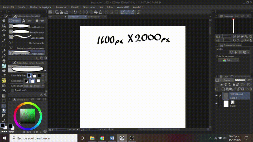
The letter must be legible and dynamic, without serif.
You can use the default font called: Comic sans MS
This section is also extremely important because people should feel comfortable reading your dialogues, especially if your chapters represent a multi-panel reading.
To create your own font list:
Select the font list -> Open font list setting dialog (gear on the right side) -> Create new list (first button on the bottom left) -> Select font or fonts to go inside the list— > Accept.
In this way you can create your own list and thus have your selected sources saved.
Film script
The narrative of your chapter can be seen reflected in a written script, that is why I highly recommend writing a script for each of your chapters before anything else, because this will save you a lot of time. The written script serves as a guide, both for you to visualize the panels, their number, their distribution and the distance between each element, including the dialogues.
As a personal tip, I think the script is the first thing you should have written before starting a chapter. And not only that, I think that in general the dialogues are the first thing that must be established and finished.
I'm going to give you two options to streamline this important part.
Option 1: If you have Clip Studio Paint PRO
Copy one by one the dialogue that you are going to add to your chapter and place it in the part where you want that dialogue to go, until all the dialogues are copied in your chapter.

Then add the speech bubbles.
To create the dialog balloons go to the toolbar:
Speech Bubble Tool —-> Speech Bubble —-> Selects a speech bubble.
There are three types of speech bubbles:
Elliptical Speech Bubble - This is a round / elliptical speech bubble.
Curved speech bubble: with this tool you can create the shape of your speech bubble.
Rounded Edged Speech Bubble: Speech balloon with rounded corners.
I recommend creating a folder that will contain all your speech bubbles and onomatopoeia. This folder should go at the top of all your work. This will prevent the balloons from hiding under the top layers, such as the colored layer or the layer where you will place the backgrounds.

Option 2: If you have Clip Studio Paint EX
From the upper left side select:
Page management -> Edit Text -> Open story editor —-> OK.
Once the story editor is open, copy your dialogue just as you want it to look inside the text balloon and then paste it.
Close story editor —-> OK (save).
With this action, all your dialogs will automatically be inside your panel.
lineart
My lineart is always made with the same type of nib. It's a pen that I set up, but it's not that different from the G pen, so you can use that one if you want to.
You can also make the line with a type of nib or brush that does not have such a determining mark in pressure, as well as markers or felt-tip pens. That is up to each person.
Explore your own style, with which you feel best comfortable or comfortable.
I also usually help myself with the "Bézier curve" tool to make the faces, because with this tool you can vectorize certain elongated parts with an organic line. This is very useful for drawing the lines that delimit each or certain very long parts of the body.
Color
Some color techniques that I apply to all my chapters help me to considerably reduce work time, so I will give you some of my tips.
There are two ways you can create and save your own color palettes. Color palettes are important because they mark our style and the genre that our webtoon moves through. For example, my palette is very colorful since my webtoon is of the comedy and slice of life genre.
I will teach you how to configure this part.
First have the following base colors already chosen:
Skin color, skin shadow color, hair color and eye color.
-
-
Option 1.
Go to the command bar:
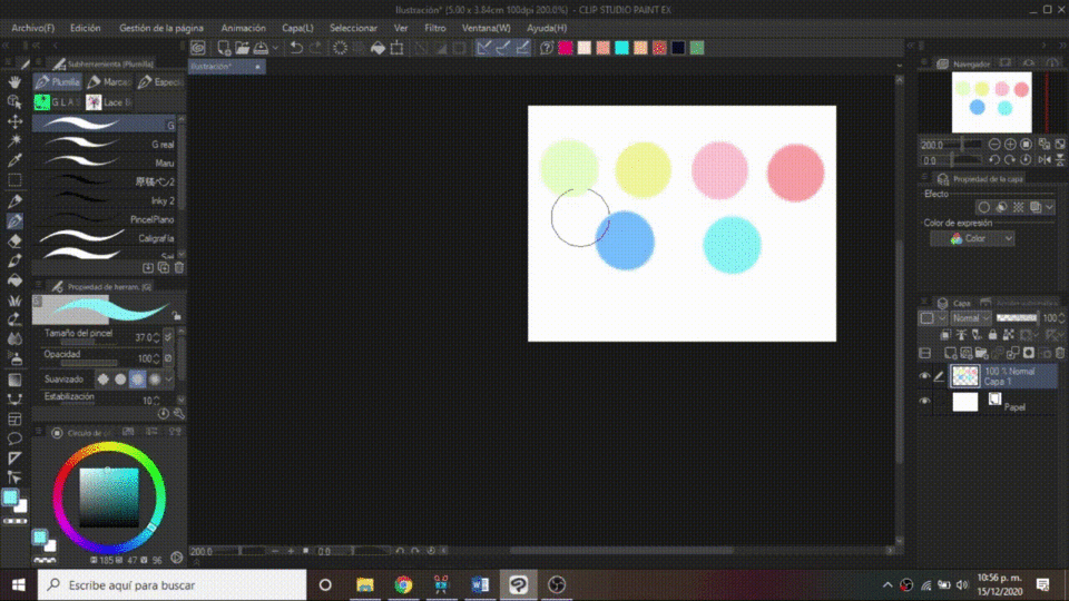
In the empty space, right click —-> Add drawing color.
In this way you can create a color palette that will always be within your reach.
I think this is the best option to have your palette available at any time.
Option 2.
The usefulness of this palette is that you can add large sets of colors.
Head over to where your colored circle is:
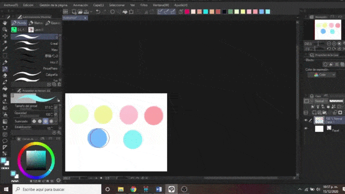
Go to the “Color set” window —-> Select the “Color set (key)” button -> Add new settings —-> OK.
An empty palette will be created for you to add the colors you want.
To add a color, right click on an empty space —-> Add color.
-
-
My working method starts with the flat color of each section of the main characters. I mean "flat color" as the base color, meaning no shadows or highlights. I usually paint the base color of the skin first, then the hair color, and finally the clothing color. Of course, each in different layers.
Then I place the shadows over my base colors by attaching a top layer to the bottom layer.
I recommend you do this and not paint completely character by character because it will take a long time, it is preferable to paint all the base colors before and from this, start placing shadows and details later.
To give your characters dimension, I also advise you to place gradients, mainly on clothes and hair.
For gradients and leftovers I usually use the layer blending mode "Multiply", and for lights I usually use "Add brightness". It is not common that I leave the opacity of these two layers at 100%, I prefer to play with the opacity in different percentages.
By the way, to paint the leftovers I use the "Lasso fill" tool:
Fill Tool —-> Lasso Fill.
Money
Backgrounds are an important part of our webtoons because they help give expressiveness to situations.
In addition, since the reading format is vertical, we can play with this section, for example, a scene where we go from one situation to another using this advantage.
Now, I work the funds in a way that also helps me to reduce the delivery time. If you notice that I have been insistent on the time, it is because my webtoon is published weekly, so I need to use all the available resources to speed up the time and be able to have my chapter ready.
When I need to add a background, I usually use photographs and these photographs are usually pictorialized. That is, I edit them to look like animated backgrounds. I have already done a very simple tutorial explaining this technique, I will leave you a link to the tutorial.
Briefly summarizing, the effect is on:
Filter —-> Effect —-> Pictorize.
You can also intervene in your photographs using some preset brushes such as those of leaves, grass, trees, clouds, etc.
Image export
When your chapter is ready, you have to save your images according to the requirements of the site where you will publish your work.
Where I post, the requirements are 1280 x 800 pixel vignettes, so I configured my vignette cutter to export this way and thus simply upload the images.
If you have CSP EX, then you can cut your bullet if you go to:
File —-> Export Webtoon
It does not matter if the images are exported cut, because when uploading them for publication, they will not show that cut, they will be shown as a single vertical image.
-
-
-
This was my creation process.
I hope that some of the advice, tips and suggestions that I mentioned here have been very helpful to you.
I hope you are encouraged to create your own webtoon. It is not as difficult as it seems, you just have to have perseverance and discipline. There is no more secret.
If you publish your webtoon, I would love to know.
I wish you a lot of success!
-
-
-
Links where you can find my work:
Users who liked this post








Comment