
Hi, I'm Cherry and this time I'm going to teach you how to paint two types of effects and finishes on your illustrations, satin finish and holographic/iridescent finish.
Value Scale / Gray Scale.
This scale refers to the tonal valuation between black and white, which results in a gray scale in those values.
We must identify at least one high value, one medium value and one low value.
Keep this in mind because it is very important to understand how light and shadow are related.
Gradient Maps.
Gradient maps are color adjustments or tools that allow us to work on the values (the scale of values) that we have on an image. We can choose between the alternate change of as many colors as we want.
In this image I show you two examples.
Image 1: scale of values from black to white
Image 2: value scale with the default scale “dusk brightness”
Image 3: value scale with the default scale “rainbow”
Gradient maps are very useful for speeding up your coloring work.
Satin fabric / Satin.
Before we begin, I would like to tell you about the differences between the two.
As these types of fabrics have the same finish, they are often confused. Both have the same type of framework that partly helps to give that light effect and it is that same pattern or weave that gives them their name. However, the fibers with which they are made are different.
Satin weave is based on silk thread, while satin weave is mostly made of cotton.
And although they seem the same, they are not, however, they are similar finishes, that is why we have to take into account this type of detail when illustrating.
To have continuity and narrative coherence in our paintings.
I will refer to this fabric as “satin”.
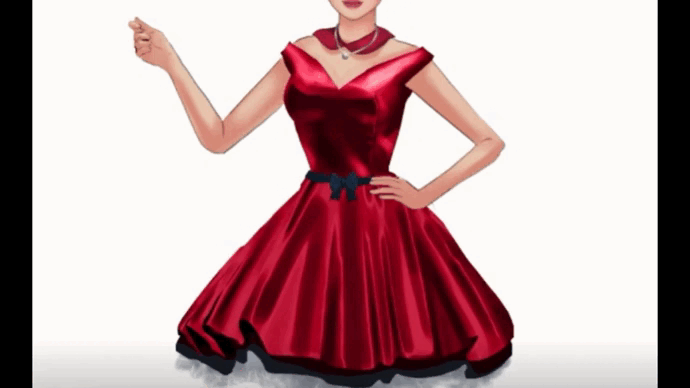
The satin has a characteristic shine on one of its faces.
As the finish is very smooth, then the fabric captures a lot of light and this is present especially in the curves of the folds, where the curve protrudes a shiny shine is noticeable and where the curve goes down the color turns almost black.
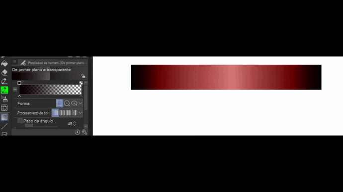
SATIN EFFECT - Map of gradients.
To prepare our gradient map we will do the following:
In the toolbar we choose --> Gradient Tool (1) --> Right click on “Foreground to transparent” --> Duplicate sub-tool
(We name it as we want to identify it, I name it “satin”).
Then we have to work on that new gradient. We will choose the color for our satin fabric, I chose red.
On the gradient configuration we move the arrows that are together below the bar.
We can also put the cursor at the beginning or end of where these are and generate more arrows. With this action is how we can manipulate the intensity and position of the colors, and in the small boxes above we can choose the color we want.
This gradient has to have a finish similar to this:
Here is a video for you to understand better.
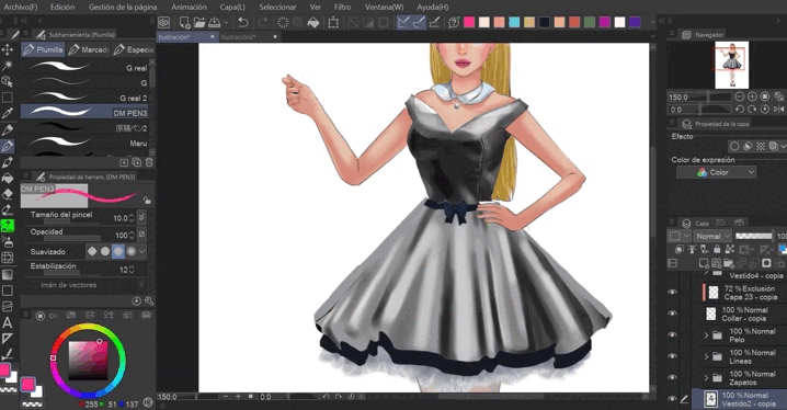
To paint your illustration you should only take into account that on satin fabric the shine usually has the main tone, for example, if you chose a blue color, the shine will be a slightly desaturated light blue. Also the color you choose must be desaturated. The shadows must be very dark.
Both the base color, as well as the shadows and the brightness must be in different layers, I recommend that for all your illustrations. When you have everything ready, save it in a folder.
Duplicate that folder and make it a raster layer.
Duplicate folder --> Right click --> Convert layer --> Convert to raster layer.
This is how you will be able to use the gradient directly on top of this new layer that you created.
To use this, make sure you have selected (or are working) on this same layer.
Then do the following:
Edit --> Tonal Correction --> Gradient Map
Select the gradient map you created and accept.
Finally, put the finishing touches on your illustration by adding or removing layers of light and shadow, but already working on the new layer. Do not forget to correct some errors that may occur. Like shadows or highlights where they shouldn't be. You can also correct the tone.
ACABADO IRIDISCENTE - A map of the walk.
The process is exactly the same, but with slight differences when creating the gradient map.
Iridescence is an optical effect in which the light will be visible depending on the angle of how it is observed, that is, the variation of tones will change depending on the angle, that is why, when observing this effect, the range of colors will vary being affected. not only by its environment but by our own perception.
The layering system is placed exactly the same as with satin fabric.
Base an intermediate color, a layer of dark shadows (not as dark as satin) and on top a layer of lights not so accentuated or bright.
To create this gradient map, follow the same process that I did above, but this time the value map goes in this direction:
The colors you choose must also be desaturated and take into account the strip of a light color interposed between the darkest and the lightest tone, because precisely that effect makes it stand out from satin or other types of finishes.
This effect is very complex and requires a lot of study because it happens that the stripes of light cannot be placed anywhere, like the satin effect, where the light is painted on the surface of what simulated to be fabric and the most intense shadows are painted in the part where there was no light. Iridescence doesn't necessarily follow those rules. The brightest band of light is not placed next to the darkest point.
Since I know this is a bit difficult to understand, I found some gradient maps that you can download from the Assets library.
Studying these will help you a lot so that you can create your own gradient maps with this effect or use these that are available as a free download.
The friendly user who created these maps is: westdogalcohol
Don't forget to use and credit your references. <3
Ready! What do you think about it?
I think that using gradient maps is easy and helps a lot to make incredible finishes that seem very complicated at first glance.
I hope I helped you with my tutorial. 😊
I wish you much success!
-
-
-
Links where you can find my work:
Users who liked this post


Comment