
INTRODUCTION
Hi, I'm Cherry!
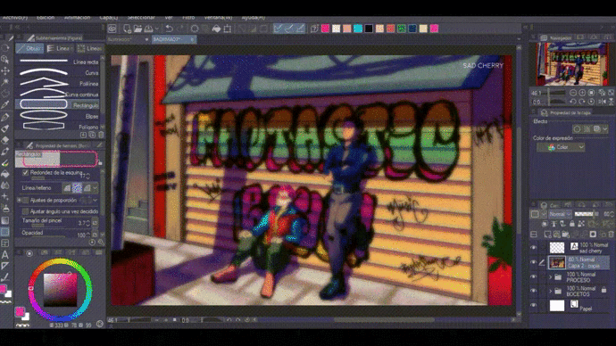
This time I will show you the speed paint of my process to draw an illustration of the original characters from my comic website "Fantastic Boys" and, of course, I will explain to you step by step how I got to the result using my favorite Clip Studio Paint tools.
I'll show you how you can save your sheet formats, use perspective rulers, sketch with straight lines that follow perspective, use as many tools as possible in 3D poses, handle color in an interesting way. and create your own color palettes, use layer combination modes, make borders, select and move an image making it have perspective, import gradients, add textures, etc.
I created this tutorial so that you can learn about some tools and give you some of my tips and advice to use CSP as efficiently and easily as possible.
I hope you can take some of these explanations and that you can create your own illustrations. I would like some of the tips that I give you here to be useful to you and that this is an entertaining, fun and interesting activity for you, in addition to the fact that you may be able to discover some function in CSP that you were not aware of.
SHEET FORMAT
First I open my worksheet with a configuration that I adjusted and saved myself. I recommend you save your sheet formats so that it is always available in your preset options and you can use them in the future.
How to save a sheet format?
-Select: New -> Comic Settings -> (Configure your worksheet with the measurements you prefer) -> Click on the "SAVE" button (located on the right side of the "preset" bar -> Name format (in this case I saved it with the name of "SPECIAL FORMAT"), select all the unchecked boxes and accept -> Accept
And voila, this format will be available in your preset options.
RULE OF PERSPECTIVE AND BACKGROUND SKETCH
PERSPECTIVE
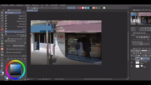
To create the perspective of the background, the "Perspective Ruler" can help you.
The perspective that I used in my illustration is based on a photograph that I took. I imported the photograph as an image on my canvas and simply arranged it to my liking.
-Select: (Ruler Tool) -> Perspective Ruler
I followed a couple of lines in my photography and this is how I created my perspective.
In the end I just deleted my photograph.
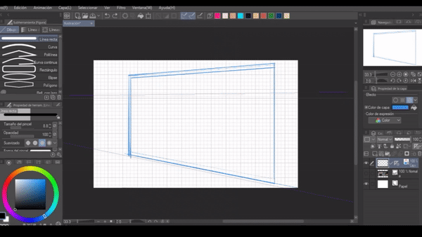
SKETCHES
I dragged the ruler onto a new raster layer and then started drawing on this layer with the “Maru” pen.
In order for the canvas to respect the perspective ruler, the "Ruler settings" and "Special ruler settings" icons must be activated (as a tip, I also suggest activating "Snap to grid"). These icons are found in the upper toolbar as I show you in the following image.
If these icons are selected, then any brush or nib you choose should respect the perspective ruler.
To draw the metal curtain with the blinds spaced at the same height, I opened a new raster layer and activated the grid view and the "snap to grid" icon.
-Select: View -> Grid
In the side toolbar I selected the "Figure" tool and with the "Straight Line" I began to draw parallel lines with an equal space between each line.
Later I selected all the lines with the "Scale / Rotate" tool located at the top of the toolbar and finally I chose the "Free Transform" mode located in the tool properties.
I moved the tips of the selected layer according to my sketch so that the lines also had perspective.
Look at the following gif so that this information is not confusing for you and you can take advantage of these useful tools such as the grid, and free transformation.
Later I removed the grid view (-Select: View -> Grid) and continued drawing on the raster layer where the perspective ruler was.
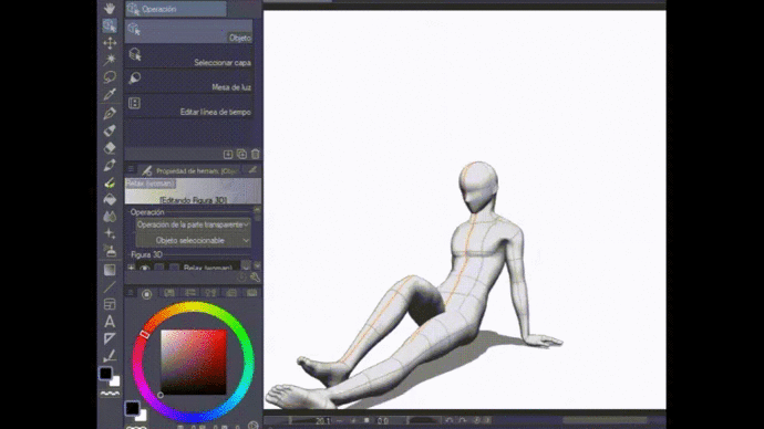
3D POSES AND SKETCH OF MAIN FIGURES
When the background sketch was ready, I continued to sketch the main figures on another raster layer. To draw my characters I used some default poses in CSP, chose the ones that suited my taste and dragged them onto my canvas.
-Select: Material Bar -> 3D -> Pose
First of all, I arranged the poses according to my perspective rule. To do this I first made the perspective of the poses visible. This action is carried out in the layer properties by clicking on the ruler icon (which comes in the pose layer).
-Select: Set display area of the ruler -> Show in the same folder
To remove the perspective view of the 3d model, the same step as above is performed.
Once the models are in the proper position, I made some changes regarding their body and limbs.
In the "Tools Properties" menu we can choose between many options to adapt the 3D models to the needs of our illustrations. For example:
-We can adjust the angle in the "preset" option.
-Apply the source of shadow and light.
-Change the height.
-Give the head to the body, manually or use the default settings (I slightly changed the proportions of the head, manually).
-Adjust the proportions of the body (muscular, slim, etc.) And in the drop-down menu you can choose certain parts of the body and provide them to your liking.
-Put your hand, either open or close it (and move all the fingers).
-Activate the manga perspective (with which you can draw foreshortenings).
-Determine the width of the outline of your 3D model.
You can make use of all the tools, but these are just some of the ones I used in the 3D models to draw the poses of my characters.
LINE ART AND COLOR PALETTES
LINE ART
My line art is almost always done with the pens "G" and "Maru" on vector layers. I do this lineart separately. I make one for the main figures and one for the background and then I arrange them in two different folders.
COLOR
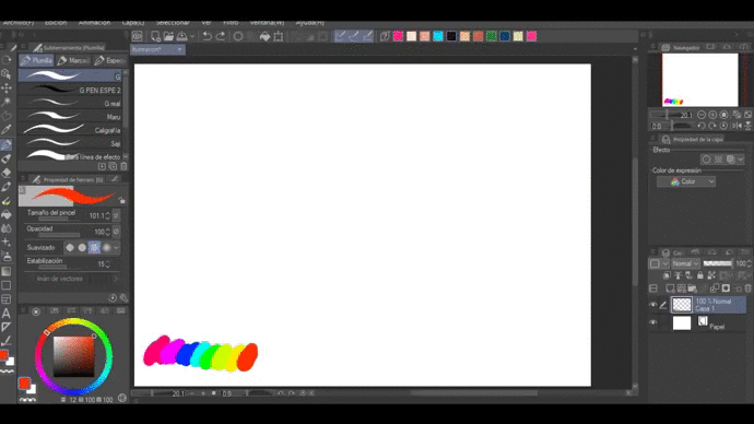
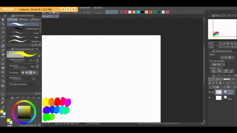
For the illustrations of my original characters I use a color palette that I create myself.
There are two ways to save the colors you use the most and this can be done by saving a color palette or adding some colors to your top toolbar.
TO CREATE A COLOR PALETTE.
On one side of the color palette there is a box where the color sets are collected, click there.
-Select "Edit color set" (tool symbol next to the color palette drop-down bar) -> Add new settings (your color palette is ready) -> (Edit the name of your new color set) -> (Select a color you want to include) -> Right click on any empty box -> Add color
-If you want to delete a color in your palette, right click on the color you want to delete -> Delete color (or you can simply click on the color and touch the "trash can" icon).
TO ADD COLORS TO THE TOOLBAR.
-Select the color you want -> Right click on the bar -> Add drawing color
COLOR, LIGHTS, SHADOWS AND LAYER COMBINATION MODES
When I finished my linearts I started to put the color.
My favorite brushes for this are "Transparent Watercolor", located in Brush / Watercolor / Transparent Watercolor. And the Soft Ink, located in Brush / Ink / Soft.
I started with flat colors on my main characters, my favorite color palettes are the very colorful palettes that range from pastel to vibrant colors.
Also the base colors like skin tone, eye color, hair, etc., are stored in my quick access, so it is very easy to repeat the main colors in my characters.
To choose the color of the clothes I was simply guided by color sets that I have used before, for example, for the character with pink hair, I usually use vibrant and generally complementary colors, but for the character with dark hair color, I usually use colors more muted and analogous.
In digital painting things are slightly different from traditional color theory, but I will try to explain the concepts in a simple way. We know that in traditional painting, the primary colors are yellow, red, and blue.
The combination of the primary colors gives us as a result the secondary colors.
Yellow + Red = Orange
Red + Blue = Violet
Blue + Yellow = Green
Complementary colors.
They are those colors that maintain the highest contrast to each other, but are visually harmonious and are just on the opposite side of the color wheel. In such a way that the complementary color of yellow is violet, red is green and blue is orange.
Analogous colors.
As the name implies, they are colors with a similarity to each other. In this case, the analogous color (s) will be those that are similar to each other, and part of this is because they maintain a similar base color.
SHADES
This time I did not want to add different colored shadows on the spot colors, instead I preferred to add a single uniform shadow on my two already painted drawings. The shade I chose was purple, because I think that tone suited the colors with which I had already painted my characters.
To paint over a colored layer without the brush affecting everything else, first create a new raster layer and place it on top of the layer you'll be painting on.
-Select the new raster layer -> Fit to lower layer
You can also paint directly on the color layer.
-Select the layer where you applied color -> Lock transparent pixels.
However I do not recommend this, because if you make a mistake you will have to paint the layer you are working on again.
I also like to add texture, but I'll show you that later in more detail.
LAYER COMBINATION MODES.
Basically almost all the colors in my drawing are flat and what gives it the feeling of depth is the use of basic shadows. The shadow that I put on the color layers is of the same tone and to make it look like a transparency I used the blending modes.
Blending modes are the ways in which the colors of the upper layers can be mixed with the colors of the lower layers, basically.
The mode I chose for the shadow is the "Multiplication" mode.
To choose a blend mode, select the layer to which you want to apply any of these modes and this layer will adopt the desired blend mode, thus affecting the lower layers or if you prefer, only the lower layer.
SOURCES AND EDGE EFFECT
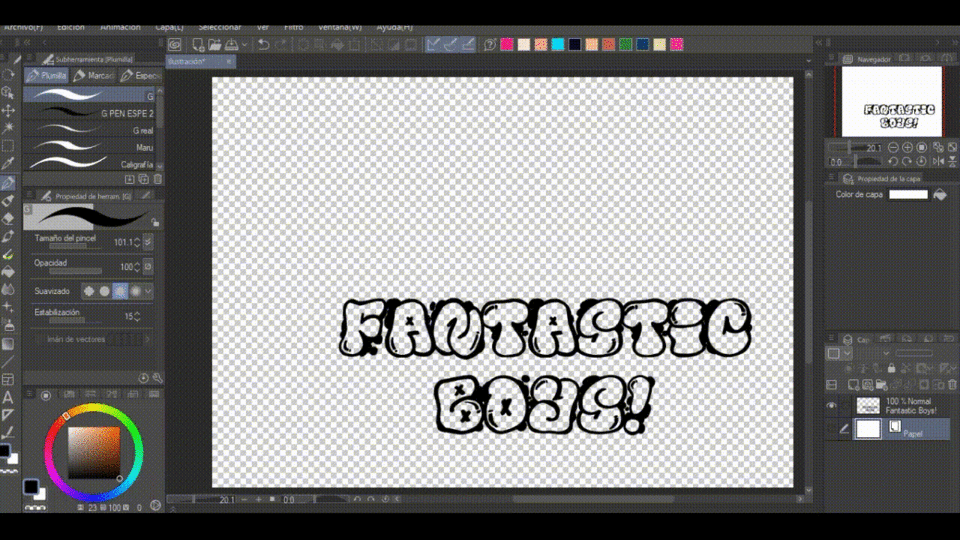
Some time ago I downloaded a couple of fonts in graffiti style and decided to use it in my illustration.
I opened a new page and wrote the phrase "Fantastic Boys" (the title of my webcomic) on it. I used a couple of fonts called "El & FontBubbles" and "Graffiti Tags".
With the font "El & FontBubbles" I wrote "Fantastic Boys!" in a sizeable size and then I turned that text layer into a normal layer.
-Select text layer -> Right click -> Convert layer -> (In the "Type" option) Rasterized Layer -> OK
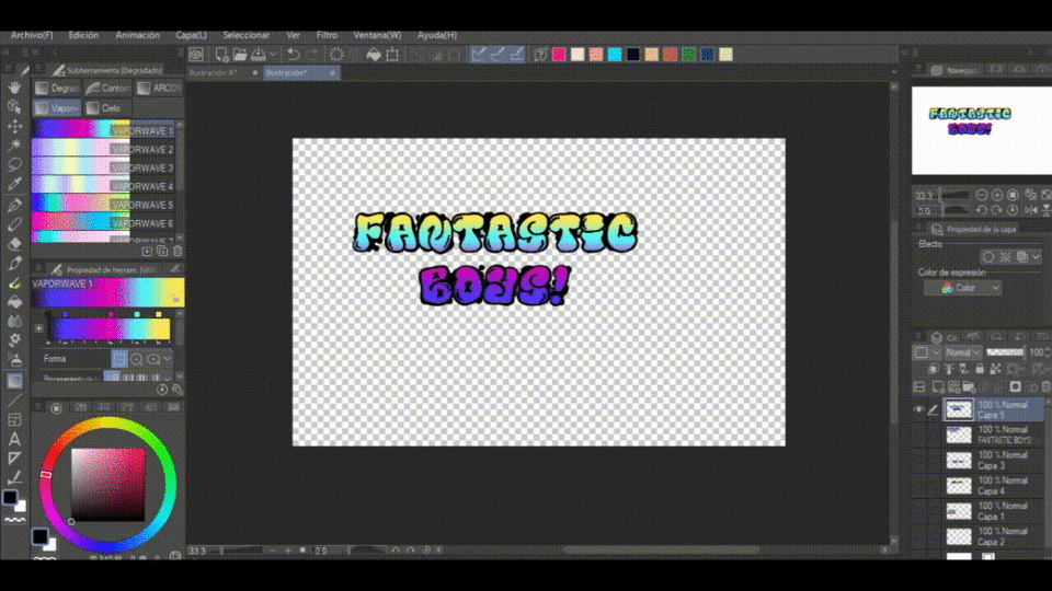
I placed a white background below the letters, because later I wanted to add a gradient that would color the letters inside.
To do this, I created a new raster layer below my graffiti layer and worked on this new raster layer, selecting the entire layer with the "Auto Select" tool.
-Select: refer to all layers -> Click on the icon "Invert selected area" -> (When the area of the letters is selected) Paint with the desired color (in my case, I painted in white) - Deselect
Finally I joined both layers.
I also added color over the graffiti. I opened a new raster layer and placed it on top of the graffiti in "Multiplication" blending mode, then adjusted that layer so that it only affected the bottom layer and placed a color gradient.
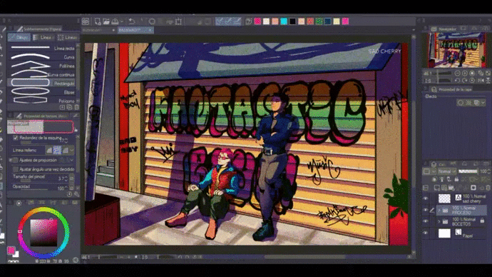
I copied and pasted that file (the graffiti) into my original illustration on the background color layer, I chose a layer mode "Multiplication" and selected the graffiti, arranging it following the perspective of the illustration with the "Free Transform" mode. Earlier I explained the steps to do all of this that I just mentioned.
For the other graffiti it was not necessary to do the whole process above, I just wrote on the canvas, converted them to raster layers and arranged them all over the walls.
EDGE EFFECT.
I didn't use it this time in my illustration, but I was about to. I will quickly explain to you how you can place a border.
-Select the layer on which you want to create a border: (Go to layer properties) -> Border effect
You can change the color and thickness of the border.
DEGRADED
I leave you a couple of links, here you can download the gradients that I used in this Illustration. You belong to "Clip Studio Assets" and then I'll show you how to import a set of gradients.
To import the gradients you need to download them, once they are downloaded follow the following instructions:
-Select the "Gradient" tool -> Show (tool icon) -> Advanced settings -> (Click on the tool icon next to the drop-down bar) -> Import material set -> (Select gradient set) -> Accept
Then just choose the gradient color you want to use by double clicking on it.
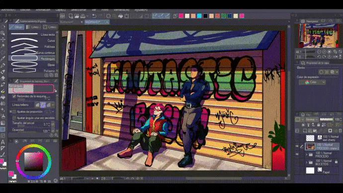
In my case, I applied some gradients in my illustration, for example, in the planter on the right side or the entrance that is on the left side. Gradients will help add depth to your illustration.
I created a couple of raster layers and placed them on top of all the layers.
The first layer I decided to paint it completely light orange and then I put it in combination mode "Multiplication". To finish, I decided to change the opacity, so that my illustration wouldn't turn too orange.
With the second layer I decided to place a gradient that went from a salmon color to a light gray. I also put it in "Multiplication" blend mode and lowered the opacity so it wouldn't affect my artwork too much.
I combined these two layers and for that resulting layer I chose a "Multiplication" blend mode once again.
COLOR BALANCE
I also did a color balance to enhance all the colors. To do a color balance you need to do the following.
-Select: (Right click on the top layer) -> New correction layer -> Color balance
FILTERS - RENDERING (TEXTURE) AND BLURING
When all the elements in my illustration were ready and I thought I was about to finish, I decided to apply a couple of filters that would give it the finish I wanted to achieve. They are personally my favorite filters (along with the artistic filter).
TEXTURES
Create a new raster layer on top of all my illustration.
For textures I like to use the "Render" filter.
-Select: Filter -> Render -> Perlin Noise -> (Choose preferred scales) -> OK
I like to use a small scale, so that the texture is not so wide. I like strength high and I always keep the other functions on a medium scale.
When my texture is ready I simply choose on top of it a layer blend mode that I like, for example this time I used the "Vivid Light" blend mode.
BLUR
Blur is another filter that I use a lot. I think it gives a very interesting glossy finish, you can try it if you want. This is completely optional, but I used it and I will show you how to do it.
First of all, I selected all the layers in my illustration and grouped them into a single folder.
-Select: (Right click on the top layer) -> Create folder and insert layer.
By doing this, all the layers you have selected will automatically fit into a folder.
Then I turned this layer into a raster layer and applied the "Gaussian Blur" filter.
-Select: Filter -> Blur -> Gaussian Blur -> (Choose a considerable blur, but not too sharp) -> OK
Finally I selected this layer and chose the blend mode "Lighter Color".
STEP 1
STEP 2
STEP 3
Ready!
Finally I finished the illustration using some tools that Clip Studio Paint offers.
I am very happy that you have accompanied me on this tour, but I would be much happier if any of these tips that I gave you are useful to you. I hope so.
Please feel free to comment if this tutorial was helpful. What do you think about it?
—--
Links where you can find my work:
https://www.facebook.com/LaCerezaTriste
https://www.instagram.com/sadcherry_strach/
https://tapas.io/series/Fantastic-Boys/info
Users who liked this post


Comment