
Presentation
Hello! Welcome to this tutorial.
In this, my first tutorial in this community, I will try to explain how to paint skin in what could be a semi-realistic style. Well, I hope you find it useful. Let's get started.
► Lights and shadows (Theory)
Light and shadow give volume to a drawing, in drawing when painting skin we create volumes that give shape to the body, knowing this, it is important to know the basics.
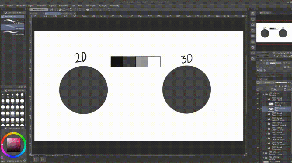
Although light and shadow are also used for flat drawings, they do not provide great depth, but speaking of 3D drawings it is necessary to give the three-dimensional sensation to a 2D plane by applying light and shadow correctly. More than anything, it is required to give the impression of images that jump to reality, we achieve this by using a game of shadows and lights.
Light allows us to see contours, textures and colours, in this sense we have: direct light, reflected light.
DIRECT LIGHT: It comes from a light source with its own light energy, such as sunlight, light bulbs, flashlights, etc.
REFLECTED LIGHT: Also called indirect light, it is a type of light that comes from the body, it does not have light itself, but rather receives light from another because the light reflects it.
As for shadows, remember that they are responsible for giving volume to the painting. They are divided into: proper, reflexive and predictive. Here is a brief description:
PROPER SHADOW: This means that it is the area where the light cannot reach directly, it is the area of twilight, and the color is usually darker.
PROJECTED SHADOW: It is the shadow that the object reflects on the surface where the object is located. This shadow has the characteristics that the part furthest from the object is diffuse and the closest is dark and hard.
REFLECTED SHADOW: It is the shadow projected by an object on another object, that is, they are neighbouring objects and are generated under reflected light. This is best understood by placing an object of a different colour. The light that the secondary object reflects on the primary object will be proportional to its own colour. All objects reflect their colour, including skin (explained below).
To shade a drawing, it is important to know which elements to reflect. For this, there are two types of lighting: natural and artificial. These lights are relevant to a quality of the skin explained later.
NATURAL LIGHT: This is the light reflected by the Sun or the Moon. Since the light source is far away, it travels parallel, in a straight line. It is projected onto the object at a 45º angle and has the same shape and extension as the illuminated object.
ARTIFICIAL LIGHT: It is the electric light projected by electric lamps, lanterns, candles or light bulbs, and it propagates in straight and radial directions. The projection on the subject is not an angular projection and gives a wider and thinner shape to the subject.
► Paint skin
With the above in our memory we can now learn how to paint skin. I will use a sphere to explain it.
What we need to do first is to determine where the light will come from so that we know where the shadows will be, and thus, apply the structure of light and shadow described above. Then apply the base color. After it is applied, we will create a "New Layer" in "Flatten to Layer Below" mode. On this layer you will apply with the airbrush at a low opacity some small green and reddish spots. Use the blur tool to make them diffuse. This is to simulate the internal processes of the skin, which I explain below. This step is optional.
Above the above we will create another layer in "Flatten to layer below" mode and change the blending mode to "Multiply". This is where we will apply the shadows with the same base color. Because it is in multiply mode, the base color will now look darker. It is not essential to put the layer in multiply mode, you can also do it yourself by choosing a dark color, but it is easier this way. Once the shadow is applied, in a layer above it in "Flatten to layer below" mode we will place the lights and blend everything homogeneously. With the information from the first section, if you know where the light comes from, you know where the shadows are.
Once the above is finished, now it is time to place the brightness of the direct light, you place it at the point of greatest light using the airbrush. Use a light color. If you feel that it is too bright, lower the opacity of the layer.
Next, I added another layer in "Flatten to Layer Below" mode where I will place the texture of the pores (textures are explained a few sections below). To do this, I took a brush with a grainy texture, using a dark brown and a medium brush size, and applied the texture all over the sphere. I lowered the opacity of the layer so that the pores would not be so intensely visible.
As a last step, I placed a layer in "Flatten to Layer Below" mode and changed the "Layer Mode" to "Overlay". On this layer I applied a vivid saturated orange color with the airbrush at the limit of light and shadow. I blurred it a little. To give it realism, normally if you look at the limits of light and shadow there is a small saturation line.
Note: All layers in "Flatten to Layer Below" mode are referenced to the base color layer.
Done, we now know how to paint skin!!! If you notice, we followed the instructions explained in the section on lights and shadows.
► Skin tones
• COLOR THEORY
With color theory we can get non-human skin colors. Unfortunately, I'm not going to explain the whole color theory because it would be a very long explanation, but I'm going to tell you the main things you can do in Clip Studio when lighting.
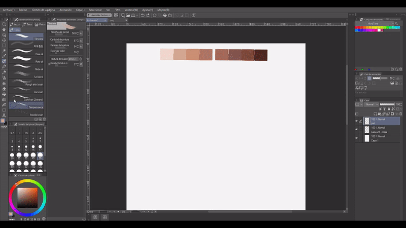
First, you need to consider the average local skin tone. This color is defined as areas where shadows, midtones, highlights or reflections remain unchanged. In a simple way, this is what we call a person's "skin color", namely black, white and brown.
Second, to get a gradient scale it is important not to move to black or white because the result is grayish, not natural. It is best to choose the colors diagonally, delimit the center and in a curve.
• EYE DROPPER
Human skin has many colors, from dark brown to almost white. So the question is, what values do I use to get realistic and decent skin? Well, here is the magic and simple technique: An eye dropper and a reference.
To get a realistic skin tone, nothing is easier than clicking a photo. So, take high-quality images, references. Look for extreme values when sampling: look for the brightest and darkest spots. There is good tone under the hair or under the chin; on the cheeks, nose and forehead, you can find bright areas; find another place to sample the midtones.
• COLOR MAPS
Color maps are a table with different gradients or random colors. You can get these in the Clip Studio store.
To get the map in Clip Studio, it's very easy to go to the store, download the desired map, go to materials, download them, grab the map and drag it to the color palette. Ready, enjoy the map. Below I leave a GIF with the process.

► Skin qualities
Skin reflects colors. If you take a lighted object and place it close to skin, the skin will reflect the color of the object. This was explained at the beginning of the tutorial where we talked about reflected shadow. The colors of the environment are constantly being reflected by our skin, which is why when painting skin, understanding ambient light becomes an important factor. Incorporate adjacent colors to add realism to your work.
This is an example of ambient colors. The skin is in a purple environment, so the skin takes on a small shade of the color of the environment next to it, in this case the background, which is the closest environment. Looking at the example below you can see how the sphere on the left does not blend into the background, it floats above it, while the one on the right does.
Another characteristic of the skin is that when you place, for example, a finger over a lamp, you notice that the corners of the mouth become reddish and translucent. This happens at the edges of the skin because there are countless capillaries that carry blood through the skin. With the power of the light, the skin becomes somewhat translucent and the dominant red of the blood is visible.
That is why when you paint skin with a light source immediately next to that part, you have to make it translucent to increase realism and consistency. This characteristic is common with artificial light.
The transparency will appear according to the amount of light supplied. The example above is with a less intense light, we could say more distant. The colors are not as vivid. While the one below is with a light close to the skin. The transparency increases. The colors become vivid. These reddish, orange and brown colors are taken from the transparency that denotes the internal structure of the body with its colors that overlap with the light that was placed.
► Internal and external textures
INTERNAL
In the matrix of our skin, it's not about how light or dark it is, but what color is placed beneath the surface of the skin and affects the overall quality of the tone. Whether we have very light, medium or dark skin, our skin can have a cool, warm or neutral tone.
Cool undertone: Flashes of pink, violet or blue coloring, flushed complexion.
Warm undertone: Skin turns yellow, peach or gold colors.
Neutral undertone: No obvious pink or blue skin tones.
Adding these colors is optional. But if you're looking for a more realistic effect, well, the solution is to paint these colors softly on the skin.
• RED AND YELLOW UNDERTONES
Because of the blood flowing beneath the skin, you'll notice that the red shows up clearly. Just look at your hand to see. White skins show up more clearly. To give it a better look, it is good to put a little of these colors in some parts.
• BLUE AND GREEN UNDERTONES
Also, if you look at your hand carefully under a not-too-strong light, you will notice that there are some green and blue tones, this is due to the veins that are close to the surface.
You can achieve this effect by applying the color with the airbrush and then blending it until you are satisfied.
This is a process to create the illusion of veins on the skin.
After you have the skin painted you will place the vein figure on a layer above with a hard brush, then on a layer above the previous one you will place the green, blue and red tones, using the airbrush. You will blend these colors until you are satisfied. Finally, go back to the layer where you painted the vein, there with the help of the soft eraser erase and soften some parts of the vein.
Something else you need to know about veins is that they change color depending on your skin tone. They are classified as follows:
WARM: Green or olive veins. Skin with yellow and peach tones.
COOL: Purple or blue veins. Skin with pink, red or blue tones.
NEUTRAL: Green or blue veins. Skin with pink, red and blue or yellow, gold and peach tones.
EXTERNAL
External textures are what I call everything that has and can happen to the skin that is visible to the naked eye. Some of them are pores, wounds, moles, freckles and folds.
• PORES
Pores are very easy to place. Pores, although they are everywhere, are clearly visible in places where there is light hitting the skin. Put them all over the skin if you like the result or just in some places. To place them alone you have to take a brush with small dots; applying them with a light or dark color according to the tone of the skin, increasing the size to what you consider correct.
• MOLES
For the moles, simply draw a dark brown spot and then use the Blur tool to soften the edges.
• FRECKLES
Use a hard round brush to apply small dots on the face. Small, not very noticeable dots (I recommend lowering the opacity of the brush to avoid pressure errors). Alternate a color between saturated and unsaturated brown. Freckles are not all the same shade. Finally, use the Soft Eraser tool to soften some freckles if you want less noticeable freckles, but if you want more obvious ones you can play with the opacity of the layer. I recommend doing this on a new layer above the skin, so as not to damage the skin when you make any changes to the texture.
► Let's apply what we have learned
• SKETCHING AND LIGHT SOURCE
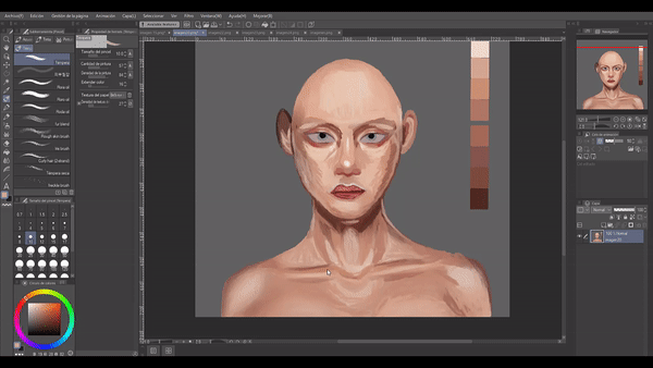
Let's start with the sketch. All we really need is a basic face. To do this, first draw the basic lines of the face clearly. Before moving on to applying the color we have to determine where the light will enter, this is a matter of personal taste, so on this occasion I will use a light that has a frontal input.
• GENERAL COLORS, LIGHTS AND SHADOWS
Use a hard round brush to fill in the base color of the painting. Use the blending modes I explained in the section on how to paint skin. This saves you from having to use such a large color palette. Blending modes add, subtract, divide and multiply colors. For more information, consult a specialized tutorial.
• PARTICULAR LIGHTS AND SHADOWS
After blending the spots, as a next step I set a "New Layer" in "Flatten to Layer Below" mode above the base color to use a solid brush with a size convenient to the application site. Finally, with the brush I define the light and shadow areas more strongly, but still in a general way. To make a good drawing and painting you always have to start from the general to the particular. Here I no longer respect the lines of the sketch, I remove them and start outlining with the brush itself using the color closest to where the line was.
• MIXING
Now, finally, it's time to blend the colors. I start by mixing little by little to create a gradient across the skin. The technique I use is the eyedropper, although I also use blurring, I only use it to soften certain areas and degrade colors.
• EYE DETAILS
The eyelids, eyelashes and skin lines are where shadows are generated underneath because these same ones limit the light that reaches them. While in the rest you will find brighter colors. In the tear duct and below where it is reflected, the light bounces giving clarity to that area.
(I make the eyes in a separate layer above what has already been done)
• DETAILS FOR THE NOSE
The nose, the highest part of the face, is where the light hits directly, so the lateral parts are in shadow or with a slight shadow. If you break down a nose into its simplest factors, you will notice that it is primarily like a rectangular prism cut in half and at the tip there are three superimposed spheres that give the sensation of a peak and width on the sides. This final part has more light in the central circle and shadow in the lateral circles.
(I do the nose on a separate layer above what has already been done)
• MOUTH DETAILS
The shadows of the mouth, on the other hand, are those that are found before and after the lips, giving them their volume. Also on occasions, when you want to represent a smile, the facial muscles lengthen, resulting in a small shadow on the edge of the corner of the lips. The muscles in that part create a bulge that, as you can see represented in the sphere at the beginning, has its corresponding lights and shadows.
(I make the mouth on a separate layer above what has already been done)
• DETAILS FOR THE EARS
The ears, on the other hand, have a spiral of shadows that begin internally with the upper part of the ear and culminate in the center of it. The ears are illuminated as if they were two layers, first the deep one (the part that corresponds to the center) and the raised part (the sides). The parts that are raised that are indicated in points 1, 2 are the ones that receive direct light, while the rest have medium tones and shadows caused by the curvature of the ear itself. Below, in the drawing of the girl, I did not illuminate her ears in detail because I knew that they would later be covered with hair, but if you need it for practice or because the aesthetics of your illustration demands it, do it in detail.
(I do the ears on a separate layer above what I have already done)
Now it's time to fine-tune the shape. As you can see, the proportions and position of some of the facial features are wrong. For example, the eyes, which look like they're squinting; they're too close together. The ideal position is that there's a distance of one eye from the other. The same goes for the chin, which looks like it has more bone on one side than the other. And don't even mention the ears, which are higher than the facial canon dictates. They should be aligned with the eyes and have the same length from the eye to the tip of the nose.
It's better to notice these errors from the beginning so as not to waste time repainting the corrections, but well, I did it much later. A tool that will help us a lot to make these checks is "Selection > Lasso."
Now, let's see the result: Did it change a lot?
To know if we are applying a good contrast and we are allowing the shapes of each element to be distinguished, what we can do is create a new layer above everything, which we will paint black and change the blending mode from “Normal” to “Color”. We can activate and deactivate this layer as many times as necessary.
If the shapes are distinguished from each other in grayscale, it is because we are on the right track.
• FRECKLES
Finally, I added some freckles on the cheeks and nose using a smudge brush I found in the Clip Studio Assets. To apply them I chose a brown shade, then on a new layer I painted them. Now, I changed the opacity of this layer and changed the blending mode from “Normal” to “Multiply”. Done.
RESULT
Farewell
This is my first tutorial, I'm sorry for the poor production quality, I hope to improve in the future. Well, without anything to say:
Thanks for getting here! ପ(๑•̀ुᴗ•̀ु)* ॣ৳৸ᵃᵑᵏ Ꮍ৹੫ᵎ *ॣ
Users who liked this post


Comment