
If you mainly draw characters, sometimes you may find that adding a background is a hard task to do.
Usually, I always finish my art with a patterned background from clip studio assets. However, sometimes it is necessary to add a background. The perspective ruler tool saves my day! So I’m proud to share the whole working(or surviving) process with you as well.
In this tutorial, I will show you the basic steps of adding a perspective background to your drawing as the final touch using only basic knowledge of perspective.
Video tutorial
Step 1 Composition Design
Adding a background to character drawings also creates a story to the image.
But sometimes you might not plan for a background at the beginning of the drawing process.
(Don’t worry, you’re not alone in this)
First, setup the resolution for the image
The resolution also depends on the purpose of the image, such as the publishing platform or printing size.
Second, when you have picked the resolution, arrange the characters into the position that will allow it to be the focus. Here I use the basic ‘Rule of thirds’
Make a 3*3 grid cover the drawing and put the image focus on 1 (or 2) if the intersection point will make a good composition for the image.
You can feel that the focus of the rule will add more balance between the background and the character.
For more details about composition, check on the tutorial by TamilVolk. It’s very clear and easy to understand :
In this tutorial, I will use the landscape resolution for the size of 16:9 video screen
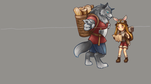
In the image is a lumberjack wolf, showing directions to a little bunny traveler.
So, basically, this scene is supposed to happen on the road.
If you do not use the Rule of thirds and put the character in the middle of the scene, you can simply add the perspective background with a vanishing point leading to the center to make the focus on the characters.
Without leading lines to the center, you may see the scene is not so focused. (This also depends on the actions of the characters)
when applying the Rule of thirds to the composition, you can see the scene is also telling the story more than focusing on the middle alone
For example, this shows where the bunny is walking to.
You can also add some details to represent more of a story. (optional)
When changing the focus, this will show what the bunny has just passed by
You can see how the story in the image can be told differently by just adjusting the composition in the image.
In this tutorial, I will use the top right focus on the grid.
Step 2 Perspective check on character
By nature, you already apply some perspective on your characters while drawing them by the view you look at them.
To apply the background after the finished characters, you must know how the perspective of your character is set.
Basic perspective components are:
Eye-level line (or horizon line)
Vanishing point
The eye level is the horizontal line when we look at the image, the eye level for the background that we are going to add must be the same as the eye level for the characters.
If we change the view of the character, you will see the eye level and character perspective changed.
Create the new canvas and put the characters in the focus composition we designed
If there is one more character, make separate folders for each.
Draw the eye-level line justified by the view of the characters. This will be the eye level of the whole image.
If you’re not confident about the perspective of characters, you can use the 3d models as a reference.
You can find the model in [Material panel > 3D > Body type]
Drag the model to the canvas, it will automatically appear in the middle.
Use the camera control to adjust the model into position
In the tool property, you can find the additional adjustment of the model.
You can adjust the body scale of the model to match your character.
After adjusting, you can see the model floating, place it on the floor using this icon.
Move the model near the drawing.
In the layer panel, click on the ruler icon.
The perspective ruler will automatically appear with the model
You can edit the ruler with the object tool, this will also change the perspective of the model.
Bring the model close to the character, make sure the eye level of the model is close to the eye level of drawing.
Optional: you can click on the model parts to adjust and check anatomy gestures.
Select on the character folder, then [Edit > Transform > Mesh Transformation]
Adjust the number of nodes on the tool property panel.
Adjust the nodes to correct the perspective of the character to match the model
Press [Enter] or click [OK] button to make the adjustment
Adjust both characters to make them more relative to the eye level of the overall perspective
Step 3 Layout design with box models
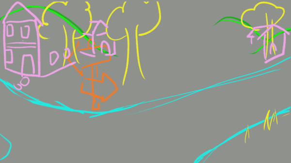
After adjusting the eye level and checked the perspective of the characters, do some quick sketching for the background
Here I add mountains, a road sign, trees, and buildings.
They’re what you would see on the road-side. If you have no idea what to add to the background, you can find some references of background composites from the internet.
(This is not related to the perspective at all, just decide where to put the things in the image)
Set up the perspective ruler, start by creating a new layer, and draw a box over the bigger character.
Then in the ruler tool, select the [perspective ruler]
Click and drag on the box side to make the vanishing point
You must click and drag again on another side to create 1 vanishing point.
The blue horizon line will appear after making the first vanishing point. This is the eye level that will be used for the whole image.
Also, it’s adjustable with [Object tool]
Create another vanishing point, it will snap to the eye-level line when you drag the line near.
The perspective ruler is ready to use!
Let’s start with the building.
Create a new layer and draw the projection line from the height of the characters to the building direction.
The line will snap on the ruler we created if we draw in the direction of the vanishing point.
Any stroke you make will snap to the ruler.
If you don’t want the snapping, toggle disable the [snap to ruler].
This will be the character’s height if he stands in the position where we are going to put the building
Draw a box that relates to the height of the character, also draw the door to help to estimate the box height.
Draw another box stacking on the top, to create the second floor.
Do the same with the house on the other side
To avoid confusion, sketch the clean box again on a new layer without projection lines
Repeat the steps with other objects, make them into a clear box shape
(also use the color changed to avoid confusion)
Note: some objects like the road and mountain are not always in a block shape. Just draw them relative to the ruler.
When the boxes are ready, fill them with details,
Create a new vector layer, I recommend using the vector layer to fill the details because it’s easy to remove the unwanted lines (make sure your eraser is enabling the vector eraser mode)
Then draw the house, I used fairy tale references from the internet to create a simple house.
For the details of the second floor, draw a line under the window.
Then use the object tool to move the line up to the second floor, click and hold [shift] and move the line.
With this, you can create a window for the second floor with the correct position.
There will also be some shapes that are unrelated to the perspective ruler we made
For example, for the gable, draw the height up at the middle of one side of the house block
Select the perspective ruler with [Add vanishing point]
Select the ruler layer
Now you can add a new vanishing point without creating a new horizon line (eye level)
You can delete it later by selecting the [Delete vanishing point] and clicking on the ruler
Note: you can add many vanishing points, but the snap will be more complicated to control, I recommend deleting the additional vanishing points after use
Toggle [snap to ruler] off to draw the straw roof
Note2: you can also toggle snap to the ruler on/off by selecting ruler with [Object] tool and check on [Snap]
(the ruler will become green when disabling snap by default setting)
For some objects it is less complicated, just draw it without snapping on a new vector layer, using the block we created as perspective reference.
Also, name the layers and order them by the front > top to avoid confusion
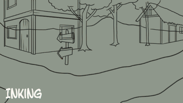
Final ink result + process
Step 4 Finishing the background in your style
When you add the background later, sometimes you may see it take the focus from your artwork.
Color choices or painting with less detail will help to focus more on the character.
In this tutorial, I will make the background with the inkless style so the focus can be directed to the inked characters.
If you do not get used to background painting, sometimes color choices for the overall image may become a hard task for you. So I paint it with grayscale to make it adjustable.
Create a new raster layer for the grayscale
You can simply pick the grayscale level from the standard color set.
Use the [Refer other layers] fill tool with area scaling a bit larger than the ink line, this will avoid the blank area between the ink line when removing the ink layer later.
Hide the other ink layers and fill the flat color to each part.
When hiding the ink layer, you can see the color has filled the area with no gaps between each part.
Repeat the steps with the other ink layers.
(hide the finished layer when it is done to avoid confusion)
Also, group each part in folders.
Next, set the direction of light to the image, here I want daylight noon.
Create a new multiply layer above the folder for the shadow direction.
And paint the shadow above the object with gray color
Clip the shadow layer to the folder to avoid leaking into other areas.
Repeat it with each part. You will be able to control the light direction of the overall image.
To fill color, create a new layer and clip it to the gray layer.
Then, Select color and fill it on the clip layer with [Alt]+[Delete]
Adjust the layer mode to [Overlay] to make the color blend with the gray level.
Repeat steps to each part.
Add more detailed touches to the image with textured brushes.
For me, I love to use the standard realistic brush set [Rough wash]. You can find it under [Brush] subtool
I pick around 3 shadings to paint on one area, the light, shadow, and base color.
Create a new clipping layer over the base color, then paint over the area. This will give a textured look to the surface.
To give the street a natural look, I also add a new layer and paint over the edges.
Also, paint some ground textures.
result
For the building, instead of hiding the ink layer, reduce the opacity of the ink layer so you can still see the detail.
And paint on a new layer, over the ink layer.
I use the [Oil paint flat] blush to make it look like oil painting art.
And also add the aged texture with [Rough wash] brush
For the straw roof, use [Watercolor] brush
The very easy background is almost finished
Fill in additional details by creating a new layer above the layer folder and shadow clipping layer to add paint-over details between each layer folder. (do not clip the layer)
Tips: I also added little grass details by painting it with [Darker pencil]
Create a new multiply layer above all the layers for additional overall shadows
And the background is done!
Process summary :
Here is the conclusion for the standard brushes I used (and where to find them)
You can also find many interesting brushes on Clipstudio Assets ^_^
Step 5 Final touch with light and effect
When the background is done, you may see that the characters are not yet getting along so well with the background.
I will use the layer blending mode and correction layer to adjust it.
Group the background layer into one folder.
Adjust the color tone of the background with a correction layer
Here I use the Hue/Saturation/Luminosity mode for color tone.
I dim the lights down to give it a more natural look
If the correction layer is too bold, you can adjust opacity for less effects shown.
Note :
You can edit the adjustment of the layer effect by double-clicking on the layer thumbnail.
The correction layer will only take effect for the layers under it only.
Add highlights and shadows to the characters with [Add(Glow)] and [Multiply layer]
(make sure you add it relative to the light direction set for the image)
Tips: A bit grayish-yellow will give it a soft daylight effect with the [Add(Glow)] layer.
And also mild shadow effect on a multiply layer.
Paint the light and shadow with the soft airbrush tool
And paint the highlight with the watercolor brush
Paint the blue ambient light to add depth into the background with the airbrush on [Normal] mode layer
And also add additional glow on the objects that the light shines on
Finish!!
I hope this tutorial helps you with the background painting.
Good luck and have fun with the perspective ruler!!
Users who liked this post


Comment