
Presentation
They say that the best gifts are those that you make yourself, which is why this Christmas season I will show you my various ways to create Christmas cards, especially different tools so that with your imagination you can create whatever you want.
► Christmas Colors
This time of year is marked by the characteristic Christmas colors. These colors are those that emerge from the plants of the season, so Christmas cards form their aesthetics based on these colors.
I recommend looking on the internet for references to various lustrations or palettes from this era. Normally, the colors that predominate most at Christmas are the range of reds, oranges, browns and greens, as well as pastels that tend to be very versatile regardless of the season.
When choosing different shades, it is recommended to take them from the color wheel in one of the following two ways to ensure color harmony:
✱ ANALOGOUS COLORS
Analogous colors are neighbors on the color wheel, which have a common tone. This situation is very common in nature, it may be the most common harmonious combination of colors.
✱ COMPLEMENTARY COLORS
Complementary colors are the opposites of a color. To achieve them we will have to draw a line that crosses the center of the circle until it meets the color on the other side.
► Decorations
Now that we have an idea about the Christmas colors, it's time to make the decorative figurines for the cards.
★ The first step for any type of decoration is to make a sketch of the desired objects. Below are a few lineart figures that I will use for Christmas cards. It can be any figure, be it a reindeer, a Santa, bears or anything you imagine for Christmas.
I made the lineart of these figures in a vector layer because the functions of this tool allow me to modify the line.
★ The second universal step for any drawing style is to place the basic colors. Then, add the shadows, the details and finally the textures that you want to apply. To place the base colors, create a normal layer above the vector layer.

★ The third step would be to place the shadows, the figures do not have to be super detailed, well, most Christmas cards are not; That touch of innocence and warmth are what characterizes them. My favorite brush that I use for any style and that never fails to give texture is a brush that comes by default in the program, the "Tempera".
★ As a fourth step, it is time to place the details of the figurines; eyes, mouths, folds, etc. This is done with any figure, more details can be added, it all depends on the level of realism desired.
The following GIF contains the complete process, I drew some darker red folds on the bun; I added some eyes, buttons and sugar decorations to the cookie, to the sock just short, messy lines with the tempera brush and to the candy cane some extra lines.

✱ GINGER COOKIES
To give a cookie effect to any figure is very simple. First we duplicate the figure layer and place it below the original layer. Then, on the duplicate layer, we make the shape larger, enough to leave a border around the entire original shape.
Now you have to change the color of the duplicated and enlarged layer of each figure to an opaque brown, so that it begins to take the shape of a cookie.
And finally, I placed a pattern to give the cookies texture. To do this, use an image material that comes by default in Clip Studio, particularly those in the "Color patterm" section, because these have a porous texture, ideal for representing the porosity of a cookie.
Drag the material onto the layer, place it above the layer where the dull brown shapes are, and snap it to the layer below to restrict the pattern to just the shape area.
Now we have to change the color of the texture, to do this we have to click on the blue box found in the layer options.
A pop-up window will appear where we can choose a color, in this case brown.
This is the final result of the gingerbread cookies, as you can see, to the front of the cookies I also added a pattern the same as I put in the previous one, but this time anchoring the layer of the material to the layer of the original figures. Below is a GIF with the complete process.

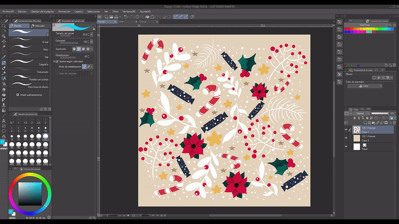
► Patterns
Another decoration that can be added to Christmas cards is patterns. They are easy to make. The first thing is to create a new canvas where we will draw the figures, all the figures we want in the pattern. To draw them I used the "G Pen" and "Meru Pen" because of their characteristics of changing the thickness of the line when drawing according to the pressure. The background has to be transparent, but to better orient yourself you can generate a new layer underneath where you can place a base color, this layer does not matter because in the end it will be discarded.
It's time to arrange the figures. You can also fill the empty spaces with small figurines, as seen in the GIF below.
The drawings are duplicated as required and with the transformation tool we can rotate or change the size of the shapes. Use this purple square to guide me inside the square of the layer itself.
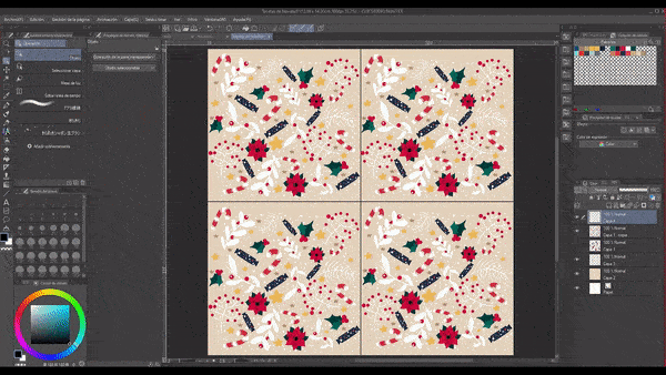
For the next step we will unify all the layers that were created in the process of arranging the figures, joining them all. In the end there only has to be a single layer left and that layer must be duplicated 4 more times.
Once the four copies have been created, we will make them invisible along with the original and the next thing will be to draw a cross on a new layer that covers the entire sheet and is symmetrical. To achieve this, you can use the rules.
When the cross is already produced, one of the copies must be made visible and using the transformation on that layer we are going to move it to quadrant one of the cross, reducing the size in such a way that that layer is attached only to that quadrant. For better understanding, look at the following GIF carefully.
The same will be done with the other three copies, one in each quadrant.
Afterwards, we will fill in the empty spaces that are on the outline of the sheet and those that are in the cross.
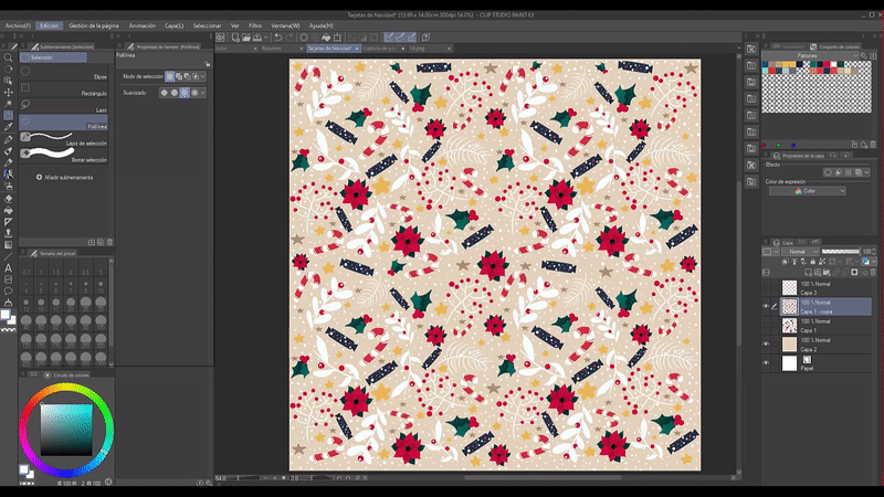
As a final step we will go to the upper options bar by clicking on Edit > Register Material > Image. At this point, the drawn patterns have to all be on the same layer.
The pop-up window will be the material properties window where we will name the material and select the "Paste Operation" > Motif and choose the save location. This option makes it possible for the illustration to become an infinite pattern material to be used in any circumstance. All you have to do is drag the material from where it has been saved to the layer where you want to use it.
It is required to use the same procedure for simple cyclic patterns. For this other pattern, use the "grid" function with a frame size of six.
Next, draw a diamond pattern made up of smaller diamonds with a couple of variations on the color composition.
The trick to get the easiest pattern without having to duplicate the layer and fill in the empty spaces that remain is to make half of the top rhombus the same as the one left in the bottom rhombus. To do this, you have to cut out a rectangle from the rhombuses, making each half match the color of the opposite half as seen in the image below.
The rest of the steps are the same as the previous one, you have to go to Edit > Register Material > Image. Ready, a new pattern created.
► Typography
Another characteristic of Christmas cards is their beautiful messages made with different types of fonts. Clip Studio comes by default with a large number of fonts whose shape, size and color can be edited; What I will teach you to do will be letters with textures and multiple colors.
★ METHOD ONE
For this you have to place a text and duplicate it. The copy must then be below the original layer. Next, it should be offset up/down or to the sides depending on the focus you want to give it.
Now we change the color of the letter of the copy and the original to contrast. While you're at it, change the background to something nicer.
★ METHOD TWO
For this other option you have to draw a decoration with several colors. I made the decoration on a layer below the letters, the letter layer has to have a low opacity so that when drawing the color shapes, I know where to place them.
For the next step you have to lower the letters layer below the colors layer and raise the opacity.
Then, you have to "Adjust to the bottom layer" the color layer.
★ METHOD THREE
This method is similar to the previous one, only now a texture is added. Like the previous one, we are going to draw some figures with colors below the letters. And then, you have to upload the colors layer and anchor it to the layer below.
The next thing is to unify the color layer with the letter layer and then drag a texture from the materials to a layer above.
As in the previous textures we are going to change the color, to do this we have to click on the blue box found in the layer options.
Finally, I modulated the opacity of the layer to adjust the texture and that's it.
With these three methods you can make endless combinations for Christmas cards, such as using the rhombus pattern to decorate the letters.
★ METHOD FOUR
The last way to decorate the letters, which is the simplest, but does not deserve to be ignored, is: drawing shapes on the letters. As you can see in the illustration below, draw some dots around the letters with the "Dot G" brush.
► Aesthetics
Finally, it's time to unify all of the above into a single Christmas card.
★ DIMENSIONS
To begin the creation of these beautiful Christmas cards we have to establish the dimensions and characteristics. Because it is not a typical illustration, the size is smaller and the resolution is intermediate. These features work for both printed and digital cards.
1 - The first thing is to create a new project to which we will change the unit from px to cm, this to make it easier to use the measurements having as reference the dimensions in centimeters of a sheet for printing.
2 - Afterwards, the basic canvas characteristics are modified as follows: width 14 cm, height 15 cm, with a resolution of 300.
These are just reference measurements that can be modified at your own discretion according to your needs.
★ COMPOSITION
Composing a Christmas card is easy because it is based on a very simple concept; the message and the striking figures go in the center. On the periphery there can also be decorations that are in accordance with the harmony of the central message. To help balance the composition I recommend using the rule of thirds scheme. This rule says that where the rectangle delimited by the intersection points of the axes is located, the most important thing is drawn. In conclusion, the center.
For this card I arranged the message in the center along with the larger figure and then I added the decorations, in this case the glitter and the lights. On one layer I made the Sketch of the deer, on another layer above I filled the figure with solid colors without applying shadows, while on a new layer I drew the lights above the antlers; On a layer behind I put a blue background and placed some glitter that I had previously drawn, decorating the empty spaces with dots, stars and hearts. Finally, I placed the message in the center of the antlers.
Farewell
Christmas cards are so much fun to draw and it's even better when you give them to someone you love. That's it with this Christmas TIP.
Well, without anything to say, thank you for coming this far! ପ(๑•̀ुᴗ•̀ु) ॣ৳৸ᵃᵑᵏ Ꮍ৹੫ᵎ ॣ
Vibrate high!!! We won't see you another time ( •⌄• ू ) ✧
Users who liked this post


Comment