
Presentation
In this quick TIPS of the month I'll show you everything you need to create color palettes for any kind of illustration using Clip Studio Paint's new "Color Mix" feature and other tools in the program. The first part covers color theory, but don't worry, it won't be tedious, it's simple concepts; the second part will be an explanation of how to use some of the program's tools to make color palettes. Well, that's all there is to it.
Let's get started!!
Color mixing palette
I'll start by explaining where to find this tool and its functions because I'll use it to explain color mixing and you can also use it to practice color theory.
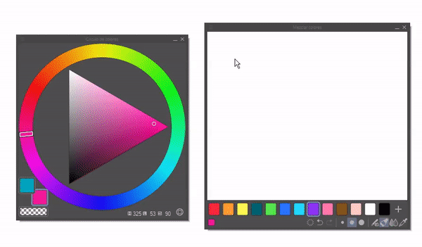
To see the mixing palette, go to the Window > Mix Colors menu.
The functions that this window has are the following:
1. Menu where you can reset the default parameters and background color.
2. The currently selected color is displayed.
3. Clear.
4. Undo and Redo.
5. Brush size.
6. Uses the same subtool as on the canvas.
7. Paintbrush.
8. Color mixing.
9. Eyedropper.
10. Default color set.
1. Theory
► RYB Model
To start, we must know that there are three color models: RGB, RYB, and CMYK. In our case, we will talk about the RYB model because we plan to imitate the analog process using the *"Mix colors" tool. This function can help us make the color selection process more intuitive. This model is based on mixing colors through light. The primary colors are red, blue, and green. By mixing these three colors, we can obtain the final color spectrum. We will use this model because it also works for cell phone and computer screens, which is why it is used to work on digital media.
If you look closely, you will notice that the model that Clip Studio uses is CMYK for its color wheel, and this is due to how digital devices process colors. But that will not be a problem. That is why we are learning color theory. With this knowledge, we will be able to have total mastery of color.
• PRIMARY COLORS
Primary colors are those that cannot be obtained by mixing them with other colors. By mixing them, secondary colors can be obtained, and finally, by mixing primary colors with secondary colors, tertiary colors can be obtained. For the RYB model, the primary colors are yellow, red, and blue.
• SECONDARY COLORS
As you read in the previous paragraph, secondary colors are the result of combining primary colors with each other.
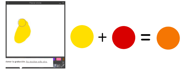
The combination of yellow and red results in the color orange.
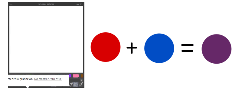
The combination of red and blue results in the color violet.
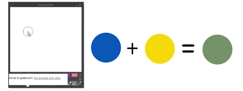
The combination of yellow and blue results in the color green.
• TERTIARY COLORS
Tertiary colors are created by combining primary and secondary colors.
The color wheel below is the conventional representation of this model. I advise you to practice combining colors as I explained above, this will help you understand and memorize the process from which colors are born. It will be useful to use the "Color Mixture" tool because it is practical for combining colors.
Tertiary colors are located between the colors that created them, in this case, the primary and secondary colors that originated them. The combinations are:
YellowOrange=Yellow-Orange
OrangeRed=Red-Orange
RedViolet=Red-Violet
VioletBlue=Blue-Violet
BlueGreen=Blue-Green
GreenYellow=Yellow-Green
To recap, first we create a triangle where at each vertex we place a primary color, then we invert the triangle and on these new edges we place the secondary colors, finally between the spaces between the primary and secondary colors we place the tertiary colors, that's how simple we have our color wheel.
► Color properties
• BRIGHTNESS
Brightness is the proportion or levels of white or black that degrade a color. The higher the percentage of white, the lighter or brighter the color will be, while the higher the percentage of black, the darker it will be.
• SATURATION
Saturation is the degree of purity of a color, it defines its intensity. It is determined by the amount of gray it contains; the more gray, the less saturation it has, and the less gray, the more saturated it will be.
► Color classification
Colors can be classified as cool and warm, this classification is based on color psychology according to what they transmit to people. The reason they are known by that name is because they are visually associated with a low or high temperature. They are usually represented as a division in half of the chromatic circle.
• WARM COLORS
These colors transmit sensations of high temperatures. Warm colors are those that go from red to yellow. These colors transmit to the viewer the sensations of enthusiasm, passion, joy, love, energy, warmth, etc. They can also represent a time of year such as autumn.
• COLD COLORS
In contrast, we have cold colors. These colors transmit sensations of low temperatures. Cold colors are those that range from blue to green, along with purple. Blue is the color that is most closely related to cold tones, which, if present in other tones, helps to make it feel colder. The more blue a color has, the colder it will be. Cold colors are the tones of winter, of the night, of the sea, lakes, tranquility, calm, solitude, serenity, sadness, the night, winter, etc.
► Color harmonies
We tend to expect to find a series of combinations in nature and in illustrations that we innately like more than others. In this way, when a multitude of similar colors appear in the scene, we will feel more comfortable than when there is a confusing mixture of several disparate colors. For this reason, it is good to know the color harmonies; by using them correctly, we can create palettes that give credibility to our illustrations.
• COMPLEMENTARY
Complementary colors are those that are opposite on the chromatic circle; this combination causes a contrast. This harmony can be used to contrast the figure with the background, also, to contrast opposing ideas.
• ANALOGUES
Analogous harmony is formed by the implementation of colours that are close together on the chromatic circle. Because of their proximity, they combine well with each other. Like blue, violet and pink, which are found sequentially close to each other on the circle.
• MONOCHROMATIC
To create palettes with this harmony, all colours are derived from a single colour from which the various variations of luminosity and saturation are used. Different neutral greys can also be added.
2. Tools for creating color palettes
Clip Studio has a few functions that will help us visualize the colors with which we will create our color palettes. In essence, the functions are similar and are designed to make it easy to choose colors without having to combine the colors manually. The last function is the only one that is designed to be able to mix colors manually. Now we will look at each function.
First, we need to know where these tools are. To access them, we will go to: Window > The options will be from Color Wheel to Mix Colors.
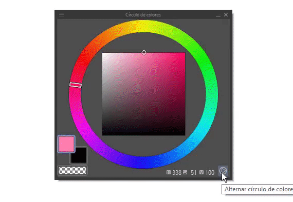
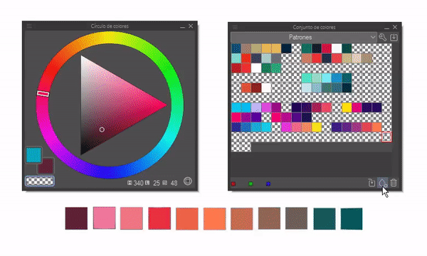
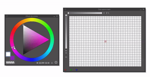
► Color circle
You already know the color wheel, and at the beginning of this TIP I explained how these colors are created and how to master them. The Clip Studio circle uses the CMYK model to guide colors, but once you know the basics, the model doesn't matter. In addition, we can set the circle in two different ways: in HSV or HLS color space. To do this, just click on the circle at the bottom right.
By clicking on the color icons we can access the functions of different color displays, the color sets we have created and the color history. The disadvantage is that you cannot work with this pop-up window while painting, you just choose the color you want, then close it, but don't worry, this does not happen in the following tools.
► Color slider
We will start with this function. This tool allows us to change the color model between RGB, HLS and CMYK. With this tool we can get the luminosity, saturation or tones of a color that is selected from the color wheel. The first color icon corresponds to the primary color, the second to the secondary color and the third is transparency (if the brush is used it acts as an eraser).
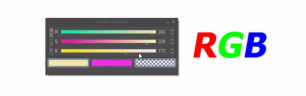
RGB, HLS and CMYK are models used in digital media because that is the way devices process colors. The primary colors for each model are:
1. RGB: Red, Green and Blue.
2. HLS: Hue, Saturation, Lightness.
3. CMYK: Cyan, Magenta and Black.
From the color differences of these three models, you can get various color palettes like the following ones that were born from a color (in this case orange) and based on that create different palettes depending on the interpretation of the different models.
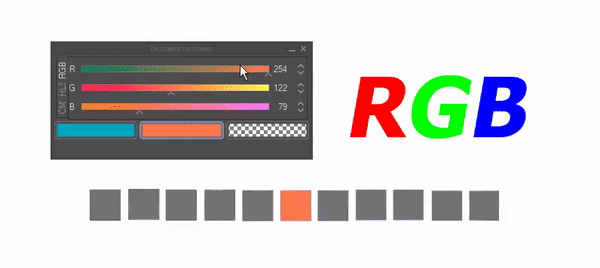
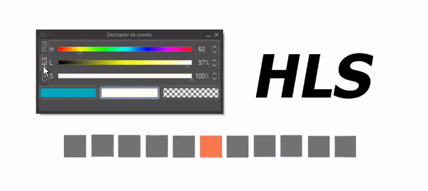
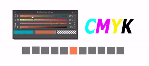
All three palettes have a single origin, orange, and regardless of the model, in all three cases harmonious results were obtained. Now you know that you can use this tool to easily create palettes from one or more colors.
► Color set
This tool is super important because it allows us to save the color palettes we want. At the bottom right there are three functions that serve to: Replace color, add color, remove color that allows us to fill and organize the color palette we want to create. I use this function to store color palettes that I have created and want to keep for later reuse.
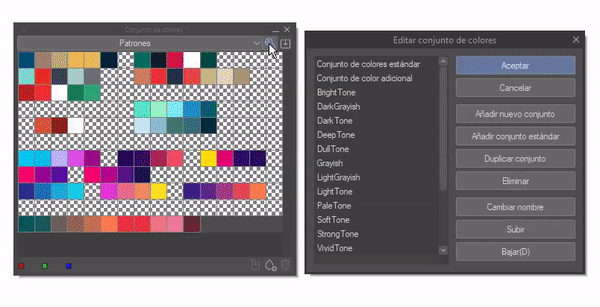
To create a new color set, click on the wrench located at the top right. When you click, the following window will appear where various options will appear to create, modify, duplicate or delete a set.
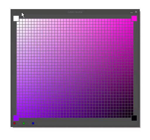
► Neutral and approximate color
• NEUTRAL COLOR
This function also allows you to obtain the luminosity and saturation of a color or colors selected from the color wheel, depending on the colors you place in the reference boxes. The larger boxes at each vertex (reference boxes) can have their color changed to make combinations without having to mix the colors manually, as explained in the luminosity and saturation section.
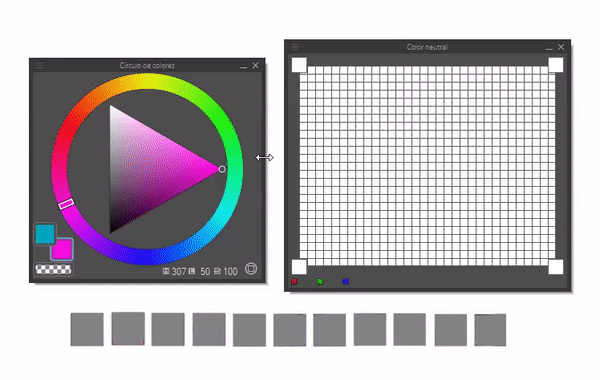
By clicking on the three stripes at the top left, you can access functions that will allow you to change the grid size, remove the grid, and hide the neutral color.
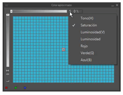
• APPROXIMATE COLOR
This is specifically used to obtain an approximate color for your selected color. With the bars on the left and top left you can modify the gray and white levels to measure the level of the functions you choose. This window has seven functions that you can access by clicking on the letter that appears next to each bar.
The elements that we can use as parameters to change the values of the two variables (bars) are:
0. Hue (H)
1. Saturation (S)
2. Lightness (V)
3. Luminance (L)
4. Red (R)
4. Green (G)
5. Blue (B)
Each of these elements has already been analyzed in the theory section, so we know what effect they have on the color when applied. We can make combinations between the bars such as: Hue (H) and Green (G). This is another way to obtain colors for our color palettes.
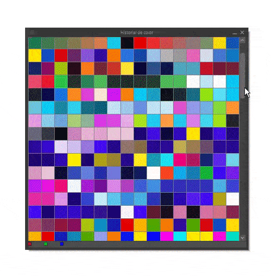
► Color History
This tool displays the colors that have been used in the application. This is good for when you want to repeat a color that was not saved in any color set.
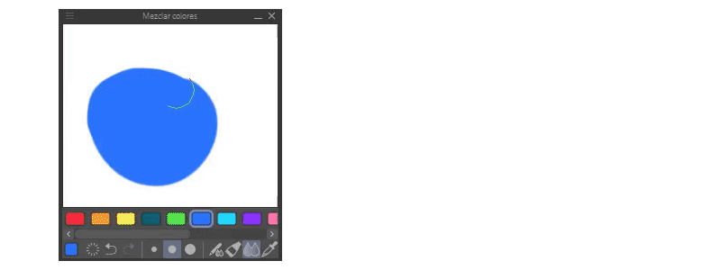
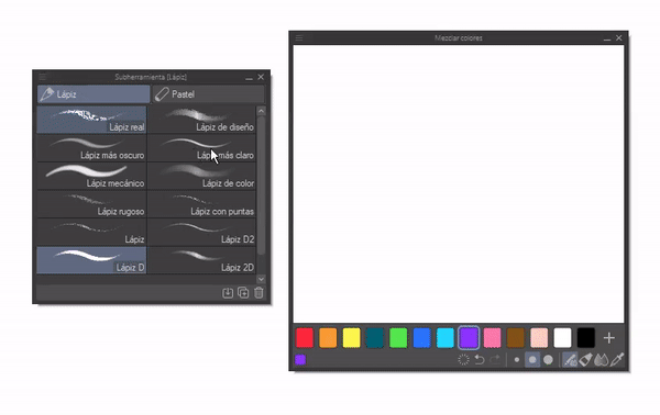
► Mix colors
This tool is the one I showed at the beginning and with it you can mix colors to generate new ones completely manually, just as you would do with traditional analog media.
You can also use different brushes to blend, change brush size, do, undo and erase.
Farewell
I hope you like what you've seen in this tutorial. I hope it helps you. Well, without anything to say, thanks for getting here! ପ(๑•̀ुᴗ•̀ु) ॣ৳৸ᵃᵑᵏ Ꮍ৹੫ᵎ ॣ
Vibrate high!!! See you later ( •⌄• ू ) ✧
Users who liked this post


Comment