
Throughout years of doing illustrations, I’ve picked up some fun and helpful tips and tricks when coloring my illustrations. At a glance, these tips might look like something simple or insignificant but these small things, once added up, are actually very crucial in making the final piece shines. You might even actually have done these things before without noticing!
Let’s go through each stage in the coloring process.
I've done a video for these tips and tricks as well so do check it out!
The base color
Let’s begin with the earliest stage of coloring: the base color. I won’t take long for this part since my base-coloring technique is pretty simple and basic. Since I usually don’t lineart my drawing and directly use my sketch, the lines are not the neatest to work with.
So, what I usually do is:
1. Create a new layer underneath the sketch (name the layer, for safety).
2. Use the pen tool to trace the section of the sketch you wish to fill in (e.g.: hair).
>>>Tip: Use any random vibrant color so you can easily see what you’re doing.
3. Use the fill tool from the tool bar to fill in the space.
4. Lock the layer (this is extremely helpful as it helps you avoid from accidentally coloring different base color sections on the same layer).
5. Choose base color the fill tool from the command bar to immediately recolor the entire colored area in the locked layer.
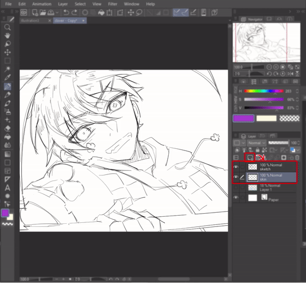
That’s it and you’re done! Use different layers for different sections (eyes, hair, skin, clothes, etc) to make it easier during the shading process later.

Shading process
Now we’re going to move on to the fun but dreaded part. That’s right, the shading. Shading your art is fun, but not so much when it ruins the artwork right? Yikes. I have a love-hate relationship with shading and let me share some tips I learned on how to make shading the artwork fun for you.
TIP 1: USING AIRBRUSH TO QUICKLY PRODUCE PRETTY ART
Sometimes, there are days when you don’t feel like putting much effort into the shading but still wanted your artwork to look nice. Don’t worry, I got just the trick: use airbrush!
Choose a color, set a large size for your airbrush and in one stroke, airbrush half of the selected section of your character (hair, face, eyes, etc). Make sure the layer’s locked! It always works wonders for me and I hope it’ll work wonders for you too.
TIP 2: COOL SHADING EFFECT WITH WATERCOLOR EDGE
Another cool shading trick that I used to do is I add ‘watercolor edge’ effect to my artwork, normally the hair-shading part, so the colors pop out a little more.
In order to do this, first you select a brush of your choice (but you can do this with pen or pencil too) and click on the little wrench icon at the bottom corner of the tool property box. A window titled “Sub Tool Detail” will pop out. This window allows you to customize your selected tools to your liking.
Now, look at the list of settings on the left and select “Watercolor edge” and afterwards, tick on all 5 boxes that appeared (eye symbol will appear on each box). The ‘watercolor edge’ option will now appear on tool property box at the sub tool window and give you quick access of enabling or disabling it later.
Time to try it out! Tick the box to enable the watercolor edge effect. Click the small ‘+’ button to expand the setting and alter the edge’s range, opacity, and darkness to your liking. Voila, now you can play around with the watercolor edge effect.
Tick off the box when you want to revert back to your normal brush or you can simply duplicate the brush to set up a custom brush with your preferred setting.
Fixing the lineart
Once you have colored everything, you might realize that your lineart needs some tweaking in order to better suit your color palette or coloring style. So, in what way can you fix the lineart after the coloring has been done?
TIP 1: CHANGING THE WEIGHT OF THE LINEART
For this part, I’m going to show you how to change the weight of your lineart. Sometimes, maybe your lineart ended up too thick that it’s overpowering your coloring so you need to thin it down. Or maybe it’s the other way around where the lineart is too thin and the colors ended up being too much instead? Here’s a quick fix to your issue:
1.1 How to Narrow Down the Lines
To make your lineart thinner, select your lineart layer and go to [Filter] > [Correction] > [Adjust line width]. A window will pop up. Select [Narrow] from the ‘Process’ drop down menu to thin the lines and don’t forget to tick in the box that says [At least 1 pixel]. If you don’t tick that box, the system will erase your lines to thin it out. So, keeping it to minimum 1 pixel will avoid that situation.
And you’re done!
1.2 How to Thicken the Lines
On the other hand, if your lines are too thin and you wish to thicken it instead, there are 2 methods.
1.2.1 Using the correction filter
Similar to narrow down the lines, select your lineart layer and go to [Filter] > [Correction] > [Adjust line width]. A window will pop up. This time, select [Thicken] from the ‘Process’ drop down menu to thicken the lines. Adjust the slider on the scale to your liking and you’re done!
1.2.2 Duplicate the layer
While Method 1 is nice, sometimes the minimum thickness given is too thick for the lineart. Hence, the other option you can go for is by right-clicking on your lineart layer > select [Duplicate layer] to duplicate your lineart layer and voila, your lineart is now thicker!
TIP 2: COLORING THE LINEART
You can also ‘fix’ the lineart by recoloring it to compliment the other colors in your artwork. The simplest way to recolor your lineart is to lock the layer and recolor it using brush of your choice.
However, personally I prefer to create a new layer on top of the lineart layer > clip it > airbrush colors of my choice on the clipped layer. I think this method offers more freedom and makes it easier to edit the intensity of the colors later since you get to toggle it on and off between the original lineart and the overlaid colors.
Adding final touches
The last, but not least. Personally, this is my most favorite part since these final touches are the secret spices to making the coloring on an artwork stands out.
TIP 1: OUTLINING YOUR CHARACTER
If the background is too bland or your character blends in too much with the solid background color, add outline around them to make them stand out!
To do this, select the [Auto Select] tool from the tool bar > click on [Refer to all layers] so the tool will detect the pixels from all the visible layers. In the tool property box, make sure your selection mode is [Add to selection] so you can select continuously on different parts of the canvas.
Now select all the areas surrounding your character and click on the [Invert selected area] from the command bar to invert the selection towards your character.
Go to [Select] > [Expand selected area]. A window will pop up where you can adjust the expansion width to your liking. Once you’re done, press [OK] and the selected area will expand.
But you’re still not done, don’t press the deselect button yet! Now add a new layer and pull the layer underneath of all your character’s layers but make sure it’s above the solid background layer.
Choose a color of your choice and click on the [Fill] tool from the command bar.
Ta-da, your character now has an outline around them! You can drag the outline using the [Move layer] tool to give off a cool shadow effect too!
TIP 2: ADDING DRAMATIC LIGHTING WITH BLENDING MODES
This is my most favorite trick and I’m guilty of applying this almost all the time.
First up, just like the first step shown in "Tip 1: Outlining Your Character" above, use the [Auto Select] tool > [Refer to all layers] and select all the areas surrounding your character. Then, invert the selection using the [Invert selected area] button from the command bar.
Then, create a new layer on top of all the other layers and using the [Fill] tool, fill in a dull color of your choice (I usually go for maroon or wood brown).
Don’t worry, trust the process. Click on the [Blending mode] drop down menu > [Multiply]. Then, adjust the opacity so that the color’s not too dark or too light.
Right click on the utmost top layer and select [Merge visible to new layer]. You will now have a new single layer which contains a copy of all the pre-existing layers.
Use any blur filter to blur that layer (for this I’m using the [Motion Blur] to create movement effect) and by using [Eraser] > [Soft], gently erase parts of the blurred layer that you wish to highlight.
You can read more about this blurring method in my previous tips article:
Now, create a new layer on top of the blurred layer. Set your [Blending mode] to [Add (Glow)]. We’re going to add in dramatic light effect on the character.
Choose the light color of your choice. Normally I go for either warm tones (yellow/ orange) or cool tone (blue). Select the [Airbrush] tool > [Soft], enlarge the brush size and strategically spray it onto the character for your desired dramatic light effect.
Adjust the layer opacity to your preference, and you're done!
Here are some more examples on how my artworks look before and after applying this technique.
TIP 3: ADD SPARKLES
If you somehow think your artwork’s color still look dull or isn’t popping enough, add sparkles… LOTS of sparkles.
Create a new layer on top and use pen to draw white sparkles or dots all over your artwork. You can also make use of the [Effect] brushes from the [Decoration] tool to finalize your sparkly touches.
Other tips
These are just minor things but I personally find them very useful to have.
TIP 1: UTILIZE YOUR EXPRESS KEY
Make full use of the shortcut buttons as they make your life easier when coloring. Go to [File] > [Shortcut Settings] to personalize your shortcut buttons. The shortcuts make it easy for me to eyedrop colors, switch between the main and sub colors, do tonal correction, and more.
TIP 2: USING THE HSV SLIDER TO PICK COLORS
This is simply personal preference but I think the HSV slider is the easiest to use when picking colors compared to the color wheel or other color sliders since you pick the color in an orderly fashion (hue > saturation > value).
Closure
To be honest, I can go on and on about the coloring process. Believe it or not, I used to really hate the coloring aspect when creating an artwork because I was just terrible at it. Thanks to my dislike of coloring, I ended up having to do tons of trials and errors just to find a coloring method that suits me. I’ve learned so many different methods of coloring along the way and I wish I get to share them with you.
I hope my tips above will help you come to find the coloring process enjoyable, just like how I also came to be. Just keep on experimenting to find a coloring method that will finally suit you and never give up!
Users who liked this post


Comment