
Hello, Happy New Year everyone!
For the following past year, I’ve been creating many tutorials using Clip Studio Paint.
Try to type GraceGit in the search box, then you can see all of them.
However if you can see my Instagram, I mostly create watercolor artworks because I like its blending mode! Now, talking about blending, it’s quite different with Clip Studio Paint or digital painting.
My YouTube video tips below will show some techniques I learn about Blending Modes in Clip Studio Paint. Please excuse my speaking English (it's not my first language), therefore I will simply use 'in-image texts' within some parts of my video.

Chapter 1: What is Blending Mode?
In Visual Art, when we talk about blending; our mind would be automatically thinking about colors or mixing colors. While it’s also true, but blending mode in digital art would have a slightly different term.
Using layer types in different mode inside Clip Studio Paint would be the perfect answer.
[For Your Info] Clip Studio Official has already share Using Blending Mode guide with their official tips below.
However if you wish to know how do I use the knowledge with my personal Blending Mode art style, feel free to continue reading this little tutorial and I hope you enjoy the process. ^.^
First things first, I create the document or digital canvas in Instagram Reels size (1080 x 1920) pixels and 300 resolution, and it's a vertical size of blank canvas and it's okay if you wish to create your own size or dimensions too, but make sure it's a square one if possible.
Ok then, let's start our lesson!
Chapter 2: Tracing your own photo
As an artist, often times I use guidelines such as basic shapes, structures, and all other features to start a character design. It’s a fairly common method in digital art and traditional media.
In this tutorial, I’ll skip the foundation steps and show you how I capture my portrait and turn it into a digital illustration or stylized artwork. You could say it's an 'avatar' or profile picture for your social media accounts.
DISCLAIMER: It is my own photo, so it's safe to use for Clip Studio Paint user guidelines when posting a tutorial. If you don't believe in me; please watch my YouTube video first ^.^
Ok so...
First, create a new layer then rename it to SKETCH/DRAFT or anything you wish.
In my YouTube video, I use Design Pencil or Real Pencil to start tracing my photo, with decreasing opacity to 50% on my photo’s layer before I do the drafting.
By lowering the opacity of my photo, now I can see clearly my tracing draft outlines in the sketch/draft layer.
This is a good opportunity to share the legal and safest way to visualize your own photo into stylized art without the help of an A.I generated 'avatar' images.
A.I art has been circulating throughout the internet, I don't really care much about that because I think human artist has their own uniqueness from our own perspective. That alone can’t be replaced by a stable diffusion, machine learning program or whatever the name is.
The only concern when tracing your photo or anything else is not just about the likeness but all about finding the best feature or uniqueness as I mentioned above.
For example, the outfit you’re wearing, the shape of your face, the special features like chubby cheek, big eyes, small nose, plump lips or anything.
Chapter 3: Adding Action Lines
In the video, I show you a bit about action lines and how do you reshape the artwork entirely after tracing. Adding action lines (the red lines) will add dynamic figure on your drawing and here’s the further explanation about it:
I. Make simple shapes like circle for the head, then rotate it a bit.
II. I’m adjusting the fingers to look cuter with the pose holding a tomato.
III. Finally, the body needs to be rounder and curvy.
With 3 simple adjustments, now I’m ready to give an inking to my draft/rough. Simply give the clean outline with G-Pen or any Pen you prefer in a new layer above draft.
P.S: I remove the fingers on the right (the one near the chest) because I wanted it to be clean.
Chapter 4: Flat color
In this chapter, you’re about to give a flat colors to the inked illustration or ink outline.
Simply create a new layer, rename it to 'FLAT'.
There are many ways to give colors after your ink outline, one of the best feature in Clip Studio Paint that you MUST know is: Reference Layer + Fill Tool combo.
Let me break it down to you:
The YouTube video shows you where the icons of Reference Layer and here I use screenshot above to show you exactly the place just in case.
You must choose the INK layer first, click the icon to set as Reference Layer then go to your FLAT layer which is below the INK layer to proceed the coloring.
Now here comes the FILL Sub Tool and it plays the important part of this chapter.
After you choose Fill Sub Tool, choose REFER OTHER LAYER. Make sure the icon on the Refer Multiple set to Reference Layer.
Now you’re ready to do the magic!
But there might be a slight problem with some areas not getting filled properly.
All you have to adjust will be the following:
Tolerance & Area Scaling
Chapter 5: Shadow – Multiply Blending Mode
Finally we arrived in the chapter where one of the best mode I ever use in digital drawing: Multiply.
I have to admit, there are plenty of modes on the layer that I use occasionally. For example; Overlay, Color Dodge, Add (Glow), Glow Dodge, Screen, and Lighten, but every time I start to do a digital illustration; I simply choose Multiply Blending Mode to give the shadows after flat color.
But in order to add the shadows or give a dimension into the artwork with Multiply blending mode, I will share to you my habit of using Clip to Layer Below. It’s a very handy feature in Clip Studio Paint and here’s why:
Image above is a layer, set to MULTIPLY but without CLIP TO LAYER BELOW!
And image above is a layer, set to MULTIPLY and with CLIP TO LAYER BELOW!
As you can see, the difference is quite impressive! It's a color or shadow that only visible to the area of text or drawing below it. You don't need o be worry the shadows go through the other unwanted area if you do Clip to Layer Below.
Further of explanation, I use Clip to Layer Below to do experiments on my digital drawing piece below - even adding some extra refinement of colors before adding the shadows.
Multiply blending mode set as shadows will be our main goal here, however you can also explore many ways of giving textures as seen on the video, then apply lights and shadows onto your artwork by different light sources.
Since the main purpose of our tutorial will be applying Blending Modes for my digital artwork, I’ll just stick to personal two methods that I did in combination with Multiply Blending Mode.
1. Brushing
2. Lasso Tool
1. Brushing or cell shading
My first method is a common practice when using Blending Mode: Multiply.
After picking your preferred color (for me a purple) and pick your favorite tool such as Turnip Pen, Watercolor, or any solid shape brushes, just brush the area you feel great as a shadow part. When it feels too dark, you can always change the Opacity to whichever numbers suit you best! Personally, I'll go 20-50% of Layer's Opacity.
2. Marking area with Lasso tool
Another method adding the area of shadows, I use Lasso Tool. This method really works if you had experiences on traditional media, years of practice with traditional pencil shading and understanding how 3D forms, structures, and lights interacting each other.
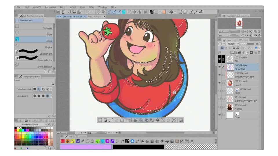
A quick shortcut for filling inside the area will be [Alt + Backspace], of course the quickest way is clicking on the button over there (shown on the image below).
Fell free to try those buttons after doing a selection with Lasso tool. It's kind of the same with shortcut keys with many functions on its own.
Deselect (Ctrl +D) and also Clear/Delete (DEL) are two shortcut buttons I use the most.
Then here it is, from the flat goes into '3D form' because of the shadows with MULTIPLY Blending Mode and 50% Layer's Opacity.
Chapter 6: Highlight – Glow Dodge Blending Mode
After we’ve done with simple techniques of multiply for shadow, it’s time we go for highlights and having another of Layer’s type.
Simply create or add a new layer, on top of your shadow layer - rename it to HIGHLIGHT.
I believe it's the same repeated process that you've already understand very well if you follow me from the beginning of this written tutorial (or video tips).
Adding a color balance or different TONE of cool and warm colors is one of my usual habit when balancing the overall digital illustration.
- YELLOWISH TONE is my own term to add a 'glow' to the hair and some parts of the picture (like hat/cap, cloth, etc) which will always be on the right side of the image.
In this chapter of Highlight Blending Mode, we're having a goal to add highlight to the image and make our illustration stands out.
I always start with COLOR DODGE, then try to change it to OVERLAY, or even GLOW DODGE, it's always a good opportunity for you to play along with the contrast, opacity, density, or anything within its own layer and even different brush.
Note: I use SOFT AIRBRUSH to give a contrast to the hair and the cap.
As for me, I usually compare between GLOW DODGE and ADD (GLOW) to achieve what's best for my Blending Modes to reflect the hair with its color.
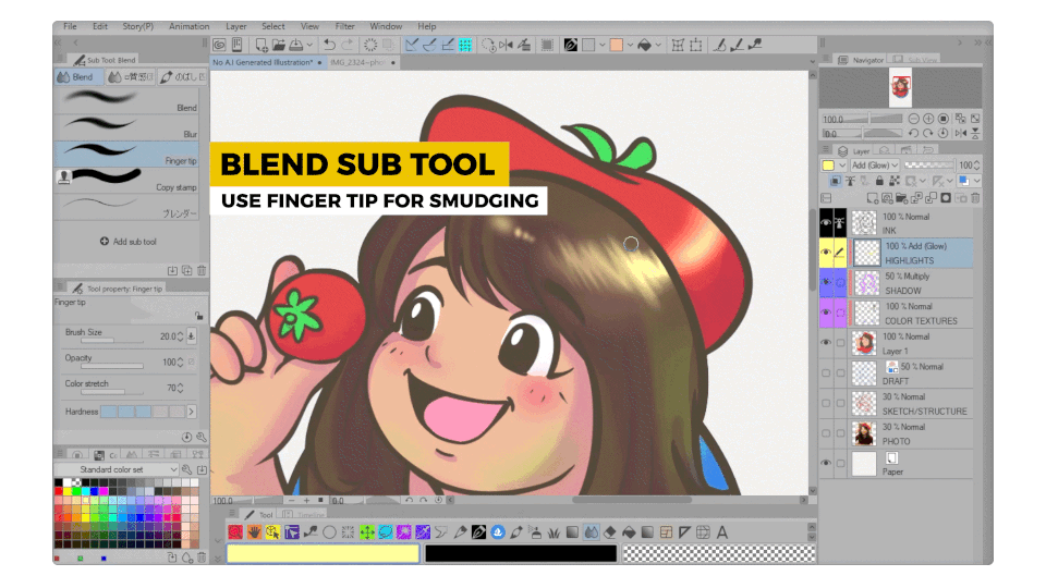
After done with the brushing, it's time for you to experiment the BLEND SUB TOOL.
Versatile tool! As you see the GIF above, using FINGER TIP from Blend Sub Tool would be the perfect and effective tool for showing the hair strokes instead of just brushing it over and over with any brushes you had in mind.
Several minutes done with smudging, I can see the reflective and shiny hair is too overwhelming, I feel it's a bit too much warm colors over there.
So I decided to tone down with cool colors.
Before changing the cool color mood, I think it's best to keep the other part (left side of the hair) with yellow, so I use LOCK TRANSPARENT LAYER first before anything else.
Right after locking the layer's pixel, I feel it's best to use SOFT AIRBRUSH and +LIGHT BLUE TONE for the rest of right side hair. Now it's getting better to look at.
Sometimes you need to see the opposite of your canvas, simply click the icon over there to FLIP CANVAS HORIZONTALLY, then you can see if there's anything wrong or give another brush strokes with better handling of your hand (because I'm a right handed artist).
Flip canvas, although it seems common and not everyone used it, but for me; it is one of my biggest advantage in digital art!
GraceGit's Closing Remarks
It’s been a pleasure being with all of you who read all of my words until this very end. I hope you'll learn a thing or two with my written and also video tips!
Please subscribe if you wish to see another of my tutorials, mini tuts, or even my Instagram!
Users who liked this post


Comment