
How do you draw FUN Hybrid characters? Then, this tutorial will show you how!

Grace here! This Clip Studio Paint tutorial will teach you to draw cute characters from scratch, from any objects as a reference, and refine them into masterpieces you can share with the world!
But that’s not all! You’ll also gain invaluable skills in digital drawing and professional illustration. With each lesson, you’ll level up your artwork, boost your confidence, and increase your creativity and imagination.
Don’t miss out on the fun and excitement of creating a charming Hybrid character design that will capture the hearts and imaginations of your viewers! You’re guaranteed a blast with my Clip Studio Paint tips & tricks, so join me and start learning!
[ Fundamentals ] - Initial Process
Depending on your needs, you should draw characters in portrait mode.
However, mine is 1080 x 1920 pixels because I will be using that for Instagram Reels to share my steps and timelapse.
※ Document Size - Vertical Canvas for Social Media
This is my standard social media document for Instagram Reels. You can start with anything else regarding width and height.
Important: Your image Resolution should be set to 300. It’s for printed materials, just in case.
Record Timelapse is optional since the file will be larger than usual.
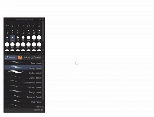
※ Default Design & Real Pencil - Personal Choice
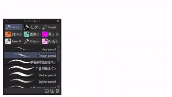
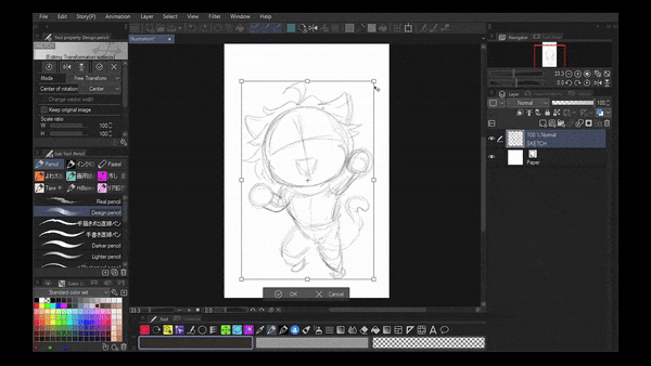
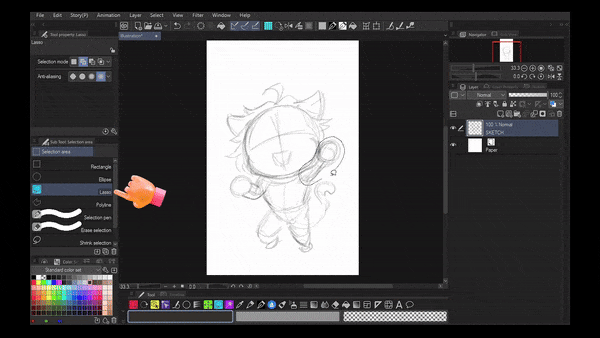
All tutorials will use [ Design Pencil ] as part of my initial process. This is not mandatory, and you’re free to choose which is more suitable for your taste. However, using a design pencil is the best way to create a draft or rough sketch every time.
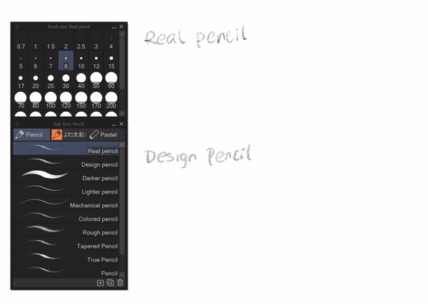
Consider this when using [ Real Pencil ] and [ Design Pencil ]. Since I’m aware there are so many options for Pencil Sub Tool for us to choose from personally, I compared these two to see the result of each value shading with the same brush size between small and medium (8, 20, 40).
※ MOUSSIE - The Mouse Headmaster
The GIF above exemplifies my Design Pencil for the draft and Real Pencil for the Refinement step. A Mouse Hybrid Character (Moussie, The Headmaster) would be a good headstart for the tutorial.
Trivia: My inspiration comes from Disn*y Character, I would admit I created my own version with the silhouette of it. I grew up watching tons of animated movies from it so I guess, without even knowing; my art style being influenced by that lifetime cartoon character.
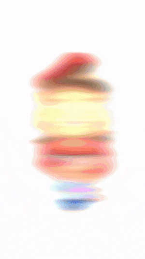
※ Default Pen for Digital Ink - Personal Choice
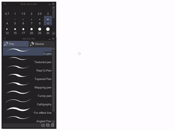
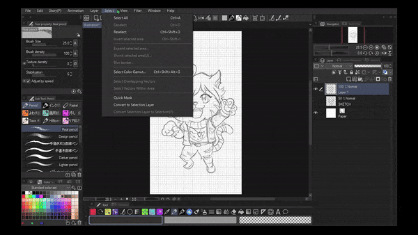
From the GIF above, I will show you some Pens that can be used (or not) for the Inking step. Digital ink will be necessary to make your illustration or Hybrid Character Design stand out. But, even for me, sometimes, I choose the Pencil Tool to behave like ink or give the outline of my characters.
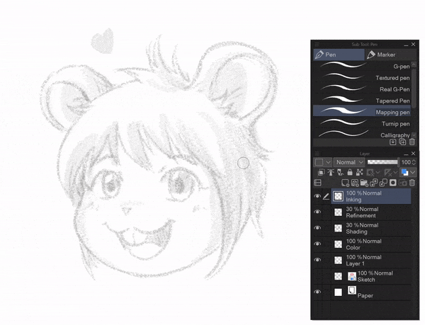
Here is an example of my inking using the [ Mapping Pen ] method on top of my refinement (Real pencil) layer. It depends on your pen pressure or graphic tablet. I’m doing this with my Micr*soft Surface Pro.
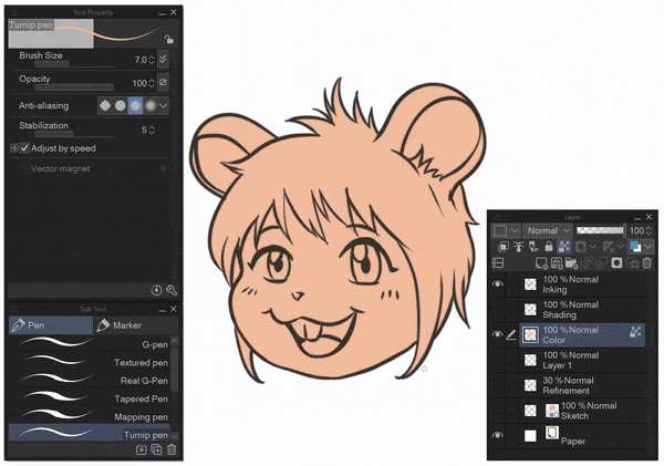
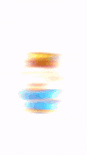
※ Default Color Blocking - Personal Style
You’ll notice how I do the simple colour blocking from the GIF above.
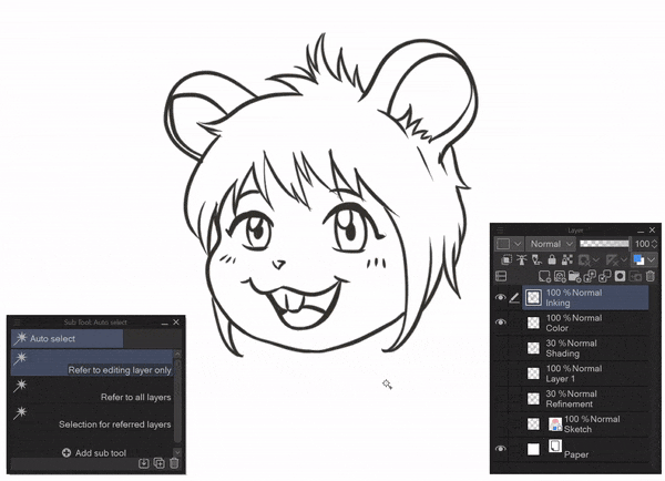
Use the Auto Select Sub Tool outside the Inking layer
Important! Do the select inverse with [Ctrl Shift I]
Please create a new layer at the bottom of the inking layer, then fill the colour with [Alt Backspace] for the base colour; you can choose anything as long as it is lighter
Deselect the Auto Select feature, but Don’t forget to Lock the Transparent Pixel.
You can see the magic of colours without going outside your drawing!
[ !! ] A T T E N T I O N [ !! ]
If you don’t Lock Transparent Pixel, your color will be going over the image like I’ve shown to you with pink brush.
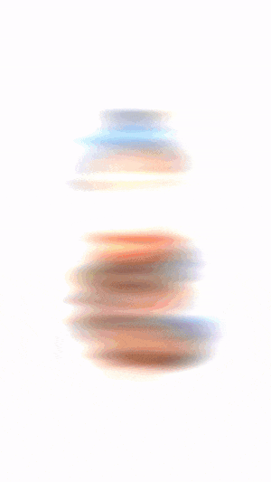
※ Default Color Shading - Personal Style
Lastly, these are the final principal/fundamental tips for my style. It’s just a glimpse of what I’ve been trying to share throughout my tutorial.
The Reference Layer will need no complicated explanation of its function. But anyway, here’s the caveat…
You need to be patient reading my written tutorial below if you’re a beginner artist or you can search YouTube for Clip Studio Paint Reference Layer.
※ Set Reference Layer
Step 1: Set your Inking layer as the Reference Layer (the icon shown on the JPG above)
※ Fill to Reference Layer
Step 2: Find [ Fill ] Sub Tool (the icon with paint bucket drop), then choose [ Refer Other Layer ]
Step 3: Don’t forget to check the Refer Multiple (turn on the icon the same with your layer)
Step 4: Remember to use the Fill feature in the Color layer (highlighted with green)
※ Clip to Layer Below
Step 5: Create a new layer on top of your Color layer.
Step 6: Set that layer into Multiply with 50% Opacity (highlighted with green)
Step 7: Click/tap the icon besides the Reference Layer icon (highlighted with red)
Then, you can choose any color (pink for me) to add shadow without worrying about getting outside the base color.
※ Glow Layer (Highlights)
Step 8: Create another new layer on top of your Multiply layer.
Step 9: Set that layer to Glow Dodge with 50% Opacity (highlighted with green)
Step 10: Use [ Airbrush ] Sub Tool with Soft to color.
And you’re done! That’s it for the warming up! The beginning of our tutorial includes all the principles or techniques I use throughout the tips!
Those fundamentals/principles of art were my initial approach to the techniques. Still, before we go deep into a tutorial, I’d like you to see how much you know about the basics of character creation from 3D thinking!
※ 3D Thinking!

My YouTube video above is part of the Alacarte tutorial that you can pick out of curiosity and don’t need to watch all the chapters. It will focus on 2-minute information about 3D Thinking for a total beginner 2D artist.
You can watch the video (with speed up process) or else you can continue scrolling to find the written tutorials below.
※ 3D Thinking with Cube & Sphere!
First and foremost, the familiar shapes we will learn all about cubes & spheres. It’s fundamental knowledge when we understand art in school: The seven elements of art are line, shape, space, value, form, texture, and colour.
Based on the GIF above, you can see my interpretation of using a square, duplicating it, then adding some strokes diagonally, vertically, and horizontally, and then it becomes a CUBE!
Moreover, there’s a circle that transforms into a SPHERE because of shadow, highlight, and curved lines. After those two shapes have been made, you can see the combination between them: a Spherical Cube that finally turned into a Bear Head!
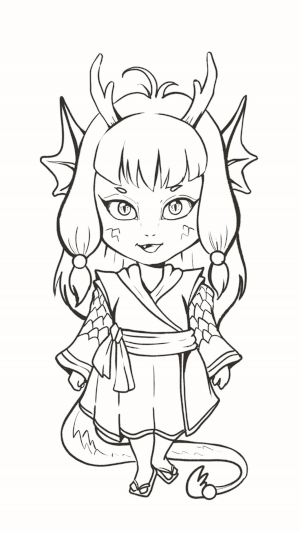
※ DRAGONIA - The Dragon Empress

Year of The Dragon it is!
Meet my Hybrid Character: Queen Dragonia - The Dragon Empress!
I’ve been wondering how to introduce her in an elegant style’ for some time because… Well, she’s an Empress. After learning the basics before designing a great personality Hybrid character like her, here we go with The Queen Dragonia Design!
The video tutorial above consists of creating a Hybrid Character with a correlation of the Chinese Zodiac Sign, the Dragon, with her simple robe to address the Empress's clothing.
Of course, if you’re thinking about something else like modern clothing, it will fit her too, but I keep it simple and sweet for you to imagine on your own.
A timelapse recording of Dragonia: Sketch to Inking

A timelapse recording of Dragonia: Shading to Coloring
[ Tracing Tricks ] - Efficiency & Effectiveness
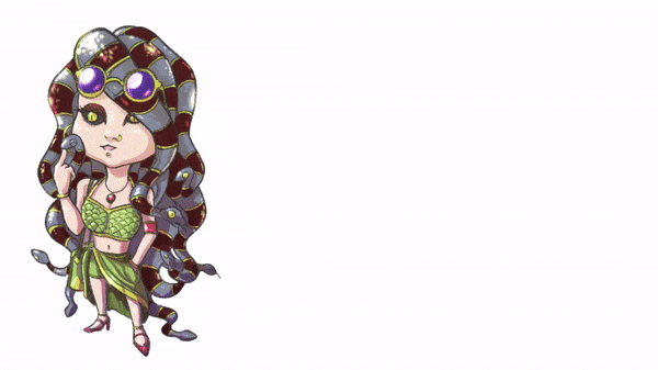
※ SERPENTINA - The Viper Influencer
A femme fatale, a young, beautiful lady known for her deadly style. A relative from ancient Gorgon. Serpentina is one of the Hybrid Ladies that I wish to introduce after her niece, Dragonia.
These two are living in a separate world and have different tastes. Dragonia is favoured in an old style of the dynasty, while Serpentina lives in the metropolis, although she’s also the daughter of the Viper Clan’s Godmother.
※ Learn Through Tracing!
ATTENTION! This is my drawing. Not from other references.
I show you why tracing is sometimes necessary, especially if you want to speed up your understanding of shapes & structures from image references, not to claim it as your drawing after you trace someone else’s work (because that’s a blatant lie & stealing).
※ Bones & Structures Tracing!
As you can see from the red lines, I trace Serpentina’s final artwork with red lines (Design Pencil) to give you an idea of how the ‘bones & structures’ are getting extracted.
Then, I sketched the blue lines beside it to show that you can practice without tracing, too. It’s just a matter of consistently switching between doing the tracing and actual sketching from observation.
Draft:
Serpentina's inspiration comes from the core of Medusa (the Mythical Character with serpent hair). Still, recreating the Hybrid Character adds cultural differences from the ancient world to the modern world.
Rough Refinement:
Medusa’s famous short serpent hair has been in everyone’s mind since ancient times. But Serpentina chose to have long hair instead. With a touch of modern civilization, Serpentina wears glasses to block her fiery gaze, which can petrify people.
Base Colors:
Choosing the classic light green color with the essential red maroon for some stripes (serpent’s body) will make your Hybrid Character Design pop up with vibrant or contrasting colorization.
Shadow (Multiply):
Create a new layer on top of Color Base, set to 50% Opacity, Blending Mode: Multiply. I chose dark pink and [ Turnip Pen ] to do the shadow, giving a three-dimensional look from flat colours.
Hint: Clip to Layer Below is my recommendation for this particular layer since if you don’t do that; your colors will be outside of parts that you don’t want to.
Highlight (Add Glow/Glow Dodge):
Adding glows will make some parts of Serpentina stand out. Her sunglasses, for instance, and some serpent’s skin are also good. I was hoping you could choose the right colour (for me, it’s pale yellow) to give some highlights and make her look more 3D.
[ Everyday Objects ] - Inspiration from Your Surrounding
This chapter will specifically show how everyday objects can be turned into any character design. My YouTube video chapter allows me to demonstrate how some items in my table inspired me to create 4 Hybrid Character designs based on each of its unique shapes. Below is an example of how they turned out!

Images of 4 Hybrid Characters that turned out from every day’s object
Did you believe the Rooster-Bunny-Cow-Dog-looking Hybrid Characters Design was made from a potted plant and perfume bottles?
I dare to challenge you; everything can be made by looking at everyday objects!
There is no secret to making this hybrid character design: Roztar. It’s playing with your observational skills when doing a rough sketch.
My YouTube video shows how I turn the potted plant into a fabulous rooster-looking chick!
※ ROZTAR - The Rooster Shopkeeper

A timelapse recording of Roztar: Sketch to Coloring
From the potted plants to the rooster-looking character design, it lies within your observational skill and creativity to see things from different perspectives.
I have several potted plants; sometimes, I use those pots to learn with other mediums, such as watercolour. But the more I think, the better reason for me to use those house decorations for something else: silhouette-making character design!
※ BUNBUN - The Bunny Librarian
My second attempt to use my creativity is this medium-sized perfume bottle. Of course, these items are my personal belongings that I put on the table. From the look of it, I guess it’s good for me to turn that into a rabbit-shaped character at first thought!
After some doodles here and there, I think the rabbit is somewhat not cute (for my taste), even when I put on a robe, sunglasses, and a stick. Oh~ my, it turned out to be an old-looking bunny? Well…
I changed my mind. So I try to make it a bunny figure, a cute one; probably, it’s better with a gender shift (from male to female) before I finalize the whole design.
There you go! I’ve got an idea to change the old-looking character design to the fresh new ones! A bunny girl reading a book, so I called it The Librarian.
A timelapse recording of Bunbun: Sketch to Coloring
※ COWLKID - The Coolest Calf
The third attempt at designing the Hybrid Character Design is using a little perfume bottle. I challenge myself to make it as simple as possible. Like a chibi-looking character, their head and body will be the same size.
Here comes the cool kid from the block! Part calf, part cool so that the name will be Cowlkid (~~I know it’s rather lame, but here I go :D~~)
I was thinking of making this character into a Minotaur, but then~ a cute-looking character design is what we aim for in this tutorial, with a bell and other stuff from domestic farm animal inspiration.
A timelapse recording of Cowlkid: Sketch to Coloring
※ SIR DOUGLAS - The Guardian Dog
The tallest black perfume bottle that inspires me is Anubis figure! But when I learned about the background stories of what Anubis is, I changed my mind (again) to make something cuter.
There you go. When I chose to make it a doggo (canine head, humanoid form) or foxy character design, I picked the Guardian Dog instead! It shows a bit different with its outfit, a middle-earth style, a sword, a manteau and, of course, the colours adjusted to muted tones.
A timelapse recording of Sir Douglas: Sketch to Coloring
[ Personal References ] - Add Personal Touch
A fun idea to share with you is an inspiration from personal references! The video above will show exactly how a piggy bank I bought, especially for this tutorial, turned into my personalised hybrid character!
※ PIGRACYA - The Piggy Painter
From the image above, I’d like to share my point of view using my object. It’s the same colour and shape, and it’s a perfect example to let you understand that if you look hard enough, you can find the red car theory on everything - even with your artwork or design.
The Red Car Theory suggests that opportunities, like red cars, are everywhere — yet we often fail to notice them. By developing a mindset of curiosity and openness and actively seeking out opportunities, we can unlock potential for growth, success, and fulfillment in different areas of our lives.
A timelapse recording of Pigracya: Sketch to Coloring
[ Convey Emotions ] - From Emoticons, Emoji to Facial Expressions
※ Emoticon vs. Emoji
What's the difference?
An emoticon is a sequence of keyboard characters used to illustrate a facial expression (or to render some picture or symbol), such as : ) for a smile, : ( for a frown, XD for a laughing face, or O_O for surprise.
An emoji is a small image used alongside or in place of text. Many depict facial expressions (such as 🙂 and 🙁), but there are many, many other kinds (such as 👍, 💙, and 🐈).
Despite their similarity in form and meaning, the words are not etymologically related: emoticon comes from a combination of the words emotion and icon, while emoji comes from a Japanese term meaning “pictograph,” from e, “picture, drawing,” and moji, “(written) character, letter.”

A timelapse recording of Emoji
※ Spheremoji
Always start with a simple sphere as your base.
That’s why I called it Spheremoji from Sphere Emoji.
Make a horizontal curve and a vertical one to divide your sphere, as seen in the picture above. Please understand that a simple sphere will be your starting point to be the head, and then you can lock it.
The image above is the simplest way to create the area or location for you to put your character’s face.
The blue line for the eyes,
The red line for the mouth & nose.
An additional light blue striped line for the eyebrows, if needed.
※ Horizontal Curve Lines
The difference using horizontal curves position:
The lower curve, as seen with red lines, represents slightly negative.
The upper curve will have more positive vibes.
※ Palette Colour Layers
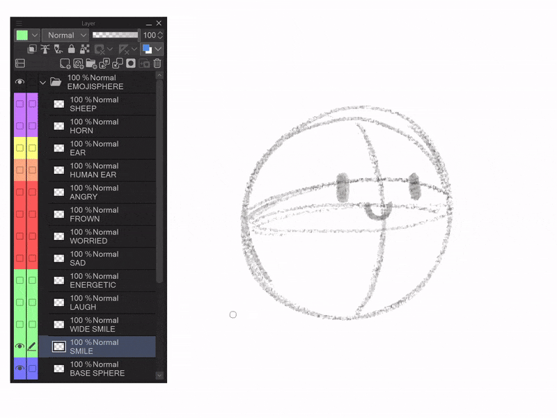
This is an example of my ‘Emotion Layers’:
Sorting with Palette Colours Layers will be good for you to make sure you stay organized with many layers but with different attributes.
We, people, can easily see the colour rather than actually read the layer’s name.
Emotion Layers are indicated by the green and red in the picture above.
Green is for positive emotions, while red is for negative emotions.
The little icon (highlighted with a green circle) can be changed into any colour you wish. But for me, I added some colours, such as orange, yellow, purple, and cyan, for different attributes.
Please note that I use Draft Layer setting (three red circles) to sketch, laugh emotion, and base sphere and set the Opacity to 30% before I create the refinement of my Sheepo drawing.
※ Emojination
Emoji with Imagination equals to Emojination in my own definition.
Feel free to create your own ‘emojination’ for practice!
[ Hybrid Fashion ] - Dynamic Character Creation
Tiger Boy’s punk outfit was inspired by a local band in Indonesia that I couldn’t share here because of Clip Studio Guidelines. The tutorial above focuses on something the old CSP version struggled with: grid and alignment.
※ Transform Tools
Free Transform Tool:
The GIF above shows you how you can easily distort your draft with Ctrl Shift T and choose any small rectangles to modify the form.
Default Transform Tool:
Tiger’s Boy arm can be modified with the Selection Area Sub Tool. Choose Lasso, circling the area you need, and then it can be moved easily with Ctrl T to move and rotate it.
※ Center Alignment
DISCLAIMER:
Since I only use version 1, which I bought eons ago, these particular tips might be outdated for some of you with a (probably) auto-alignment feature on version 2 or even 3.
Here we go: In Menu, find View, and then Grid/Ruler Bar Settings.
Tap Center, then on Grid Settings, you can set its parameter to anything you like depending on how big the Gap you want and the Number of Divisions.
[ Thank You Notes ] For Clip Studio Paint Version 1 User :')
Thanks for taking the time to learn with me! As a fellow artist, I know the true power Clip Studio Paint Pro & Ex holds in other versions, but for me, who can only purchase version 1 because of my financial issues, it’s also a real deal and tons of fun.
I hope this tutorial empowers you to bring your creative vision to life even from the basic knowledge, default brushes, and standard Clip Studio Pro or EX version 1.
Feel free to follow me on Instagram @gracetjayadi_ so we can share anything related to traditional watercolour art and digital art as well!
Users who liked this post


Comment