
Presentation
Hello!!, welcome to this new TIP. On this occasion I will share with you the knowledge I have about skin painting and especially shading, to do this I will explain a little about the theory of lights and shadows, as well as the use of program fusions that will facilitate the process. I hope it is useful to you, without further ado...
Let's get started!!
1. Volume (Theory)
Volume is produced when light collides with an object and consequently shadows are generated. These coherent combinations of lights and shadows are what gives that three-dimensional appearance to objects. This three-dimensional feature is what we want to recreate in our portraits. The concepts that we will see below are those that will help give volume to any object.
► Lights
You cannot talk about shading without first talking about lighting. Light and darkness are two sides of the same coin, you cannot talk about one without knowing the other. Light allows us to see contours, textures and colors, in this sense we will have: direct light, reflected light and secondary lights.
DIRECT LIGHT: Comes from a light source with its own light energy, such as sunlight, light bulbs, flashlights, etc.
REFLECTED LIGHT: Also called indirect light, it is a type of light that comes from the body, it does not have light itself, but rather receives it from another. The reflected light cannot be as bright as the original light.
This light accentuates the volume of the shapes, which is why it is so important. There are three types of reflected light: 1. Contour light, 2. Soft reflection, 3. Strong reflection.
- REFLECTION
Light also bounces off objects, so if we place our sphere on a table, it will reflect a certain amount of light.
The reflected light along with the reflected shadow (explained later) is what creates the atmosphere, with these two concepts in mind we can match our subject to the background. Because the main light does not reach everywhere, the parts where the light does not reach, the ambient light occupies in the form of shadows. Otherwise, the object would not snap to the background.
For example, if the environment is a turquoise bluish color and we introduce a white sphere, the shadows will have a bluish color; the dial will borrow the colors of the environment. In short, the table and walls reflect their color to the sphere; If the stage is blue, the sphere turns blue, if it is purple, the sphere turns purple. This is true if the light that illuminates is white, but if it is another color, the sphere and the environment will also take on that color.
- SECONDARY LIGHT
One way to make our illustrations more attractive is to use two or more light sources. To highlight them, we will have to place the secondary light at a point opposite to the main light.
If we have the white light source coming from the top right, placing the secondary source on the left side would be a good option.
► Shadows
As for the shadows, they are responsible for cementing the volume. They are divided into: own, projected and reflected. Below is a short description:
SELF SHADOW: It means that it is the area where light cannot reach directly, it is the twilight area; the color is usually dark.
PROJECTED SHADOW: It is the shadow that the object reflects on the surface where it is located. This shadow has the characteristic that the part furthest from the object is diffuse and the part closest is dark and hard.
REFLECTED SHADOW: It is the shadow that an object projects on another object, that is, they are neighbors between objects and are generated under reflected light. This is best understood by placing an object of a different color. The light that the secondary object reflects to the primary object will be proportional to its own color. All objects reflect their color, including skin (explained below).
► 3D bodies
All objects can be read as the composition of basic geometric figures, these are: circle, square and triangle. For the portraits we will use these same figures, but with their representation in three dimensions (sphere, cube and cone); Using the theory of lights and shadows seen previously we obtain the following:
SPHERE: The sphere is constructed as we saw previously.
CUBE: For the cube we have the manifestation of three intensities of lights different from each other. The edges cause the light to rotate at a 90° angle, so each one receives the light differently. In this case, the front face takes on the lightest color (1), the side face is dark (3) and finally, the upper face has an intermediate tone (2).
The essence of three tones is repeated for any angle of light. If, for example, we change the light to the lower right, the light will be projected on face 1, but with a slight inclination towards the lateral face, we will obtain that the dark layer will be the upper one because it adsorbs the least light. In summary, to give volume to cube shapes you have to consider this three-color scheme.
CYLINDER: For the cylinders we will find that a gradient occurs, first, the part where the light hits directly will be light, while the rest will degrade towards dark tones, these being the opposite to the origin of the light.
Note: The same thing happens with the cone, in general, with all curved objects.
2. Plans
We already know how lights and shadows work in basic shapes, now we must take these concepts to the anatomy of a face. To do this we must take into account the plans.
► Apply lights and shadows to the face
As I explained in the section on 3D bodies, all objects can be read as the composition of geometric figures, for faces it is the same, we must decompose the face in geometric terms, and this is what we call planes. But don't worry, there is already a model that shows us the planes of the face, this model is known as Asaro's head. Asaro's head basically consists of a head sectioned into simple shapes, just like the ones below.
In CLIP STUDIO ASSETS there is a brush with the head sectioned at different angles, ideal for doing light studies. Next the entry to the brush. Furthermore, on the internet there are endless models with different light angles, although later I will explain how to make your own light models in CLIP STUDIO PAINT.
This head prototype is already sectioned, improving the understanding of the volumes of the face. When we paint these shapes, by removing the contour lines we can understand the structure. You see the three-dimensional structure. This way, placing lights and shadows becomes much easier to visualize.
The face is not flat, it has angles, and because of this the light does not reach each plane in the same amount, just like on the faces of a cube, but the cuts between these angles are not rigid, they are softened by curves.
For example, to put the shadows we follow the process of applying the color like a cube. Since the result will be rigid, we will soften the edges, just as we would see on a sphere or cylinder.
For example, if the light comes from the top, the upper volumes, facing outward, will be brighter, while those below, facing inward, will lose luminosity until they become deep shadows, as in a sphere.
To better understand the planes of any face it is important to do studies; take a real human face, a photograph and try to paint over the volumes. We will notice that the shapes are the same as the model, but with the variation in proportions corresponding to each face.
The planes can not only be applied to the face, but also to other parts of the body, this is a universal system for applying lights and shadows to a character, you just have to learn to decompose the objects into geometric shapes. I recommend looking for models of the muscles and the body's anatomy in general to have a concrete idea of the volume.
- EYES
For the eyes we have an M architecture at the top; The eye socket is sunken to a greater or lesser extent depending on the race. The eyelids, eyelashes and skin lines are where shadows are generated due to the limited light that reaches them.
While in the rest you will find brighter colors. Light bounces on the tear duct and below, giving clarity to that area. For greater realism in the eyes, we must consider the channel at the bottom, that is the width of the eyelid that covers the eyeball, it is kept with a light tone to mark the volume. Finally, on the upper eyelid, a gloss is placed in the center with a lighter color, a place where more light reaches due to its prominence.
Searching for eye references and trying to imitate them taking these concepts into account will help us better understand the volumes of the body.
- NOSE
The structure of the nose is linked to the structure of the eyes. The nose is the highest part of the face, where light reaches most easily, so consequently the lateral parts are in darkness or with a slight shadow. The entire nose generates a shadow projection, this projection depends on the angle of the light.
If one breaks down a nose into its simple factors, you will notice that it is primarily like a rectangular prism cut in half and at the tip are three overlapping spheres that give the sensation of a peak and width to the sides. This final part has greater light in the central circle and shadow in the side circles.
- LIPS
The shadows of the mouth, for their part, are those that are found before and after the lips, providing them with their volume; the upper lip usually has shadows. The line that I form when joining both lips is an occlusion of light (area where neither direct light nor ambient light reaches), therefore, it is the darkest part of all.
Also on occasions, when you want to represent a smile, the facial muscles lengthen, resulting in a small shadow at the edge of the corner of the lips. The muscles of that part create a bulge that, as was well represented in the sphere at the beginning, has its corresponding lights and shadows.
With references we can refine our memory bank, so we will know how, when and where to place shadows.
- EARS
The ears, for their part, have a spiral of shadows that begin internally with the upper part of the ear and culminate in the center of it. The ears light up as if they were two layers, first the deep one (the part that corresponds to the center) and the raised part (the sides). The parts that are elevated are those that receive direct light, while the rest have medium tones and shadows caused by the curvature of the ear itself.
Once again, the ear hole is an occlusion of light because it is one of the parts hidden from both direct and ambient light, therefore, it is the darkest. Below I leave a pair of illuminated ears so that the previous scheme can be better understood.
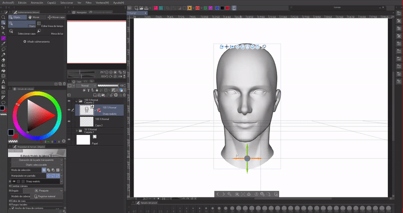
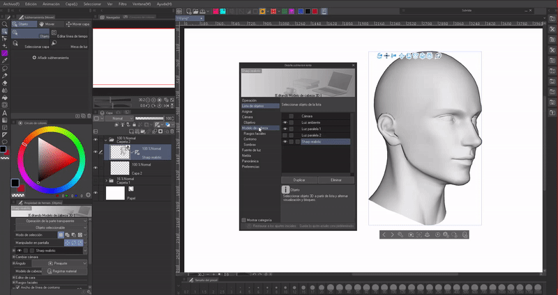
► Study of light angles (3D head models)
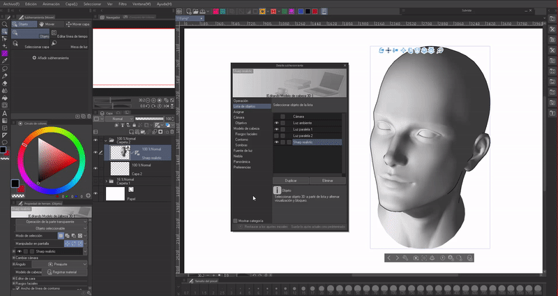
Having a visual reference is useful at first, when it is difficult to visualize where to place the lights and shadows depending on the angle of the light, but to solve this difficulty, CLIP STUDIO PAINT has a new function: “3D head models”.
We will go to the “Material” palette, then to: 3D > Head. From the different options we will drag the model that seems appropriate to the canvas. I recommend using realistic models or the skeleton.
From these heads we can create different types of faces; To learn how to modify the facial features of 3D models, I recommend visiting this Official Tutorial about this new feature:
NOTE: The lighting that appears when placing the model on the canvas is set to frontal by default. First we will see how to change the angle of a face and then, we will see how to change the angle of the light.
- FACE ANGLE
First, we must establish what angle the face is at, so we can better understand where to put lights and shadows. By clicking on the model, a menu will appear, in which the face, its size, and its latitude are rotated on the canvas.
Now, to adjust the direction of the face, we will have to go to the wrench icon found in the model's floating menu. Once inside we will go to the “Facial features” section.
By clicking on the front face icon (Direction) the movement options will appear. We will use: Tilt, Angle and Side Tilt to change the position.
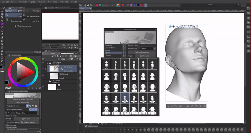
- PREDEFINED ANGLES
If we go to the camera section, in the section: Angle > Preset we find some preset angles.
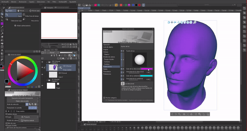
- SHADOWS
To edit the angle of the light and therefore the shadows, you must go to Tool Properties (Wrench icon) > Light Source.
Dragging the circle modulates the direction of the light.
With “Ambient/directional light color” you change the color of the ambient and direct light.
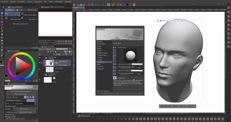
Finally, "Light/ambient intensity” defines the density that the shadow will have. Now we know how to use these models to correctly place the shadows in our illustrations.
NOTE: With the full body models it is also possible to change the direction of the light as explained above. So they are also useful for painting directly or as a reference.
► Scale of values
The value scale covers the different levels of luminosity between black and white, grays. Scales can be created from 3 to a complex value such as 16 shades.
It is advisable before starting to paint to make a scale of values. It can be with colors or in gray scale, but it is more advisable to paint with a gray scale and then change it to color, but of course, with practice painting directly with varied colors becomes easier. The important thing about a value scale is to have a reference for the lightest value (maximum light) and the darkest value (absolute shadow).
If you choose dark grays close to black, the result will be an underexposed illustration, while choosing light grays close to white will result in an overexposed illustration. These color palettes are not very pleasing to the eye.
Don't be afraid to use deep shadows and light highlights, but do everything in moderation, giving space to a wide variety of colors so that the illustration can breathe. Although, we should not use pure white in excessive quantities because it burns the image.
To determine the intensity of the shadows we must consider the distance between the light source and the object. The closer the light, the denser the shadow and vice versa, the further away, the shallower the shadows. As for whether shadows should be hard or diffuse, this still depends on the distance of the light, they can be hard if the light source is small and close.
► Workflow
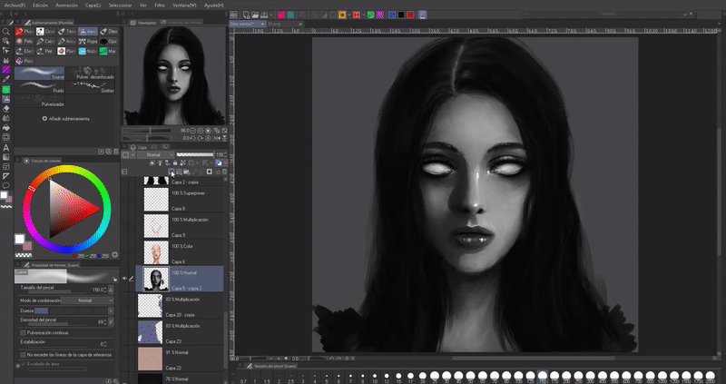
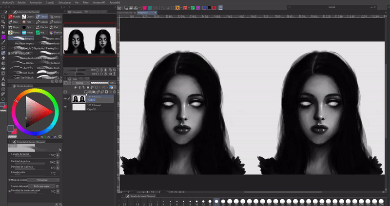
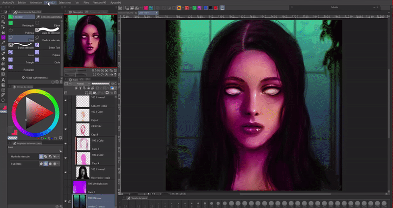
I recommend painting in a gray scale and then coloring them. Let's start with the sketch. All we really need is a basic face. To do this, I first draw the basic lines of the face clearly; There are better and more detailed sketches than mine, but for now this is how I work. After choosing our colors, we have to place them where we think the light will fall.
Here I used a sectioned head because the face is in an easy to understand position, but if we have a difficult angle we can move on to using 3D heads. The advantage that these faces have is that they even highlight the specific shadows of the eyes, mouth and nose.
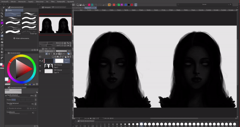
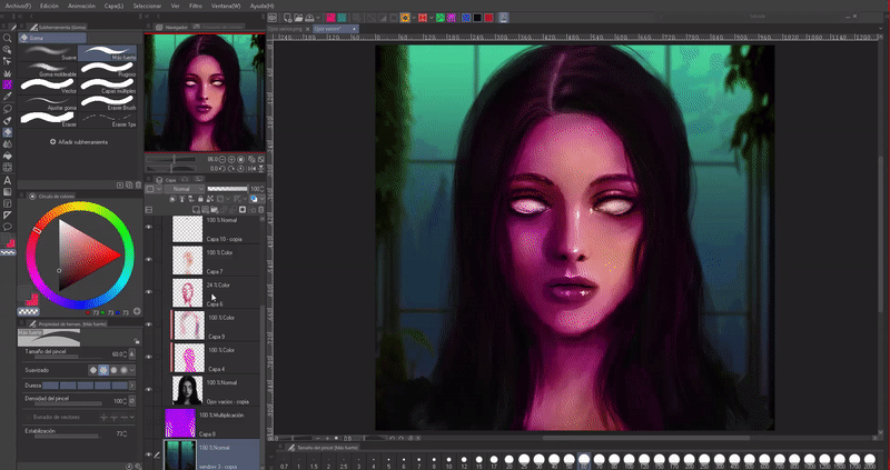
Using the tempera brush I filled in the silhouette of the face and by varying the colors I outlined the volume of the eyes, nose, mouth and ears. I established the shapes. Once finished I mixed the colors so that the lines didn't feel so abrupt. Now, in a new layer in combination mode “Multiplication” I am placing deeper shadows respecting the direction of the light and the volume of the body.
You have to be careful with the shadows because if we don't place them properly we can distort the shape a lot, it happens a lot to me, especially with the nose, seeing many examples will help us.
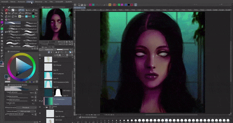
I style the hair making it darker with layers of tonal correction, and with these same layers of tonal correction I can modulate the saturation and intensity and we manage to give color to our illustrations in a short time. If you want to know more, I made a TIPS talking about them:
It's time to merge the colors. I start mixing little by little to generate a gradient throughout the skin. The technique I use is the eyedropper, although I also use blurring, I only use it to soften some areas. I give the specific details of the nose, eyes, mouth and ears. Using textured brushes also helps us improve the texture of the illustration. Finally, I place highlights with a pure white to highlight some areas; The pure bench is a color that we cannot abuse because it burns the illustration.
- GIVE COLOR TO A GRAY SCALE
The "Color" blend mode is useful for coloring a grayscale illustration, plus they are extremely easy to use.
The process is very simple, first, we will create a layer above the gray layer that we want to give color to, we will adjust this to the layer below, then we will change the blending mode to color. Now we choose one or several colors and paint.
But using only this blend mode is not enough to obtain a pleasant result, use other blend modes such as “Multiply” to darken and “Overlay” or “Dodge (color)” to brighten. Additionally, for greater success, using the different tonal correction tools will make the colors look better.
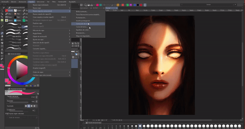
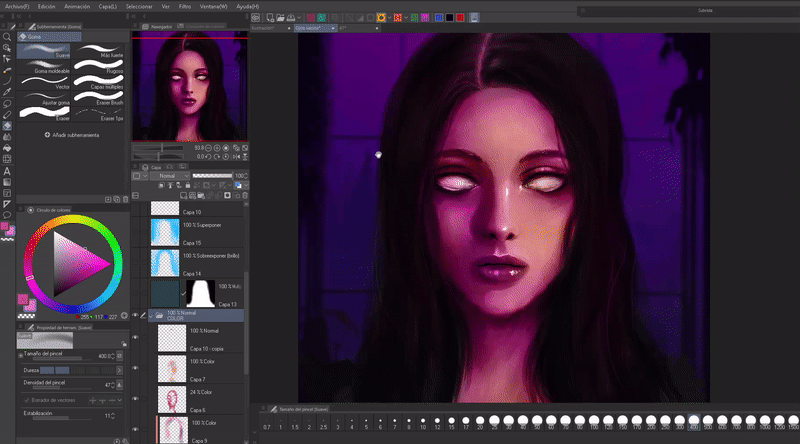
To give that color to the skin, I used a layer in color mode, another in multiplication, dodge (color), dodge (brightness) and several tonal correction layers: tone curve, color balance and gradient maps (the last two I will explain them later), all these layers have to be above the grayscale illustration.
If you want to rectify the intensity of the lights and shadows, it is good to change the image to a gray scale. To achieve this in an easy and non-destructive way, we are going to create a layer above all of them with absolute black, then we will change the combination mode to color. Having this layer we can deactivate and activate it at any time.
- TONE CURVE
If there are some colors that are too light or too dark, we can correct them using the “Tone Curve” tool. First a small explanation about how the interface works. We will find this tool in the following path: Layer > New Correction Layer (J) > Tone Curve.
In the interface we find that the left side controls the light and the right the darkness.
The interface is as follows. As we can see, the output is on the left and the input is at the bottom, this means that the curve represents the shadows (1), the midtones (2) and the highlights (3). By creating points on the curve and moving them to the left we will obtain lights, and shadows to the right. The center is the midtones.
At the top left we will find a drop-down menu, the default option is RGB. When displaying the top menu we find other options such as: Red, green and blue. When changing the option we have to:
RGB: Controls black/white tones.
Red: Controls red/cyan tones.
Green: Controls green/magenta tones.
Blue: Controls blue/yellow tones.
At each end of the curve there are two points, the first point is the brightness (upper right), if we drag it down it will start to get darker. The point at the bottom left is the darkness, if we drag it up it begins to lighten.
By playing with the parameters we can modify the luminosity of our composition. If what we want is for it to only be applied to one layer, what we will do is attach the correction layer to the lower layer. Clicking on any interval of the center line will create new points that will allow you to precisely control the color parameters.
3. Lighting/Shading
Now we will talk about lighting, which is very important to give life to the portraits and ensure that they do not look flat. We will see how we can obtain various moods from a single illustration.
► Lighting angle/Ambient shadows
Light can come from anywhere, at any angle, pass between objects and give shapes, in addition to shadows framing the volume, they help us transmit emotions, especially if it is a face. There are several types of lighting that generate ambient shadows, let's look at some of them.
Firstly, we have these two lights that evoke nature, they are lights that come from the environment.
1. Upper side light
2. Side light
On the other hand, these two lights evoke artificial environments (although the fourth is an ambient light), lights that do not come from nature, can instill drama, fear and even horror.
3. Top light
4. Nadir light
And finally, angles where the light comes from the back of the character, in addition to a special light, the selective light only illuminates a section of the body, while the rest remains in darkness; This is because there may be an opening and when light passes through it it will project its shape. As in the previous ones, these give the composition drama.
5. Rear light
6. Selective light
- PROJECTED SHADOWS
To give depth to the illustrations you can also add shadows to the background, but how? Including shadows from elements that are not directly in the illustration enrich the environment. To achieve this, you must keep in mind that all objects cast a shadow on the things behind them.
For example, let's imagine that the girl is under a ceiling, this ceiling casts a shadow on the wall and her face. On the other hand, because the light comes from the right and casts the shadow of the ceiling, consequently the girl must also cast her body shadow on the wall; Likewise, the nose must cast a shadow following the direction of the light. Thus we maintain a correlation of the effect of the angle of light on the environment.
A simple way to make body shadows is by duplicating the body layer (“CTRL + C”, “CTRL + V”), then using the “Hue/Saturation/Lightness” tool that we can find in the path: Correction tonal > Hue/ Saturation/ Lightness (CTRL + U) we will lower the lightness to the maximum. We will use the Gaussian blur so that the shadow is not so hard, now we will move the layer below the portrait, offsetting it following the direction of the light. Finally, I lower the opacity of the layer so that the shadow is not so deep.
- OCCLUSIONS OF LIGHT
Light occlusions are deep shadows where neither direct light nor ambient light reach. The shadows cast by the hair are hidden directly from the sun and ambient light, so the amount of reflected light will be minimal; Because of this these will be the darkest shadows.
► Ambient light
The light illuminates the scene while the shadows shape it. The light source(s) bounce off the objects in the environment in which they are located, this is a reflected light (a concept that we saw in the light and shadows section) that we know as ambient light. Therefore, it is the result of the reflected shadow of other objects. It is extremely important to take this light into account because it is what will allow the main object to be attached to the background, to the environment.
We must keep in mind that generally the environment determines the color of the shadows. This is because the main light does not reach everywhere, therefore, the parts where the light does not reach, the ambient light occupies in the form of shadows. This is useful to convey feelings of sadness, calm or to show a different time of day such as dusk or sunset.
For example, if we point a white light; The back part, the part of the shadows, will take on the color of the environment, as the room is purple and the amount of white light is not enough to saturate the color and turn it white, it remains the original color and sometimes a slightly different shade. lighter due to the effect of the light that dilutes the color, the shadow of the circle will take on a color with those purple tones of the environment.
- COLOR HARMONIES
A technique that we can use to choose the color of the shadows is to take into account warm and cold colors. The areas illuminated by the light will be naturally warm, while the shadows will be cold. Warm colors convey vitality, warmth, heat and suffocation, while cold colors convey loneliness, sadness, tranquility and freshness. Taking into account the emotional qualities of colors is also important to convey atmospheres in illustrations.
If we divide the color wheel in half, we obtain that warm colors range from red to yellow and cold colors range from purple to green.
On the other hand, if we want to have shadows and lights that are harmonious with each other, and in general an atmosphere that fits, I advise using color theory. There are different harmonic combinations, I am not going to explain each one, but if you want to know, I leave an entry to another TIP:
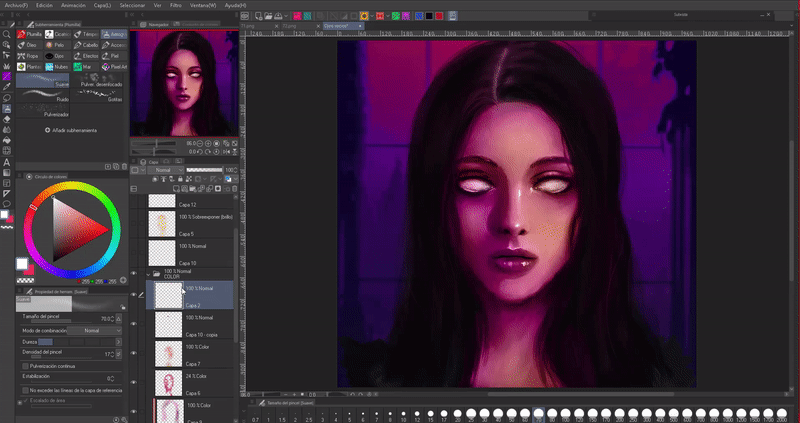
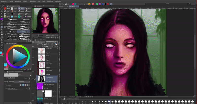
In the following illustrations I used an analogous combination; This color combination is based on choosing nearby shades on the color wheel.
►Light sources
There are two types of light, natural and artificial. As for the natural, it can come from the sun, the moon, a candle or a bonfire; If it comes from the sun it will be yellowish/orange. On the other hand, that of the moon is bluish and white. These lights will set the character at different times of the day and even the seasons of the year.
An example, if our character is outside in broad daylight, his light source will be the sun, therefore, the shadows will reflect the blue of the sky, if it is a sunset orange, purple colors will be reflected, and in the evening blue tones will be reflected. dark Finally, if it is a candle or campfire, the light will be orange and the shadows will be the remaining color of the environment.
On the other hand, artificial sources come from spotlights, flashlights, LED lights, neon, etc. These can be any color, they make the most surreal illustrations.
Knowing the types of light will help us determine the color of the shadows, we will see this in the environment section.
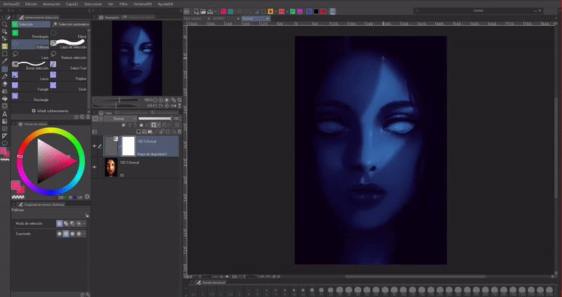
- GRADIENTMAPS
CLIP STUDIO PAINT has a tool that allows you to quickly modify the state of the environment, that is, using gradient maps. Suppose we have a basic coloring, but we want it to fit a particular environment, this is where gradient maps will help us. To move from left to right.
We find the gradient maps in the following path: Layer > New Tonal Correction Layer > Gradient Map. In the drop-down bar we can see all the added sets. There are several sets that evoke different atmospheres; we can download them from CLIP STUDIO ASSETS.
Having selected the layer where we want the gradient to be applied, we will open the window, using the drop-down menu; We will choose the gradient set we want, by default the program comes with some atmosphere sets that we will find as “Sky”.
Here are some examples of different states: sunrise, sunset, and nightfall. But they don't look that convincing, this is because we need to make some adjustments to them with some other layers, using blend modes or other tonal correction tools.
For example, I want it to appear that the girl is at dusk, but a line of light goes through some object illuminating a section of her face, to achieve this I erase the section of light using the layer mask that is created with the gradient (the white layer that appears to the side of the gradient layer, I click on it to use it). Then, I blur the edge to remove that rough erase look and lower the opacity to the layer so that the skin doesn't look completely blue, but rather it's just taking on a bit of the color from the environment.
We can still improve the images using blend modes, but we'll get to that later.
4. Skin qualities
The skin reflects the colors. If you take a lighted object and place it close to your skin, the skin will reflect the color of the object. This is explained at the beginning where we talked about the reflected shadow. The colors of the environment are constantly being reflected by our skin, which is why when painting skin, understanding ambient light becomes an important factor. Incorporate adjacent colors to add realism to your work.
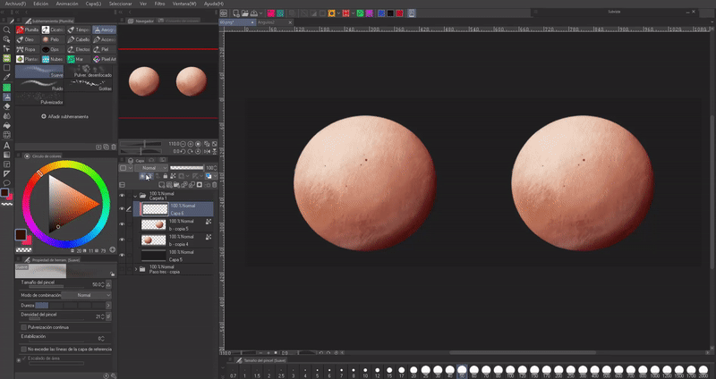
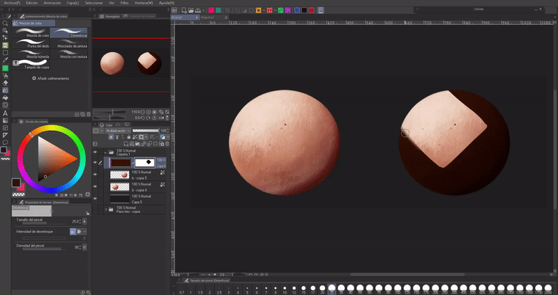
This is an example of the colors of the environment. The skin is in a purple environment, so it acquires a small shadow of the color of the environment next to it, in this case the background. Looking at the example below you notice how the sphere on the left does not integrate into the background, it floats above it, while the one on the right does.
Another characteristic that the skin has, especially the hands, is that when you place, for example, a finger above a lamp you notice that the corner becomes reddish and translucent. This occurs at the edges of the skin because countless capillaries carrying blood pass through the skin. With the power of the light, the skin becomes somewhat translucent and the dominant red of the blood is seen. The two scales in the image show the most common tones that the skin takes when illuminated by a lamp. It can, on the one hand, take on yellowish colors from the light of the lamp or pink from blood.
That is why when they paint skin with a light source close to that part they have to make it translucent to increase realism and congruence. This characteristic usually appears with artificial light.
5. Post processing with blend modes and correction layers
IMPORTANT: Combine modes and correction layers are not mutually exclusive, they can be combined, use all of them to improve color, highlights and shadows.
There is an effective way to add dramatic lights and shadows to finished illustrations, for this we will use the blending modes. We can find these in the layer options.
There are 28 blending modes, these options can be grouped by the similarity of their characteristics. The groups are divided into darkening effect, brightening effect, contrast effect and color changing effect, the groups are as follows (normal effect is excluded from this division):
1. Darken.
2. Clarify.
3. Contrast.
4. Component.
- SHADOWS
In this case, to apply shadows we will use group 1 (darken), particularly the “Multiplication” mode. The effect offered by “Multiplication” makes the colors darker.
Once we have our illustration, we will create a new layer above which we will set the blending mode to “Multiplication”. Either with a brush or the fill tool we will paint the layer with a color or gradient according to the atmosphere. Additionally, using “Adjustment to lower layer” we can make a cut so that the color only dominates the section of the lower layer and cannot leave that area as seen in the GIF, but this is optional.
Now we will use the “Layer Mask” on the created layer, to do this we will click on the icon of a white square with a circle in the center, which is found in the layer options.
To use the created layer mask we must select the white thumbnail that will appear on the side of the layer. Using the eraser or a brush with transparency you can remove the unnecessary parts of the darkening. Painting with a brush with black ink reappears the hidden parts of the color. In this way we can make environmental and projected shadows in a simple way.
What the clipping mask does is generate a false clipping; if we delete the white layer the effects will disappear completely.
Additionally, if the shadow is very deep, we can modulate its intensity with the layer opacity or by blurring certain parts.
- RAYS OF LIGHT
When light hits skin or any other object, an edge of saturated light is generated between the shadow and the light. To achieve this effect we will use several combination modes.
NOTE: This border only shows up in direct light.
1. To start, I create a new layer above it with the blend mode set to “Multiply”, I apply a dark color to the layer; Then with a clipping mask I erase the part that will correspond to the light. I usually blend the edge of the shadow, but you can leave a hard edge.
2. Now on a layer above with an orange color using the airbrush or any other brush I paint the edge of the shadow. If the color is very saturated, I usually blur the edge a little or directly erase with the soft eraser with a minimum density or lower the opacity of the layer.
Later, I create another layer with the combination mode in “dodge (brightness)” where I will paint once again with the same color, but with a lighter tone throughout the part that the light illuminates. Ready, we already achieved the effect. Add a blue reflective shadow at the end to mark the volume.
The same process is followed on a face, but you have to be very careful to respect the volumes. The figure formed by the ray of light is deformed due to the different unevenness of the face. For example, if the light comes from the upper right diagonally on the face, when it hits the nose, it will generate a shadow projected following the direction of the light. Furthermore, the raised part of the eyelid will be the one that is illuminated, the rest will be shadows. The lower eyelid will block the passage of light, so a light curve will be generated.
When we are under a tree and the light passes through the leaves, it creates a beautiful effect that looks incredible in portraits. To achieve this we will follow the same process as in the previous one.
To do it faster, in CLIP STUDIO ASSETS there is a brush dedicated to this, to use it we will create a layer in multiply mode with a dark color according to the atmosphere and then on that same layer we will brush with an expensive color or directly white selected. Later, we can add that saturated effect between light and shadow.
- LIGHTS
To have good lights, it is good to use combination modes, the brightness modes bring the colors to life. The combination modes I usually use to place bright lights are: “Dodge (brightness)”, “Dodge (color)” and “Overlay”.
For dramatic lights we will follow the same procedure. For example, if the light comes from the background, the face will be darkened, we will darken it as explained above, with a multiply layer to which we can lower the opacity to modulate the depth of the shadow, and for the light a layer in overexpose brightness where I paint the silhouette of the body and illuminate the background using a light color according to the atmosphere, in this case blue. Then, in another layer in overlay mode I highlight parts on the hair.
- ATMOSPHERE
In a complete illustration we would think about the shadows taking into account the background or vice versa, but if we have both concepts with mutually exclusive colors; One way to couple them would be using combination modes.
To make this change of atmosphere we will create a new layer to which we will change the blending mode to “Multiply”, after that we will apply a gradient map or solid color in the direction that best suits us and if necessary we will lower it opacity to the layer as much as needed.
By combining both methods of adding lights and shadows with combination modes, we can drastically change the atmosphere, even if we start from a totally different illustration.
Gradient: I use a gradient because it gives me more shades than a monotone throughout the illustration. If you want to know more about gradient maps, I leave the entry to a TIP I made talking about them:
- CHARACTERS
To attach a character to its background we will create a new layer above the character, we will adjust this to the layer below, then we will apply a gradient or solid color, lastly we will lower the opacity to our liking. In this case, the room is in darkness, so it would be logical that the character should also be in darkness.
For a better result, I recommend adding details on new layers according to the general atmosphere. Also using layer masks you can delete parts that you don't need.
And finally, the “Color Balance” tool, with it we will vary the tones to achieve a better result.
In color balance, in the scrollable bars we find the colors cyan, magenta and yellow with their respective opposites on the other side, red, green and blue. Regarding the postponement balance section, we have the option to control the shadows, midtones and highlights. Maintain Brightness, maintains the light of the illustration if left selected.
6. Automatic shading
The last tool that I can recommend to work on the atmosphere of our illustration is: “Automatic shading”, a new function that we can find in the following path: Editing > Automatic shading.
To know the technical specifications of each of its sections, I recommend visiting this official tutorial where it is explained in detail:
To change the atmosphere we will use the preset modes as a reference and then we can change the color or intensity values to our liking. Having the layer selected we will open the tool, once in the tab we will locate the state of the day we need (day, night, sunset, etc.)
Now we will change the type of shading to “Cell shading”, this mode is the one that gives the best results in semi-realistic illustrations. Depending on the day state we choose; One or more levels will appear and we can change the color. Finally, by expanding or reducing the blue circles that we can move around the illustration, we will modulate the intensity of the light and shadow effects. Finally, we can change the type of light between discretionary or spherical.
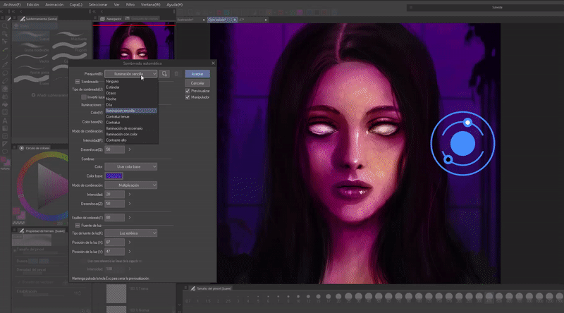
Ready. If we combine this function with the above we can obtain amazing results.
Farewell
I hope that what you see in this tutorial is to your liking and that it is helpful to you, sorry for being so long. Well, without anything to say, thank you for coming this far! ପ(๑•̀ुᴗ•̀ु) ॣ৳৸ᵃᵑᵏ Ꮍ৹੫ᵎ ॣ
Vibrate high!!!
We won't see you another time ( •⌄• ू ) ✧
Users who liked this post


Comment