
Presentation
Hello! Welcome to this baking class. On this occasion I will be your teacher in AriaVon-style baking. In this space we will learn some simple, but striking compositions; in addition to preparing dishes with bright and colorful colors. At the end I will reveal to you the secret of appetizing desserts. I hope it is useful to you, without further ado...
Let's get started!!
1. Angles
First, we must position our food somewhere in space; The angles will help us make our illustrations more dynamic. There is a wide range of presentation angles, such as:
1. Zenithal
2. Chopped dorsal
3. Dorsal
4. Low-cut Dorsal
5. Nadir
6. Against chopping
7. Frontal
8. Chopped
But not all of them are appropriate for food compositions, there are some that look better than others. Among them I highlight three:
1. CENITAL (90°)
This type of angle allows us to present the ingredients in close-up and in greater detail. Here everything is more symmetrical.
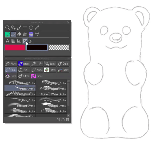
TIP: Use the symmetry ruler and shape tool to get exact strokes.
You will find it in the following path: Tools > Rulers > Perspective ruler.
2. DORSAL PICADO (45°)
This, on the other hand, shows a small angle that gives the composition dynamism, ideal for highlighting some area or element. Getting this angle requires perspective.
To achieve the appropriate proportion we will have to resort to the perspective rules that the program has.
3. DORSAL (0°)
This angle is characterized by presenting the food at eye level. Like the first, it's easy to draw, it's symmetrical and doesn't need a lot of perspective.
2. Volume
In order to draw delicious desserts we must consider the theory of lights and shadows, this is what precisely gives volume to objects.
► Theory of lights and shadows
Light allows us to see contours, textures and colors. This color structure acts the same in various circumstances.
✦ Direct light (1): Comes from a light source with its own light energy, such as sunlight, light bulbs, flashlights, etc.
✦ Reflected light (2): Also called indirect light, it is a type of light that comes from the body, it does not have light itself, but rather receives it from another. The reflected light cannot be as bright as the original light.
As for the shadows, they are responsible for cementing the volume. Below is a short description:
✦ Own shadow (3): It means that it is the area where light cannot reach directly, it is the twilight area; the color is usually dark.
✦ Projected shadow (4): It is the shadow that the object reflects on the surface where it is located. This shadow has the characteristic that the part furthest from the object is diffuse and the part closest is dark and hard.
► Three-tone technique
To better understand the theory of lights and shadows we will use the three-color technique. This technique consists of taking a light, medium and dark tone in a gray scale; From them give volume.
First, we establish which direction the light will come from. Then, on a layer below, I fill the shape with the intermediate color. Now on a layer above the middle color we begin to place the shadows. The shadows in this case will be placed in two important areas, the center and the lower periphery following the shape.
In the case of this bread and many others that have a crusty texture, to achieve it it is necessary to put that area in a darker color. For now we will leave it like this, we will render it later.
Note that the shape of this bread is a curled cone, so it is a good way to place the shadows taking this structure into account. Now with the light we will understand that it must fall on the most prominent parts. The volumes are not exact shapes, they rise and fall constantly.
The structure of the lights and shadows is already completed, now all that remains is to render: Mix the colors better, illuminate some parts of the cover to simulate the texture. I recommend using references to better understand the textures of different surfaces.
With an even darker color I illuminate the areas furthest from the light, these parts are known as: “Light occlusion”, places where the light does not reach. Now, with a lighter color we will soften the lights on the cover.
With a dark color, I highlight some edges and delimit other areas. Finally, with a light color, almost white or white, I place some glitter in the areas where the light should shine directly. I blend some of these highlights so that all the lines don't look so hard.
I render a little more, better delimiting the shapes and place a light color in the lower part so that the change from soft to the crunchy part of the cover can be noticed. On the other hand, I highlighted the cover with a darker color so that the shine stands out more.
Lastly, I place the cast shadow following the direction of the light. By mastering the gray scale we will be able to easily give color to anything.
- NOTES REGARDING COLOR -
There are some aspects of light that cannot be properly explained with gray scale, we need to turn to color. Let's see what they are:
1. Reflected light: It is the shadow that an object projects on another object, that is, they are neighbors between objects. This is best understood by placing an object of a different color. The light that the secondary object reflects to the primary object will be proportional to its own color.
For example: The cast shadow reflects its color in the closest area of the bread. In addition, the small pink spots simulate reflections from another object that is outside the scene.
2. Light edge: When light hits the skin or any other object, an edge of saturated light is generated between the shadow and the light. It is an effect that looks very good, but it should not be abused. To achieve the effect we will use a layer in “Add (brightness)” mode.
NOTE: This border only shows up in direct light.
- TIP: AUTOMATIC SHADING -
If you still don't know where to place the shadows, you can help yourself by using the tool: “Automatic shading”, a new function added in version 2.0 that can be found in the following path: Edit > Automatic shading.
To use it, you must create a layer below the lineart where the figure will be filled; then, staying on the fill layer, we will mark the lineart layer as the reference layer (lighthouse icon).
Now you have to go to the tool, when it opens we will mark the option: “Use the lines of the reference layer as a reference”.
After all of the above, all that remains is to move the light source, change the colors and move some settings until it looks the way you want.
If you want to know more about the configurations, I recommend reading this official tutorial:
3. Color
To choose colors we will have to resort to color theory, but don't worry, we won't talk about all of it and its multiple explanations. In the case of desserts, only a couple of concepts will be necessary; Let's see which ones:
► CONTRAST
To make our illustrations look appetizing, we must create a contrast, because contrasting two opaque colors is not the same as contrasting one dark and one light. The second option is more appetizing.
The most contrasting (saturated) colors are the most striking, the ones that seem most appetizing; Therefore, to choose colors it is recommended to use those found in the upper quadrant of the color circle.
CONCLUSION: As much as possible, gray tones should be avoided.
Now, let's think about what color palette to use. To do this we will resort to color harmonies, using them correctly, we can create palettes that give credibility to our illustrations. There are five important harmonies, but in this case, by using two of them, we will obtain good results; Let's see what they are:
1. ANALOGS
Analogous harmony is formed by the implementation of colors that are close on the color wheel. Due to their proximity, they combine well with each other.
2. COMPLEMENTARY
Complementary colors are those that are opposite on the color wheel, this combination causes a contrast.
- EXERCISE TO CHOOSE LIGHTS AND SHADOWS -
We take a random base color and then move to warm colors (from red to yellow) for the lights and cool colors (from purple to green) for the * *shadows following the structure of some color harmony. Doing these types of activities helps us learn how to combine colors.
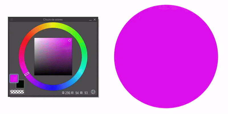
- TIP: CHOOSE COLORS -
A tool that we can use for these purposes is: “Color slider”. From this tool you can extract the luminosity, saturation or tones of a color that has been selected from the color wheel. The first color icon corresponds to the primary color, the second to the secondary color and the third is transparency (if the brush is used it acts as an eraser).
This tool is located in the following path: Window > Color Slider.
Step 1: We choose a tone from the color wheel.
Step 2: The normal thing in this step would be to choose the luminosity and saturation in the color square, but if it gets complicated, this is where this beautiful tool comes into play. We slide the controllers until we find the color that best suits our needs.
4. Important elements
Here we will list some considerations that we should know to achieve a better finish in our desserts.
1. TEXTURE
Texture is fundamental in illustration, it is what gives it realism. To achieve it, it is not necessary that we dedicate hours and hours to do each of the details, we simply have to simulate it, but how do we achieve that? Very easy, you have to go from the largest to the smallest. Let's see it with an example.
- COOKIE -
To get the texture of the cookie I take a light orange color with which I draw a mesh, in the second step I take a more saturated orange color with which I fill the gaps. Finally, I add a touch of light with a color similar to that of the mesh and a small brown line in the corner where the light should shine directly, this in order to create a volume, since in that section an angle of 90 is formed. ° with light.
- ICE CREAM -
Getting the burning texture is not difficult because it is smooth, but it has some aspects. Which are:
One: The shape of the cream when served is curled, so the lights and shadows when painted will take the shape of a stretched rhombus that follows the direction.
Two: The lighting close to the light source will be clear and saturated, while the challenge will have dull light. The same goes for shadows, but you still have to remember not to choose gray colors.
- BISCUIT -
Baked breads have the peculiarity of being spongy. This is due to the air bubbles that remain inside the mixture when baking. We notice these bubbles when cutting the bread and seeing the porosity of the crumb. To achieve this texture it is as simple as painting small dots of a dark color, but not so much throughout the cake.
As you could see in these examples, we started with the biggest thing, the structure, then the color and finally the lights. It does not need to be detailed for the shapes to be understood, in addition to providing rest to the observer's eyes so that they do not feel overwhelmed by so much detail.
2. REFLEXES
Reflections simulate the presence of another object, even if it is not shown in the scene. Adding them adds more information to the illustration, making it more interesting.
It is not that difficult to represent them. First we will mark them with a solid color, they can be specific figures like a window or simple spots of another color. We blur these spots a little and lower the opacity of the layer. The color of the reflections should reflect a certain harmony with the rest of the colors in the composition.
Opaque: By painting only the reflections we achieve a matte texture.
3. BRIGHTNESS
The glitter is the soul of the illustration, it highlights it, makes it more striking and delicious. We make these with a pure white color and a hard brush. For some of the highlights it is good to blend the edges. Most of these follow the shape of the volume or some others form semicircles.
Glitter: Glitter gives the illusion of a reflective surface. We will use it a lot to represent glazes.
Strawberries: Brightness is very important in desserts, they are what makes them more striking. For example, strawberries look more appetizing with glitter.
Glazes: These are jams that drip over the dessert or remain at the bottom of the plate. The denser it is, the shorter its length will be due to its inability to slide easily across the surface; On the other hand, the light ones will be long. Both need shine to achieve their reflective texture.
TIP: Draw them as drops sliding down a surface, usually following the direction of the surface.
- TIP: TOOLS -
Lights: To get extra lighting, use the layer in “Add (brightness)” or “Dodge (brightness)” mode and the soft airbrush with warm colors in the areas where the light falls directly.
Sparkles: Starbursts follow the same principle; We create a layer in “Add (brightness)” and with a warm color using the star-shaped sparkle brush.
Shadows: To get deeper shadows we can use the layer in “Multiplication” mode.
5. Let's paint some desserts
At this point we already know all the necessary ingredients for our desserts, now it is time to put it into practice with some examples and understand some textures.
- BRUSHES -
They say that the important thing is the technique, not the materials and that is true, but brushes are a good support to facilitate simulating textures. Personally, I like grainy brushes. The brushes used in the illustrations in this TIPS are:
• Pen G (Lights and reflections).
• Chalk brush pack (Color):
• Pencil D (Sketch and/or color):
• Roro oil (Details):
► Ice cream
Ice creams are mostly made up of two sections, the cone and the ice cream. The texture of the latter is not complicated, so the magic lies in the cone.
First, on a layer below the sketch, we will fill the shape. To do this we can use the selection tool and the paint can.
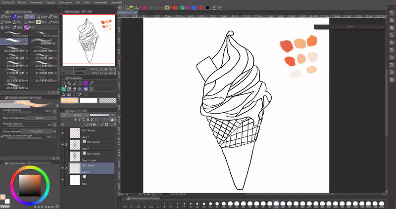
NOTE: The easiest way to fill a figure is once the lineart is well closed, is to use the magic wand in the white space and then invert the selection in the floating bar menu, move to the new coat and apply the can of filler.
We create a new layer above the base color to which we will attach to the layer below to avoid going out of bounds.
NOTE: If we create more layers above and dock them to the previous one, all of them will be linked to the area where the first one was anchored.
Now you have to determine which direction the light will come from, in my case from the top right. To start giving color you have to visualize the volume and follow the shape.
Then I placed the lights with a cream color following the direction of the cream. Ice cream does not have a complex texture, so shaping it is as simple as adding shadows and blending. For the cone wrapper I used a dark color on the sides, painting it like a cylinder, highlighting it in a lighter brown, but not so much in the center.
To make that texture so typical of cookie cones, you have to draw a mesh with a light color, and then, with a dark color, fill the gaps in a non-uniform way; let the irregularity be seen.
The entire mesh can be in the same direction or half in another, simulating the cookie curve of the cone.
Regarding the volume, to begin, you have to put a small shadow right in the first section where the light falls, that is, to simulate a cusp. The rest consists of a gradient from dark to light.
You also have to remember to place darker shadows, such as occluding the light behind the ice cream drop.
In order to highlight the cone more, I am going to place some small white or light colored lines following the shape of the cone, which I will then blur with: “Color mix”.
Lastly, with the “G Pen” and the stabilizer I place some small glitters and stars throughout the entire illustration with the color white, but this is just personal taste.
► Strawberry cake
With this strawberry cake it starts the same as the previous one. First, we fill the sketch with a solid color, and then, on separate layers we place the colors of each object, this way it is easier to paint without damaging the colors of the other layers.
We lower the opacity of the sketch layer to better see the shapes we obtain by applying the color. Now, with “Block transparent pixels” I place the shadows following the direction of the light. For example, strawberries have a small cast shadow and an occlusion of light between them.
In the next step I start with the rendering. First I define the edges, and for the cake I use a porous brush with a varied size, giving small dispersed brush strokes to give the shape of porosity that the bread has due to the air stored between the mixture when baking. Then, with the tool: “Color Mixing” I blur the edges of some parts a little.
Strawberries: For the texture of the strawberries it is necessary to place some small dots throughout the strawberry to simulate seeds. For those close to the light source, I place a small dark semicircle to create the sensation of depth. Regarding the brightness, I place some clear lines that surround the first section of the strawberry forming rhombuses that surround the seeds.
Lights: For the rest of the slice I place some pure white highlights with the “Pen G” brush. This is the biggest secret to making desserts look attractive, putting lights with pure white. But we must not abuse it, because otherwise we would end up burning the image.
Finally, with a new layer with the combination mode at “Brightness (add)” I highlight the direct light of the strawberries with a yellowish color and with a light purple I outline the cast shadow to give it a touch of saturation. Finally, with the G pen I draw small crosses and dots throughout the illustration (this is more of a personal taste).
I'm sorry I can't start the process, when I wanted to export the timelapse I realized that I hadn't even activated it.
► Flan
The flans have their trick, it all comes down to the shine. First we start with the base colors, then the shadows. The caramel has the peculiarity of thickening and not letting light pass through so easily, that is why we will have to paint it a dark color and the edges of an orange color, and in some sections a dark orange mixed with the dark brown of the caramel .
Regarding the flan, I will add some yellow glitter using the layer in “Glitter (add)” mode and with a pale pink color on the shadow side.
For the caramel on the top I will follow the same process. Finally, I outline the entire border with orange and blend it.
Now comes the magic. First with the “G Pen” I place small glitters with a pure white color; These will be the main highlights. For the reflections we will create a new layer where we will paint their shapes with a hard brush with a pure white color. Next, I lower the opacity of this layer to a level that seems appropriate to me.
All that remains is to blur the edges a little. For this I use the “Gaussian Blur” tool found in the following path: Filter > Blur > Gaussian Blur.
Since the colors did not convince me at all, I decided to modify them using several tonal correction layers, specifically: Color Balance, Tone Curve and once again a tone curve layer. These layers are very good for giving color to the illustrations, I recommend their use. We can find them in the following path: Layer > New correction layer.
If you want to know how to use these tools, I invite you to read this other TIPS where I address each of them:
Lastly, render a little more, add some highlights with the “Add (brightness)” mode and shadows with the layer in “Multiply”. Ready, we now have our baked flan.
- TIMELAPSE -

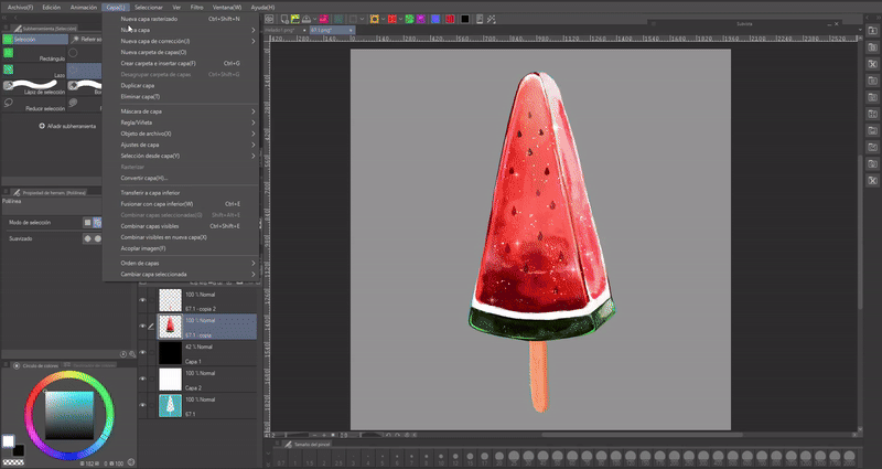
►Suika Bar
For those who do not know this candy, the suika bar is a frozen popsicle of Japanese origin that is shaped like a slice of watermelon.
We begin by placing the base colors, the beauty of this type of candy is its cold surface, to simulate it we will use light colors and mark the three-dimensionality of the object; In the case of the watermelon it has a face that is not visible, but we will mark it a little.
In this damn I start rendering, I mark some colors better and I start to better outline some lights with pale colors.
Now, to mark the coldness of the surface, we will use a light color, almost white, in a layer in “Add (brightness)”, in addition to putting some light green highlights in the lower part. I place each of these glosses marking vertices of the volume, in this way the volume is better highlighted.
To finish the texture and make it look more like an ice pop, I paint spots on top with a porous brush following the direction and color of the area.
Now place a series of glitters with a spray brush with different sizes and opacities on a layer in “Add (glitter)” mode.
Finally, to simulate the classic drops of water falling from a frozen element, what I did is with the “G Pen” with the opacity at 100% I draw these shapes and then I blur the edges a little with the “Blend” tool colors".
The characteristics of these drops are that they are long and thin. I recommend that they all flow in the same direction.
I blend some glitter, paint some stars and that's it. A delicious suika bar made to order.
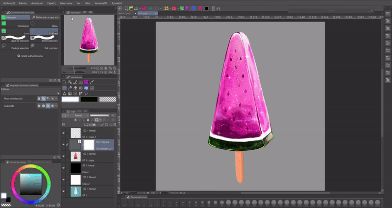
- COLOR CHANGE -
There is a tool that allows us to change the color quickly. This can be useful to simulate different flavors; so we wouldn't have to draw a new one. The tool is: Tone/contrast/luminosity. As its name indicates, with its controls we can change the tone, contrast and saturation of the colors. If we place each color on a separate layer we can modify them separately.
We find this tool in: Layer > New correction layer > Tone/contrast/luminosity.
- POST-PRODUCTION -
Post-production of an illustration is important to give it some improvements. One of the useful tools for this is: “Color balance”, this is a tool that allows you to improve the quality of colors, make them more intense, more striking.
We find this tool in: Layer > New Correction Layer > Color Balance.
► Donate
For this donut with red glaze I did exactly the same as in the previous processes. Start with the base colors on separate layers, then move on to placing the shadows and highlights using a layer with “Transparent Pixel Lock” so I don't go out of bounds.
In this part I rendered a little, improving the limits of the colors. Next, I added some highlights on a new layer that I lowered the opacity and blurred a couple of the edges.
I also added a cast shadow. A trick to make the projected shadow adapt to any background is to paint it completely black and lower the opacity to the level that seems correct to us.
Finally, draw highlights with white and add a texture to which you flatten using the “Overlay Texture” effect found in the layer properties palette, and finally lower the opacity of the texture.
We add a background and that's it.
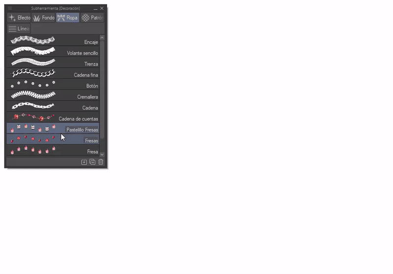
Extra: Dessert brush
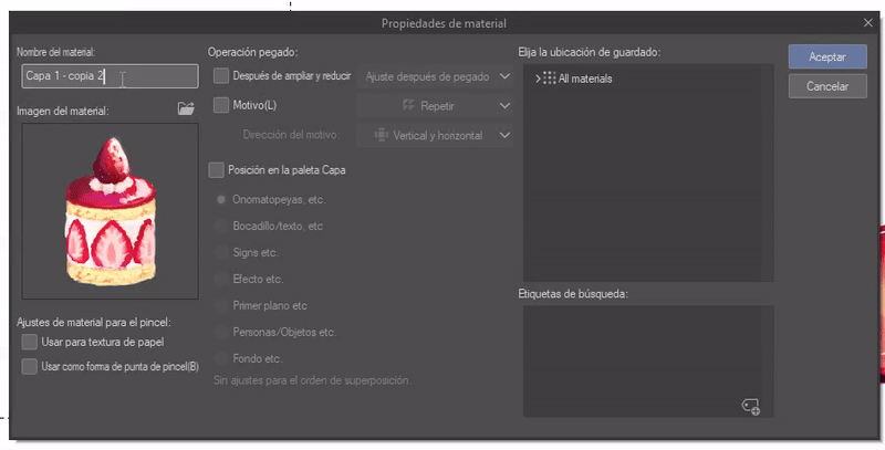
As a last point, I will teach you how to make a dessert brush, so we can use them in other illustrations with a single click. The desserts that I will use will be these:
First you have to register each one as a material, to do this we will select one with the “Selection” tool (I recommend the rectangular tool). Afterwards, we will go to: Edit > Register material > Image.
A window will appear where we will enter the name of the material, its location within the program and most importantly, we must check the box “Use as a brush tip shape.” When we have everything, we accept.
Now we will go to the “Decoration” brushes that CLIP STUDIO PAINT has incorporated by default. We choose the “Pearl” brush and we will duplicate it by right clicking on it, a menu will appear where we will mark the “Duplicate sub tool” option.
A window will appear where you can modify the name, icon and other options, but in this case only the name is necessary.
Once the new brush has been created, we will go to the wrench-shaped icon located in the lower right part of the window “Tool Properties”. A new window will open where we will go to “Brush Tip”.
Now press the arrow on the image shown at the top, the search engine will open, here we choose the material that we registered previously and when finished we accept and close the previous window. Ready.
By doing the above we would already have our brush, but if we want it to have a combination of different desserts what we will have to do is add new materials. To do this, we will click on the sheet icon at the bottom right, once again the search engine will open where we will add the material.
We can add various materials to the same brush. Incredible!!!
This is how the brushes look. We can modify its size and some other properties like a normal image brush.
Farewell
I hope that what you see in this tutorial is to your liking and that it is helpful to you. Well, without anything to say, thank you for coming this far! ପ(๑•̀ुᴗ•̀ु) ॣ৳৸ᵃᵑᵏ Ꮍ৹੫ᵎ ॣॣ
We won't see you another time ( •⌄• ू ) ✧
Learn more about me at:
Users who liked this post


Comment