
Intro
Hello there, this is Tamil. Today I wanted to go over pencil sketching. Specifically how to immitate traditional look in Clip Studio Paint.
I made a lot of dense tutorials before and I am happy it helps people. This time, I wanted to do a little bit different approach. Specifically for my video. I wanted to make something more inspiring. Less dry information and more about giving you the mood to sketch! I have watched so many good tutorials, but a lot of times I learn and then don’t practice the discovered topic. This small experiment is for YOU to do your sketch today ~(˘▾˘~)
Free ᕙ(⇀‸↼‶)ᕗ
Yes. You heard that right. Everything is free:
- My own pencil brush
- 3 real paper textures of my own sketchbook
- High res art
I hope it will help you learn and be a better artist.
(˵¯͒〰¯͒˵)
( I will put a separate link at the end of the article for timelapse and CSP file too! I don’t mind sharing it for free, but gumroad is forcing me to put 1$ for big files :/ it’s really unfortunate, but maybe one day it will get changed! )
Relax before drawing
What? You need to relax before art? In my opinion yes. It helps so much. And I am not even talking about references or brushes or what kind of software you like to use.
I recommend making sure you did your list before you start doing any art at all:
- Have you picked good music to tune for drawing? A podcast? A youtube video?
- Have you ate and drank? No way we can do good art on an empty stomach. I try my best to make some tea beforehand.
- Sleep and exercise? Have you taken at least a 10 minute walk outside?
- Do you actually want to draw? I know it seems so simple, but sometimes taking it easy is also good. Don’t feel like you need to force yourself all the time to make art. Life is complicated, and if you need a break, that’s okay too.
Paper Texture
So how do we imitate traditional pencil look? Usually I start with a good paper texture. There are many different ways you can get textures. There are lots of online if you search for it. Another great way is to make your own!
If you have a scanner or a good camera, you can always take pictures of your own sketchbook. There there are some cons and pros for each.
Don’t forget that we can always manipulate the scans we already have. If you take a scan, a lot of times you will need to increase contrast in order for the paper texture to show up. A good tool for that is going to be levels.
We can import our texture into clip studio with a simple drag and drop. On top we can create the level correction.
I know it might feel daunting, but it’s not as complicated as it looks! Entire line is information / data of our image. As you can see my texture is mostly on the right side, which means it’s mostly white.
Left slider is black point. Right slider is white. The snail is the mid point slider. Usually I do not touch the middle slider at all.
In this case we have a lot of empty space in the middle, which means we can bring the contrast a little more if we want to.
This is what I had before for my texture. You can feel the paper if you zoom in, but not as strong.
In this example you can see that I pushed the black and white to the limit. Right where the information is cut off. Very simply. I pushed contrast really really hard. Is that a good thing? Well, kinda. The best part is that we can manipulate the effect little by 50 in layer panel.
See? We can put the levels to 50% or more depending on the style you going for.
Don’t forget that we can always add color to your textures. I usually throw a Multiply or Overlay on top to make my textures pop. Light orange on multiply makes it more vintage looking.
Now we have a really nice texture to work with for the future. We can save it as separate texture and it will make our art pop more. The entire paper is now in 50% gray tones. It’s not just pure white. This will help the art on top stand out.
Pencil
Penciling. Sketching. Skepenciling. Whatever you want to call it :D it’s fun and easy.
I honestly wish I could only sketch my entire life and just live off of that. If you feel stuck with your art and have too many unfinished paintings, then I recommend going back to the basics. Just do basic sketches.
To start out, you will need a pencil brush. There are so many good pencil brushes out there, it’s impossible to count. Clip Studio Paint assets has lots of options there; free or paid.
I will make a quick pencil brush for myself that is free to download. Completely up to you if you want to use one from the asset store. Here is the link just in case:
Let’s make a really quick pencil brush. In case you missed it, I have done a tutorial for brushes settings before.
To make a brush, first we will need a quick brush mark. This will define our brush stamp. It depends on what you want to create, but it’s good to start simple!
We will need a small canvas to create. Usually I go for 250px by 250px or smaller. The most important part to change is basic expression color. This way we can make it black and white for the brush stamp.
Experiment with what you want to create. This is just an example of possibilities.
Once we are done we can select all by Ctrl+A.
Then edit + register material + image. Now we can save our stamp for a brush.
You can name it whatever you want to. Make sure to check “Use for brush tip shape” at the left bottom corner. Then in the location just pick any folder you comfortable with. You can either find it later by name or location, so remember either.
Once we have that, there are many ways we can start. Usually I just duplicate an existing brush I already enjoy that is close to what I need.
Once we have that, we need to open our secret brush panel to tweak. To do so just do Window - Tool property. In there we can access the wrench icon.
Most of the magic happens in here.
First we need to go to Brush tip and add our stamp that we made. Just click the add button and find your stamp. Make sure to the delete the old one. That will be the trash bin on the right.
After making our brush tip, there are lots of things we can tweak, but the main one for brush is to add more texture to it.
In texture panel we want to pick texture that has more grain and feels like paper. There are lots of default textures in clip studio paint, but you can also import your own! I just used one of my old scans I made.
Main things to play with is texture density. Low will make it harder for the brush to show up. Texture mode is usually good for height or subtract when making a brush. Other settings are more about experimenting and seeing what works best.
Last two things to add are opacity and size pressure. It depends on the type of pencil you looking for, but usually most pencils do not work as ink. It needs to be a little transparent and build up.
Go to ink+opacity tab+make sure pen pressure is on. Sometimes the opacity is off because color mixing is turned on. So watch out because they cannot both be on :) I made that mistake many times and being confused.
Go to brush size + brush size tab + pen pressure + tilt.
Pen pressure will let us change the size of the brush based on how hard we press. On the other hand, tilt is my favorite because it let’s use create a more thicker shading if you tilt the stylus. Just like a real pencil!
( some styluses do not support that function though )
There are more tips I can give to making your own brush, but if you never did it before, that is the basics I would starts with.
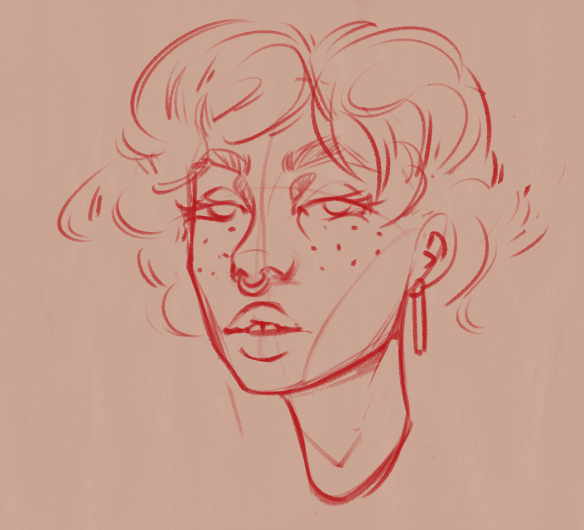
Color for Pencil
( Don’t forget to cross hatch when drawing! it’s so much fun to get lost in the shading from time to time )
After you have your perfect pencil and texture. I wanted to share a few tips about using pencil.
1. Never use pure black. Pencils can be dark if you press hard, but never black. It’s good to use 70% gray to start out.
2. Use multiply mode to keep the texture showing. Just lower the opacity to make it feel more authentic.
You can see that in the third one there is a lot more texture showing. I like to keep it as much as possible when painting. Up to you if you want it though.
Another tip is to spice up your pencils with a classic blue and red combo. Lots of people use red and blue when sketching in real life. It’s almost feels like you making less mistakes when doing it.
Usually I start out with red as my base. Then put it on lower opacity and go over with blue. This way we have the blue as the the final and red as a nice color fill behind.
Another way to use this technique is to use red as the line work and the blue as shading. I pick the big shadows and just fill it with blue as much as I can. Then put it on lower opacity and sometimes just smudge it with the blur tool. Works like a charm.
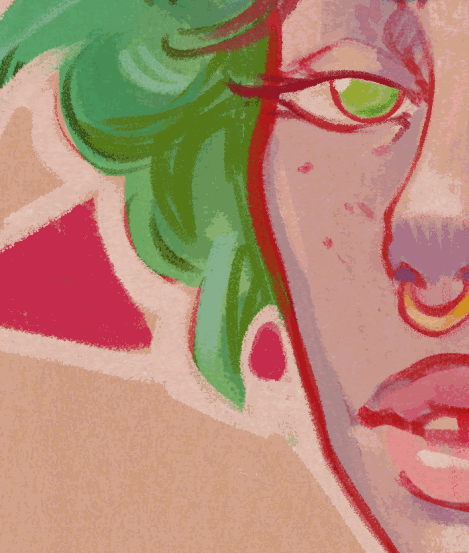
Tricks to make your art pop.
A lot of artist say to focus on fundamentals and do your best to focus on anatomy. It’s a really good advice. Never stop studying, but it’s also good to know when you can cheat a little and make the work look better without too much effort. It’s good for commissions or just when you focusing on the presentation part.
Fill in the sketch from the back. Make a new layer in which you can add a color depending on your color theory knowledge. The main goal is to make the art move to the front. If you have a dark background, then a bright color will be helpful. If the background is bright, then we can go for a lighter tone.
Add an edge around the character. Again, we can go for more contrast. Add black outline or white depending on the environment. A lot of times I enjoy adding slight color to the outline to make it more colorful.
Add a shape behind the character! It depends on the mood you going for. It can be a square, rectangle, sphere, or a triangle. I went with triangle since I love something more sharp in my work.
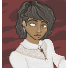
Give it more texture! It depends on the look you going for. If you want more vintage and even more traditional, then just add the same texture you had before on multiply. Lower the opacity until satisfied.
Keep drawing :)
You can add more colors, more cross hatching on top. Maybe even add some wash on top as if you used a little water color on it. The sky is the limit. I really liked this drawing, which is why I kept going and going. It’s only a matter of time before you get carried away and finish something.
Sketching is all about fun. If you not feeling the sketch, then you can always start with something new and get your art juices flowing. I remember taking a class and working on the same painting for more than 30 days. It was very hard. I was so happy to sketch when I finished it!
The end
Thank you for reading! I really appreciate you spending time with me. Hopefully you learned something.
Let me know in the comment on youtube if you feel like I missed something or enjoyed a specific part of the tutorial ^-^
Here are the extra resources. Because files are big, gumroad is forcing me to put 1$ on it.
My socials in case you want to follow me :>
Users who liked this post


Comment