
Intro
Hello! Today I’ll show you how to make an illustration of simplified flowers with Clip Studio Paint. First we’ll see how you can use your references to study a flower’s anatomy, later we’ll see how you can use vector layers to make your lineart more manageable and clean, and lastly we’ll see how to colour them in a way that harmonises with the style as a whole.
How to sketch flowers
First you’ll need references. For my illustrations, I’m very inspired by Art Nouveau, and you can come upon a lot of art on the internet to inform your style. Some of my favourite compendiums are free public domain books that you can find in the Internet Archive. Here are some I recommend:
Of course, you’ll need some flower references. I am fortunate enough to have a garden, and my mother loves orchids, many of which are flowering right now, so I’ll use those as reference as well as some fake flowers we have indoors. You’ll especially need references if you are not confident in drawing flowers, but don’t worry too much, flowers are one of the most forgiving subjects to draw.
We start our study by seeing what is the simplest shape that can shortcut our flower. We call this the gesture. Some flowers are easily simplified with a circular gesture, like the orchids, while for others it’s best if we use a cone, like for the rose. It’s also good to place the general position of the petals. After the gesture we can start constructing the elements.
Let’s analyse the elements of these orchids. They are Dendrobium and Phalaenopsis orchids. You’ve probably seen some similar orchids before, they are very common. Most orchids have five petals, with two of them being generally bigger than the others. These are called petals, the other three are called sepals. Orchids also have a lip in the middle, that may be large or small. In this orchid, the petals look very angular, but in the second one, they look more circular.
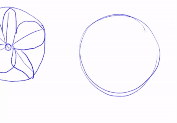
As I said, flowers are very forgiving, it doesn’t matter how you draw them, as long as they look close enough, it’ll be fine. Here are the studies of the roses:
Once we identify the major elements and what shapes form the flower, we can draw them freely. Don’t be afraid to pull out your reference and draw them, too. Nobody expects you to nail them right away.
I liked the way the orchids hung, so I’ll use it as part of the composition.
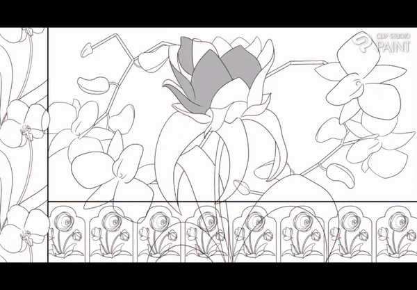
I decided to make an illustration with a rose like flower in the middle (those leaves don’t look very flower like, but don’t worry, nobody can tell, that’s how easy it is to draw flowers); two orchids; and two borders framing the central mosaic, one for the left side and one for the bottom. Decorative borders are commonly called “margents”, or “marginalia”, and are a common feature in Art Noveau’s architecture and design.
If you’re struggling coming up with compositions, you can always do several thumbnails. Thumbnails are smaller versions of the illustration that you do quickly, that way you can check if you like how things look.
The elements of the side and bottom function like border patterns, a very common use for flowers in illuminated books. I’ll show you how you can do patterns quickly in Clip Studio Paint. CSP makes patterns with the [Image Material Layer]. To make any layer into an Image Material, simply click the three lines in the corner of the [Layer] palette > Select [Convert Layer] > Click in the drop down menu > Select [Image material layer]. This will make it your layer into an Image material layer.
These patterns are very simple in that you’ll just need to keep some space between the elements to make them work. By default the borders of the Image material are those of the pictures, but you can change this by making a selection of the image before converting the layer, like this:
Then the pattern will be made with the selected space as the borders. If you select the Operation tool, you can see the differences. With the Operation tool still selected, you can also see the Image material Tool Property palette, where we create the pattern. There are 3 types of Tiling direction: Vertical and Horizontal, Only Horizontal, and Only Vertical. For our border, we need to select Only Horizontal.
We can do this process in the sketch, line art and colouring stages, which cuts a lot of the work.
Once we have our sketch, we can do our line art.
Line Art
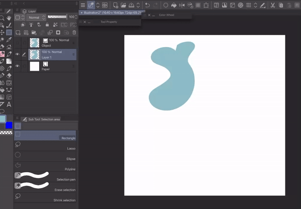
I like to make my line art in vector layers because it means I can edit them without much hassle.
I made a whole tutorial an how I use Bezier curves to make illustrations. My process is still the same, so I’ll just plug it in here:
Colouring
Base colours
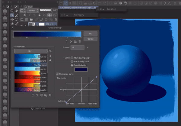
Before we start painting, make a base colour layer for each one of the elements. For this you can use the bucket tool, or a brush with no opacity change. Make sure everything is in its own layer, that way you can use clipping masks to make colouring easy. But what colours will we choose? When I have no idea what colours to pick, I use gradient maps.
I wish I would have made a video so I could explain gradient maps in detail, but alas, I didn’t have time. You can use this incredible tutorial by CrimsyCreates to learn how to use them:
Gradient maps are an easy way to change colours. Just make sure that your base colours go all the way from black to white. There are many gradient groups already in Clip Studio Paint, but there are also many more available in the assets library. Here are some of my favourites.
After a lot of playing around, I picked these six. They were all very good, but after some thought, I picked the second one.
Once I had my colours, I changed the base colours of the elements to the corresponding ones. One tool detail that makes colouring much easier is the “Do not cross lines of reference layer”. On your preferred brush, go to the [Sub Tool Detail] palette by clicking on the wrench icon. Then go to [Anti-Overflow] and click on the checkbox next to “Do not cross lines of reference layer”. If you are using a vector layer like me, you may also want to click on “Fill up to vector path”.
This makes it so that your brush remains within the lines of your reference layer. To make your line art a reference, just select all the layers that have line art and click on the lighthouse icon.
Colouring Line art
You can keep the linear black, but I prefer colouring them. I just place a Clipping mask layer on top of the lineart and fill it with colour. I use a colour close to the base colours, but slightly darker and more saturated. It gives the illustration a very refined look.
Painting the flowers
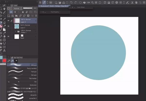
I use a very flat style to render the flowers, preferring to suggest the shape instead of defining it. Using a brush with the opacity set to pressure sensitive, pick where your light source is, and follow the shape. Give it one or two layers of a darker colour to insinuate a change of gradation. Here’s an example with a simple ball.
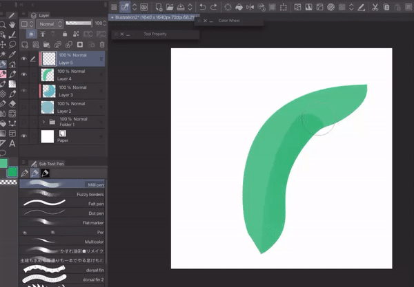
And here’s an example with something a bit more organic, like a leaf:
On some occasions, you may prefer to blend the colours to make the gradation more subtle, as I do here with the Orchids.
I also used the Finger tip blending tool to add texture in the orchid bulbs and petals.
After everything is painted, you can add some texture. I like to use the texture of this material. After downloading, just grab it and drop it in your canvas. Here’s also the opacity I like to use for them.
The objects in the background are just copies of the orchids’ lineart placed all over, since I felt it looked a bit empty.
Timelapse
Here’s a gif with a speedpaint of the whole process, from start to finish:
Conclusion
I hope this inspired you to make your own stylized flower illustration. It really is that simple to make. Thank you for reading all the way through! Have a nice day!
Users who liked this post


Comment