
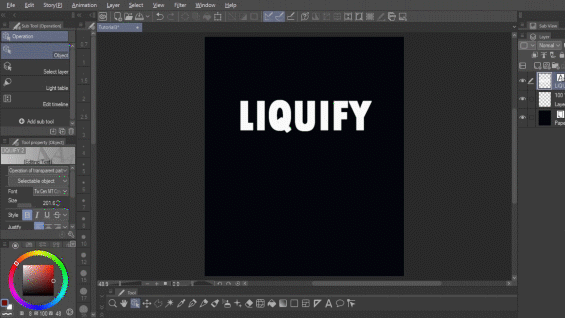
Hello everyone! Today I present to you another tutorial for Clip Studio Paint, this time on the topic of one of its newest additions: the Liquify tool. This tool has been highly requested by all of us, and CSP listened! I'll first show you a complete guide to the tool, and after the guide, I'll show you three different processes to create lettering posters with it, so you can grow accustomed to it while doing some fun practices, instead of just listening to me rambling. First let's check the tool:
Tool and Specifications
Previously, in Clip Studio, if you wanted to transform your image by moving it or moving a section of it, you only had [Mesh Transformation] and [Scale Rotate]. These are great for moving large sections, but they can be stiff and inexact. Enter Liquify, a long awaited addition to CSP’s catalog of tools. It’s excellent to move smaller sections or move an object with the precision and fluidity of a native brush.
In CSP, Liquify is located on the Blend tool, next to the Blend group. You can also press [J] on your keyboard if you have the default settings.
It has 7 modes: Push, Expand, Pinch, Push Left, Push Right, Twirl Clockwise, and Twirl Anti-Clockwise. Let’s see each one:
Liquify modes
✦Push
The Push mode moves the image towards the direction you move the brush.
✦Expand
The area of the image that is touched by the brush gets larger. It’s the reverse of Pinch.

✦Pinch
The area of the image that is touched by the brush gets smaller. It’s the reverse of Expand.
✦Push Left
This displaces the image towards the left, or up if you are moving horizontally to the right. It’s the reverse of Push Right.
✦Push Right
This displaces the image towards the right, or down if you are moving horizontally to the right. It’s the reverse of Push Left.

✦Twirl Clockwise
The image gets twisted in the same direction as the movement of the hands of a clock. It’s the reverse of Twirl Anti-Clockwise.
✦Twirl Anti-Clockwise
The image gets twisted in the opposite direction as the movement of the hands of a clock. It’s the reverse of Twirl Clockwise.
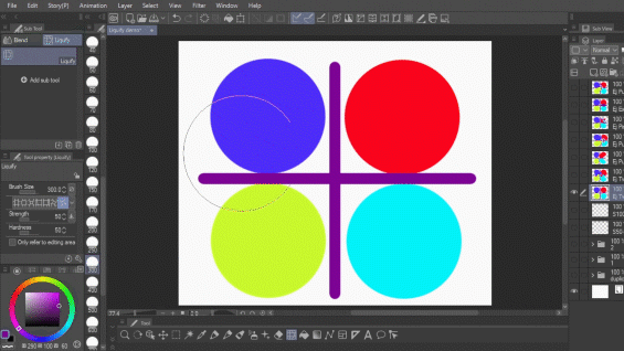
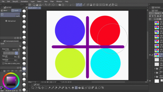
Liquify modifiers
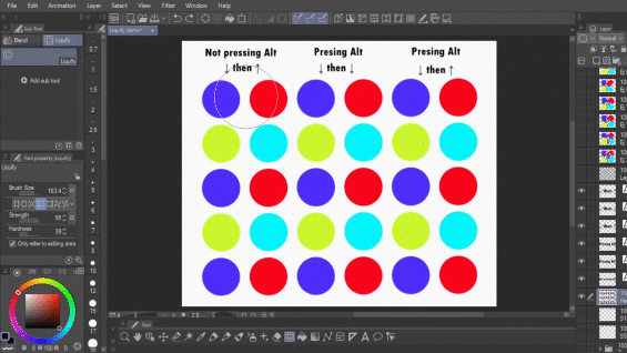
All three Push options (Push, Push Left and Push Right) require movement to work. The others can modify the image if you keep it pressed without moving. You can access the reverse of a tool while using the other, by pressing [Alt] on your keyboard, as seen here with Twirl Anti-Clockwise.
There’s an exception, however, with Push Left and Push Right. Both of them are direction sensitive, so if you move the brush downward or rightward, the image will be pushed as indicated by the brush, but if you move upward or leftward, the image will be moved to the reverse direction. So if you press [Alt] while moving upwards with Push Left, the image won’t move right but further left.
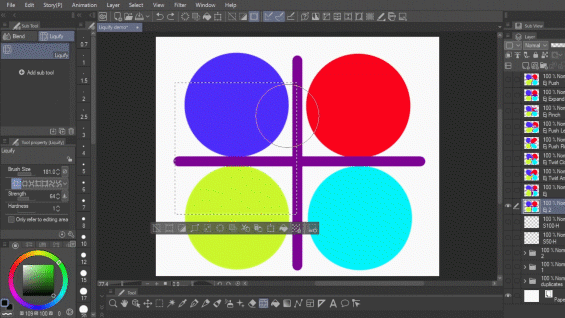
Another modifier that affects how Liquify works is [Only refer to editing area]. If you have this option turned off, the brush will reference the image beyond what is touched by the brush, if you have it on only what is touched by the brush will be referenced.

This also applies when an area is selected. The effect of the brush will not go beyond the selection, but it will take from outside of the selection if [Only refer to editing area] is turned off.
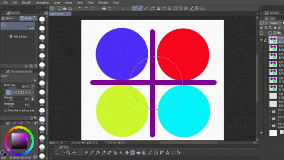
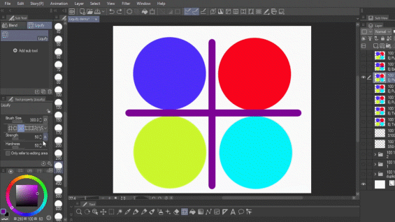
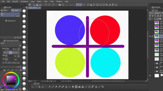
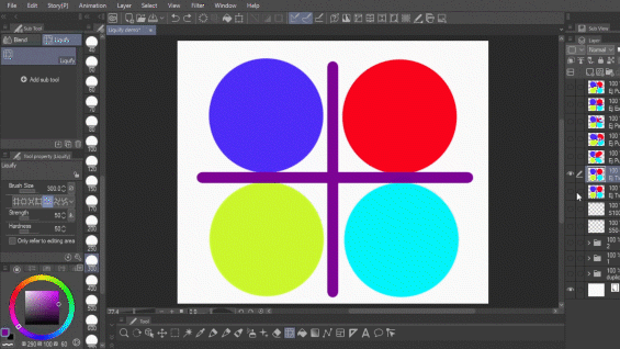
Let’s talk about the two modifiers of the brush: Strength and Hardness.
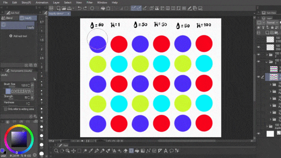
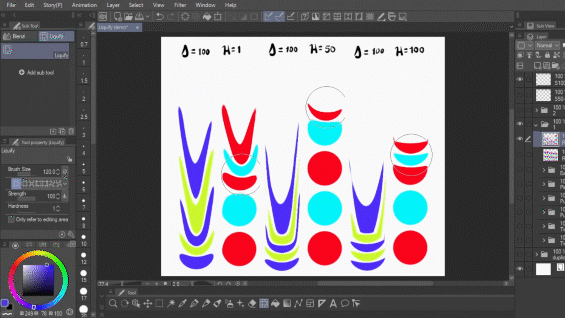
Strength determines the degree of intensity of the liquify effect. If the level is 1, the brush will have no effect, and if it is 100, it will be very extreme. Hardness refers to the focus of the effect. If it is 1, it’ll focus on the very center of the brush, if it’s 100, it will condense the effects on the area of the brush, creating a very clear border.
Here, I’m showing you how liquify reacts in Push mode with strength set on 50 or 100, and with Hardness set on 1, 50, and 100, but in the video I show them with all the modes.
Typography posters tutorials
Now, the liquify tool is excellent for little edits that make all the difference in an illustration; making the hand larger, moving the nose a little down, changing something’s perspective slightly; but something I love making and that the liquify tool makes a lot more amusing to do is lettering posters.
You know the type, with the melting letters or the malleable designs:
I just really love them, so I thought maybe I could show you three tutorials on how I do them. I’ll show you the tutorials here, but the video may be more illustrative. Let’s begin!
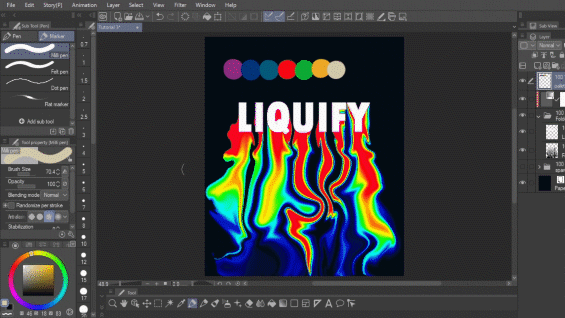
1. Glitchy letters
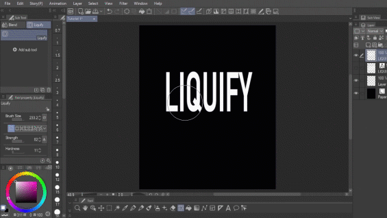
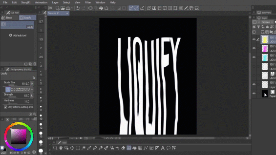
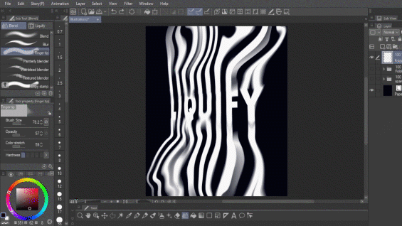
In a canvas with a dark background, write your message with a long font. You can also stretch them down, don’t worry. Don’t forget to rasterize the layer by right clicking on it and selecting [Rasterize].
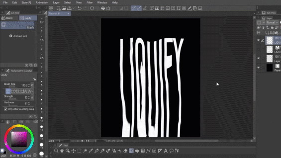
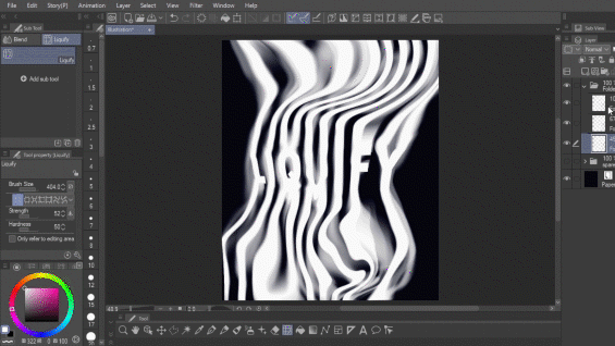
Then, use Liquify to further stretch the letters. Once it is at the desired length, use the [Finger tip] sub tool in the [Blend] tool to drag some of the borders, so as to not make it too stiff. Change back and forth between [Liquify] and [Finger tip] until you are satisfied. I later stretch them to the right, but for now, I’ll keep them this way.
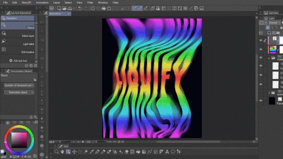
Once you're set, duplicate the layer three times, set them to Screen blending mode, and with [Level correction] in [Edit] > [Tonal Correction] > [Level correction] go to one of the layers and adjust the Red channel by dragging the Highlights output all the way to the left.
Do this on each layer duplicate, one for the red channel, another one for the green channel and lastly for the blue channel. You should end up with a cyan layer, a magenta layer and a yellow layer. Later, I regret the yellow layer, and erase it altogether, but it’s up to you.
Once you have your layers, move them around a little with Liquify, so as to make them visible underneath each other.
Then, make your Liquify brush very small, set hardness all the way up, and make horizontal passes on each layer, so as to make it look like there’s a glitch.
As I said, I changed the design midway because I thought it'd look cooler. You can go back and forth with [Liquify] and [Finger tip] all you want.
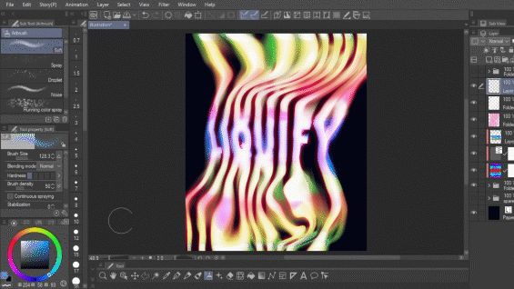
Lastly, I add some textures. I like using these three:
For this one, I always turn off the bottom layer:
Set these other two to Screen for a distressed paper look:
I also shift the colors a little with a [Tone Curve] correction layer. This is the final result:
2. Groovy letters
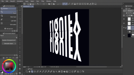
For this one, I will start by reshaping the letters into a trapezoid of sorts.
Duplicate them twice and flip each copy, placing them as if to mirror the original word.
Stretch them a bit, and apply a motion blur filter by going to [Filter] > [Blur] > [Motion Blur]. You can merge everything together then.
Once that’s done, stretch the letters upward and downward with Liquify.
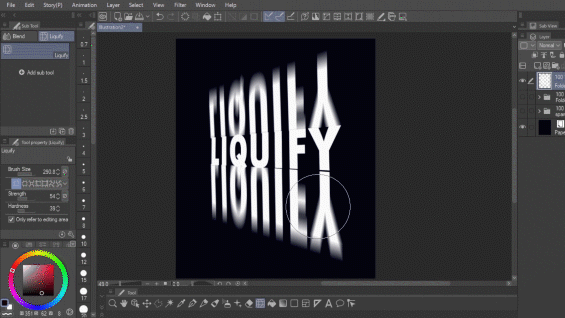
Use [Finger tip] to blur the connection between the letters.
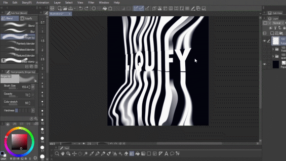
Once you’re happy, duplicate the layer twice and move the new layers around with Liquify. I colored them red to make it easier to read, but in the end I’ll return them to white.
Once the design is how you like it, create a Gradient layer by right clicking on the [Layer] panel > [New layer] > [Gradient]. I initially used a rainbow gradient, but I later regretted it, because it made the design too complicated.
Duplicate one of the layers and put it on top of everything. Give it a Gaussian blur by going to [Filter] > [Blur] > [Gaussian blur]. Duplicate this layer again. Set the top copy to Overlay, and color the bottom copy in pink and set to Vivid light. This will give it a blurry shine.
I tried as hard as I could to fix the colors since I was unhappy with them, so I did everything except actually change them, je, je. In the end I did just use a different layer with a purple, a red and a white, which made me way happier, but you’ll be the judge.
To create a chroma effect, I made some lines in a blue color with the Airbrush tool, I masked it to my group layer, set it to Multiply, and modified the layer with Liquify so as to make it look as if it curved with the design.
Finally I added the texture and a Tone Curve correction layer and, Voilá! Here's the final result as you just saw it, and with another color after I went back and revised it. Which one do you prefer?
3. Metal fire
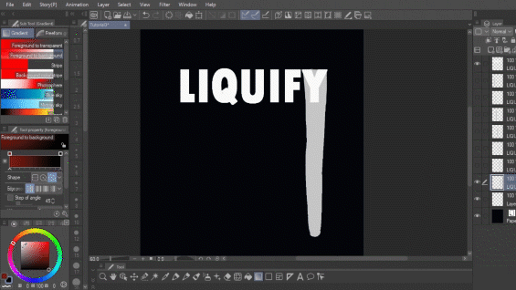
Last one! Start on a duplicated layer of your word, with Liquify set to a high strength and [Only refer to editing area] turned on. Stretch the bottom of the letters, until it forms a uniform line. Fill up problematic letters like I did with the Q, F, and Y, to make them easier to stretch on their widest point.
Once you have them all, select each one and cut them, so as to have each one on their own layer. Lock the transparency of these layers. Fill each shape with the Gradient tool. I choose black and white, but you can do this with any color.
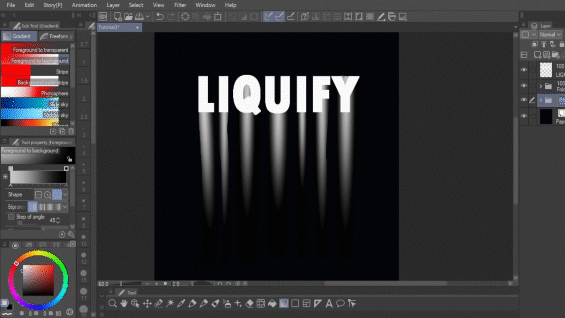
Once you’re done, merge them to the same layer, and use Liquify to create shapes. Don’t forget to soften it with [Finger tip] lest it looks too stiff.
I’m going to use a [Gradient map] to color this one. You can find it by right clicking on the [Layer] panel > [New Correction layer] > [Gradient map].
I also added a vivid light layer following the same instructions as in the second tutorial. I thought it needed something else, so I added extra flames to the top, and just to show you it doesn’t have to be complicated, I simply used an Airbrush to create the initial figures. Then, I modified them with Liquify. At this point, I also edited the white letters because they looked way too bland.
Alright guys that was it. If you have any questions don't hesitate to ask them in the comments. Have a great day, and don't forget to keep creating!
Users who liked this post


Comment