
First of all, I apologize if there is a language misunderstanding, because my foreign language is not very fluent
Definition of Composition for the Visual Arts
This is the main generator designed to make you think about combining fundamental rules of composition,
different compositional elements and various types of visual interest. When you consider the 'main focus'
and 'sub focus' subjects, and how to fit them together with the variables displayed you're essentially
forced to practice the fundamentals of composition without getting lost or confused.
So what variables are there?
like some visual elements or their placement
Like
-Line
-Shape or Object
-Proportion
-Size
-Space
-Color
-Texture
-Contrast
-Background
-Rhythm
So is it important to create a character? Of course!
Because in visual art it is important how a work can communicate with
audience. Composition makes visual art interesting, dynamic, balance, harmony,
calming or confusing.
Shots Composition
Shot composers have endless composition possibilities to choose from, so it is important for them to be able to determine which one best suits their goals.
The size of the shot will depend on how much detail is needed to tell the story being told.
Shot composition is the process of choosing shots for your character by framing them. Shooting composition is one of the most important elements in visual art because it influences the audience's reaction, mood and understanding.
Full Shot
Full Shot shows the full size of the character in the shot (from head to toe)
Mid Shot
This type of shot takes part from the character's waist to the head only or partially, to show the character's figure clearly.
Close Up
The Close Up Shot type is often used to emphasize the emotional state of the subject which usually only takes the character's head and this shot is also useful for showing details that can be used as a cut in.
For example, I make a character feel sad and have emotional courage.
Medium Close Up
This shot is taken from the chest to the top of the head to emphasize the character's image.
Extreme Close Up
This shot was taken from a very close distance with the aim of focusing on certain parts and is very clear.
Long Shot
The same as a full shot but the difference is that the shot is taken from a distance, the entire object is exposed to the background.
Extreme Longshot
Same as Long Shot but the shot coverage is wider like Concept Art.
Point of View [POV]
POV shows things from a particular character's point of view. This shot is effective at drawing the viewer into the action by giving them a first person perspective.
High Angle Shot
Taking a shot at a higher angle than the object. The resulting shot looks small and focused with the impression of being low, weak, inferior and lonely. The effect of this shot conveys the activities the character is doing without having to remove the surrounding background.
Low Angle Shot
Take a shot by placing the character object at an angle from bottom to top. With this shot, the object will look more elegant, tough, strong, dominant and luxurious.
Bird Eye View
Position the shot at a height like the point of view of a flying bird. This shot shows the surrounding environment more broadly and other objects around the character.
Group Shot
Taking objects in the form of a group of people such as a crowd.
Composition Method
Rule of Thirds
The Rule of Thirds allows us to create more interesting and dynamic compositions, especially dividing a composition into three parts, either vertically or horizontally, where the key elements of the whole work are placed along the lines or at their intersections.
By placing the subject at the intersection point.
How to make Rule of Thirds guide lines?
There are several ways to create rule of thirds guide lines, I found this when I first tore apart the Clip Studio Paint software so that I could maximize performance when using the software and I will share the method with you.
So you can choose which method you think is efficient when you use Clip Studio Paint.
Rule of Thirds using the Shape [Rectangle]
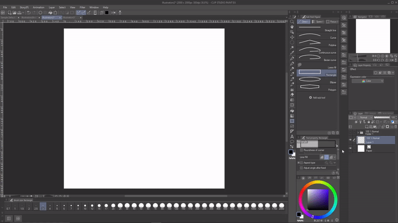
1.Go to the Figure[I] tool and choose rectangle
2. Make an equilateral square
3. Hold Alt+shift to duplicate and shift to the right or you can also copy paste with Ctrl+C [Copy] and Ctrl+V [Paste]
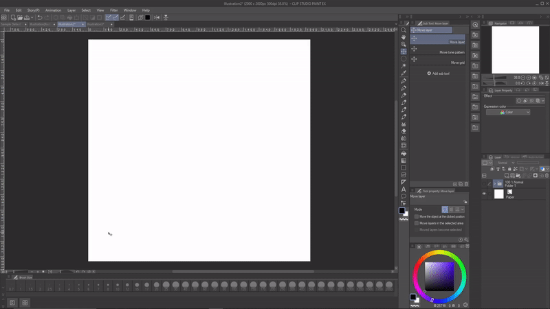
4. Do the same thing but by sliding down.
Look, the Rule of Thirds has been created.
So what about fitting the canvas size? First, merge the layers into one.
5. By going to the Move Layer Tool [K]. Then scroll down to tool properties and change the adjust position from free position to Canvas
6. See the Rule of thirds now follows the size of the canvas.
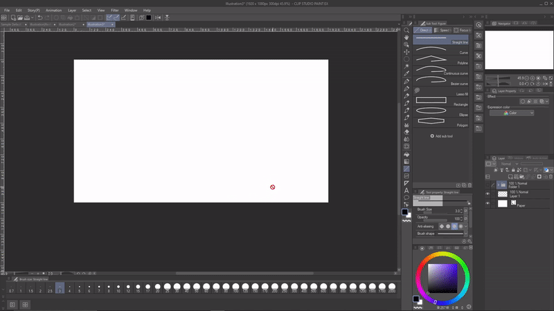
What if with a canvas size of 16:9 or 1920x1080?
7. Just copy and paste the layers that have become one by clicking Ctrl+C [Copy]
8. Then paste the layer to a new canvas, go to the move layer menu again and scroll down to tool properties, change the adjust position from free position to canvas.
Rule of Thirds using a Grid
1. Go to the view menu, scroll down and check grid to turn it on.
2. Go back to the view menu and go to “Grid/ruler bar settings”.
3. If you use a canvas with a ratio of 1:1, then just use this formula, because whatever the size of the canvas, from 1000px onwards, the results of the grid will remain the same.
4. Draw intersecting vertical and horizontal lines and create a rule of thirds.
5. And this is the result.
6. What about a 16:9 or 1920x1080 px ratio? Ok, go back to the view menu and go to Grid settings.
7. In this case, if you use a size of 1920x1080 px, then the horizontal part uses the formula one-third of 1920 and the result is 640, because it has been divided into Number of divisions, just put the number 1.
8. Then what about the vertical part? the same thing, divide 1080 by one third and the result is 360.
9. And this is the result of the formula.
Rule of Thirds using a Frame

1. Go to the Layer menu and select Frame Border Folder [C].
2. Name it "Rule of Thirds" so it's easy to find it in the layers.
Just give line width 3 and tick Draw border.
3. Give divide 3 because we are making a Rule of thirds, check "Fit to Side Direction of Frame", to divide folders select "Do not Change".
4. And this is the result with a canvas ratio of 16:9 and 1:1.
Golden Ratio Composition
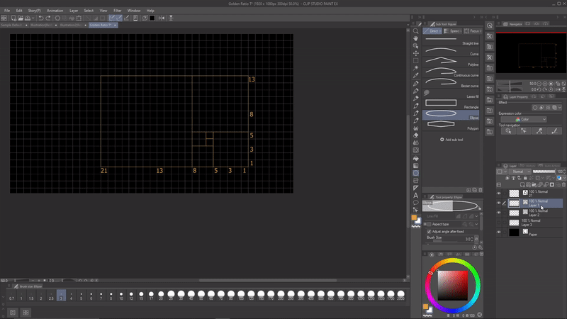
The golden ratio is a number used when two quantities are divided in such a way as to produce the same ratio as the ratio of the largest of the two quantities. The number is 1.618 or called phi.
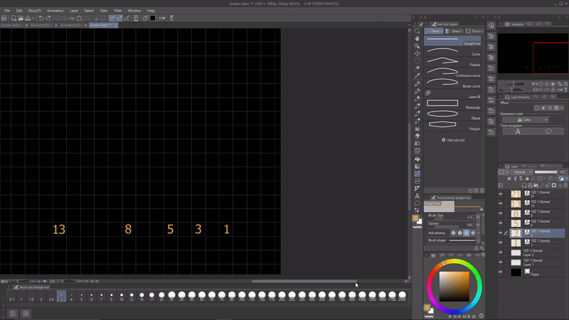
The concept of the golden ratio was developed based on the Fibonacci Series to show the difference between two numbers in the series. In simple terms, the Fibonacci Series itself is the sum of the two previous numbers. Examples are 0, 1, 1, 2, 3, 5, 8, 13, 21, etc
for example 0+0=1, 0+1=1, 1+1=, 1+2=3, 2+3=5, 3+5=8 etc
What is the Phi Grid?
The Phi grid is another way to consider proportion in art, it looks like the rule of thirds, but it uses the ratio 1:0.681:1 instead of 1:1:1
This method is used to place the subject slightly more centered in the middle. This method makes the composition more unique and attracts attention, but it is more difficult to use than the rule of thirds.
Guide lines "Golden Ratio"
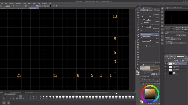
Make a distance between the Fibonacci sequence, to copy paste easily, you just hold Alt+Shift and shift to the right, indirectly you don't need to calculate it again from a vertical position.
Right click all selected layers and select merge selected layers.
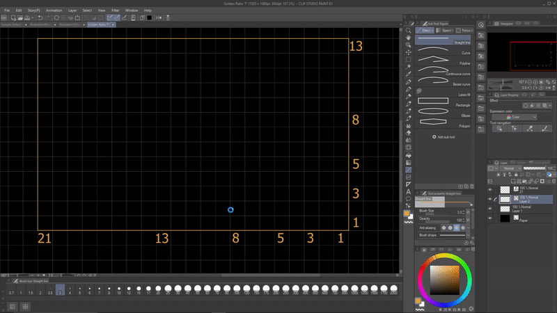
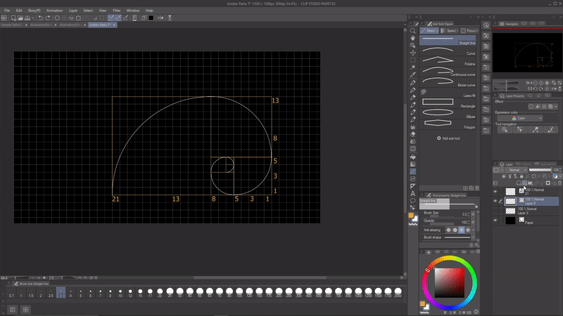
Draw a rectangular line following the Fibonacci sequence.
What about the spiral? by making a circle the size follows the Fibanocci series, for example if we want to make a "13" spiral then we make a circle twice the size.
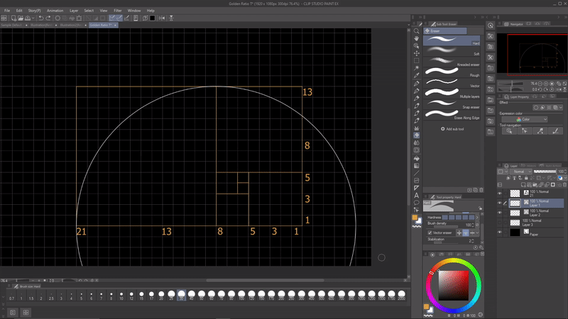
There are two ways to delete a third of the circle, namely the first way, if you are using a raster layer, then use the Selection Area [M] tool to cut it and fill it using transparent.
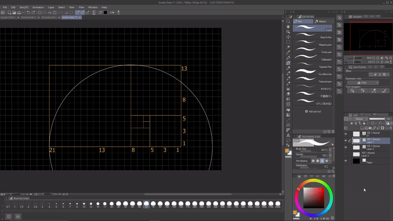
The second way is if you use "Vector Layer" then create a straight line to cut the meeting point so that the circle becomes a quarter using the Eraser in the "vector eraser" section.
Do it repeatedly for other numbers.
This is the result of the Fibonacci sequence numbers 1 to 21.
To use the commonly used golden ratio, we will add the 34th number of the Fibanocci sequence, do the same thing to make the continuation spiral.
This is the result of the commonly used golden ratio.
Diagonal Composition
In a diagonal composition, the various elements in the image are arranged along diagonal lines. Such a composition can emphasize perspective, give a sense of depth to the image, and add dynamism.
And The diagonal line does not need to be exactly in the middle.
Triangular or Pyramid Composition
This composition can be used for various purposes, generally starting with the character standing to get the impression of stability and if you position the inverted triangle, what differentiates this composition is the impression of dynamics and instability.
Rule of Space
This rule states that if the subject is not looking directly at the camera, or looking out of the frame, there should be enough space for the subject to look in and this rule uses negative space to highlight your main subject and automatically draw the attention of people who see your work to that main subject.
Negative space that relates to the main subject so that it suggests movement, activity or conclusion in your composition. Negative space functions to determine and emphasize the main subject, so that it can guide your eye to it.
Negative Space
Negative space refers to areas of a composition that are empty, bland, or uninteresting. That's why negative space is also called white space; it's where nothing really happens.
Negative space is used to create balanced and harmonious photos. This is referred to as “the space between elements in a composition.” This kind of concept aims to blur the space around the object so that the eye focuses.
Frame inside Frame
A frame within a frame is the use of visual elements in a scene to delimit a subject, which in turn draws focus to that subject. The first frame is the literal shape and boundary of the entire image. A second frame is then created within the image, hence the term.
What are frames within frames used for?
-Direct the viewer's focus
-Create deeper meaning
-Establish an observation perspective
Symetry and Asymetry
You must already know about this composition.
Symmetrical composition indicates that the object on the right is the same or similar to the object on the left of the image area. Meanwhile, an Asymmetrical composition shows that the object on the right is not the same or similar to the object on the left of the image, however, it seems to show balance.
Line
A line is a combination of points that coincide or are close together. According to their type, lines can be divided into straight, curved, long, short, horizontal, vertical, diagonal, wavy, dotted, broken, spiral and others. Lines have character, for example an upright straight line has the character of being strong, sturdy and sturdy. Lines that have a soft and flexible character are curved lines and horizontal lines. Meanwhile, broken lines give the impression of being stiff, and spiral lines give the impression of being flexible.
Proportion
Every work created has the right comparison in terms of form and combination of artistic elements. Proportionality or better known as proportion is a comparison of the sizes of the elements, both comparisons between parts and between parts and the whole. Setting the size of the parts is a principle that is closely related to balance.
Contrast Composition in Art
Contrast is a compositional element in visual arts. Using contrast can create the desired effect, such as balance or dynamism, change the difference between color and value, create an impression of realism or abstraction, and produce a harmonious image.
Contrast adds aesthetic quality to visual art. This means that with the presence of contrast, visual art will become more complex or complicated. For example, contrast in visual art that shows differences in color and shape is of course seen as more complex than a work of art that only shows one color or shape.
Contrast can be defined as the juxtaposition of two elements that are different, but work together to create a balanced whole. In the visual arts, contrast is used to direct the viewer's attention to specific areas in a painting, and can be used to create a variety of different effects.
Contrast can be created using a number of different visual elements, including color, value, texture, and shape. By changing the level of contrast in a visual art, you can change the overall tone and feel of the visual art.
Color
Color contrast are colors that are produced as the intersection of the midpoints of a color triangle, resulting in the impression of colors that are opposite to one another.
Color contrast describes the contrast between the colors of an image. Complementary colors have high color contrast, such as the colors located at the ends of the color wheel.
Saturation is another way to describe color contrast, it refers to the intensity of a color.
Value
The value of contrast is created by using light and dark tones to create a sense of depth and three dimensions.
The definition of value in the visual arts is the relative lightness or darkness of a color, regardless of its hue. Value contrast can be used to make an object appear closer or further away, and can also be used to create a sense of drama or movement.
Shape
Lines, shapes, values, and edges all comprise an object's shape. Contrast can be used as an element to vary the thickness of lines, the relative hardness or softness of edges or the size and nature of shapes in a work of art.
Texture
Contrast of the texture surfaces (the texture contrast) reduces when the viewing distance increases. Similarly, contrast between the surfaces of the objects and the background (the area contrast) reduces when the viewing distance increases.
Texture Composition in Art
Texture is the impression of a material or the feel of a material that gives rise to the character of an object, for example a rough impression or a soft impression. Each object has different surface properties.
Texture can add realism and depth to a character design, as it can indicate the material, quality, and condition of a character's clothing, skin, hair, and accessories. For example, a smooth, shiny texture may indicate cleanliness, elegance, or wealth, while a rough, dull texture may indicate dirt, roughness, or poverty. You can use texture and detail to create contrast and harmony in characters, as well as to enhance a character's nature, mood, and environment. For example, characters living in cold, snowy climates may have more fur, wool, and leather textures to convey their warmth and survival, while characters living in hot, sunny climates may have more cotton, linen, and silk materials. texture to show their comfort and leisure.
Color Composition in Art
The main concept in composing with color is the “most, some and least” rule, which states that in a dynamically balanced color scheme, most colors should have the same temperature, value and intensity.
Four color components play a role in composition
These elements are called hue, saturation, value, and temperature.
Hue
Hue is a term to describe the name of the existing colors. For example, the color circle is formed from 3 basic colors, namely: Red, Yellow and Blue. Of the three basic colors, when you mix each color, color gradations will appear. and the color gradation whose color name is unknown is called HUE. So simply put, Hue is a color name, which is useful for identifying unique colors so that their identity is known to distinguish one from another. The Hue color range in the color wheel/color circle is from (0 degrees - 360 degrees) starting from red.
Saturation
Saturation is color intensity or the purity of a color. Saturation is simply the density of a color/weakness or strength of a color. For example, a perfect bright blue color means high intensity, but if the intensity is low the color.
The intensity range of a color is expressed in percent (%), namely (Grey) 0% - 100%. then 100% means the color is very Bright/Full Saturation.
Value
Value is the Color Value to determine the Brightness of a color or the Darkness of a color. The highest brightness is white while the lowest brightness is black. When designing, it is often used for lighting and shadow.
The number range is expressed in the form of Percent(%), namely 0% - 100%. so if it shows 0% then the color is black (depending on saturation) whereas if it is 100% it will be white (not perfect white but more saturated white, almost gray)
Temperature
Color temperature refers to the perceived warmth or coolness of a color. Warm colors like red, orange, and yellow have higher temperatures, while cool colors like blue, green, and purple have lower temperatures. The use of warm or cool colors can have a big influence on the mood of a work of art.
For example, a painting with warm colors may feel inviting and comforting, while a painting with cool colors may feel more calming and soothing. The use of color temperature can also help create a sense of depth and space in a work of art.
Definition Color Temperature
Color temperature is a system that uses numerical values to measure the color characteristics of a light source on a spectrum ranging from warm to cool colors. The numerical value is referred to as degrees Kelvin (K). We often associate orange with warm and blue with cool, but on a color temperature chart, it's the opposite. Higher values are cooler tones such as blue. Lower values are warmer tones such as yellow. A blue sky, for example, has a temperature of 12000 K. However, candlelight has a temperature of 1500 K
Rhythm
Rhythm is a regular sequence or repetition of an element or elements in a character's artistic composition, for example repetition of shapes or colors. Repetition of elements in an arrangement will give the impression of movement to those who see it. This impression of movement is called rhythm.
Thank you for reading! I really appreciate you spending time with me. Hopefully you learned something.
Users who liked this post


Comment