
Video
Hi! My name is Iarlis and today I come to you with a tutorial on how to make a nostalgic background so you can implement it in your illustrations!
Sketch and grayscale
TIPS before the sketch
Don't be scared by this step:
The most important thing is to make the composition. I recommend that you base it on a real photograph. In this case my scenario will be a landscape.
It is important to ask yourself what emotion you want to express: joy, sadness, fear, anger, etc.
Another tip to mention: Don't let realism be what I mean?
When we use many real references we only focus on the details and realism and not on the experiment itself.
(I clarify this: If YOUR style is realism, obviously don't take this advice. This tip is more for those who have a cartoon or anime style. Sometimes less is more.)
Sketch
I recommend that you separate the drawing into different scales (the closer to the “camera” is darker and the further away is lighter). This is known as depth, don't start with the details but we will place the elements on the canvas.
Explanation
Search
The use of a good reference is essential to know the type of scenario we want to achieve. From interiors and exteriors. Also, it is important to look for references already made by other people: like studio ghibli, or even in a film itself.
I leave references of some examples:
Color
We already have the pose and the general idea. Now it's time to do magic and trust the process.
TIP:
A good illustration that knows how to convey something is based on composition and color. Of course there are exceptions but in this case we will focus on the color.
If your idea is about something calm and peaceful, I recommend warm colors. If you want to convey fear and sadness, cold colors. These are examples, but color plays an important role in what we want to convey to the viewer.
Another important fact to emphasize is that at all times work on the canvas away from you. Because? If we zoom in a lot on the canvas we would focus on the details. It is always important to work by seeing the entire canvas so that we can build the scenario. Once this is done, you can move on to the details
edge tool
At this point I started with a wonderful “border” tool, which I used in almost the entire illustration. It helps me mark the lights and shadows. In addition to drawing elements.
Does the idea seem a bit obvious?
As you can see, I started using default “leaf” brushes and feather brushes to mark highlights and shadows.
pictorial effect
If you want to add a cartoon-like effect to your illustration, you can use this tool in effects.
Creativity when coloring
As I always say: Don't be afraid to experiment with brushes.
Here I already used the border tools, pictorial effects, hatches, among others.
For now this is a general explanation. Later I will show you the importance of color in the scene.
Color theory in the scene
The importance of color
Color psychology is responsible for studying how colors affect our behavior, what emotions they provoke in us and even how they influence them. However, it is not an exact science, since in other cultures colors can express something else. The emotional response to a color will depend on the origin of the observer, their cultural heritage, and even their emotional state.
Yellow:
Positive aspects: Joy, energy, optimism, happiness, fun, wealth, power.
Negative aspects: Envy, anger, lies, betrayal, jealousy, anger, danger.
Orange:
Positive aspects: Energy, enthusiasm, vitality, extroversion, sociability.
Negative aspects: Superficial, dependent, frivolous.
Red:
Positive aspects: Strength, energy, action, passion, courage, determination, love, seduction, dynamism.
Negative aspects: Aggression, violence, domineering, anger, danger, the forbidden.
Purple:
Positive aspects: Creativity, elegance, mystery, fantasy, magic, power.
Negative aspects: Vanity, artificiality, cynicism, arrogance.
Blue:
Positive aspects: Confidence, calm, order, seriousness, responsibility, purity, fidelity, harmony.
Negative aspects: Sadness, depression, coldness, passivity.
Green:
Positive aspects: Nature, health, ecology, calm, hope, vitality, youth,
Negative aspects: Indifference, poisonous.
(These are some examples of what color conveys)
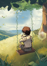
As I said before, color is essential to convey to the viewer, I will use the same illustration for different interpretations.
The first two scenes transmit tranquility. You can see that it uses both cold and warm colors, but what predominates the most are the warm ones.
Something interesting happens with these two, which is why I say to always play with the color corrector that is in the “tonal correction” interface.
In the first we see, nostalgia, peace, the memory of the moment.
In the second we can see that it is more thoughtful as if the character was about to make a decision.
Issues to consider:
In the first option we see that the colors look dull and “strange” does not generate anything, just as if the color was poorly planned. I recommend that you study the psychology of color, it is very interesting to know about the scene and is even used a lot in marketing.
In the second option, it is not so much a mistake because we usually see it in webtoons or even in the movies: The resource of memory. We associate it as a memory of the character. But I needed to mention it in case that's not your intention.
Farewell and examples
If you made it this far, I thank you and I hope it has helped you. It's the first time I've done a tutorial of this style, so I'll try to improve next time.
I will leave you several examples of scenarios that serve to transmit emotions. Never give up! Always practice and you will notice the changes. The most important thing is to have fun.
CLARIFICATION: The examples are commissions, so do not steal.
Users who liked this post


Comment