How to draw moving illustrations
Introduction
Hello, in this tutorial I want to go over a variety of methods of how to add movement to an illustration, and make it more dynamic. I will use an illustration of a garden as an example, but these techniques can be applied to any subject and to any artstyle.
I have used Clip Studio EX for the illustration, though the same principles can be applied in PRO, to shorter timelines.
Furthermore, this tutorial requires a bit of knowledge of the way animation folders function in clip studio. I will try to go over most details, of how to start animating, but this tutorial is primarily focused on technique, rather than individual tools.
Step 1 - Plan out the illustration
First, you have to draw the illustration. But rather than starting sketching it straight away- during the sketching stage you have to lay out where the static and moving parts will be.
When placing the moving parts, make sure they aren’t located too close to each other. in a way that clashes. While overlapping can create a sense of depth, a lot of moving parts can distract the viewer from the focal point of the illustration.
For my illustration of a record player on a park bench, I’ve decided to add some swaying grass in the foreground, as well as some posted notes, the record movement and a ladybird passing through.
I will also add some changes in lighting, but I will explain them at the approporiate stage
In order to layout th illustration’s composition, it can be usefull to sketch out the maximum range of the movement of the parts that will be in motion. You can draw them in as sketchy as you want, what’s more important at this stage is how the whole composition looks.
Step 2- Finish the static background
Before animating the moving parts, you have to finish the static background behind them. Make sure that it won’t detract from the moving parts, by being too bright, as it might confuse the viewer.
Step 3- Animatic
Next step involves drawing a rough animatic of the planned movements. For animated illustrations it is best to do a looped animation- as it will allow the animation to seamlessly repeat. In order to make a loop, the first and last frames of the cycle should be identical, to allow the animation to repeat without interuptions.
To start animating it is best to create a new animation file, as opposed to adding timeline to an illustration, as the former will allow you to specify all the file settings. I prefer to make my loop animations quite long, as I can vary the applied effects (in this example I made the animation 33 seconds long), however any length you are comfortable with, can work.
When animating the sketch it’s best to decrease the opacity of the background, in the layer tab, in order to make the drawings look more visible. During the creation of an animated file, Clip Studio offers to create additional space. This is very useful if you have any elements that may go outside of the illustration’s border
Though don’t be scared if you are putting in large numbers. As the animation will be done with loops, you will only be animating a small chunk. For the sketch, I have decided to make it a ‘10’ frame loop where there are 9 individual frames, and the ‘10th’ frame is actually the repeated 1st frame of the cycle.
To ease the animating process, I recomend turning on the onionskinning, which is the overlapping icon located on the top of the timeline. Onion skinning allows to display the previous and next frame, displaying the former in blue, and the latter in green
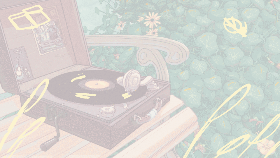
Drawing out the animatic instead of starting the animation straight away, will allow you to look at any potential mistakes. Like in my 36 second trial of a potential loop, I realised that I was a bit too rought with animating the stick notes. Moreover, the ladybird passes the scene too frequently and the grass moves too swiftly. Making these mistakes during the animatic sketch, will allow you to easily fix them during the animation stage.
Step 4- Drawing line art and corresponding decisions
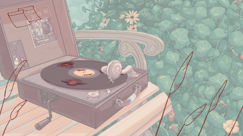
Next stage is drawing the lineart to the animation based on the animatic. This is another decision heavy stage, as during this stage you will have to impliment the fixes to the animatic, as well as decide the pacing of the animation (i.e. how the frames are spaced on the timeline).
Lineart animation folder can be placed on top of the animatic layer, in the timeline, allowing you to compare the lineart to the animatic. You don’t have to follow the animatic exactly, but rather draw the best parts of the sketch, whilist fixing the worse ones.
It’s best to vary the space between frames on the timeline based on the nature of the movement. Even spacing works for mechanical objects, for instance like the disk in my illustration
Where as for plants and other things swaying in the wind, I played around with the spacing of the frames, to immitate the push and pull like nature of the wind currents. After finishing drawing the lineart, I recomend trying different spacing between frames, to see which one works best.
Step 4.5- Animating using keyframes
You may have noticed that the animation examples above, didn’t feature the ladybird. The reason behind this is that as a moving object, it is best to move it using keyframes, while using hand drawn animation to animate the body movements.
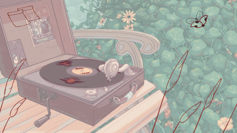
When animating such object, it is best to first animate the looping movement, before turning on keyframes (as it is difficult to edit keyed frames in cip studio).
After finishing drawing the frames in an animated folderplace it into a normal folder.
Click this Icon to enable keyframes.
Then you can click on the icon to the left of it, to place the first keyframe.
There are three modes of keyframe interpolation in clip studio, hold, linear and smooth. They are marked with yellow, green and blue diamonds respectively. Hold method is best for immitating handdrawn animation, linear for lstraight, linear movements, while Smooth, is best for organic movements, or movements involving acceleration and decelleration, like turning or stoping.
At the first keyframe, make sure to place the center of rotation in the middle of the ladybird, to ease the animation of the turn. It will also make it easier to track the object, while it is outside of the frame.
Move the ladybird outside of the frame.
Move forward in the timeline and move the object at the different exit point out of the frame.

Preview the animation. While the movement speed is fine, it moves a bit too linearly. Hence it’s best to give the movement a slight curve in the middle.
I gave the movement a bit more time, by moving the last point, an inserted a key frame in between the two. At that keyframe, I’ve added a slight rotation, thus giving the flight path, a more natural feel.
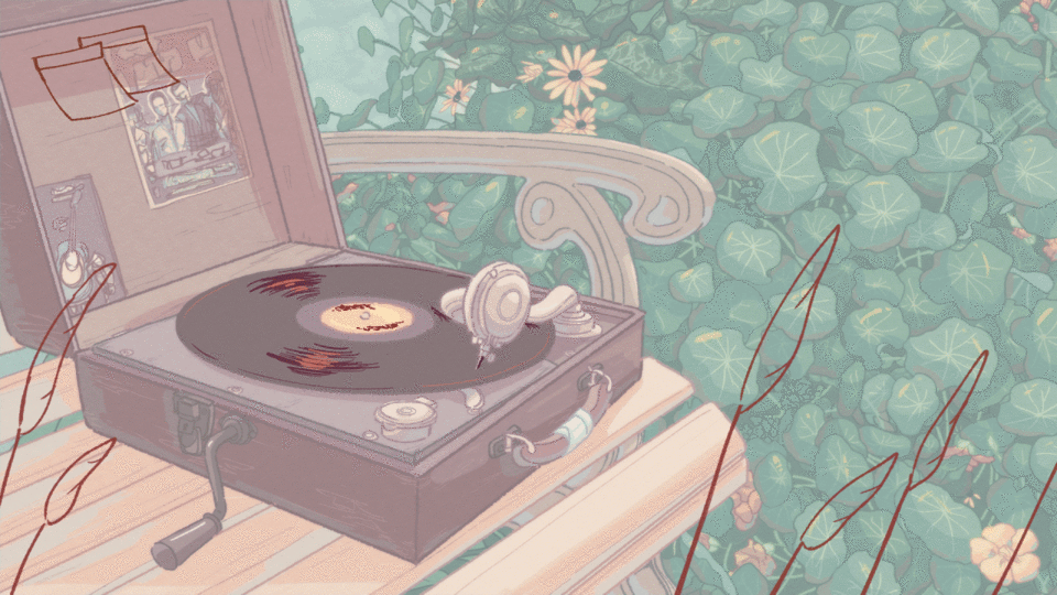
Now after testing the animation again, I can see that it moves much better.
Now I can isolate the movements as a section on the time line (which placing the animation folder in a normal folder, has made much easier), and copy the sections, placing repeated movements around the timeline
Step 5- Colouring the animation
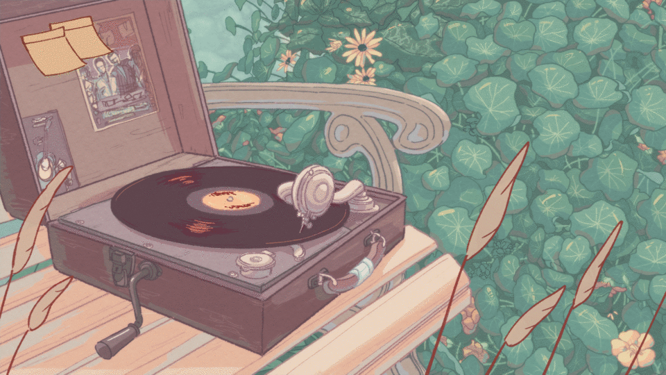
After finishing the line art, the next steps are much easier, as almost all the thinking is already done.
Now you need to colour in the animation.
In clip studio, animation is coloured in by placing animation folder, where the flat colours will be underneath the animation folder containing the line art.
Make sure that the colour frames, are corresponding under the lineart frames.
Step 6- Shading the animation
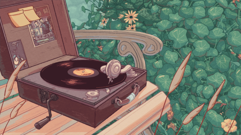
The shading step is exactly the same as the colouring one. Similarly to the animation folder with the colours, the shading one is placed underneath the lineart, but above the colour folder on the timeline.
An aditional tip for this step, is that similarly to normal raster layers, you can clip animation folders to the one bellow. In this case, you can make the shading process speedier by clipping the shading animation folder to the colour one.
Step 7- Using gradient map to change time
The last step is pretty much it. You now go forward and create awesome moving illustrations with new knowledge from this tutorial. However I also want to share a tip, that can give your illustrations an extra aesthetic appeal.
This trick involves gradient maps.
First, create a gradient map layer, if you are starting with daylight, this will just be a slight enhancement to your normal colour scheme. You can either use the clip studio default gradients in the sky section or use your own
Then turn on the key frames and go to to the beginning of the timeline. Change the layer mode to Overlay and opacity to 12%. You can notice that the program has created another label on the timeline, titled “Opacity”. All the keyframes regulating opacity will go there.
You can go further along the time line and try adding another keyframe, at the same opacity level.
Now you can add another gradient map. I find the switch from noon to sunset quite striking, so I will show how this method works, based on it.
Now add a second opacity keyframe to the ‘noon’ gradient layer. Change it’s opacity to zero.
Add key frames to the sunset gradient a bit after the ones on the noon layer, and change the opacity to zero. Keep the sunset gradient map blending mode at normal
Now move a couple of minutes along the timeline and add a second keyframe to the sunset layer. Set its opacity to 50%.
I chose a long timespan for this step as I am aiming for a lofi chill look. If you are trying to create a diffrent effect, such as immitation of a timelapse, I would recommend putting the second keyframe closer, timewise, to the first one.
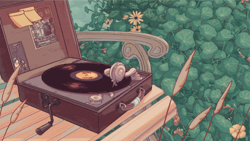
The result should look something like this.
(Note: the noise isn’t part of the final result, but rather a side effect of the compression, though personally, I feel it can fit quite well if you are going for a nostalgic atmosphere).
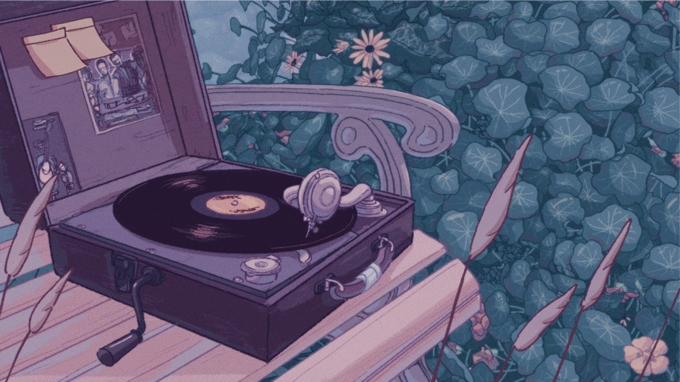
This trick can be used with a variety of gradient maps, to achieve different lighting changes. I have included some of my experiments of switching from sunset to night and night to sunrise down bellow.

Conclusion
Today’s websites and social media support a variety of formats such as gifs, mp4 or webm that allow for animated illustrations to be published. Moving elements can be added to pretty much anything, bringing additional exciting details for the viewer to observe.
I hope that you liked the tutorial and I was able to help you in adding movement to your amazing illustrations.
Clip Studio has a lot of features, that can help you in this process, and I hope that you’ll have a fun time experimenting with them and trying out new things.




Comment