
Intro
In this tutorial I'm going to cover how to create a simple Greeting Card for the Holidays. You can make yours as personal as you like by changes the brushes, fonts, and colors used. You won't need any drawing or technical skills to follow a long with this tutorial. You can use a tablet, but it's also not required.
Now let's get started!
Setting up the Canvas
I usually try to set up my canvas to work with a standard print size. Here I change the settings to 6x4 inches so that I can easily print my finished card as a photo.
I set the type to "illustration", and make sure the "basic expression color" is set to "color". This way I start out with an RGB document. If you miss this step you can close your document, or change it later.
You can change the "unit" from cm, in, px, etc.. under the unit field. Use whichever unit of measurement you are familiar with.
Using Available Assets in the Design
Clip Studio Paint has a very large selection of official, and user created, assets available. Most of these are free to download. I'll be using assets I had previously installed, but I'll do my best to link to each asset.
For my card design I want to focus on a single decorated tree in the middle of a conifer forest. I could draw each tree, but it's much faster to use an existing piece of art and modify it to my needs. To do this I'll use the "coniferous forest brush AKC".
I was going to link to this asset, but as I'm writing this I found that the original user has deleted it.
So instead I'll link to several different, free, coniferous tree brushes for you to download via Assets instead. Because I already have the brush installed, I can continue to use it. Regrettably, it is not available for further download.
And using the below brushes, you can easily paint your own coniferous trees.
Once you have your tree brush selected, it's time to set up the layer to draw them on.
Navigating the New User Interface
As of version 1.9.7 of Clip Studio, the User Interface has received a major update. For this reason I'll be going over some of the locations of things in more detail than usual.
In the layer window, you'll find an easy access icon for creating a new layer. This icon is highlighted above.
Click this icon to create a new layer. We want a new layer for each element of our card. This is so each part can be moved, manipulated, or edited without damaging the other elements of our design.
It's on this new layer that we will be "drawing" our trees.
In the "tool property window" you'll find the settings for your tree brush. For mine I set the "particle size" all the way up to 2000. This is the max size of any brush in Clip Studio Paint. Drag the slider around and place a few trees to see how large you need to set your particle size. The exact size will depend on the size of your canvas and resolution.
Note that the "particle size" and the "brush size" are not the same thing.
The "particles" are the images that are being "sprayed" with the brush and the "brush size" is the area that they are being sprayed over. For this brush each particle is a different tree image.
If you find the trees are still too small, you can always adjust the size once they are on the canvas.
Here you can see the result of my placed trees. Even at max particle size, mine were still not quite large enough and I had to scale the entire layer up a bit. Note that too much scaling may result in a pixelated image.
To create the large tree in the center, I just "layered" the tree brush, placing several trees in one spot to make it look like there is one large tree. For this brush I used an up and down motion to hide the multiple trunks.
Add a Gradient Sky
With the tree line laid out, it's time to add a sky. For this I used a simple gradient, but if you like you can always paint it in, or use an existing "image material".
There are also lots of beautiful skies to download and manipulate available on assets!
To select a gradient click on the grey filled in circle icon in the tool bar. This is highlighted above.
I chose to use gradient 32 near the top of the screen shot. This entire gradient set is available to download below.
Just as we did before, we want to create a new layer for the sky. This will be placed below the tree layer.
This particular gradient asset will create a new layer with a mask attached upon being used. It will always be created above the currently selected layer so if you use this asset you'll need to drag the new gradient layer below the trees manually.
To do this just click and drag to the desired location.

Usually skies are lighter at the bottom and have a darker/richer color near the top due to the atmosphere. To simulate this, hold shift, and drag up or down so your lightest color is near the bottom. Just like any other type of layer, you can use transformation tools on gradient layers and can scale the result up or down as needed. You can also move the layer around to get the colors in the exact place you want with the move tool.
Now with the sky in place let's polish up the environment!
Adding Snow
To make the scene feel more like winter, I'm going to start by adding some snow.
Create new layer and change the layer mode to "screen". This is the field that is labeled "normal". Click and scroll down until you find "screen".
Screen layers lighten without becoming overly bright or saturated.
Since snow is light and the hues falls more along de-saturated hues, screen is perfect.
You can see the new screen layer above.
If I start creating a lot of layers, and I don't merge them down as I work, I try to keep the layers organized by naming them. My new screen layer is named "snow" and my normal layer with the trees are name "trees". It helps to keep things logical.
I didn't feel the need to name the gradient layer since it was the only on of its kind at this point.
I use another particle brush to create the snow.
To do this I use a brush I downloaded from assets.
Just like the previous particle brush, you can adjust the spray radius, particle size, and various other settings.
The snow brush I used can be downloaded below.
Lighting the Tree up
To help push the festive feel of my greeting card I want to add shining ornaments to the large tree in the center.
The perspective of the environment is not complicated and I want the shapes to be somewhat stylized. I use several perfect circles to get this effect.
I select the ellipse shape tool and the new shape icon is highlighted in the screenshot above.
To make the circles perfectly round you need to lock the aspect type (by clicking the check mark box) and make sure it is set to 1 to 1 for the "w" and "h".
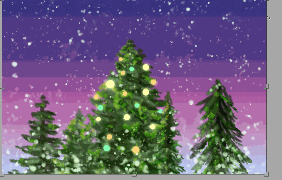
On a new layer, I create the circles by clicking and dragging with the shape tool selected over the canvas. I use 3 similar warm colors for my ornaments. I want the colors to pop on their own, but still fit within the color theme I've established. My colors lean a little on the green and yellow side due to this.
To make the ornaments glow, we first need to duplicate the existing circles. Right click on your ornaments layer and mouse down to, and click, "duplicate layer".
This creates an exact copy of the layer you right clicked on.
I rename the layers to "ornaments top" for the duplicated layer that is on top, and "ornaments blur" for the lower, original layer.
I change the layer mode for "ornaments blur" to "add glow". This layer mode brightens and saturates the colors. It's good to use for bright lights and special affects.
With the "ornaments blur" layer selected, mouse up to the "filter" tab. Under the "Blur" menu, select "Gaussian blur".
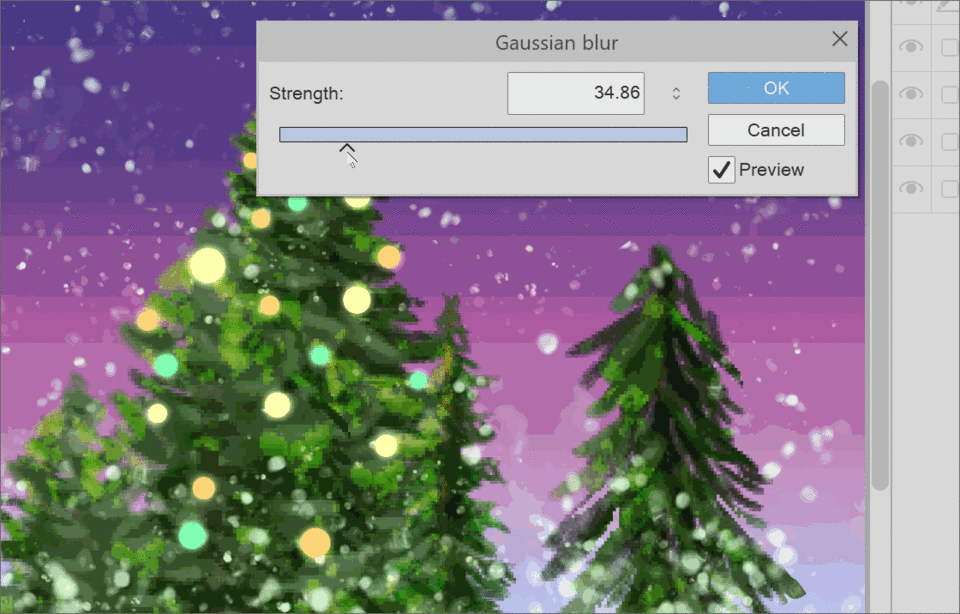
Use the slider to change how intense the blur strength is. Move it back and forth until you have a look you are happy with. If you don't see any change, you may not have "preview" checked.
Click ok to apply the filter.
I like using this technique because it only takes two steps, and the original sharpness of the shape is maintained. Try applying it other other elements in your work!
Create a Soft White Border
The winter scene is essentially done at this point. Now I need to prepare the illustration by scaling it down and adding a border.
Everything is currently on separate layers. While we could simply flatten the image, I prefer to create a flattened copy instead so all of my other layers are retained and still editable.
To do this right click on the top most visible layer and select "merge visible to new layer".
If you do this on a lower layer, then everything you see on your canvas will still be copied, but it will be underneath of any other layers you have and those layer modes will also be applied again. If you do this instead, you can simply move the merged layer to the top.
Above you can see the merged layer. It has also copied the name of the layer that I right clicked on to create it, and added a "2" at the end of the name. You can, of course, change this to whatever you like.
With the image merged into a workable layer, I want to scale everything down slightly. I use the "scale/rotate" shortcut icon at the top of the software.
Hold shift and drag the corner handlers in a bit to scale the image down uniformly. You can also check the 'maintain ratio" box in the tool palette instead of holding shift.
Hit the "enter" key, or click the confirm icon when you are satisfied. I only scale my image down slightly because I'm also doing to soften the edges of the image in the next couple steps.
I create a new layer underneath of my merged layer and fill it with white. This will hide the other layers and will match the paper that the card is going to be printed on later.
There are several ways to soften the edges of the image. You could use the gaussian blur technique that we used earlier, but it's not as suited for this without a lot of airbrushing. You could also just use a soft brush and erase the edges of the layer, but I like to preserve things as much as I can.
Instead I create a layer mask with no initial selection. The white areas of the mask icon are areas that are visible. Black areas are what are hidden. At the moment everything is visible.
Side Note-
You can see the new "mask" icon above. This looks like a rounded rectangle with a circle cut out. If you hover over any of the icon that you are unsure of, you'll get a short description in text.
To hide something within a mask, you can erase, or paint with transparency. I prefer to paint with transparency. You can see the "transparent color" highlighted above. Select this as your color.

I use a soft airbrush and paint away the edges of my image. You can do this a little at a time by hand, or you can do entire edges by clicking in one corner, releasing, then holding shift and clicking again on another corner. This will lock your stroke into a straight line. This will use the full size of the brush you have selected.
After I "shift click" the edges away, I go back in lightly and soften the edges of my strokes.
You can use any soft brush for this, or even one with a texture if you like. If you want to follow along as closely as possible you can download my "digital sketch" brush that I used for this step below.
Adding Text to your Card
With the soft border complete the next thing I focus on is the actual greeting part of the Greeting Card.
My hand writing is not very steady and I like my cards to be very easily read. Because of this I'll be using Clip Studio Paint's Text tool.
This is pretty easy to find in the tool bar. It's the same as in all of the drawing software I have used and is almost always an "A" icon.
With the text tool selected, click anywhere on your canvas. This will bring up a text field for you to type in. Type in your greeting. Mine was "Happy Holidays".
In the text tool settings you can find a font selector. There are also fields for changing the spacing between characters and words.
When selecting a font to use I like to browse dafont.com and always change the search critera to public domain, 100% free, etc... so if I decide to use the work I create with downloaded font, I don't have to worry about if commercial use requires payment at a later date.
You can find the website below!
Stylizing the Text
Once you have selected your font, have it installed, and have written out your message, then it's time to make the text look pretty.
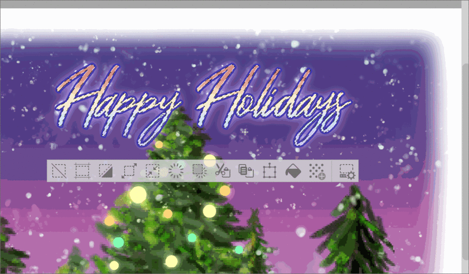
Just like I did with the ornaments I want to make the text glow. The font starts out as a layer type that you cannot edit. In order to edit the text if first needs to be rasterized. Duplicate the text layer. On the lower layer, right click, and select "rasterize".

Here I also changed the color of the font from a mint green to white. In order to do this, select the text tool, double click on the existing text, then select it by clicking and dragging over the text. Once selected go to your color wheel and pick a new color. Click the confirm button when you are done.
To quickly add a stroke to your text, select the "layer property" palette. The icon for the layer property window has a changed from a check mark to a stack of squares with shapes. I've highlighted this above in case you have difficulty identifying it.
The very first circle icon from the left in the "effect" region adds the stroke. Click this and you'll be able to select a color and change the thickness of the stroke.
I chose a dark blue here.
To add different effects, like a gradient, or shading to your text color, you'll need to either rasterize it, lock the transparency, and paint inside of it, or select the stroke and work on a new layer.
To select the text shape, hold ctrl or cmd, and click on the layer thumbnail. This will select all of the pixels on the selected layer.
To preserve my original text shape, I duplicate my "happy holidays" text layer, and then resterize the copy. Then I hold ctrl to select the text.
Once I have my selection made, I choose a gradient I like and drag it over my rasterized text.
Because my duplicated text layer had the blue stroke, but it has been rasterized, I can add a new stroke outside of the blue one. I repeat the same steps, this time using a creamy yellow color. This helps the text pop out even more from the card art.
You can continue duplicating and adding strokes until you like the way it looks. I stopped at two in order to keep things simple.
You can also create a new layer with your text selection, set the layer mode to overlay, and add all kinds of different textures and effects. There's so much to do when stylizing your text!
When you're happy with your the look of your text, it's time to put the finishing touches on your card.
Adding a Border and the Final Decorations
We're almost done! Once your message is complete you could actually stop at this point and keep the design nice and clean. I personally like to add a little more.
Let's start with setting up a vector layer to create our border from. Click the "new vector layer" icon (highlighted above).
Select the rectangle shape tool and click + drag out a box the size you would like your border to be. Make sure you have the vector layer you just created selected when you draw your box.
Now it's time to change the stroke to the brush shape you would your border to be made up of. I wanted this holly brush to by my border. You can download this bellow.
By default any brushes you create or download will not be registered for use as a "brush preset". To change this open the "sub tool detail palette" by clicking the little wrench in the bottom right hand corner of the "tool property" palette.
You should have a new window open up. Click on the "brush shape" option in the side menu. Make sure you have the brush you want to register selected from your tools. If it's properly selected you should see a preview of it in the brush shape menu.
Click the "register to preset" button and that's it! Your freshly downloaded brush can be used as a stroke for the shape tools.
But we already drew our shape so what now? You could always draw it again, but there's not really any need to do that.
Select the "object" tool. This is highlighted above in the tool bar. With the object tool active, click on your previously drawn rectangle. You'll see transformation handles come up that you can use to scale, transform, and move around the line/object you selected.
Let's just change the stroke.
In the "tool property" palette click on the "brush shape" box. This will most likely look empty to start with. Once clicked previews of different registered brush presets will load in. Find your newly registered brush in the list and select it.
The flat "pen stroke" will change to your selected brush! Your brush might be too small to see immediately so play around with the "brush size" slider until you like the way it looks. I went from 9 px to 146 px before I was happy! The exact number will depend on the size of the brush you are using and the size/resolution of your canvas.
You can see above that my "rectangle" has rounded corners. This is an option you can check and adjust in the shape tool properties.
After picking my brush I adjust the size of the shape using the object tool some more. I scale it up until the edges of the holly leaves are just inside the canvas, but not touching the edges.
Some times when scaling a brush around a shape the artwork will get distorted. This can be hard to avoid and I usually fix it by creating a new layer and covering up the flaw. Here I added a bit of white to hide where the holly was stretched out.
Once I'm happy with my border I add some snowflakes as decoration around the text. I create these on a new vector layer, just so it's easy to move each flake around individually.
You can find the link to the snow flake brush I used below!
For the snowflakes I placed a few to get a good variety of shapes. Then I used the object tool to select the individual flakes and scale them up and down, and arrange them as I liked.
With that final bit of decoration the card is done!
Closing
Even though the artwork created in this tutorial did not require a lot of drawing skill, it covered a wide range of techniques that you can use to create your own cards, or even apply to your usual artwork. I hope you gained something and thanks so much for reading to the end!
Please let me know in the comments if something was unclear or if you have any questions!
Happy Holidays!
About the Author
My name is FalyneVarger. I have been drawing for most of my life. I started working commercially about 10 years ago and have created artwork for books, games, comics, and more non-commercial commissions than I can remember.
I'm @falynevarger in most places, but you can find me online at any of the links below!
Social Links!
Les utilisateurs qui ont aimé cette publication


Commentaire