Easy animated symmetrical background with Transform features
Hello everyone, I will show you the very easy way to create a symmetrical background with the Clipstudio transform technique in this tutorial. It’s not only saving your time on drawing everything but it also creates some amazing effects for your background without expert knowledge on perspective needed!!

Design the symmetrical look
Before designing the symmetrical background for your art, you must know how it's symmetrical first. For example, I design the background of the tunnel in spacecraft with a 1-point perspective that leads to the center.
The very basic one-point perspective is a room like this
Draw the parallel line to each corner of the room to create more sides to the room.
Now we’ve got the 8 sides room
Add some detail to each side by making the same detail for the opposite sides
You can also plan for non-symmetrical detail for adding later
Now we can see, the background(exclude panels) is symmetrical on the vertical axis.
And also symmetrical on the horizontal axis
With this pattern, we will only draw one side and make it repeat on another side.
Then add the additional panel later to make it look less symmetrical (optional)
Step 1: preparing the files for background
For the background, it will be a composite of 3 walls.
Draw them in separate files.
Let start with..
1: sidewall
Create a new canvas and enable the grid for drawing the wall
Then set up the grid with menu [Grid/Ruler Settings]
Set the gap to more pixel so it’s easier to draw
Enable the [Snap to grid] on the menu bar
Use the rectangle tool to draw the column detail of the wall
Make sure the space between each bar is the same.
Use the rectangle selection tool to make the crop selection.
Make a selection to crop the area like this
I also plan for a seamless pattern later, so the summary of the gap on the last space and first space will equal to gap size at the middle.
Go to [Edit > Crop] to crop the image
You will get the piece of seamless pattern for one side of the background
To add light effect, duplicate the bar layer (drag the layer to [New layer] icon)
Apply the blur filter, go to [Filter > Blur > Gaussian blur]
Adjust the blur strength to the bar
Then lock the transparent of the blur layer, select the light color, and fill it to the layer[Alt+Del]
Optional: copy another layer, move it a bit back and fill the light color to add depth to the columns
If you want stronger light, you can copy the light layer.
You can also create the light effect with the layer blending mode [Add (Glow)]
When finish, save the file in Clipstudio format (.clip)
2: the light bar
Create a new canvas that has long width. This will be the length of the loop animation.
Draw the arrow with the polyline tool, set the Line/Fill mode to fill, then draw the arrow one by one.
Note: the move tool will not snap to the grid. I recommended repeating draw on the grid one by one.
Move the drawing a bit front to give some space to the effect, make sure the gap at the left edge is equal to another gap between each triangle.
Hold [Shift] when moving will make it align to the same horizontal of the old position.
Create a new raster layer for the light effect, then paint the gradient with [Foreground to transparent] mode, set the edge process to reverse mode, then drag the gradient on the canvas.
Erase another gradient wave, keep only one.
Convert layer to [Image material layer]
You will see the center point of the gradient object
Drag it to make the center of the gradient align to the edge of the image.
Clip the gradient to the arrow, it will make an easy glow effect to the arrow bar
These are the basic steps of light moving animation:
create a new timeline, and set the framerate, here I use 12 fps and 30 frame lengths.
Enable the layer keyframe to animate the light
Add new keyframes at the beginning and the end of the timeline (use linear interpolation mode)
Click on the last keyframe, move the gradient to the front, this will create an easy movement for the light.

If you want to make it into a loop, you need to make the start and the end of the animation the showing the same, before animating, copy the object and paste it in the front
This will be the start and endpoint for the loop animation
Instead of moving the object individually, put all gradient layer into a folder and enable the layer keyframe on the folder to move them together
For moving gradients together as a folder, you can see it make loop animation, but here is still some blink gap at the loop.

You need 3 gradients to make it perfectly smooth, adjust the gap equally as much as possible.

To create the glowing effect, I copy the arrows bar and apply the blur effect on
Copy also the light layer folder, move them on the top order, then set the layer mode of the arrow layer to [Add(glow)]
Adjust the opacity down, you will get the very easy glow effect for your bar

When finish, save it into clip studio file(.clip)
3: floor
For the floor tile, I draw only one tile using the Polyline tool on the grid
Use the foreground to transparent mode to create the metallic shining effect
Note: make sure it still symmetrical on horizontal axis
Then crop it into one single tile and it’s ready to use.
In conclusion, you will have 3 clip studio files for making the background
Step 2: combined images into the background with transformation
From the sketch, crop on one part that is symmetrical to another.
Select the area with the Selection tool, then [Edit > Crop]
Resize the image to a bit larger to avoid the quality drop when resizing the image later.
[File > Change Image Resolution]
Create a new layer and draw the background with the polyline tool.
Import the wall object to the canvas, go to [File > Import > Create file object]
Adjust the object to the frame, use the Object tool.
In the tool property panel, select the mode to [Perspective] this will allow you to adjust the wall image in a pair of the parallel nodes.
Adjust the image to fit the frame, you can zoom out to see the overall border of the object
Use the [Scale] or [Scale/Rotate] mode to scale down the width of the object
Also, uncheck the [Keep aspect ratio] to resize only one side of the image
In the tool property panel, enable the tiling and set tiling to repeat horizontally
Repeat the steps with the floor
For the animated bar, we need to create a timeline for the image first.
IMPORTANT: use the same setting as the bar file
Select the first frame and import it into the file object.[File > Import > Create file object]
Adjust it to the frame like other parts.
Create a new layer and fill color to the end area or the image, adjust it as you like
You will get the animation for 1 side of the background like this
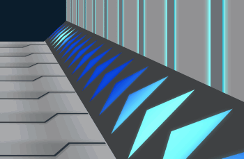
If the color tone is not matching well, don’t worry, you can adjust it with correction layers.
I love to use [Hue/Saturation/Luminosity] to adjust the color tone
If you want the correction to appear on only one part, clip it with the part layer.
You can also add the color tone to the image with [Overlay] layer mode
I also draw the extra lines for more detail
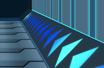
When finish, save the file in clip studio format (.clip)
Step 3: Apply the background on the image
From the design, I draw the seal and the girl in separate clip studio files (.clip)
Delete the paper layer to make a transparent background
Create a new canvas for the combination scene, and also a timeline with the same setting of the background file
Then import the file object of the background to the canvas
Move it into one corner
On tiling setting in the Tool property panel, set it to reverse mode
(It’s like MAGIC!!)
You can also use transformation mode in the object tool to scale it to your preferred ratio
Extend the frame length by right click on the timeline and [insert frame]
You will see the gap on the timeline because the frame number of the background file object is less than the frame number of the scene.
Copy the timeline bar by clicking on the header to select the entire bar
then [right-click > copy]
And paste on the blank place after the bar
Now you can extend the frame number
The animation will appear together, make some awesome effects!!
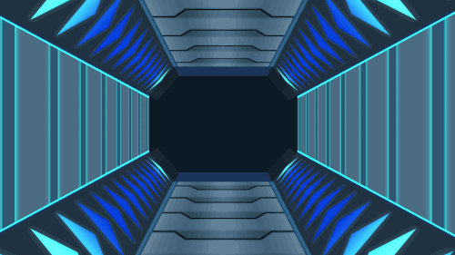
I add additional panels to the blank area to make it more detailed
Drawing directly on the wall will be a complicated task to do, I enabled the grid and draw it on new layers with multiple figure subtool.
This is a fun task to do ^_^
Later, I selected all the layers and create the free transform[Ctrl+t]
(or [Edit>Transform>Free transform])
You can find the transform mode (the same as the object tool) in the tool property panel
Adjust overall first, then adjust the individual panel later
You can also use flip to apply the panel on another side
Select all panel and merge the layer, then lock transparent of the layer
Use the fill tool to fill multiple color to panels
Copy the panel layer, apply blur effect, and set to [Add(Glow)] mode to apply the light effect to the panel
Import the character to the image as a file object
You can add extra light with [Add(glow)] layer mode
And extra shadow with [Multiply] layer mode
The result:
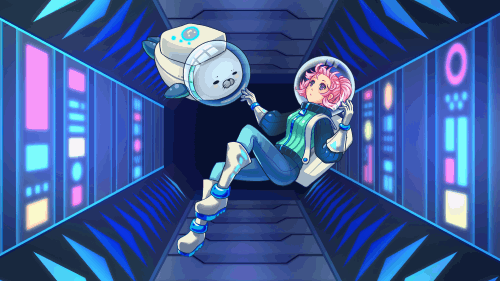
Step 4: Extra animation for the scene
Here is a very useful tip for creating in-between keyframes with the Clip studio transform feature.
I make the blink eyes animation for the character without drawing any in-between keyframe, it’s very easy!!
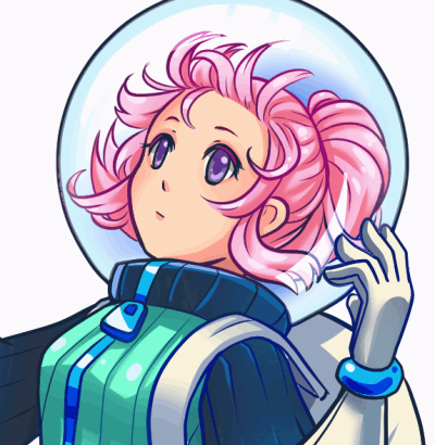
The eyes must be separate from the body layer, here I put layers for eyes in a folder
On the timeline, create a new animation folder and put the eye layer folder inside
Note: I renamed the folder to ‘01’ for easier to order on the timeline.
Make it appear on the canvas by clicking on the [Specify cels] icon at the first keyframe, and select the folder for eye keyframe
Copy the keyframe by drag the folder to the [New Layer] icon, it will auto rename the new folder to ‘02’
Specify the folder to appear on the timeline(right-click and select folder)
Hold [shift] and select all the layer in the keyframe folder
Then create mesh transformation by [Edit > Transform > Mesh Transformation]
It will create mesh transformation for the eyes
In the tool property, make sure the [Change vector width] is unchecked
Then you can easily adjust eyes into halfway close for in-between keyframe
You may enable the onion skin to see the previous scene so it's easier to adjust
Press [Enter] or click [OK] button to confirm the transform.
For the fully closed eye, I draw it.
Repeat(in inverse) the keyframe for eyes opening too ^ ^
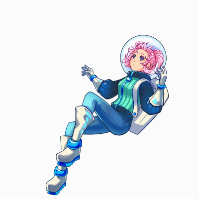
Note: don’t forget to set the timeline length to match the main scene.
[IMPORTANT!] you must create a timeline in the character file before import it to the scene, if you add the timeline after, the animation will not appear on the scene.
Add some float animation for the character to the scene, create a new keyframe at the start and the end of the timeline to create loop animation.
Move or rotate the object with the Object tool when active in the middle of the timeline, it will auto-create the keyframe for the movement
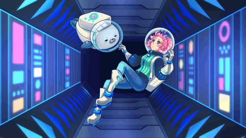
For some light glowing effect, you can enable the layer keyframe and adjust the opacity of the glow layer on the timeline
(click [+] icon on the timeline layer to adjust opacity on the timeline)
You may also add camera rotation to make more scene movement to the scene
Create the new 2D camera folder
Then put all layers you need to move with the camera inside the folder
Resize the camera down a bit to create space for moving (make sure you’re active at frame 1)
Then also add the keyframe at the end of the timeline of camera folder
Rotate the camera a bit at the middle of the timeline to create camera rotation movement
You can also switch to camera view to see the result.
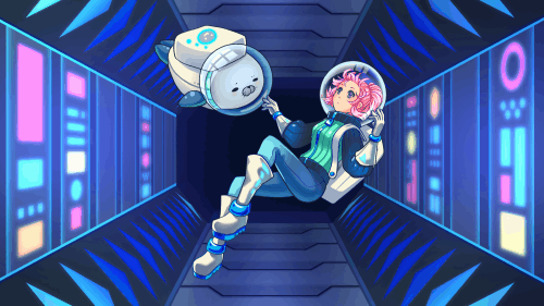
[Optional] I also add some hologram effect to the scene
Check my tutorial about the hologram effect:
Final result
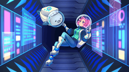
I hope this tutorial gives you some idea to work with the transform feature of Clip Studio.
Please stay safe at home and enjoy creating art with Clip studio! Have a good day and see you in my next tutorial ^_^




Commentaire