
Hello everyone! This is Grace and welcome to my latest tutorial! It's been a while since I have a free-time to use my Clip Studio Paint and be part of the awesome monthly challenge!
I think many people already took the sky drawing, so here I am cosplaying myself and become a retro chick then self-visualize if I were living at that time. Also I've been trying my best since last time I 'pop-up' myself with my previous tutorial about Vintage Selfie & Pop-Art Style (although there was a 'hiccup' back-then, I did something wrong, got my tutorial deleted and I feel a bit discouraged to post after that incident).
I will portray myself (again haha!) as a young lady who was living in the past and the present time, I think I'd like to share a lesson or two about Clip Studio Paint filters, also in this tutorial I will share how to turn my photo into a retro vibes with gradient map, and add personal touch with my own textures.
With this opportunity, I will explain my traditional art techniques using several traditional tools such as watercolor and acrylic to create awesome textures and even I took photos by myself to create and combine both traditional and digital texture pack!
Let's get started-!
< Introduction of Traditional Texturing Class >
The following are materials I use to design my retro poster (or any watercolor posters).
Use this list as a suggestion to guide you when buying your own. In FIVE WORDS:
BUY ACCORDING TO YOUR BUDGET ! ! !
My Art Supplies:
1. Watercolor Paints (Can be Tube Paint or Pan Paint)
2. Brushes (with variant size)
3. Roller Brush (medium to big size)
4. Sea Sponge (medium size)
5. Watercolor Paper (A5 & A4 around 230 - 300gsm) cold-press most often
Miscellaneous: Recycled paper with a bit of 'oily' coated surface, also mini sponge if available (man-made material, difference from sea sponge)
I wouldn't recommend you to buy things according to my preferences, since it will vary with the level of comfort from me to you while choosing your own tools and supplies. But paper is one supply I don't skimp on! Use top-quality paper-it does make a difference in the finished work.
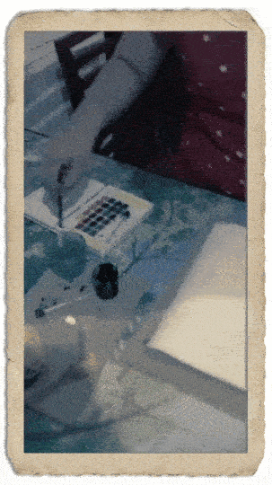
< Traditional Media Texturing - Part 1 > Wet on dry techniques
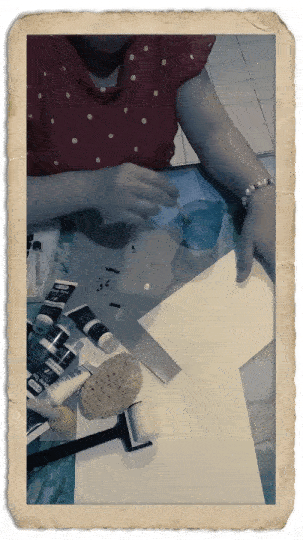
With a blank piece of A5 watercolor paper around 230gsm, I pick dark brown color from my pan paint watercolor and a bit combination with acrylics that I place on a piece of oily (recycled) paper to hold the water (it's an 'oily' paper coated with some-kind of fluid furnish which also water resistant in exchange of standard painting palette).
I place my colors on top of A5 watercolor paper then with a mini sponge (also you can use any brushes) with that technique - honestly I don't know what's the better name for it: I called it 'dotting' but you can understand better from animated gif above.
Continue using the sponge with a bit of water and paint with any chosen colors that you wish: my suggestion only pick 'muted' colors such as brown, gray, yellow ochre as well as sepia. Those typical colors can be found easily within any 12 - 24 watercolor paints.
Tips: if you don't know how to mix some colors like yellow ochre or sepia: I suggest you can start with a combination or mix brown and yellow to create yellow ochre then combine the yellow ochre with red to gain the sepia color. Experimentation is the key here.

The texture created by a sea sponge is wonderful for depicting leaves, rocks and cliffs (if you're aiming to do those textures for other drawings). Just dip the damp sponge into the paint and press it on your paper. First test it on scrap paper before you put it on your final design.
Tip: A sea sponge has better texture than a man-made sponge, you can buy them in art supply stores or through online services.
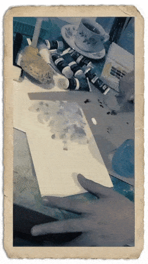
After you think it's enough with the sea sponge, it's better for you to use a dry roller that you hd or maybe a tissue to spread some colors or water that too much concentrated on a spot.
To make the border looks a bit interesting and fully colored, I add some colors that combined with the man-made mini sponge that I have been using at the first time. I use a bit of wet technique especially for the border and let it dry by itself.

Lastly, before I go to the splatter technique to give a bit of sandy textures, I need to make sure some areas already dry by using a medium man-made sponge.
Splatter technique tips: You can use an old toothbrush, and other tools to hold your brush just like animated gif above, rub the paints to make it dry faster. The amount of paint and how wet it is determines how the paint splatters onto the paper.
The wetness of the paper also makes a difference results. When I use this technique, I make a few test "splatteriments' over scrap paper or newspaper until I get the consistency I want.
Happy trying-!
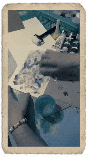
< Traditional Media Texturing - Part 2 > Wet on wet techniques
With a blank piece of A4 watercolor paper 230 gr, I place it on top of recycled paper then with a mini paint roller that dipped into the water cup, I roll it on the surface of the paper; forth and back. Depending on what you try to achieve, this is the wet on wet technique - so you need to make sure the wetness of paper will be enough for the next step.
Tips: try not to add so much water, instead the roller can be useful for spreading the water on the paper surface. If you don't have the roller, you can use any big and flat brushes.
Do NOT leave it completely dry, as the technique will be futile. Try to wait a bit, around 1-2 minutes before you continue with the next step: traditional brush random splattering-!
Now, with any of your chosen tiny brushes (mine is "1-2" size series). Try to do the technique shown from animated gif below with a bit of dipping your brush with any chosen watercolor or acrylic dark or deep colors (mine is Payne's Gray) but I do suggest to mix colors that you think suit to your taste.
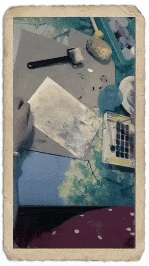
And here's the final results from these two type of techniques! I hope you can try experimenting by yourself. It's easy, just remember like Bob Ross said... (I don't remember exactly but...) "Love the little 'happy' accidents" while doing the artwork - for my case: texture creation-! It's a satisfying and mindful activity that I love whenever I'm feeling blue.
I will also include the scanned (unfiltered or unaltered) version of my traditional texturing.
Feel free to use all of these provided textures made by myself (and other photos that I took), they will increase the quality of your retro or vintage design to another level.
Just by doing your own creativity and 'happy little accidents', you can create endless of possibilities with these kind of techniques by yourself - with paper combine with watercolor, acrylic, even oil painting and canvas-!
< Texture Name: GraceGit's A4 - Wet Grunge Texture >
< Texture Name: GraceGit's A5 - Dry Grunge Texture >
Yup, here's the proof after I created those two textures - and of course waited around 1hour to dry completely, I scan them using my scanner. It's self explanatory, the way that your scanner works and its result should be A4, 300 or even 600 ppi (pixel per inch).
FREE BONUS TEXTURES INCLUDED-!!
You can (save image as...) using your web browser (Right Click) all these following textures that I provided for FREE- Because I think you might be needed for later tutorial while doing the compositing and final texturing part for the Vintage Poster Design.
< Texture Name: GraceGit's Brown Grain Texture >
Also, here's another take: corroded wall texture and also almost broken rooftop... Hahaha... I know it looks like haunted house to be honest - but well, I guess these textures could be an interesting for later use - maybe it will add some kind of 'an old' feeling into any of your vintage artworks or posters.
< Texture Name: GraceGit's Old Wall Texture >
< Texture Name: GraceGit's Old Wall Texture II >
< Texture Name: GraceGit's Old Wall Texture III >
< Texture Name: GraceGit's Old Wall Texture IV >
< Texture Name: GraceGit's Old Wall Textures Combined >
< Texture Name: GraceGit's Old Rooftop Texture >
Finally this is the end of Traditional Texturing Class-
I hope you can create those experimental grunge textures by yourself or you might try to find any dirty walls, 'broken' rooftops or whatever to emphasize the old feeling onto your vintage and retro poster.
You can use my textures as well, of course it might be useful for any relevant projects. In this tutorial, I will also explain how to use it more efficiently with any photos that I provide here on later section.
Up next, let's learn about how to turn any photos into Vintage looking ones!
< Photo to Vintage Filter Class >
In this section, let me introduce you how Correction Layer and Filter works to turn any of your chosen photos into retro vibe!
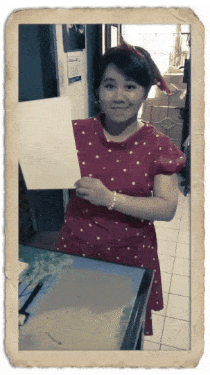
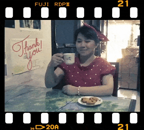
You can also practice using my personal photo below to follow my tutorial step by step. It's going to be easy, since all materials I provided here as well as it's only using standard and default Clip Studio Paint tools, sub-tools, and features.
< Info: My Personal Photo, taken by my fiance >
< The Power of Gradient Map >
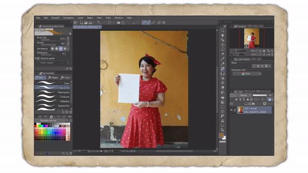
Go to Layer ---> New Correction Layer ---> Gradient Map
In here, you can play around the Gradient Set [ Somber Shade ] and for me, I choose Somber Shade (yellow) by double clicking on it to begin with warmth color of retro style.
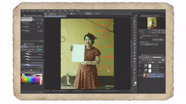
Then as you can see, you can even change the way its color affected by dragging the slider, also I try to change the white color into a bit of bluish from Specified color.
Just play around with the slider a bit and maybe change into another retro color that you wish to see how it turns out to be 'retrofied'. Just remember, to decrease the Layer Opacity to 50% because sometimes it's better to have the 50% of original photo's color scheme and combined it with another 50% of Gradient Map filter.
Tip: You can also try to change Layer's Blending mode from Normal to Overlay or Soft Light, whichever suits you. I will stick to Normal then make it 50% of its Opacity.
< Adding Additional Filter >

My suggestion for this step will be, copy or duplicate the Gradient Map and double click on the little icon besides the (eyes) to hide or show the layer. It will open the same filter (Somber Shade Yellow) but now you can try another colorization like (Somber Shade Blue).
However, if you wish to change Gradient set from Somber Shade to Sky, Effect, or anything; just go experimenting on it. There might be some 'filter' you'd like to use rather than mine.
Tip: Whichever you think it's good for your image, I keep on adding cool color to my warmth filter. So I pick the Somber Shade Blue then I change its Layer's Blending Mode from Normal to Darken to make the color balance quiet well and pleasant to look at.
And here's my result:
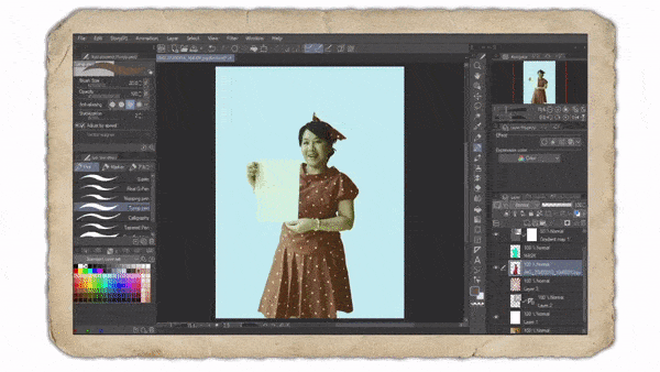
After done with the adjustment of colors, now we're going to crop the character (obviously, it's me - so careful when cropping! Haha) to separate her from the background.
< Crop the Character: Retro Chick >
Start with a New Layer, then I choose (Turnip Pen) to begin 'outline' my photo.
As you can see, at first I use the highlight color with red scarlet for my pen. Then I realized I need to turn off those 2 Gradient Maps so they will not affect my chosen colors but after a while my red scarlet will be less visible around red skirt that I wear.
So I invert it with (Ctrl + I) now my color becomes cyan-! Then continue until everything outlined without a single gap. Or else (Fill) tool will be useless and the colors will be spreading everywhere.
Next step just fill it with the same cyan color, using (Fill) tool. It's a pretty quick way to 'mask' without even create the masking area over the original photo. Just left click on the layer that you've been using for that outline (cyan ones) to load the selection area -> after that, go to your original photo -> (Ctrl + C) then (Ctrl + V) to create 'the cropped' version of your original photo and there you go! You will have your original photo untouched but you also have the 'cropped version'.
< Those Retro Lines / Sunburst Lines >

Ever wonder how to create those sun-ray burst with its lines inside Clip Studio Paint? I once tried many techniques and this one will be the best I found, using standard and default tools and features by Clip Studio Paint without ever find anything online (texture, images, etc).
In order to begin, create a new layer with white color then leave it be.
Next, create (New Vector Layer) on top of that white layer, I'm using Vector Layer just in case I need to adjust or delete some lines without using eraser, it's hassle-free.
After that, go to (Symmetrical ruler) and make Number of lines: 16 and don't forget to check [v] Line symmetry, leave everything else as it is.
Actually you need to experiment by yourself, looking at my animated gif, I turn off my photo before using (Turnip Pen) and create those lines.
Tips: Please keep in mind, if you need that to be better and easy to color, starting point should be from the middle but not too close to the center (you can see from image above.
And also make your canvas smaller when holding [Shift] button to drag the (Turnip Pen) outside the canvas, it makes your lines go beyond and further away and fill the entire canvas with perfect straight lines rather than make some of them fall short.
Below is what's going to happen if you're not taking your straight lines beyond or outside the canvas further away. It will affect those 'symmetrical' lines falling short inside the canvas and create the gaps that we don't like.
After you deal with those short lines and create those lines without a single gap, you can fill it with any retro color using (Fill) tool - but please not, since I'm working with Vector Layer, I can not fill it right away, but don't worry; just create a new layer, select the line with (Auto Select) tool and just press these shortcut keys: [Alt + Backspace] to automatically fill the color you chose.
Since we already set up the Gradient Map, you can always drop any colors that you want and those two Gradient Maps will make it looks like retro in no time.
< Modifying Photo to acquire Vintage Looks >
Now this is the easiest way to turn your photo into any 'old-style' looking posters. Actually, Clip Studio Paint has the so-called artistic filter to make your image looks like a poster.
After I select my cropped photo, I duplicate it first, so whenever I messed up with the filters, I always have a spare to use. You need to have the same habit while filtering or do anything with original photo, a back up images would be so much important because you can always get back to its original state and create another experiments-!
Go to Filter --> Effect --> Artistic.
There are 3 choices, I go to Color only. To be honest, there will be NO strict rules to follow, the parameter slider will be vary based on photos that you use. But please make sure to modify only the necessary ones such as: Color blending, Color blur, and also Number of colors.
Most important thing you need to understand; retro poster has limited color choices, so make it around 4-5 will be better than make it too much.
< Additional Retro Borders / Outlines >
Now as you can see from image above, the image on the left is without outline, but the image on the right is with the outline. You can see the difference even if it's subtle but it's necessary to separate the paper from the background.
You can find Layer Property and turn on the (Border Effect) and make the (Thickness of edges) around 7. And it's done. This is a method to create outline for your character, but not only that, it can be useful for text that you wish to place into the poster.
Tip: I use the same outline or Edge color with a bit of golden brown, pick from the sunburst lines from the background.
If you'd like to learn more about Halftone Pattern creation and make the different artwork without looks like a flat filtered ones, here's the link for you:
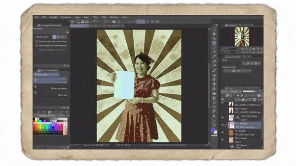
< Digital Media Texturing > Scanned Images to Digital Art
Now we're almost done with our poster creation, all you need to do now: playing with scanned images (or saved images from photos I provided up there) to create your own retro poster-!
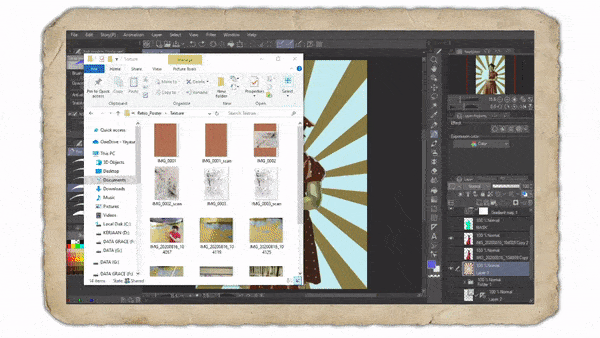
This step obviously just drag and drop your texture.
I already given you the < GraceGit's Brown Grain Texture > to begin play with. Just decrease the Opacity around 75% and also change the Blending mode to Multiply.
Please note: You can place the texture on top of sunburst layer, but needs to be below the character. It affects the sunburst as well as the rest of layer but will not showing any unnecessary texture to the main object (which is my photo).
You can also try to add another texture, < GraceGit's A4 - Wet Grunge Texture > and play with its wet media effect to make a grunge texture by changing it's Blending mode to Hard mix with 30% Opacity. This is important as it will make a vintage looks real all over the picture.
Tip: You can also rotate, scale the texture to suit your needs. There will be no limitation, even you can try pressing (Ctrl + U) then bring the (Hue/Saturation/Luminosity) dialog box and change its base color, it's brightness as well.
And here's the result:
It's not completed yet, but I hope you guys can figured out what I was trying to do: combining personal (traditional) work with digital media have it's own uniqueness.
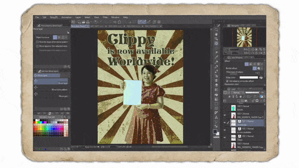
Next, I will show you how Clip Studio Paint Text tools help me to design Retro & Vintage Poster, I try to aim a minimalism approach although real retro posters tend to have crowded typefaces all over the places and sometimes made me dizzy to read it.
< Digital Media Typography - Modern Retro & Vintage >
Last but not least, adding the elements of Typography (Text) tool into our poster creation is essential. Also what to choose for it will be important too, do not pick any text with modern or science fiction look- it will defeat the purpose of old and vintage poster creation-!
I'd like to show you some of the Typography elements or Fonts that I chose, but since it will be against Clip Studio Tips; I am unable to post my chosen Fonts - but let me give a clue about what's modern and retro vintage looks:
When designing Retro Poster, try to stick with these simple rules (that you can search it online for better inspiration):
1. Use 2 different Fonts with the maximum of 3 Fonts' family you'd like to put into the poster.
2. Please use Serif Fonts instead of Sans Serif when designing Vintage or Retro Poster. And here's why (I put link here so you can get the idea to create better design):
Important: Always check your spelling!
And do yourself a favor to check the grammar as well... I am not a native speaker of English, my first language is Indonesia, so if you found something I can't really explain about or weird or typo... Please bear with me and you have my sincere apology.

You need to go with your Search Engine on your browser and type: Free Retro Font, from there you can choose anything that you wish to be implemented onto the design. Animated gif above shows you how I put the Font below my own photo.
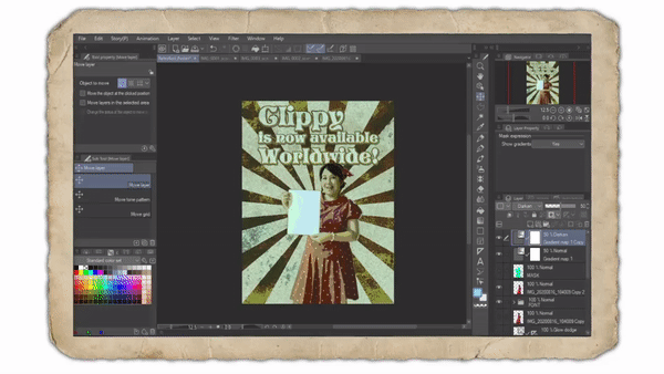
Then I give the border, the same principle and technique with Retro Borders / Outlines, with a bit of highlight color - because I choose my text 'Clippy' with dark brown, so I need to have a clear visual of its border with a bit of light blue.
Note: I had this idea of creating Clippy Poster because, honsetly I have no idea what kind of poster I would create in order to desigh the content and fit the theme: 'Poster-like'. So I guess, Celcys' email brought that inspiration that night with that announcement! Haha! Thank you!

Actually it's kind of difficult for me to explain in details for creating text with Clip Studio Paint. But let me try my best; first after you create the Title (for me it's: Clippy is now available worldwide!) my suggestion only; you need to separate those text.
1. Clippy <--- the first one should be bigger than the rest.
2. is now available <--- because this one longer, it should be a little bit smaller.
3. Wolrdwide! <--- to give an impact, I create the '!' and balance out the size.
In order to make the composition good, using (Ctrl + T) to my photo (me holding the paper), I make it a bit smaller and a bot to the right so the word: 'worldwide' will be clearer to see.
< Using Photography Textures >
Adding photographic textures can be a bit tricky, I'm using my personal photographs to add more textures to the title. You can try every textures with the help of [Clip to Layer below] especially to the text. I use the (Overlay) Blending mode, but sometimes it will be better to use (Multiply) depending on the texture colors.
Now for making some visual elements of the poster, not only the 'main character' and typography, but also play with some retro shapes to emphasize the feeling of old elements in design - banner will be the good choice for this and also a Polaroid border effect.
< Banner for Additional Texts >

First: Banner, in order to create the banner. There will be several ways, you can start with new layer and create Figure: Rectangle or just using Marquee tool with Selection Area: Polyline. After I choose the method that I want (Polyline), I select red scarlet as my color base, it's a bit like red purple so it's good to go.
For Polaroid border effect, I create a new layer, place it on top of main layers except the Gradient Maps, because I need to have the same color scheme with retro feels then choosing these two default brushes: (Real Pencil) and (Design Pencil), I just brush it using [Shift] for entire side of the canvas-! With their default texture while giving the strokes: these two brushes will bring a better visualization for the retro feeling.
After tweak here and there around 30 minutes or so, here's the final result:
< Acknowledgements & Tea Time-! >
When I set out to write this tutorial, I didn't expect that I would spend so much time stumbling around my house, dress-up as a retro chick, and thinking how easy this one theme might be.
At the outset I underestimated the complexity of the subject: retro design, which has challenged minds far keener than my own. Understanding vintage design and retro poster means grappling with the past, must have strong visual perception, and solid history of chosen colors, as well as the special vocabularies, typography elements to be put into overall creative and artistic approach with modern and digital media.
I would like to express my appreciation to my fiance, Futopia for his support of this tutorial creation from start until finish, his ideas, his photography skills, his OBS Studio knowledge to create those wonderful animated gif images and bringing my idea into tangible form.
My deepest thanks goes to my family, who believed in me right now; because we live separated and currently I'm living close to my fiance and his family, cheered me on at important milestones. Most of all I thank Clip Studio Paint - Celcys, especially the editor (judges?) who will see our submitted tutorials, giving their time and thoughts, also to all viewers including other artists who fight half-year of 2020 through pandemic.
Hope everyone stay faithful, healthy and safe!
Cheers, Grace Tjahyadi
Jakarta, August 2020.
この投稿を「いいね!」したユーザー


コメント