
Let’s bring some nostalgia feeling to your illustration by adding shaking ink on it as if it was drawing repeatedly to make old-style animation. This can be a good idea for some storytelling animation or some flashback scene. ( ^_^)

It’s very easy to make from a single illustration and needs only a few keyframes, you can also make it on the Clipstudio paint Pro version that has a frame limitation to 24 frames.
Video tutorial
Part 1 : Prepare your illustration
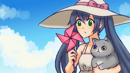
Here is the process I prepared for my illustration that used in this tutorial.
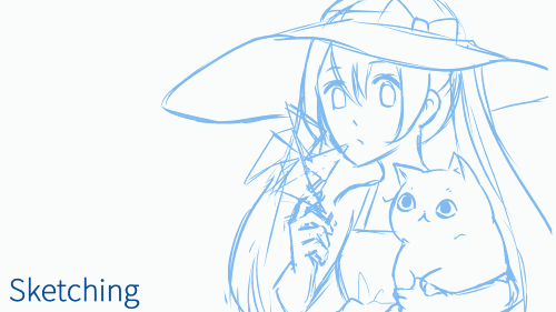
It is necessary that your art must have an outline done on the vector layer to make this effect. If you want to apply this effect to your illustration that didn’t ink on the vector layer, you may have to draft it before continuing to the next process.
Create a new vector layer and simply ink all the outlines on it with G-pen.
[Optional] I draw the paper turbine on a separate layer for rotation movement later.
For more information about working with the Vector layer. Check my tutorial:
Make sure you group parts for animation if you plan to make some more movement later to avoid confusion.
Part 2 : Turn your ink into traditional ink style
The key to creating a traditional look to your art is adding some texture to your ink and color, In this tutorial, I will use [Textured pen] which is my favorite Clipstudio default brush.
You can custom the brush for a more texture look by the setting on the bottom right corner of the tool property panel. The pop-up panel for extra brush setting will appear.
If you want a more (or less) rough look, you can adjust the [Thickness] of the brush tip and the [Gap] of the brush stroke.
I create a new raster layer and do some stroke tests on the canvas to find the preferable setting.
When finishing customing the brush, click on the duplicate brush icon to create a copy of the brush with this setting.
Select the [Texture pen] brush and reset it to the default setting with the reset icon on the tool property panel. This will avoid confusion when you need to use the default brush again.
In the next step, we will apply this brush to our ink vector layer.
Select the new brush and click on the extra setting icon.
On subtool detail panel, go to brush shape > Add to preset
Select on the vector layer for the ink, and with [Object tool] you can see the ink setting on the [Tool property] panel.
You can change the ink color and brush shape on this panel
When clicking on the option of brush shape, you can see the brush you registered, select it, and the brush will instantly apply on the vector ink.
You can also adjust the brush size and the brush dynamic with this option
To learn more about brush dynamics. Check my tutorial about traditional inking here:
You can also find the ink customization option here too.
Adjust the [Gap] value of stroke to make the ink flow looks more smooth
You must select the first option for the [Gap] to enable the bar adjustment.
However, the adjustment may have some area that looks messy (It depends on how you work with the ink, the more neat stroke will make it easier to customize)
Fixing it is easy with the [Adjust line weight] tool in the [Correct line] subtool
You can also change the ink color by select the color on the color wheel.
[Optional] I also apply the blur effect to color layers to make it look softer.
Select all color layer, right-click and merge them together
Then blur it with menu [Filter > Blur > Gaussian blur]
Part 3 : Create Animated ink effect
Traditionally, this is how I make the animation in this style, life before knowing the vector layer is a kinda time-consuming task for me. I always add this small movement of repeat line to make the non-moving scene looks interesting.
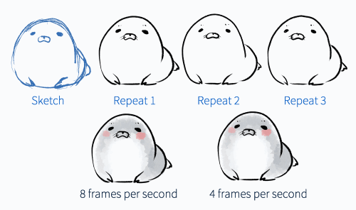
The more frame per second you give will make more faster movement. Sometimes the slower movement fits more the story theme.
On the timeline panel, click on create new timeline icon. (If you don’t have this panel, you can open it on [Window > Timeline])
If you use Clipstudio Paint Pro version you will have the Playback time limitation to 24 frames.
This means that you can set the frame rate to 1 fps and your animation for 24 frames can last to 24 seconds.
2 fps for 24 frames = 12 seconds
4 fps for 24 frames = 6 seconds
8 fps for 24 frames = 3 seconds
12 fps for 24 frames = 2 seconds
I always recommend 4-8 fps for gif animation, and 1-2 fps is recommended for the art process-showing animation.
Create a new animation folder.
Drag the ink layer into the animation folder.
Double click to rename the layer (This is optional but I recommend doing it because when you duplicate the layer, it will also generate the order number for layers)
Assign the keyframe to the canvas by selecting the animation folder and click the select layer icon(or right-click on the timeline to set it)
Duplicate the layer by dragging it to the [New Layer] icon the layer number will automatically generate.
Set the layer to appear on the timeline.
Select the layer with the [Object] tool and customize the ink to make it look different from the original frame.
The main options I always use to set the ink are:
Stroke > Gap
Brush tip > Thickness / Angle
Duplicate to make the third frame, and repeat the ink adjustment steps
(I have made the order randomly to avoid repeat pattern but this is optional)
Now you can get some glitch on the ink.
But it does not yet look like the repetition drawn on the scene.
To make it look more like a repetition draw, adjust the line weight of the ink keyframe with the [Adjust line width] tool in the [Correction line] subtool.
Note: don’t check on the [Process whole line] option to make it appear only on the area you paint the correction on.
Use the [Pinch vector line] tool to bend the line a bit from its original position
[Important] Only a bit!!
Another Note: I prefer the [no fixed end] mode so the line can move freely.
Repeat it to each keyframe and you can get the very easy shaken ink effect for your art!!
Part 4 : Animation with ink effect
In this step, I will add some more movement to the scene such as paper turbine and eye blinking.
Create File object for the paper turbine, right-click on the layer folder and [File object > Convert layer to file object]
Set the area to [Drawing Area] then save the file.
Open the file object. The image will be crop at the layer edge
Add some area for featured edge effect, go to [Edit > Change Canvas Size]
Add 20 pixels to each dimension you can also see the preview of additional edges.
Apply the blur effect to the color layer. The additional area of the canvas allows the blur area to spread out.
Apply the ink texture with [Object] tool
Save the file and come back to the original image, you can see the ink of the turbine is not fit with the overall drawing.
To make it easier to work with ink adjustment, drag the canvas panel and dock it to the side.
Now you can edit the ink and it will appear on the original image when you save on the turbine file. (Use Ctrl+S to save time)
Create a new timeline and repeat the steps of making ink animation.
Note: Make sure the frame rate is the same as the main image.
However, the animation will not appear on the main image (because it remembers the object as a non-animated object), you must re-import it again as an animated file object.
Go to [File > Import > Create file object] and select the turbine file.
Move the file to its position with the [Object] or [Move] tool. Then delete the old object file.
The ink animation for the turbine will appear on the main image

Add the rotation movement to the turbine, select the object layer and enable the layer keyframe.
Set the keyframe type to [Linear Interpolation] and add it at the beginning and the end of the timeline.
You can set the rotation value to the keyframe by selecting it with the [Object] tool and adjust the value in the [Tool property] panel.
Here the turbine will move counter-clockwise:
So the first keyframe will be set to 360 degrees, and the last frame can be set to steps of 90 degrees: 270, 180, 90, 0 (because the turbine is 4 sides symmetrical, so it will show the same image every 90 degrees it rotates)
If you want to rotate it fast, set the last frame to 0, it will be 360-degree rotation in 6 seconds. (framerate 4)
I explained more clear about rotation in my past tutorial:
Drag the last keyframe a bit back to remove the gap frame between the loop.
And the turbine is done!!
For the eyes, create a new animation folder and apply the ink animation like another ink
For blinking animation. Draw extra 2 frames for it
Enable the onion skin for easy to draw the keyframe
For the color of the eyes, I put them in a separate animation folder, because the color only changed when blink, the rest of another keyframe are all the same.
Repeat the keyframe to make the ink animation
I also repeat this step with cat blink ^w^)/
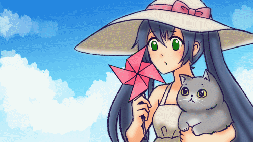
Here is the result, very easy traditional ink animation

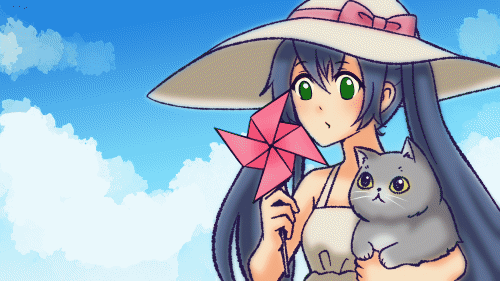
If you feel like the movement is too slow for you, you can easily change the framerate of your art by going to [Animation > Timeline > Change frame rate]
Don’t check on change the total number of the frame
Important: you must change the frame rate of the animated object on the scene too.
The result with framerate: 8 frames per second
Part 5 : Final touch with paper texture and camera effect
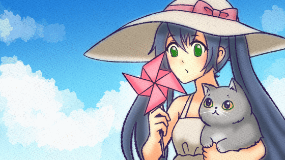
In this step, we will apply more effect on the illustration such as the watercolor paper and camera shake to make it looks more like hand-painted keyframes.
Put the paper texture on the screen, Here I use the standard Clipstudio texture: Drawing Paper. But if you’re not satisfied with the standard material, you can find a lot of paper texture on Clipstudio assets.
You can find the Drawing paper texture in the Material panel, Simply drag and drop the asset to the canvas.
(Make sure you select the most top layer before dragging the material on the canvas, so the texture can appear above all the layers)
Resize the material with the [Object] tool
Change the layer blending mode, here I use the [Linear burn] mode to make the shadow of the texture blend on the image. Then adjust the opacity to make it lighter.
The texture color is in grayscale by default. It may make the color tone of the image become too dark.
Change the layer color of the texture to make it look more natural.
Click on the [layer color] icon, select the lighter color (than black) and apply it to the [Layer property] panel
Give the paper some movement too, create a new animation folder, and put the texture layer inside. (I also rename it)
Duplicate the texture layer and move/rotate the object to make the movement of the texture.
Also, adjust the opacity to make some light glitch effect.
You have to set the blending mode for the animation folder to [Through] to apply the blending effect of the layer to the canvas. If you don’t set it, the layer will appear on the screen as [Normal] blending mode.
Repeat the keyframe shown.
Easy noise of paper texture added

For extra light effect, drag the layer to the [New folder] icon. (or press [Ctrl+g])
You also need to set the blending mode of the folder to [Through]
In the folder, you can add a layer filled with color and set the mode to [Add (Glow)] to apply additional light to the screen
To add the vignette, create new layer and paint the edge with soft airbrush
Set the layer blending mode to [Linear Burn] and adjust the opacity
You will get an easy vignette (dark corner) effect
To create some camera shaken, just create a new 2d camera folder and put all the layers inside.
Adjust the camera a bit (Only a bit) on the timeline to create some glitch on the camera
(the keyframe will automatically be created on the camera folder timeline)
You can toggle to camera real view by clicking on this icon
Optional: you can also add extra light effect later with the soft airbrush and layer mode [Add(glow)] inside the camera folder
You can also enable the keyframe of the layer and adjust the opacity of the effect to create variations of light volume.
Finish!!
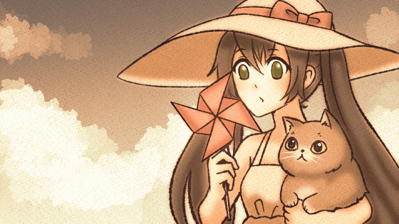
You can also easily change the color tone by using the correction layer [Gradient map]
You can adjust the gradient by yourself or select the preset to change the color tone of the image.
Adjust the opacity down to reduce the effect color. The effect will apply to all the layer below
Old film mode done in 10 seconds ^ ^
You can also learn more about gradient map in my tutorial :
I hope my tutorial gets you some idea about presenting your art. Just with a few edit, you don’t need to draw the keyframe repeatedly ^ ^
Enjoy animating and please stay healthy and safe, see you in the next tutorial.
この投稿を「いいね!」したユーザー


コメント