Animation in CSP Like a Professional! (Beginner's Guide)
Hi! My name is Manu Mercurial. I'm a 2D animator.
In this tutorial, I will show you how to create 2D animation in Clip Studio Paint.
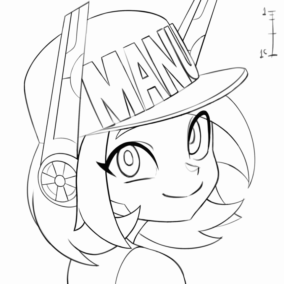
This is the final animation we will create:

I'll be using the EX version of the program, but you can also work with the PRO version.
The only difference is you're limited to 24 drawings per animation file.
To start we will go to File > New > and Select the Animation Preset
LEFT SIDE:
Here you can choose the resolution that your canvas will have, both in width and height. The standard resolution for a monitor is 1920x1080 pixels.
You have a small preview of how your canvas is looking right next to it. The Blue Square is your canvas.
You can also choose between having a tile safe area, which is also known as a TV safe.
This is an imaginary outline that will not show up in the final render, but reminds you not to draw too close to the borders.
On the other hand, we also have the option for an overflow frame. This is an extra space around the canvas, and you can use the reference point squares if you want to push it off-center
This will not be rendered either but allows you to have more room to breathe when drawing your animation.
RIGHT SIDE:
Now on to your timeline settings.
Here is your scene's frame rate. This is how many drawings per second your animation will run at.
I recommend you always keep it at 24, since it's an industry standard to show 24 drawings per one second.
This is so we can work on 'twos' and 'threes', which is one drawing every two or three frames respectively. But we have the option to work on 'ones', which is one drawing every frame if we need to.
The only exception is if you're working with Clip Studio PRO you can lower this to make your animation
last several seconds instead of only one.
We also have our playback time, which is measured in frames and tells us how long our animation scene will be. Since I want my animation to be four seconds long to start, I will multiply 24 * 4 = 96 and write 96 frames of playback time.
Let’s click ok and get started!
Now, the square you see, is what the program would export if we were to render a video.
In our layer panel you will see we have an animation folder with an animation cel in it and also a paper.
The program may look different for you. In case you were missing any of the panels or tools I will use, you just have to go to Window >And here they all are.
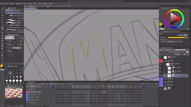
Here is the Timeline!
Your Animation Timeline might be showing a thumbnail. Personally, I turn this off because it gives me more space, by going here to the timeline options and going to thumbnail size and switch it to none.
If you started a file without using an animation preset, your timeline may be grayed out.
You can go to the New Timeline button. And then in the pop up, you can select the options like the frame rate and the playback time.
Next to it, we have to play/stop button for the animation. And next to the playback controls, we have the ‘new animation folder’ and ‘new animation cel buttons’.
Let's talk about animation folders.
If I click on the new animation cel button, I will create a new cel on my timeline, but also a new layer inside the animation folder.
But what happens if I just create a new layer inside the folder? It's not showing up in the timeline!
I would have to right click on the timeline and select which drawing I want to show.
It does not matter what type of layer you're using. If I create a new Vector layer, instead of a raster one, and click on the ‘new animation cel’ button, it will create a new Vector layer next.
If I wanted to remove any of these drawings, I would just go and click on the Delete specified cels button.
It will delete it, but still saving the drawing in here in case I need a backup.
I have 3 key poses, each one in a different layer.
I will separate certain parts of the character on different folders. This is not mandatory.
This is just to make my life easier since things like the hair tend to lag behind or the letters in her hat need to stay solid.
And the good thing about doing this is if, for example, I wanted to change the hair, I could just do a broad selection in the third drawing of the hair animation folder and just change it however I want, and it's not going to affect the rest.
So all I'm doing is making a selection on the images and then cutting and pasting onto animation folders for each part.
I always want to respect naming convention of 1, 2 and 3 since the program takes advantage of this.
You can go to the timeline menu button, then to Edit track and rename all the layers inside of your animation folder, either in a timeline order or in a layer order and you see they have been renamed.
Let’s get into the naming conventions in clip studio.
Let's say I want to create a breakdown between frames 2 and 3.
So I will go right here in the middle and press the new animation cel button. You will notice CSP adds an A. So it is now 2A. A number plus a letter.
If I were to create another one between those two, it will be B. So it continues using the same naming system.
This way we know we can use numbers for our key frames (poses that tell the story – they tell us WHAT is happening), and a number and a letter for our breakdowns (poses that tell us HOW the character is going from a key frame, to the next.
What can we do for in-betweens?
Let's say I want to create an in-between between 2A and to 2B. If I create it normally, it will name it Layer 1. But we can help the program by naming it 2A1. And then if I create another inbetween, it will name it 2A2.
This might seem unnecessary, but when you start working with more complex scenes and a lot of animation folders, having different characters in the same scene, and coloring them, you'll see it starts getting a little confusing. So I do recommend using this system to your advantage.
I can also duplicate layers to reuse parts of the drawing. Going to open my animation folder. Click on the drawing that I will duplicate, and drag it onto the new layer button. I use it from pose 1 to 2 because the hat and the letters don’t change too much, so I just erase the face.
We can't start animating without introducing our best friend in digital animation, the Onion Skin Tool,
which is this button, and it will show a ghost of the previous drawing and the next drawing.
Taking advantage of the fact that I can separate the hair from her base features, I can apply a bit of squash and stretch to the breakdowns. You can see that, but I also can add a couple more breakdowns between those poses to change how she goes up. I'm dragging some features here and there. And then when she's going down, we actually overshoot and then settle.
This is more interesting than just going from one pose to the next, adding in-betweens right in the middle.
So this is the result.
I'll also start defining the animation charts. They are the information that allows me to know where we will have acceleration and deceleration. It is also kind of an in-between guide since it's telling me the spacing that the in-between should have.

One recommendation I have to avoid getting your layers panel cluttered is to use the ‘change layer color’ button. This is just for color coding. You can pick up the colors that you want.
Now I want to show you the secret to use an animation folder like a professional. This is how we do it in the anime industry.
Animation Folders in Clip Studio can only show 1 element at a time. So, if we need to have a line art layer, and a shadow guidelines layer, showing at the same time, we will need 2 animation folders to show them both, right? Wrong.
We can introduce normal folders! In a normal folder, all layers are showing at the same time, and we can we can turn them on and off separately whenever we want. All we do is put the layers that we need inside of a normal folder, and then put that folder inside of the animation folder. Then we select the normal folder as a cel inside our timeline, and now we are showing several elements, inside an animation folder, at the same time.
What if it starts getting confusing with all those layers inside? We will use the ‘change layer color’ button, to select what the ONLY color that layer will be able to draw, so if I set it to blue, no matter what color I pick, if I am drawing in that layer, I will always draw blue.
When doing this, we don’t even have to change colors anymore. I will ALWAYS draw with a black line.
I also keep the naming convention correctly for these ‘folder’ cels. So, if I’m drawing on the third key pose, I’ll name my folder ‘3’. You can also just make an empty folder with all the black layers you will need, with the ‘change color’ already turned on, and have it as a backup and just start duplicating it whenever you need to add new drawings.

Let’s talk about the playback settings menu. Located under Animation > Playback Settings.
Here you can choose between prioritizing playing the animation in real time, which means having its timing to be exact, even if it has to skip some drawings or to play all frames. Even if the animation has to play a little slower.
And also, a great option: The render before starting playback button.
This will force the program to do a little render, no matter what, before actually trying to play the animation. This way, it will always show old frames and also play it at the correct speed. It just takes a little longer before it starts.
After we have done our cleanup, all that's left is doing our in-betweens, which is basically applying our spacing charts using the onion skin to check where should I draw my lines.
Sometimes you can just select parts from cel and transform them. That’s why I recommend working with Vector lines.

Once we're done with this, we can move on to coloring.
For this, I will create a folder we will need, each for a different color piece.
You will need to create raster layers since vectors cannot be used with the fill tool, also known as the bucket tool.
Now I will set all my empty raster layers in the timeline and then start duplicating this empty animation folder, which is an easier way to get all the folders that I need.
Having several color folders instead of one gives us more control in post-production. But you can also just fill every color in a single animation folder if you want.
When using the fill tool make sure to turn on the close-gap function so the color doesn't escape through small openings in the drawing, and also the area scaling. This will help cover those tiny little pixels you might have missed.
Once we have filled each animation folder with its respective color, we are ready for post-production.
First of all, the order of the layers matters a lot. One of the things I did is having the pupil color, which is this red and the eye highlights to be on top of the line. You can see it by the color of each animation folder, things like highlights or anything that has to do with a light look better when they're on top of the line, because then they either change their color or just cover it completely.
We can play with the blending modes, which is a way to mix the colors of one animation folder or, for that matter, any other element in clip studio with another.
So I'm going to use the multiply blending mode for the shadows, and you can see the effect it gives.
I can also lower the opacity so it's not that overbearing. But now the shadow is working on top of the character. There are also blending modes that can help for highlights, for example, to make it look brighter.
You can use the clip to layer below button to, for example, paint a texture for the golden letters. And then just clip it to the lay with the color of the text.
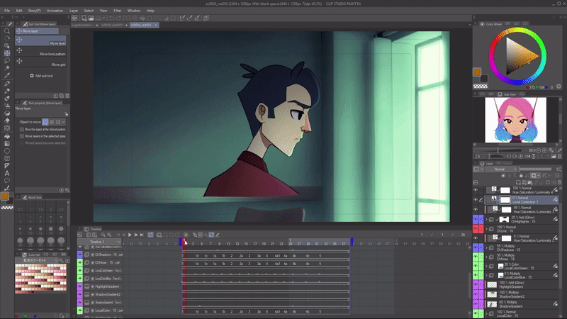
Finally, let's talk about interpolation in Clip Studio. We're going to switch scenes, to do a small camera movement.
I'll just go to my background image, and click on the enable ’keyframes on this layer’ button.
It allow me to set keyframes in all transform properties of this layer. This is scale, position, rotation and even opacity.
Next to it we have the option that tells us what type of interpolation we are creating. Hold means there will be no change from one key frame, to the other. It will just show the keyframe. Linear means it has no acceleration or deceleration, as the spacing will be totally even. And finally, the smooth interpolation, which is the most common, has acceleration and deceleration.
With the operation tool and the object mode, I have selected the background layer and I will set a key frame to all of these proportions. So position, scale and rotation. Now I will move further down the animation here and change the position 900 pixels to the right.
If you'd like to modify the curves of acceleration and deceleration, press the Graph editor button.
We can also animate opacity to generate effects like this. The lighting is changing. This is because I set different sets of layers. Some of them are turning off, others are turning on.

Let's talk about exporting options. First, we will go to File > Export animation, and here we have the options.
If this is your final stop when it comes to this animation, you can either export as a GIF or a Video, which you can save as either AVI or MP4, I highly recommend mp4.
If you plan on doing post-production in another software, like I did. Export an animation image sequence as PNG. Just turn off everything (including that background paper) and just leave the layer you want to export. PNG sequences have great quality without being huge in size, and they also have opacity.
This was the final result:

I can't wait to see what you will create using this!
And remember:
“Every line you draw, you are one closer to your dream.”
@ManuMercurial on every platform:
www.youtube.com/c/ManuMercurial
www.twitch.tv/ManuMercurial
www.instagram.com/ManuMercurial
www.twitter.com/ManuMercurial


댓글