
Intro + Video + Previews
Hey there!
This time we're going to talk about Gradient Maps!
You might have never used them before, but they are incredibly useful and versatile! I highly recommend learning about them. Chances are that there will be at least one method that could be useful for your digital art work!
I will show you how to colorize black and white pictures, add glow effects with more than one color, paint clouds and other things super easily, edit and polish the colors of your finished artwork, create alternative color versions, and even photo-manipulation. Yes, you don't necessarily need Photoshop for that!
I also made a video version of this tutorial! Go check it out:
And right below you can see some previews of what awaits you in this tutorial!
Making a Gradient Map: Tonal Correction or Correction Layers?
So, first of all I got to show you where to find them.
One place would be at "Edit" → "Tonal Correction", and there you can find it.
However, I recommend that you use them as Correction Layers instead.
The reason is because Correction Layers are "non-destructive", which means that the original layers remain unchanged. If you use the option from the Tonal Correction menu, then it also changes the layer itself.
Also, Correction Layers apply to all the layers below, or to the ones you clipped it to, and not just to one singular layer.
You can make a Correction Layer by simply right-clicking on the layer list, going to "Correction Layer, and there you can find it.
If you want a shorter version, you could also make a button on your command bar at the top. That's what I did.
By the way, I recommend using Correction Layers in general. The only down-side of them is that your layer list gets a bit more cluttered. That's about it though.
How Gradient Maps work
Alright, let's finally talk about what those Gradient Maps actually do and how they work.
The basic principle is pretty straight forward.
Imagine all of the colors of your picture are mapped on a gradient based on their tone. The darker colors are at the left, and the brighter colors at the right.
The Gradient Map tool takes that original map and replaces it with new colors. So all the colors on the right side of the gradient map replace all the original dark tones, and the left side replaces the original bright tones.
Keep in mind that that the colors are NOT sorted by their "value", which is the digital brightness of a color. They are sorted by their tone, so the brightness that our eyes actually perceive.
A blue for example appears much darker to us than yellow for example.
Down below you can see an illustration of it.
Even though the value is 100% across the whole original gradient, the black to white gradient map creates all sorts of greys from almost black to almost white.
Thanks to that the contrast of your original image still is preserved, even though it might have all sorts of colors on it.
Alright, now let's take a look at the tool itself:
I added some numbers to give you a list of the elements of this window:
✦ 1: Gradient Ramp
You can build your gradient up here. The little arrows below, called "nodes", have specific colors assigned to them, and the program creates gradients between those nodes. The node highlighted in white is the one you selected. You can add nodes by clicking right below the ramp, and remove them by dragging them out. And of course you can move the nodes by dragging them around.
✦ 2: Position slider
If you want to have more precision for the position of the nodes, then you can use this position slider.
✦ 3: Color
Here you set the color of the nodes. Main and Sub drawing color take the colors from your primary and secondary color that you have selected in general. "Specified Color" lets you open a window for picking out a specific color by clicking on the color bar itself. Or you can use the eyedropper tool to the right of it to pick out a color from anywhere on your screen.
✦ 4: Mixing Rate Curve
This gives you a lot of control of how your gradient is structured. It changes the gradient between the node you selected, the "Left node" and the next one to the right of it, the "Right node". You can add control points to this curve by clicking on it, and remove them by dragging them out. A straight, linear curve would give you a gradient that evenly goes from one color to another. The curve you see in the picture above is the default curve. It creates more contrast by pushing both the left and right color more towards the middle. When you have the curve turned off, it actually does not give you a linear curve, but that S-shaped default curve. Keep that in mind!
And so you can create the wildest curves and gradients. Whatever suits your needs~
✦ 5: Gradient Sets
Here you can find all of your gradient presets. You apply them by double-clicking on them. Just try out some of them and see what you like, or what you could build upon. In the Clip Studio Assets you can also find tons presets for free if you want to have more choices. Skin tones, Sky colors, Metal Reflections, and so on.
You can also make your own presets by clicking on the 4th button at the bottom and name it whatever you like~
So, we now have an idea of what Gradient Maps do and how you control them. Let's actually use them!
Below you can see an example image to give you a quick idea of how it looks like. You can see that all the colors were replaced by the ones on the gradient map.
This is just a very simple example however. In the following sections I will show you how they can be used on proper artworks.
Colorizing Black and White pictures
One of the most straight forward ways of using Gradient Maps in digital art is for colorizing black & white images. It is also a common technique to paint something without any colors at first, so that you can easily focus on the values, and colorize it afterwards.
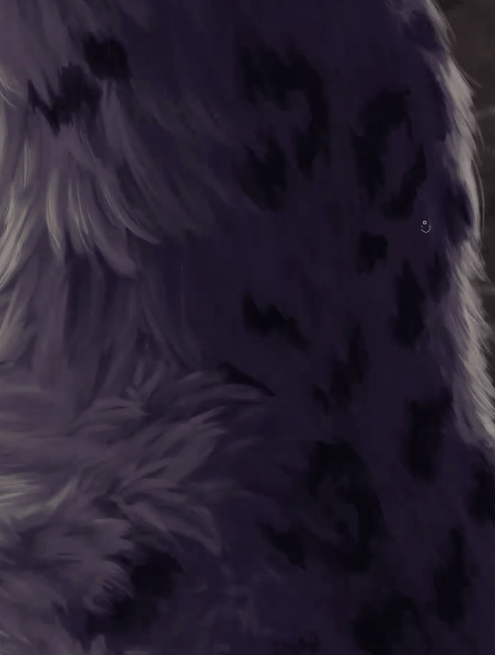
So I made this black & white painting of a snow leopard specifically for this tutorial, and want to give it some colors with the help of Gradient Maps!
The background and the snow leopard are on separate layers and folders, and I want to colorize them differently. The snow leopard will have warm yellows as highlights and cool blues for the shadows. The background will have mainly warm tones though, so that it will be coordinated with the snow leopard's highlights.
So I made a Gradient Map Correction Layer, clipped it to the Snow Leopard folder highlighted above, and chose those colors:
Black and White are still preserved. Also to keep the contrast.
The shadows get a dark blue, and the hue moves further towards yellow the brighter the colors get. The saturation also makes a curve. At first the saturation decreases. The orange mid-tones are almost grey. And then the bright yellow has a bit more saturation again. This makes sure that the new picture is going to look colorful, but also somewhat natural.
Be prepared to experiment around with your colors. You are going to need to try out and change colors constantly, move the nodes around and alter the mixing rate curve to get the results that you want. So, even though I present all of these results to you straight away, what you don't see is me fiddling around with the colors until I arrived at that final result.
Ok, this is how the snow leopard looks like with those new colors:
Quite a difference from before, even though the colors I chose are pretty tame!
The background will get a Gradient Map too. Not only do I want to make the tones warmer, but also increase the contrast. You can see that the shades are pretty close together.
So, this is the Gradient Map I made for it:
So again very desaturated colors. But even that slight hint of color can make quite the difference!
Black and white stayed on the gradient once again. You can also see that the gradient is very narrow, with most of the colors concentrated to the left. That's because the background doesn't have any tones on the brighter side.
I increased the contrast by simply moving the brighter and darker colors closer together.
Down below you can see the result:
The wavy patterns on the background now kind of look like they are glowing because of that increased contrast, which I found pretty neat~
Alright, how about we colorize the eye specifically with different colors?
For that purpose let's make a gradient map again, but before we try to find some nice colors for the eye, just choose some flashy colors that really strongly contrasts your image.
Then hit OK, lower the opacity of the Gradient Map a little bit, and click on the mask layer. Press "Delete" to quickly hide everything.
And then while staying on that mask layer, take out an opaque brush and paint in the eye.
The contrasting color makes it easier to see if you properly painted in everything.
That red might look a bit scary, oops.
It will get replaced now though! Once again the blacks and whites should remain as they are, but in between I want to have a dark purple-ish blue, going towards a somewhat bright sky blue.
After making those changes to the Gradient Map, go ahead and make a few corrections to the painted areas on the mask layer if necessary.
And so with that we have a bright, blue eye now!
Even the reflections on the eye look a bit glowier now because of that new blue outline.
With this technique, using mask layers, you can colorize any isolated part of your painting that you want. So if for example you drew a character with lots of details on them, you can make a Gradient Map for the individual parts of the character's outfit and other features.
And the especially neat thing is that you can change and adjust the colors at any point!
Instead of using a brush to fill in those areas, you could also make use of selection and fill tools. It simply depends which method is the most convenient for the particular situation.
So, as you can see, Gradient Maps make it super easy to colorize black and white pictures, and are really convenient!
Adding Colorful Glow Effects
Even though this is a new chapter, we are still working on the snow leopard. But we do something a bit different. Let's add a glow effect!
To be precise, I want to add a blue glow on the back, to make the general image a bit more colorful.
Now I could just pick out a blue color, make a new layer and paint right away. Maybe with a "Screen" or "Glow Dodge" blending mode.
However, I want to have more than just one color. I want the glow to go from a dark purple to a marine blue, to a light blue, and the brightest spots are straight up white.
That's a lot of colors to switch between. However, we can use Gradient Maps instead and just paint with whites and greys instead.
Here's how you set it up:
Make a new layer, fill it with black, and set its blending mode to "Screen".
The "Screen" blending mode hides black and brightens pixels below if you paint on it with colors that are brighter than black.
You can also make another new layer and clip it to that Screen layer. Or several layers. Or none, and you just paint on the Screen layer straight away. That part is up to you.
And then the Gradient Map! It also gets clipped to the Screen layer and we set up the colors for the glow.
Important is that you have black at the left side, so that the black on the Screen layer remains black.
Make sure that the colors have enough space in between and that you make a smooth gradient.
And so all the preparations are done! Let's get to the painting part!
Choose white as color and pick out a soft brush to paint with. Preferably one with a low brush density.
And then simply paint away on the clipped in-between layer or on the Screen layer directly.
You will notice that as you apply more paint, therefore making certain parts brighter, more and more of the brighter colors of the gradient map will appear! Even though you only paint with white!
You can also paint with greys, if you want to put a cap at how bright you can get at most.
And you can use all sorts of tools. Airbrushes, textured brushes, smudge tool, and so on.
The GIF above is just a quick example for showing you how the painting process looks like in action.
Here is the actual final result:
The glow also was made a bit less intense by lowering the opacity of the Screen layer.
And with that the snow leopard is done! I like the glow a lot in combination with the eye color.
Of course you can use other gradients too. For example you could use this fiery looking gradient, going from dark red to bright yellow. For this particular painting it looks a bit out of place, but with other paintings this could look super cool!
Painting Clouds with Gradient Maps
You aren't limited to colorizing black and white images, or working on top of already existing paintings. You can also paint something from scratch with the help of Gradient Maps really quick and easy.
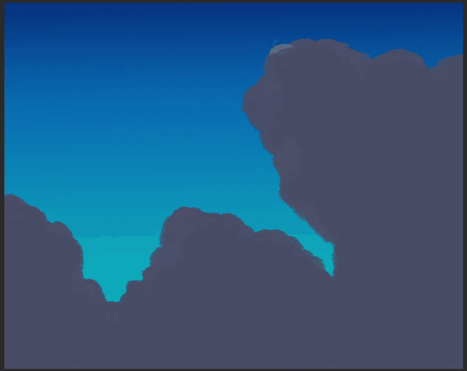
So, as an example, let's paint some happy clouds~!
It works with other kinds of paintings too. But I am already quite familiar with clouds.
So then, we need to set up some layers at first again.
I make a background with the normal gradient tool, by just using the "Blue Sky" preset. Then I make a new layer, which will be the layer we paint on, and clip a Gradient Map layer above it.
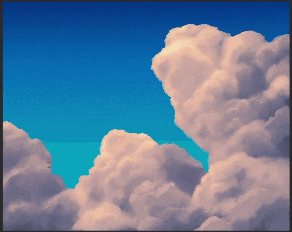
As for the colors of the Gradient Map, something else you can do is straight up picking them from a reference photo.
For example I have this nice photo here (it's a Public Domain picture), and with the Gradient Map menu open I just pick the colors from it with the Eyedropper tool under "Specified Color".
A good way to do this is to pick the brightest and darkest colors at first, and then a color that is slightly darker than the brightest, and one that is slightly brighter than the darkest.
I also added a bright yellow to have an even wider range.
And with that we can start painting!
Have both white and black selected as your primary and secondary colors, and start with black. Use a solid, opaque brush to establish the basic shape at first. Of course you could also make a sketch beforehand if you want.
You'll see that although you paint with black, only the darkest color of the Gradient Map appears.
And then I switch to one of my cloud brushes to give the edges more shape.
By the way, my cloud brushes are all from the Clip Studio Assets and free. And for drawing the fur of the snow leopard I also used fur themed brushes. Lots of good materials there!
Now lock the transparent pixels by clicking this little icon above the layers so that we only paint on the already painted areas.
It's time to use white, or some kind of grey, and paint with a softer cloud brush. Similar to the glow effect from before, more of the brighter colors come out as you change the black on the layer to brighter and brighter greys.
Again, use all sorts of tools and give the clouds more shape. Smudge tools especially come in handy for those. And keep on switching back and forth between white and black to brighten and darken parts. You can press the "X" key to quickly do that.
Since this is not a tutorial about clouds, I won't go into detail about how to paint those. Sorry. But I am working on a tutorial video that will be released in the future!
Now those clouds alone aren't really enough, so lets add some faint clouds in the back.
For that purpose I create a folder, put the layer with the already existing clouds in it, make a new layer below it, and clip the Gradient Map to the entire folder. That way it is applied to all the layers in it.
And so I'm starting painting on that new layer. This time with white straight away, and only use a very soft brush.
I'm just adding some small cumulus clouds here and there, and a contrail, because it is an easy way to improve the general composition of a sky image.
Please excuse the poor quality of those GIFs. They are GIFs after all...
The YouTube video has much better looking recordings though!
But yeah, with that the clouds are done! Well, I could spend more time to polish them up, but this is just supposed to be a quick example.
And this technique is not just limited to clouds. You could do this for all sorts of things that have straight forward color gradients.
Polishing and Unifying Colors of Finished Artworks
Alright, this time we are actually going to work with an image that already has colors. A painting I made this year to celebrate the New Year.
However I am not satisfied with the colors. They don't look winter-y enough, and the contrast is also lacking.
Gradient Maps are super useful for targeting specific tones and changing the colors of that range. That way you can influence the colors of the shadows, highlights and mid-tones easily and unify the colors a bit more, without completely destroying the original colors.
So let's do that!
I am just applying the following Gradient Maps onto the whole picture. But of course I could also go into the original file and change the individual layers.
First of all I want to change the shadows, to shift them more towards a dark blue.
So let's make a Gradient Map and switch out black with blue. Then move the white closer and change the mixing rate curve of the blue until only the shadowy parts are covered by blue.
Then click OK and change the blending mode of the Gradient Map layer to "Multiply". That way the white gets ignored, and darkens pixels below if the layer has anything on it that is darker than white. Since I used a blue with 100% value, it mostly just causes a hue shift. But it still end up looking darker, since blue is a dark color.
I also lower the opacity to about 50%, otherwise the shadows end up a bit too extreme.
It looks much nicer already!
Let's do the same thing for the brighter parts now. We make another Gradient Map layer. I plan on making it a "Screen" layer, so the black parts will be ignored this time. I also keep the white, so that the sun looks white, and add a yellow to the left of it. And once again I move the nodes and adjust the mixing rate curves until only the bright parts are covered by the yellow.
And like before the Gradient Map layer gets changed to "Screen" and now all the bright parts are even brighter and more unified with the yellow. Better lower the opacity by a lot though. It's just supposed to be a subtle change. Again, we don't want to completely destroy the original colors, or overblow the contrast.
You can also do the same for the mid-tones. For that purpose we make another Gradient Map layer, which will be turned into a Multiply layer. That time however there is white on both ends of the gradient, and a color in between.
I'm choosing the cyan color, to make the color a bit colder and winter-like looking. The process of adjust nodes and curves is the same. Just this time we aim for the mid-tones, so neither the shadows, nor the highlights.
And once again the blending mode gets changed to "Multiply".
The opacity has to be lowered significantly in this case, since we don't want to change the colors too much.
And if there are some parts that you didn't want to be color shifted, then you can use a brush, like a soft airbrush, choose transparency as color, and erase some parts through the mask layer.
And with that we are done! Here is a Before-After comparison:
Quite the difference. I definitely like the new version much much more!
And of course you can make all sorts of alternative color versions, either with already available presets, or some custom Gradient Maps.
Here are two examples. The first one was made with the "Golden Sunset" preset, one of the default ones from Clip Studio Paint. And the second one is a custom one to make this picture into some kind of horror themed art, muahahaha~
Gradient Maps can also be useful to making black and white versions of your image. In that case I recommend that you adjust the mixing rate curve of the black color.
In this example the bright parts would otherwise end up way too bright.
Using Gradient Maps for Photo-Manipulation
For the last example of this tutorial, let's do something very different!
So, I have this unedited picture of my cat Hokko. A beauty, isn't she?
I want to add a flower on her head to make her even prettier~
So, I found a free png of a flower and put it into position on her forehead.
Well, you can clearly tell that the flower has been edited in...
So I also painted in some drop shadows below it on a separate Multiply layer with some grey, so that it doesn't look too much out of place.
But that alone isn't enough. It is especially the colors. They are way too intense and don't work with the colors of the photo at all.
Before I start using Gradient Maps, I'm going to do some extra adjustments to the colors of the flower.
You see how yellow the walls looks like? I know that they are white in real life, so the white balance of the photo is strongly shifted towards yellow.
Therefore I make a Fill Layer, Clip it to the flower, and pick out the color from the color of the brightest spot on the wall.
Then I set the blending mode of the Fill Layer to "Color", and lower the opacity a little bit.
Then I added a Tone Curve correction layer to increase the contrast and a Hue/Saturation/Luminosity layer for increasing the saturation.
Alright, now the Gradient Maps come into play!
Like with the previous example I made three different Gradient Map layers. For the shadows, highlights, and mid-tones. And they are applied to all the layers, therefore they are not clipped.
First of all the Gradient Map layer for the shadows. I won't go through the process of finding and adjusting the range again. It works pretty much the same as the last example.
I chose a blue color and set it to Multiply again.
The shadows look more unified now!
Next up the mid-tones. Another Gradient Map layer in Multiply blending mode.
In this case I actually picked the red from the original flower image and found the its tone range on the gradient ramp. This barely changes the colors of the flower, but everything else gets a little bit more red. I lowered the opacity of this particular layer quite a lot to make this change subtle.
And lastly a Screen mode Gradient Map layer for the highlights. I chose a yellow color and applied it to all the bright parts of the picture. The opacity of that layer got lowered a lot too.
And now let us compare Before and After!
I would say that this is a huge improvement!
Not perfect. I am not a photo editor after all. But much better than just throwing a random flower onto a picture, for sure.
And not only does the flower fit the photo better now, but also the general photo looks nicer in my opinion. The contrast for example has improved a lot.
So, as you can see, you don't necessarily need Photoshop in order to do photo-manipulation. Even a software that is mainly made for drawing, like Clip Studio Paint, is suited for it!
Conclusion
I hope you can see now how versatile and useful Gradient Maps can be! I don't really hear artists talk about this tool, and I personally didn't know about them either before Clip Studio announced this topic for the Tips of the Month contest of May 2022. So I had to do a lot of research and experimenting in order to learn it quickly. But I'm really glad that I did! I am definitely going to use Gradient Maps in the future in all sorts of ways!
So, I guess I should thank you, Clip Studio, for bringing Gradient Maps to my attention. Hahah~
In case you are reading this though, Clip Studio, may I give you a small request for this feature?
The biggest problem I have with the Gradient Maps in CSP is that you don't have a live-preview for the Color Settings window when you pick out specific colors. So you always have to pick out the color and hit OK to actually see the change on the canvas. That's a lot of back and forth if you are trying to find the optimal color at times. It would be immensely useful if you added that feature. Not just for Gradient Maps, but also for other tools like the Fill Layer.
That's just a little feedback from me. Otherwise I am a big fan of the Gradient Maps in CSP. Especially the fact that we got a mixing rate curve. Most other programs don't have that much control.
Alright then, thank you a lot for reading / watching!
As always I am open for constructive feedback. Just leave a comment down below or on the YouTube video~
Have fun drawing and colorizing!
이 게시물에 '좋아요!'를 누른 사용자


댓글