
Hello everybody! In this tutorial, I’m going to take you through my process for drawing and painting Birds in Clip Studio Paint. Animals make for an excellent subject matter in illustration especially in combination with a particular mood and environment and birds are among my favourites. Our learning objectives today will not only cover the general anatomy of certain birds belonging to the animal kingdom, but also the economy of detail in digital painting and elements of color theory. With Clip Studio’s extensive library of assets at our disposal, rendering our feathered friends in a painterly and/or semi-realistic style can be done with more ease. I have compiled a number of images and video clips to demonstrate my process. Let’s begin!
Preparation
Nature’s intricate details can be intimidating at first, but through a little preparation we can build up a better vision of what we hope to achieve for a final piece. This is where gathering a plethora of photo references and raw material (e.g. fallen feathers) come in handy, if possible travel to where your subjects can be observed, take your own photos, make a few rough sketches. I usually take the time to do a few detailed studies from photo references of an animal subject to better understand it’s anatomy before moving on to an original piece, especially when it’s an animal i’ve never attempted to draw before.
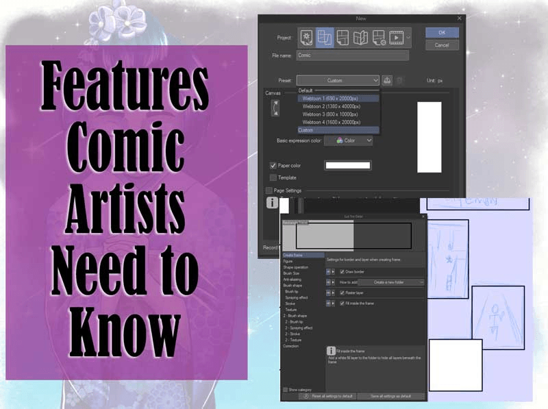
Now I'm ready to prepare my canvas, I go to [File] Menu > [New]. I work in 600dpi resolution for my illustrations, I like to work zoomed-in for finer details and with the best possible image quality in case I decide to make prints of my work at a later time, however 300dpi will suffice for most prints and online publishing so I will scale my resolution down at the exporting stage. My paper size is usually set to A4 (or larger) for full illustration work, but for the purposes of this tutorial my canvas size will be different. I hit “OK” once I’ve adjusted these canvas settings.
1. Think Like a Concept Artist
Like much of the animal kingdom, birds come in a huge variety, unsurprisingly your choice of subject can be an overwhelming one. This is where I say “think like a concept artist,” consider the theme or mood and all surrounding elements that you plan to incorporate into your piece, based on this information you should be able to make a more informed decision about which animal subject better fits your concept. Birds of prey like eagles, hawks and falcons make perfect companions for a desert nomad character for instance, and crows are often a symbol of ill-omen and can thus be used in scary settings, I’ll be painting these two concepts for this tutorial.
2. Basic Shape
I start with the [Design Pencil] in the Sub Tool [Pencil] panel, set to anywhere between 5-10px in brush size. For this stage, I also work in a deep, saturated color like an ultramarine blue from the [Color Wheel].
I find that an efficient way to begin a drawing is by identifying the basic shapes of my subject. I view the subject as a series of geometric shapes without any detail. In a new Raster Layer which I named “construction,” I loosely block in the gesture, angles and general proportions. Here, I also consider the composition of the piece. These construction lines will become the basic framework of the bird.
3. Sketch
I now reduce the opacity of my construction layer to 40% or less and lock it so I don’t draw on it by accident. I make a new Raster layer above it and rename it to “Sketch.” I prefer doing my sketches in a sepia or dark reddish brown color rather than jet black. You can also begin to understand why I chose a blue color for the construction lines, this way it’s easier to distinguish my sketch lines from the construction lines.
In my sketch layer I begin to establish the position of the eyes, beak, feathers and talons with the same [Design Pencil]. I also soften sharp angles with curvier lines around the head. I pay closer attention to the anatomy and proportions of the bird.
As a general rule of thumb, the anatomy of a bird consists of:
A centre of mass focused at the chest which is why the chest is drawn jutting outwards
Ankles which resemble reversed knees, their actual knees are hidden beneath layers of feathers.
A circular or elliptical head shape ubiquitous to all birds
At this stage I can delete my construction layer. I develop my sketch further with cleaner and more confident lines. I indicate layers of feather with a few simple pencil strokes which follow the direction of the feather growth, feathers take on a curved shape at the tip. You can start to see how the shape and contours of the bird become more defined using only simple pencil marks as opposed to drawing each and every feather intricately.
4. Flat Color
I reduce the opacity of my sketch to around 40% and lock the layer. I create a new layer beneath my sketch for the coloring stage. For this step I’m going to create a selection using the “Quick Mask” function.
I go to [Select] Menu > [Quick Mask].
A new layer will be created above called “Quick Mask.” Everything that is painted in this layer will appear red indicating the area I have highlighted for selection. Using an opaque, hard edged brush like [Oil Paint], I paint over the areas I want to fill with flat color later.
Once I’ve painted over the areas I need selected, I go to [Select] Menu > [Quick Mask] again to deactivate the function.
A selection will be created for me based on the areas I just brushed over, and the “Quick Mask” layer disappears. I select my base color, this will usually be the midtone of the animal I’m painting, and I click on the [Fill] icon which pops up below my selection.
I do this for every element on my canvas. At this point I should have a tidy, readable silhouette of my subjects, in other words, when I hide my sketch layers, the silhouette should still be instantly recognisable as a bird. This is also why I reduce the opacity of my sketch before blocking in colors as lines can sometimes warp my perception of a readable silhouette.
Tip: Although I prefer to work with the least amount of layers possible, I often separate larger elements of my work into their own layers and/or folders. I have grouped my sketch layers into one folder, and the paint layers (containing my flat color) belonging to the bird/character/tree branches into another, for example. This keeps my work-space nice and tidy and easily identifiable when I need to find a certain layer.
5. Light and Shadow
The first thing you want to do before attempting any shading, is to determine where the light source is. If the lighting and shadows on your work are not uniform, it can look as if the various elements on your canvas was harshly pasted together rather than working in unison. Therefore, it’s very important to keep a mental note of where your light source is throughout the rest of the painting process.
On my flat color layer, I click [Lock Transparent Pixel] in the [Layer Settings]. A white padlock icon appears on the right hand side of my layer indicating that the transparency lock is active. This will protect the alpha so I don’t paint outside the boundaries of my flat color.
With the midtone I used for my flat color selected as my current drawing color, on the [Color Wheel], I will now shift my hue slightly and pick a darker shade for my shadows. Generally, I like to use warmer tones for shadows if my light source is a cooler tone, likewise I use a cooler tone for shadows when my light source is warm.
Tip: Avoid brushing in your shadows without a hue shift. Using a color that is simply a darker shade to your base color will render a flat and dull result, but when you also shift your hue and saturation on the [Color Wheel] either to the left or right, you achieve a more realistic look.
I select [Soft] Airbrush from the Sub Tool [Airbrush] panel.
Taking the position of my light source into account, I begin to airbrush areas that should be cast in shadow.
I do the same for areas lit by the light source, this time with a bright color that is in line with the color temperature I decided for the light source. In my example below, the figure on the left is lit by a warm light source whereas the one on the right is lit by a cool light source. I put more pressure on my pen to get a denser airbrush application when I paint areas that are closer to the light source.
6. Detailed Render
In order to give the piece better form, I need to build up the values and texture some more. I start with one of my favourite custom brushes from the Clip Studio Assets library:
This brush realistically mimics oil paint and with its oblong brush shape it’s great for creating the soft and delicate look of feathers in addition to a variety of other textures. By default this brush lays down a thick and opaque coating of paint, but to create the illusion of feathers I want to be able to layer the paint with more subtle coatings so I make the following changes to the brush properties. Under [Tool Properties] I click the [Sub Tool Detail] icon. On the [Ink] detail I reduce the [Amount of Paint] to 36 and [Density of Paint] to 17. On the [Border of Watercolor] detail I reduce the value all the way down to 1.
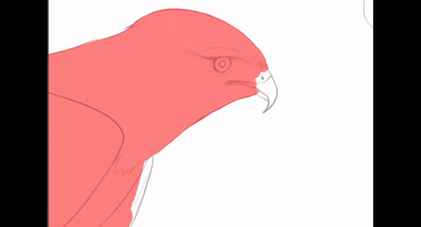
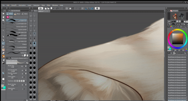
I can now start painting along the contours I marked during the sketching phase, I also make a number of long yet quick brush strokes in the direction of the feather growth. I use a darker color for the first application of paint and then layer a lighter color on top generating an illusion of depth.
Here, I consider environment, since I imagine this hawk under a blue daylight sky, I’m going to brush in a light blue hue over the midtones. This is called “ambient light.”
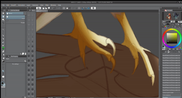
When you’re looking at an illuminated form, it’s actually the shadows that communicate a three-dimensional shape, therefore it’s important to differentiate between hard and soft shadow edges. In the screenshots below I demonstrate how I establish a hard shadow edge around the talons of the hawk.
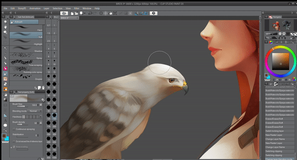
To paint the patterns on the hawk’s wing I used a combination of broader and shorter brush strokes which conform to the shape of the wing. I pay close attention to the previously airbrushed values so I can decide when my color needs to be darker or lighter before brushing over it with the oil paint. My aim is not to recreate these patterns in a photo-realistic style, but rather a loose mimicry of the natural design using a painterly technique. Notice how I also created a selection using the [Quick Mask] function again, this time I inverted the selection to block off the area outside of the bird’s wing so I don’t inadvertently paint over the neck, torso and legs.
Painting the eyes is one of my favourite parts. For this step I change to a brush with heavier paint application and smoother color mixing, like the [Dense Watercolor] and [Opaque Watercolor] brush. I recreate the effect of a glossy and highly reflective surface by painting a sharp contrast between the shadow and light with hard edges as well as adding hints of blue from the environment.
I use the same watercolor brushes to paint a more matte surface for the beak.
For the talons of the hawk I need to change the color to a yellowish hue without losing the values I have already established, I make a selection using [Quick Mask]. I then go to the [Edit] menu > [Tonal Correction] > [Color Balance]. I shift the sliders around in [Half Tone]/[Shadow]/[Highlight] until I find a combination of colors that fit.
I then take the opportunity to paint the individual nails on the talons.
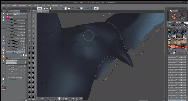
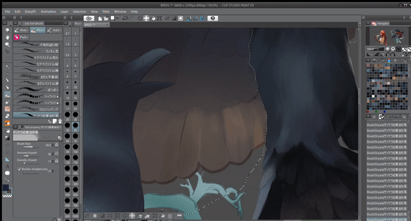
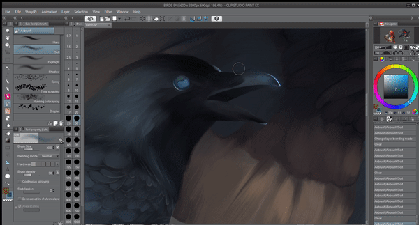
I repeat the same techniques for the crows. The deep black feathers of a crow doesn’t necessarily mean I should only work in a series of dull greys. In fact, I introduce a number of earthy tones, purples and blue/green into the canvas in accordance with my imagined environment. A pop of color against cool greys and black gives the piece more visual impact.


7. Editing lines
Some artists will discard their sketch at this stage, however I like to incorporate parts of my sketch into the work because I think it adds more character to the piece. I bring the opacity of the sketch layers back up to 100% and make sure they all have the [Lock Transparent Pixel] function active. I then use the [Eyedropper] tool to pick colors directly adjacent to my lines. Using the [Opaque Watercolor] brush, I now paint over the lines to essentially blend it into my painting.
8. Lighting with Blending modes
I will now attempt to add more depth to my lighting with blending modes. For this stage you need to either merge all your current visible layers into a single layer or group them into a single folder which is my preferred method. As pictured in step 4 of this tutorial, my layers are already organised under a parent folder (in my case “Figure 1” for the illustration of the hawk and “Figure 2” for the crows.) I create a new Raster Layer above my folder and call it “Light” before clipping it to the folder below using the [Clip at Layer Below] function, this step is necessary as I don’t want the effect of the Blending Mode to bleed into my background. At this point I can change the Blending Mode of the layer from [Normal] to [Color Dodge].
I select the [Soft] Airbrush and pick a color from the [Color Wheel] that fits the color family of the light source (warm orange/yellow for the hawk, cool blue for the crows) with medium saturation and low luminosity. I begin to apply the airbrush over areas that are hit directly by the light source as well as highlighted areas. Given that [Color Dodge] renders an intense effect, I make sure to airbrush very lightly and use the [Blend] and [Blur] tool to feather out the concentration.
I want to give these crows a bit of a fantasy look, so I’m going to use a different Blending Mode for their eyes. I make a new Raster Layer above my painting and clip it as before, but this time I select [Add Glow] as my Blending Mode.
I airbrush the eyes and add a slight flick to side of the eye to recreate a flare effect. Already the spooky feel of this piece has been enhanced dramatically!
9. Adjusting tones with Correction Layers
My last step is to adjust the tones of my painting in a non-destructive way, this is where “Correccion Layers” come in handy. Sometimes the contrast and saturation in my piece may be slightly lower than I originally perceived especially when printing, with “Correction Layers” I can come back and fine-tune the tones to my liking any time I want.
With the uppermost layer of my project selected, I go to [Layer] Menu > [New Correction Layer] > [Tone Curve].
I play around with the curves until I find a combination where my shadows appear deeper and my colors more vibrant. I don’t move the nodes I created too much from the central line as this may create an odd result. I hit “Ok” to apply my edits. The great thing about “Correction Layers” is that my edits are not permanent and I can double click the layer to open up the [Tone Curve] dialogue and edit the curves once more if I’m not entirely satisfied.
Here is the final render!
Video Process
I have prepared a video process of my painting technique, feel free give it a view for a better look at my workflow.
Afterword
Thank you for reading my tutorial! I hope I have provided you with enough guidance and inspiration to try your hand at painting your own birds. If you have any questions please feel free to leave a comment below and I will get back to you as soon as possible.
Dieser Beitrag gefällt


Kommentar