How I Color My Characters
Hello everyone
My username is BlessedBlight. I am an aspiring artist and I would like to show you all how I decide to use Clip Studio Paint to illustrate my original characters. Hopefully, I can spark some creativity into anyone who decides to read this tip.
What is my process?
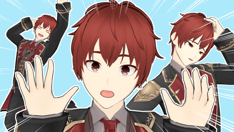
In terms of the speed and complexity of my process, it is relatively quick and easy to follow. The only tedious part is the coloring style I use inspired by artist, Van Gogh. For example, the final product of my tip ends up like this:
Realistically, any thick color brush can do for this tip. In my case, I used both the regular oil paint for the short strokes and the thick oil paint for the black outlines.
The first thing I start out with is, obviously, the line art for the character. For anybody who reads this tip, any portrait of any character can suffice to reduce the time it takes to complete this task. I initially drew my character with a regular pencil:
Then as shown above, I lowered the opacity to 20 so that when I colored and outlined over it, the drawn lines don’t glaringly show above.
This way, the line art can be made invisible after coloring over the character. The layer type can remain at normal.
After creating the line art portrait, not specifically of my character, make a new raster layer and leave the line art visible so that you can start the coloring process.
As I stated earlier, I take inspiration from Van Gogh’s painting style, though it is not a replica nor do I intend it to be. That being said, when doing the short strokes, start with a light color—for example peach or light brown(of course this can vary depending on the character you are doing a portrait for). Try to form the short strokes around the contours of the character’s face and neck to give it more shape and an almost 3D effect. Then, wherever there is shadow, avoid using black; instead, use a hue-shifted version of the base color. Wherever there is light, you can use colors like yellow or light blue, albeit much more sparingly than the shadow color.
Regarding shadows, as seen above, I also use a light purple to accentuate the shadows, along with a dark brown layered over the brown used for the base shadow. It is up to you whether or not you choose to follow the same approach in terms of color choice in this regard.
Now, in regards to hair, the manner in which you use your strokes is purely up to your character’s hairstyle. In my case, if you look at the below image, I use a lot of purple because I intended my character’s hair to be white and all I can add is shadow to the designated area. I also use a little bit of light blue on the left side of his hair, representing light.
The best advice I can give for any hair type that isn’t wild, unlike my character’s, is to try to along the hair shape and contours, and use the formula of light colors first and dark colors last.
Thank you for reading!
I hope that this tip was helpful to anybody who chose to read it. Even if it isn’t helpful to some, I am happy to at least share my style. Thank you.


Comment