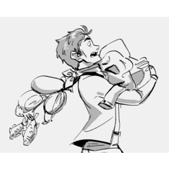
Starting on Clip Studio Paint with Small S! Part 4

-
 MVP ◆This user has contributed greatly to the management of the community, by posting many great responses to the questions asked. Once every three months, MVPs are determined based on the points earned during that period and will be recognized accordingly.
 -
 New Valuable Player (NVP) ◆These are the next-best contributors to the community after MVPs. This is awarded to users who have not yet won an MVP award, based on the number of points they have earned.
 -
 Official Expert ◆Chosen out of all MVP awardees, who are already proof of excellence, this is a testimony of outstanding correspondence in the community. After careful screening, they are appointed by CELSYS and assume their position.Note: Formally called “Evangelists”
 -
 CELSYS official moderators ◆Moderators are official CELSYS staff members who are fluent in Japanese as well as various other languages. As moderators are not experts on software or creative work, they will not be able to directly answer your questions. However, moderators will provide communication and language support to ensure that everyone can smoothly communicate with each other.
 -
 CELSYS officialThis is the official administrator account.
The convenience and fun of digital art with professional illustrators of “Small S”
In this series, professional illustrators will introduce the convenience and fun of digital art to other artists who rarely draw on computers.
When first creating art, many people turn to the familiarity of pen and paper, but many are interested in digital art as well.
However, you might be worried about how to use the tools and software.
This series introduces the basics of Clip Studio Paint so that beginners can use it with ease to enjoy creating their art, without having to learn the most complex functions.
Clip Studio Paint is a drawing software that is often used by contributors to the Japanese illustration magazine “Small S” as well as professional illustrators.
An iPad version offering all the PC functions and tools has been released!
It has the advantage of allowing artists to easily do things that are difficult or even impossible when working traditionally. A lot of useful functions can be learned from this software.
Over the course this series, you can learn and draw alongside real beginners to digital drawing as we introduce some tips for digital art!
Artists for Part 4: Shun Akagi and Aro Hagiwara
Shun Akagi (Japanese: 紅木春): She mainly works in Clip Studio Paint.
She draws book covers, for social games, and teaches illustration to high school students.
Shun also regularly attends the independent comics convention “Comitia.”
Aro Hagiwara (Japanese: 萩原あろ): She draws and paints traditionally with Copic markers, watercolors, and ink pens.
Aro usually uses Paint Tool SAI for her digital artwork, but is trying to learn how to make manga and illustration on Clip Studio Paint EX.
Last Spring, she started studying comics and illustration in an art school.
In this part 4, Aro, a beginner wishing to improve her digital art skills, will team up with Shun, a professional illustrator.
Shun will support Aro by sharing valuable tips for digital illustration.
Make the most of Clip Studio Paint’s various functions!
■ Express yourself using a wide selection of materials! [Rich variety of materials]
One of the strongest points Clip Studio Paint offers is its extensive selection of materials.
If you need more materials, click on [Search for Additional Materials] to access [Clip Studio ASSETS] and add tons of convenient materials to your repertoire. Note: Internet connection necessary.
An assortment of custom brushes, as well as many comics making materials such as tone, background materials, and 3D objects, are available for free. (Some might require a small payment.)
Do not miss out on the chance to use them!
■ Create an array of color tone using [Level Correction] & [Color Balance]!!
Clip Studio Paint provides many functions to support color changes.
As they each produce different effects, we recommend a combined usage of these functions.
Aro: Shun is using so many functions to change her colors. Personally, I like to use [Color Balance] because its a quick and easy way to change colors.
The first time I used it, I managed to deepen and darken both my reds and blues the way I wanted them to be. This function is so convenient!
■ Organize your workspace with [Layer Folders]!
The [Layer] palette becomes compact and easy to use if you arrange your layers in different [Layer Folders].
<Blending Mode [Through]>
Shun: The activation of the blending mode [Through] on a [Layer Folder] allows the application of all the blending modes used within the folder. It’s an indispensable function!
▲ Change the default mode from [Normal] to [Through] when you create a layer folder.
■ Make sure to save your files periodically using [Export (Single Layer)].
When your work is completed, it is saved but not suitable for posting or presentation because the layers are not flattened.
In this situation, the convenient function [Export (Single Layer)] comes in to save the day! Once the layers are flattened, the file can be saved in various formats.
· JPG Format: data compression ratio is high. Make sure to set [Quality] to [100] for optimal resolution.
· PNG Format: image quality is not lost. When the background is transparent, opacity can be maintained.
· PSD Format: can be opened and used on various software such as Photoshop, etc. The data size is large.
<Changing the exportation method according to the final destination>
Shun: I generally use PNG and JPG formats because their content can be seen regardless of platform.
Personally, I think that the PNG format makes the cleanest-looking files.
Details such as these are important to pay attention to because they improve the beauty and appearance of your art!
For the present lesson, I focus on processes to achieve both illustration completeness and consistency.
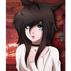
This is Aro’s illustration colored by Shun.
Complex colors and shadows were created due to several color adjustments.
Aro’s process will be explained through the following illustration!
Shun: When I paint, I test various colors, add many little touches here and there and proceed through a “trial and mistakes” finishing process.
One of the major merits of digital painting is the ability to “undo and redo” when you make mistakes. This allows for experimentation and the discovery of new brushes, textures, shades, etc.
<Four Important Points!>
· Linework color change for better blending with the rest of the painting.
· Addition of complementary colors to the shadows for perspective and three-dimensional effect.
· Color change with a [Tonal Correction Layer].
· Adding Texture for a realistic material touch.
■ Changing the linework color
Aro: Following Shun’s method, I modified the linework color.
Although they were originally black, I tried to match the linework to the colors of the illustration. For example, I changed the color of the linework of the hair to yellow, the linework of the ribbon to red, etc.
Note:
[Lock Transparent Pixel] is a function that blocks any drawing on transparent zones.
Without any proper locking, colors might go outside of the edges.
If the transparent pixels are locked, the color will be applied on the existing linework only.
■ Adding colors to the shadows
Note:
· Adding light and shadow according to the light source
Shun does not correct the shadows simply by adding colors; she also adds light gradations.
· Soft but sharp brush
Shun’s shadow blending brush.
It softly blurs the painted color of [India Ink] to a [Darker bleed].
Blurring parts of the colors to make everything look both softer and sharp.
(1) Shun: I add contrasting colors to the tips of each shadow (opposing colors on the color wheel). These little touches add both volume and depth to an illustration.
(2) Shun: I brighten the dark color of the back leg where it meets the boots.
The front parts now become clearer and easier to see.
■ Tonal Correction
(1) Shun: I use a [Tonal Correction Layer] to further correct the colors.
I use it when I feel undecided. Testing new colors helps me a lot and I enjoy discovering new shades.
(2) Aro: Using [Color Balance] instead of [Level Correction] is way easier to use; I simply need to move the cursor of each primary color from left to right to change the shade.
■ Finishing Details
(1) Shun: Once the color adjustments are completed, I add some texture to improve the feel of the materials and the credibility of the whole image.
I paste my go-to texture onto the canvas, change the blending modes and try many combinations.
(2) Aro: I complete by adding some highlights and strands of hair.
I place this layer on top of the color and linework layers.
I used a special brush to paint the motifs on the tips of the ribbon.
■ Completion
Aro: I combine all layers, duplicate the result and use [Filter] → [Blur] → [Gaussian Blur] on it.
I tried to merge both color and linework because they were both a little too sharp.
Shun changes the color of her linework and adds some final touches
(1) I create a new layer set on the blending mode [Normal], lay it on top of the linework layer and use [Clip at Layer Below].
With the top layer clipped to the bottom linework layer, any color drawn will not show past the linework on the bottom layer. Now I can easily change the color of the linework. I use orange for the skin and blue for the clothes, etc.
(2) I paint gradations using different brushes such as [Darker Bleed] located under [India Ink] in the [Brush] tool, [Soft] located under the [Airbrush] tool, [Running color on fiber] located under the [Blend] tool, etc.
· I painted some colorful rainbow shadows on the inner parts of the hat and the skirt.
· I added some color to the eyes and the cheeks.
· The luminosity seems enhanced because of the strong duality between the light and shadows.
· The color of the tips of the hair became brighter.
· I turned hair violet. I also painted the shadows in purple shades.
· I slightly darkened the color of the eyes.
· I unified the illustration by painting the inner part of the skirt in violet.
· I kept the violet hair color and added some yellow shadows on top of it.
· I added some red to darken the colors of the shadows on the clothing.
· There is some yellow left in the shadows so I brought back some of the brightness of the hair.
· I painted the linework of the butterflies in brown to blend it with the rest of the illustration.
I tried to color both the hair and eyes violet but in the end I decided to go back to the original colors.
(3) I draw more butterflies and correct some details as I add texture.
I also considered changing the background color from yellow to grey.
I do not draw with a yellow background often. I tried to use one for this illustration but found out at the end that it wasn’t the right shade for it.
(4) I made a revision of the face and clothing lines and corrected small details using the “atsunuri” technique, which consists of several thick brush strokes in one spot.
I also painted the most luminous parts with light shades of orange.
From the [Layer] menu I select [New Correction Layer] and create a [Tonal Correction Layer] for these three elements: [Level Correction], [Color Balance], [Tone Curve] and redden the colors of the illustration.
■ Completion
Finally, I sign my illustration to complete it.
Furthermore, to make sure that the illustration looks good on small screens, I export it in PNG format and use [Sharp] located under [Filter] menu.
An array of [Textures] improving your digital illustrations
Aro: I have never used textures before; when should I use them?
Shun: People use textures for many reasons. Personally, I find their usage helpful for improving the overall feel of the illustration.
I like the abrasive and runny effect that happens when you draw with an actual brush. Obtaining this in a digital drawing is complicated and I am work hard to create this look.
This is when I start using textures.
It’s easy like adding a filter to a photo on your smartphone! Textures help to change the atmosphere of the drawing and are really fun to use!
Aro: Which images should I use as a texture?
Shun: There are three types:
· Your own images
· Purchased images
· Free materials found online
The Internet offers a wide range of free materials, but you should be careful before using it because some of them might come with utilization rules or contract. It’s important to be careful before using what we find.
(I avoid downloading images coming with many restrictions, such as an obliged report of usage or the ones non-commercially available.)
Aro: How should I use them?
Shun: Utilisation also varies from one to another. Personally, I create a new layer for the texture and lay it on the top of the others, then I copy and paste the texture on it.
The look change depending on the blending mode you select. I use most of the times [Soft Light], [Overlay] and [Multiply].
Also, if the opacity level of the layer is set to 100%, the effect will be too strong. That’s why I set it on 10% or 30% in order to merge properly the texture with the rest of the picture.
In my case, I often add three to four textures to one illustration.
■ Textures Used
The following images are textures I used in my illustration.
I took pictures of scratched materials to create them.
I use them on my work to add final touches and enhance the overall feel of the illustration.
<Before processing>
I hide the background of the completed illustration.
Only the character is visible to make the painting process easier.
<After processing>
Out of the four prepared images, three were added to the illustration.
This process created a unique texture.
■ A little practice on Aro’s illustration
Shun’s texture is pasted onto Aro’s illustration.
For a better understanding, the same settings have been used on all the pictures. (Blending Mode: [Overlay], Opacity Level: 100%)
In comparison, it turned out that not only the texture but also the color tone change depending on the color of the texture.
An extensive range of possibilities is available, not only regarding the texture itself but also depending on the arrangement of the blending modes and color schemes.
Textures enhance your power of expression! I strongly suggest everyone to try using them!
Conclusion:
■ Aro’s impressions
Following Shun’s advice and teaching, I managed to change the whole atmosphere of my illustration and make it even more realistic!
I think I both improved and innovated my work. Until now I have always just been “painting for painting’s sake”; learning about painting methods and color balance techniques makes such a great difference!
Also, I am impressed by the effect generated by the add of colors on shadows!
It’s amazing how a little color touch manages to create so much relief and volume!
■ Shun’s impressions
I also learned a lot today!
One of the merits of digital drawing is the possibility of undoing what has been done and try a lot of different things.
Analog drawing does not offer this chance.
Besides, I like the look of analog drawing and use textures to add this feeling to my digital illustrations.
Even though it’s only one reference amongst many ways to draw, I’d be happy if it is of help to anyone!
And this how we conclude this Clip Studio Paint lesson. We are looking forward to the preparation of the next one!
What is “Small S”? (スモールエス)
“Small S” is a Japanese illustration magazine first published in 2005. With the slogan “A magazine for tutorials and submissions,” it features special articles with step-by-step tutorial guides for illustration making, alongside many illustrations submitted by readers. It includes both traditionally and digitally made artworks. Readers can submit their illustrations online.
Users who liked this post


Comment