
I'm sorry, the speed of the video is a little too fast, so when watching it, I recommend playing it at 0.25x speed or watching it while pausing. Also, the operation of vector layers is covered again in the video of [Line drawing course drawn by vector editing] in another new course, so you may want to take a look there.
Introduction

In this TIPS
I will introduce how to use vector layers to draw onomatopoeia and sound effects in manga while actually drawing sound effects in the above manga. I have added English subtitles for the video, so please have a look there as well.
Stroke information is stored inside the drawn line in the vector layer like a bone.
Specifically, it is a component that constitutes a line such as the trajectory of the line, the thickness of the line, and brush information.
These vector information can be easily edited even after drawing a line.

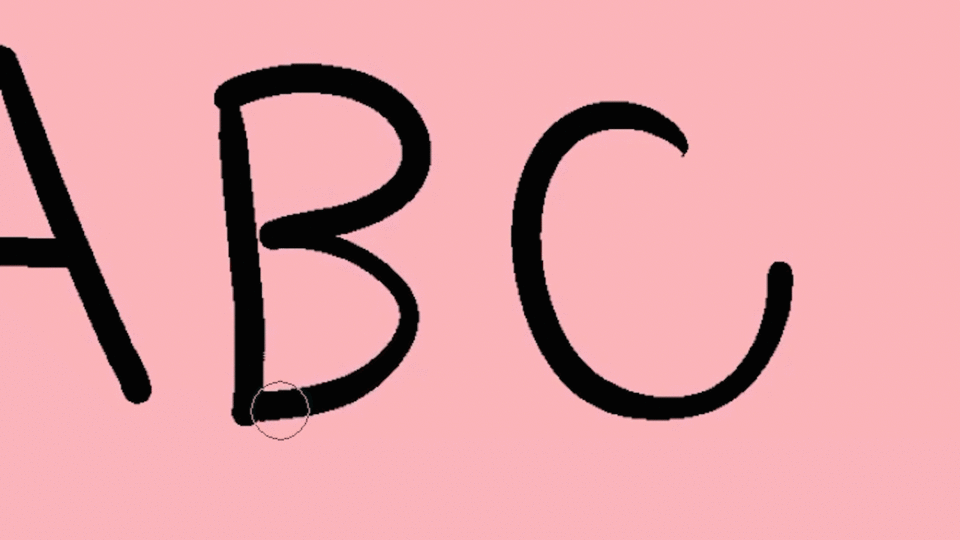
The drawn characters in the manga are also composed of lines and strokes.
Editing can be done more efficiently if editing and processing are performed for each stroke.
This is quite difficult with raster layers,
With a vector layer, you can easily edit the characters you drew once later.
In this course, I would like to take up a method of efficiently editing and drawing drawn characters such as sound effects and onomatopoeia using this vector function.

Introduction and preparation of tools and functions to be used
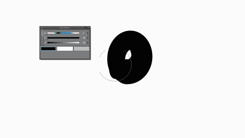
Before actually starting to draw, we will introduce the tools and functions used to draw characters in the vector layer, and prepare the tool settings and so on.
The following 6 tools / functions are mainly used.
(1) Various [Selection] tools ([Marquee] tool (Lasso, Selection pen))
(2) [Select Overlapping Vectors] function ([Select Overlapping Vectors])
(3) [Object] tool
(4) Various [Correct line] tools ([Correct line] tool)
(5) [Border effect]-[Border]-[Layer Property]-[Border effect]-[Edge] of the layer property
)
(6) [Border the selection] ([Outline Selection])
(1)-(4) are especially important for editing vectors.
The locations of each tool are as follows. I think it's a little difficult to understand, so it's better to have the video grasp the position.
(1) [Menu]-[Window]-[Tools]-[Selection] tool
(2) [Menu]-[Selection]-[Select vector for selection]
(3) [Menu]-[Window]-[Tools] [Operation]-[Object] Tool
(4) [Menu]-[Window]-[Tools]-[[Line Correction] Tools
(5) Above the layer properties
(6) [Menu]-[Edit]-[Border the selection]
Since these tools and functions are used frequently, we recommend that you register them for shortcuts and quick access, or set them in the selection range launcher. Please refer to the above location when registering.
⑤ is in an easy-to-understand position, and you don't have to register because you don't switch frequently.
Let's first explain the functions (1) to (3). Think of these three functions as one set.
Before that, I will prepare one. (1) If you perform the operation of (2), the tool will automatically switch to the [Object] tool of (3). However, if you leave the default settings, you can only make a formal transformation.
At this time, set [Transformation method] at the bottom of [Tool property] to [Free transformation].
Next is the [Line Correction] tool in (4). Especially, I use the [Line knob] tool a lot.
You can really pinch the lines drawn with the vector with your fingers.
A useful tool for fine-tuning.
Now you can freely transform the onomatopoeia drawn by the vector with only arbitrary strokes.
(1) Aim with the [Selection] tool and
(2) Catch the line you want to edit with [Select vector for selection] and
(3) Edit with the [Object] tool and
(4) Make fine adjustments with the [Line knob] tool of [Line correction] ...
That is the basic flow of vector editing. We will make corrections like the letters "ga" below.

(5) The basic explanation of (6) is omitted, but the proper use of these will be explained.
(5) [Boundary effect]-[Border] is used to draw white characters with black borders or to draw white borders on characters.
This is a very convenient function, but it has the disadvantages that it does not work properly if the opacity of the layer is lowered, and that the border using the brush shape cannot be drawn.
If you want to draw transparent transparent tone characters or remove the border with a brush, remove the border with the vector in ⑥ [Border selection], then change the brush tip or shape, or change the border. It is good to trace and draw with a brush from above.
Since (5) can also be used for the folder layer, it is possible to double the border with the border border of the characters in the folder.
The drawbacks of both (5) and (6) are that the lines are uniform and there is no intonation.
In this manga example, where I felt that a line without intonation was not enough, I added the line directly on another layer. There is another method, but I will introduce it at another time at a later date.
Practice! Let's draw sound effects in the manga!
Now it's time to practice. Let's make full use of what we have learned so far and draw letters. The image below is a manga with characters this time.
1P 1st frame. A suspicious masked man creeps up on a shrine maiden who sits on something and eats dumplings deliciously. Maybe the shrine maiden is on her way home from shopping, and there are a lot of dumplings in the furoshiki.
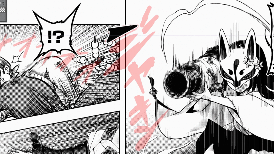
1P 2nd frame. A masked man stole the furoshiki containing dumplings and ran away. The shrine maiden is surprised and surprised.
2P 1st frame "Wait, this dumpling thief!" The shrine maiden was sitting on a cannon with spiritual power. While wearing the fox's mask, the shrine maiden immediately holds the cannon.
2P 2nd frame: While the masked man runs away while eating dumplings, he is surprised by the cannon of the shrine maiden.
2P3rd frame: The shrine maiden's cannon fires.
2P4th frame: A shrine maiden's cannon hits a masked man and causes a big explosion.
Adding onomatopoeia to all movements is not enough space and is only annoying, so the number of onomatopoeia to draw is limited to those that are important for the progress of the story. It is best to decide all the characters and positions to draw at the stage of drafting and plot name (storyboard), but in reality, there are many things to do later.
First of all, from the 1st frame of 1P, I will draw the onomatopoeia "mogumogu" where a shrine maiden girl eats dumplings deliciously.
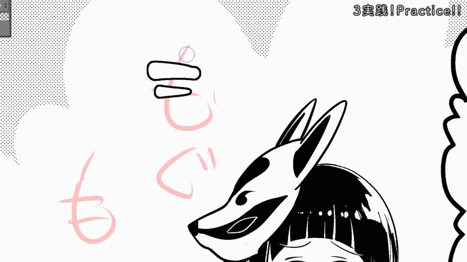
A cute girl is eating a cute dumpling deliciously, so I decided to draw it with cute characters for the purpose of enhancing this cuteness without disturbing it. I tried to eliminate sharp parts as much as possible to create a rounded silhouette.
When you make it thicker or thinner with inflection in one stroke, make it thinner or thicker somewhere else to balance it as a typeface.
Since the mastication sound is constant and there is no change in rhythm or volume, the size and spacing of all letters are the same. Pay close attention to these things, as even the slightest difference will change your impression of the reader. Onomatopoeia is a facial expression of the situation. You need to concentrate as much as you would when drawing a character's facial expression. To save time, the second "Mogu" was copied and pasted from the first one.
By pasting the tone and adding luster, it was made three-dimensionally rounded, but
I felt the uniform edge line was hard, so I added a shadow to another layer to make it look more round. The image below is the completed drawing.
I didn't notice it when I was drawing, but I wondered if it was okay to use the dakuten part of "gu" as a heart design.
Next is the onomatopoeia "Sorori ...", in which a suspicious masked man creeps up.
I wanted to give the reader an eerie impression, so I aimed for a brush-like format.
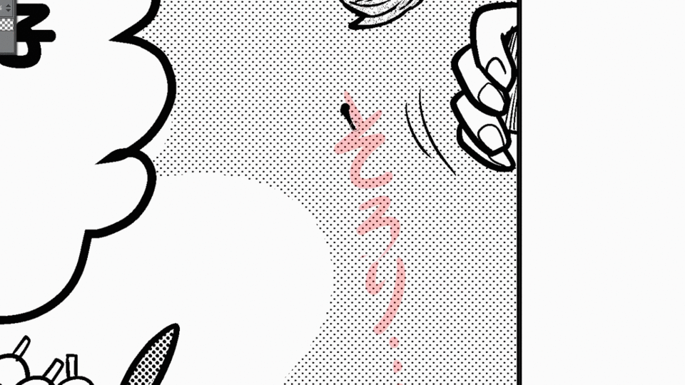
Also, I think it looks like you're partially using an eraser for the vector layer here. This kind of thing cannot be done with vector layers, and it is also the reason why vector layers are jealous of creators.
However, although it is not well known, drawing in a transparent color against a black line in a vector layer has the property of being able to obtain the effect of being erased with an eraser, and this property is used here. .. However, it should be noted that the lines are not actually disappearing. The transparent color vector is just on top of the black vector. This technique is very useful not only for onomatopoeia, but also for drawing people and backgrounds, but be aware that transparent vectors can unknowingly affect you as a bucket or vector intersection. Details will be explained at another time.
The story went awry, but this completes the 1st P1 frame.
Next is the 1P 2nd frame. I took the same care as I said in the first frame and added characters. The most important movement, the masked man, put it in the balloon to make the sound of stealing the furoshiki stand out.

Next, I drew the "dart" of the escape sound of the important masked man as big as possible. At this time, care was taken so that the direction of the sound effect (green) does not intersect with the direction of movement (red) and cancel each other out. Avoid examples like purple, as they go straight to red and cancel out the momentum.

Next is the 2P1, 2 and 3 frames. It became like this.

First, I drew the sound "Jakin" in which the shrine maiden in the first frame holds a cannon. I draw a transparent vector using it like an eraser to carve it out.
The sharpness of the metal is expressed by making it as sharp as possible. I made it feel heavy by being careful not to make it as thin as "Bikutsu" in the 1st P2 frame. In addition, the direction of the movement of the stance and the direction of the frame are aligned with the direction of "Jakin".
The sound of the shrine maiden wearing a mask was omitted because it was not so important and there was no space.
The second frame, "Ooooo," is more of an atmosphere than a wind noise. It is a sound that is often inserted in because it is not powerful unless you draw anything at the time of a pinch. If you have any problems with the battle scene, let's actively rely on "Ooooo!" And "Gooooo!".
At first, the third frame, "Don't", was painted black, but the effect of the firing was hidden and it was a waste, so I drew it so that it could be seen through in tone. I usually draw a "don" with a solid black paint, then remove the border with black on another layer, and then reduce the opacity of the black "don" to make it toned.
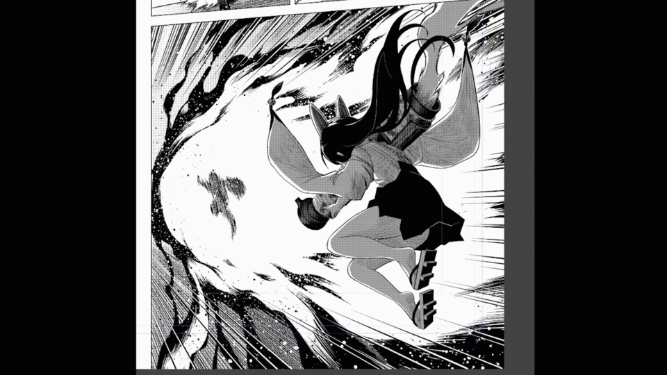
Finally, it is the explosion scene of the showcase. It looks like this.

The amount of information and elements have increased dramatically compared to the previous frames.
Three-dimensional space, the ground, the energy of the blast, the light emitted by the blast, etc. You have to think about putting in powerful characters while not damaging each other's elements,
In fact, the more elements there are, the narrower the best screen configuration will be.
You won't get lost unexpectedly. If you have the experience you have cultivated in the previous frames, you will be able to do it well.
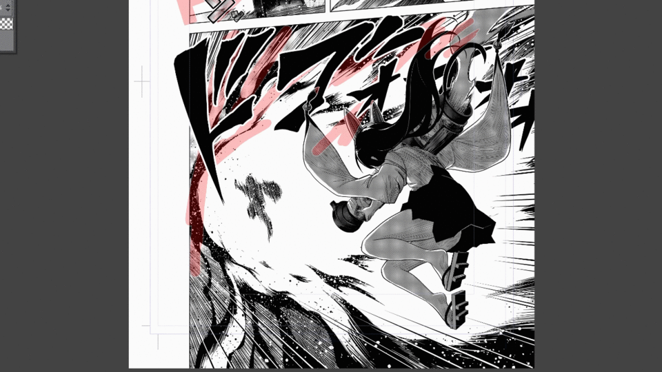
Let's take a look at some of the elements that make up the screen.
The red line is the component of the emission of the explosion and the direction of the blast.
Next, the blue line is a rough guide to the extent of the space itself.
When you put the two elements together, it looks like this.
Let's draw while imagining the spread like this.
The shrine maiden's part is masked so that the shrine maiden will not be hidden by the characters.
If you want to draw characters on the frame but don't want to hide the character, use this method.
Look for the best shape while showing the letters and being careful not to hide the explosion.
Personally, I like "Dogoo!" Than "Dokaan" because it's tighter.
Since the explosion part is inevitably hidden, I gave up crying this time.
The way to draw this character is the same as the previous "Jakin", using a transparent vector like an eraser to carve it out.

Finally, sputter white on the letters to express sparks ...
done! !!
How was this TIPS?
This time I introduced how to draw with a vector layer, but there are some things that I am not good at and inconvenient about vectors. It's a good idea to draw the raster and the vector as you like, taking advantage of their good points.
Also, the sound effects that appeared this time were all general, but I think it is better to add more and more sounds that you have never seen elsewhere or original sound effects.
I feel that the onomatopoeia reflects the author's sensibility, heart, and soul.
While writing a manga, I feel that how the person perceives the sound and emotions itself appears in the onomatopoeia as the individuality of the writer.
Sometimes it starts with an onomatopoeia that makes you want to talk about it, and a little boom is born.
When drawing onomatopoeia, it's best to listen to the things and feelings and pursue the words and shapes that best explain it to your own mind. Even if it's a new onomatopoeia that you've never seen or heard, I think it's good for the reader after all. It is quite pleasant to know the sensibilities of others, which are different from your own. Don't be afraid to try it.
I hope this TIPS will help you observe the world and pursue better onomatopoeia.
I haven't fully explained the function of the vector layer, so I plan to explain it in several parts.
The video below is the entire process of the cartoon sound effects drawn with this TIPS.
This is the whole process of drawing such as the character of the 2nd page and the explosion.
Please refer to it if you like.
thank you!
Users who liked this post


Comment