
Hey!
For this TIPS we will be explain some basic colouring and techniques to give life to your webtoon page and stop it from looking rather "generic". We will be focusing our work so we don't use an increased amount of layers, and make the process simple and clean.
This tutorial will try to give you some guidelines and tips on how to best do that using clip studio paint, i will also be using some advice given on my other TIPS about lineart. All of this is assuming you webtoon page is ready to color, with basic lineart done.
Also, if you prefer, you can watch a video version of this tutorial here:
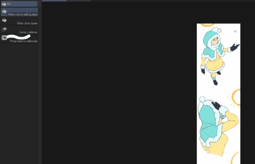
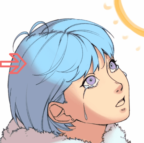
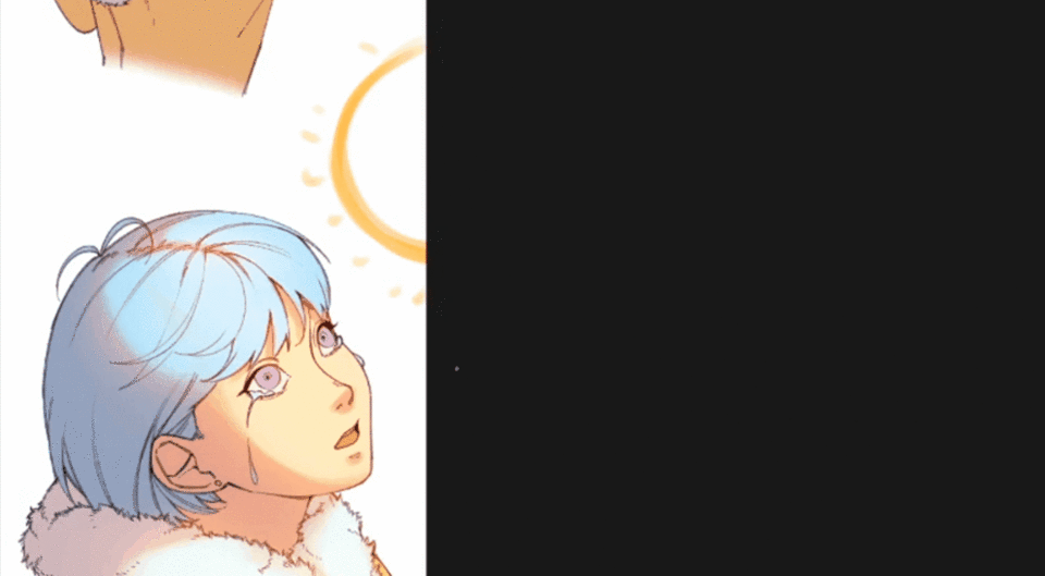
For this example i will be using a webtoon page with 3 "panels" in this simple format:
1. Base Colors
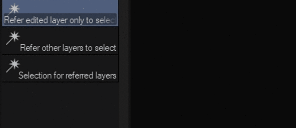
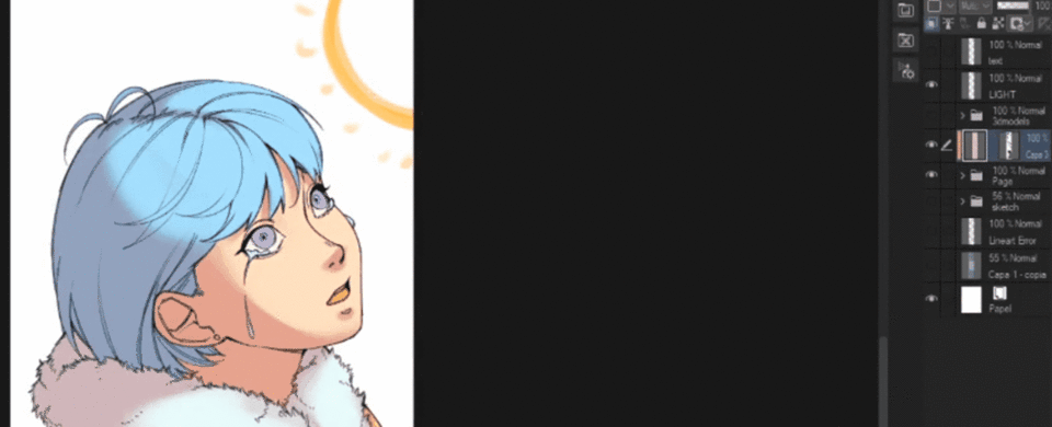
The first thing we want to do is set our Lineart Layer as [Reference Layer], this is so if we want to apply any of the tools given to a different layer, this will recognize your lineart layer as the master layer giving guide to everything else. Next we need to apply our base colors, but considering it could be a tedious task to fill every single part, we are going to use this simple tool that allows us to fill spaces much more quickly:
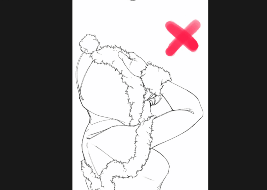
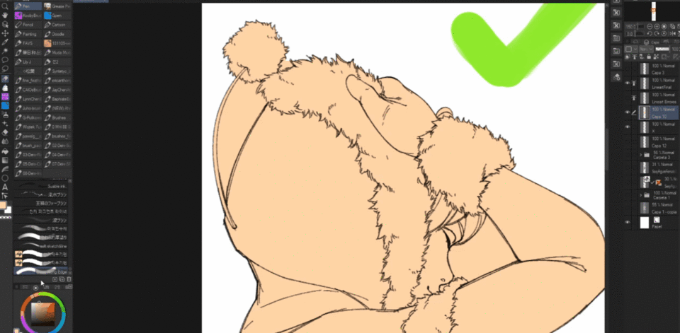
Before using this tool, make sure every single line of your piece is connected or otherwise it will not fill the place you want.
You can use the next tool to remove the filling on different parts:
After doing this, make sure the base layer that we just created has the Lock for Transparent Pixels, this will pretend us from going further or making any errors doing the process outside the area.
Using the auto select tool, we will select each part of our drawing and apply the desired color to each part on separate layers.
Remember to use the tools mentioned before in case you need to add or remove something.
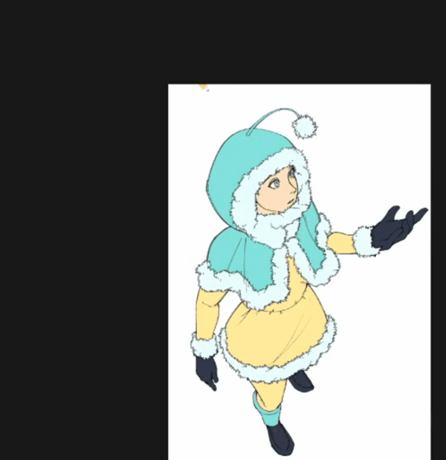
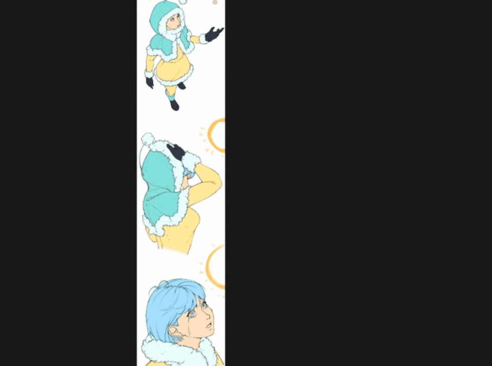
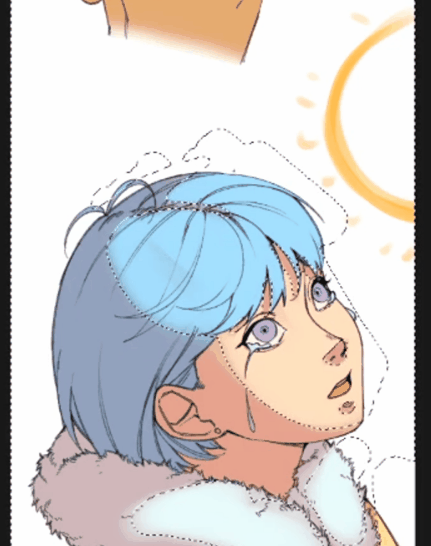
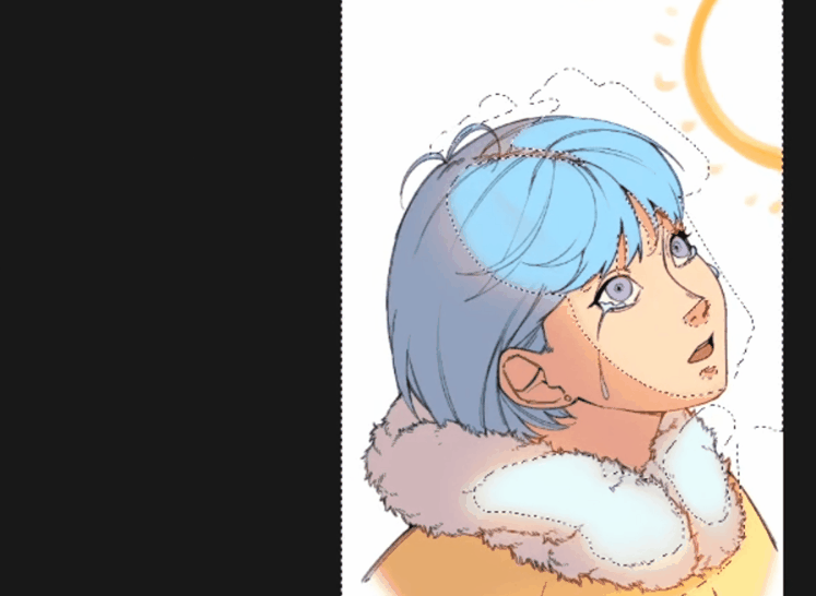
When you are done, it should look like this:
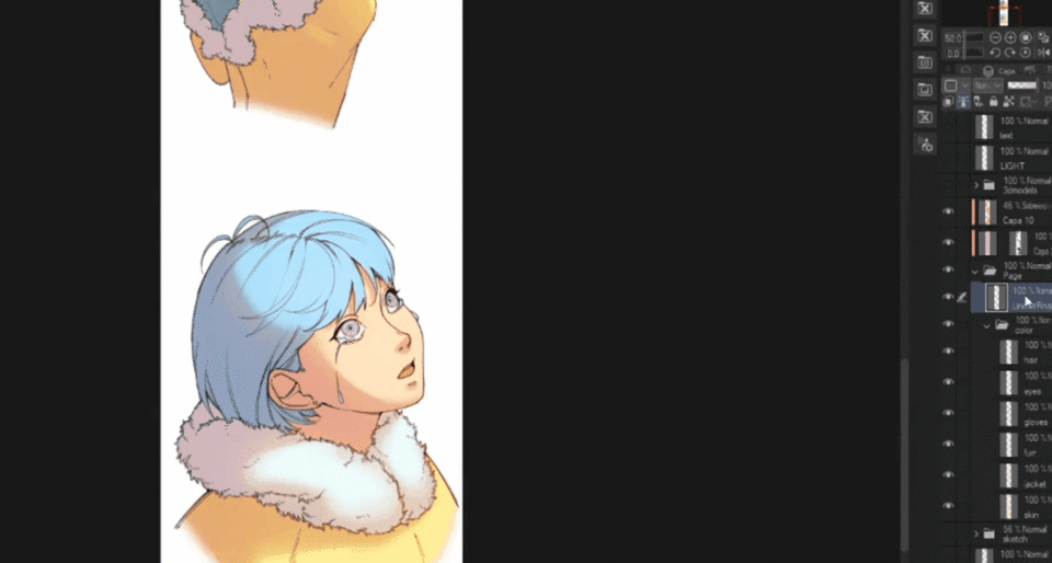
2. Core Shadow
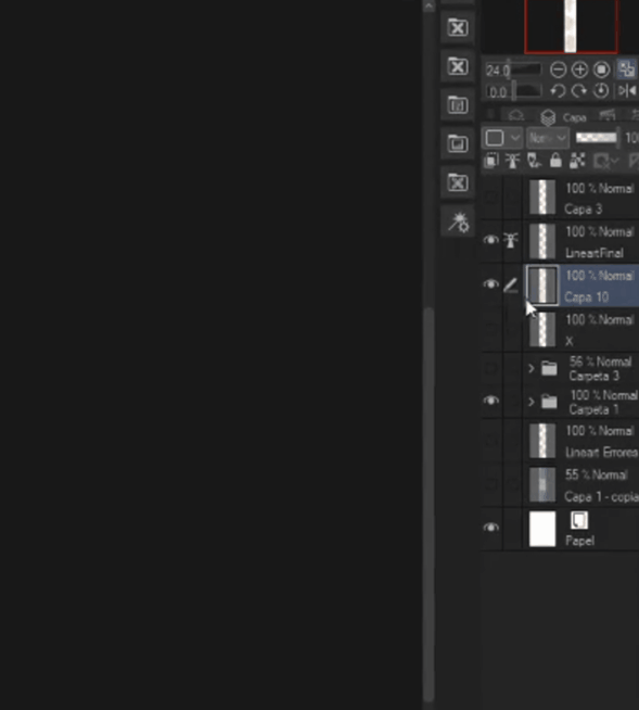
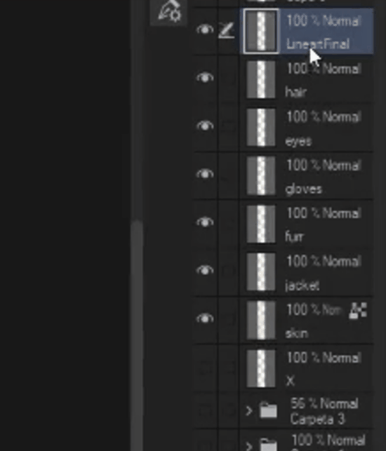
In this next step we will be creating General shadows for our page. To start, we need to group our color layers as well as our lineart layer into a single folder, to do thissimply select the the desired layers, create a folder and drag these files into it. This is my way of doing it (Color layers on one folder with lineart layer on top, and all of this will go into a single folder).
After doing so, we will create a [Multiply] layer on top of it, don't draw anything in it just yet. Set the layer to clipping mask, and then create a [Layer mask] (button on your right bottom corner, next to [Apply mask to layer], this is a function that allows you to mask (hide) an image on a layer. This layer will be helpful from now on, even if you draw with any type of color on this Mask, the color will always be that of the main layer.
This step is faster than selecting each part with the auto select tool, and add color there.
This [Multiply] layer will help us with shadows, and instead of drawing every portion of shadows, we will create some sort of general shadow, just to show where light would hit.
We can also make a guide for our light source by simply drawing on a different layer, this will make things simpler. You can always experiment with different light sources to fit your preferences.
In my case the light source will change on every drawing because the character is walking and rotating.
Now for the important part,
・There are different and easy ways to choose what color to use for your shadows, just NEVER USE BLACK. The easiest way in my case is to simply take an opposite color of your predominant one, in this piece it's Turquoise, so using the color wheel i will pick a color on the opposite direction and pick a variation of Pink but the important part, is to not choose a saturated variation of your color, instead add Grey to your current color, you may ask Why? It's because Gray helps link every color together.
As seen in this image, as soon as we hit the center of it, it's when the colors are more connected and we can make them combine in a more natural way.
And in my opinion, using opposite colors make your piece look less generic and more lively.
Now, to painting the shadows.
We will now be using the Multiply layer mentioned before, we will pick our color of choice and fill the entire canvas with it, don't worry though, since it's a clipping layer the color will only appear on the drawings we made.
I will be using the following brushes for this, they are quite easy to use, since we only need basic shapes the round brush is super helpful, we don't want to waste a lot of time getting everything perfect. The blur brush will work as our smudge tool, and it is perfect for the light source, i'll demonstrate how to use it in a bit.
・Start by clicking the Layer Mask, now everything we paint or erase in here will only appear in here, we can delet the Layer Mask if we want to and the main layer won't be affected, so always make sure that you have the Layer mask selected and not the main layer.
For the shading,
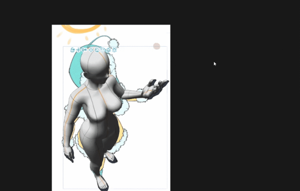
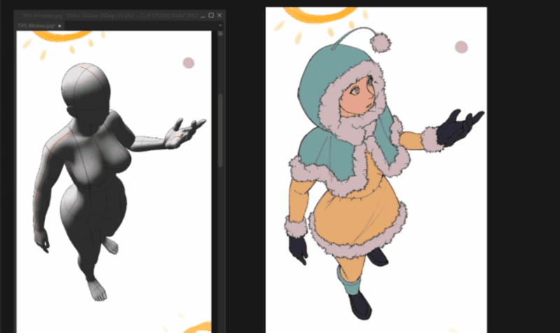
Considering the first image has the sun on top of the character but a bit further back from her face, the shadows will only hit parts of the heads, shoulders, side of her arms and legs. You have tools at your disposal with Clip Studio Paint, and if lightning and shadows are not your thing, using a posed 3d model like in this image to check your values and shadows is a great idea.
Drawing process:
When drawing you can use the blur/smudge tool provided to create the sensation that light is getting further from the surface. Check where your light source is and apply the blur the furthest place the light would hit (It's easier to just check the opposite side of where the light hits)
3. Light In!
We are almost done with our coloring, but we still need to apply one more thing to our layer.
・THE LIGHT
For this special case, [Color Dodge] is always your friend.
You may have noticed that when light hits you, the edges of it have a strong saturated color based on the main light of the shot, this is usually called "Penumbra", as seen in this example:
You may notice that there's a slight red/orange tint on the edges of where the light finishes. You can also notice, that the furthest the object is from the surface it touches, the blurrier the shadow becomes, when the light touches ball, you can notice the tint a lot more and the shadow is sharper than the one hitting the ground. We will use this concept, to add the lights to our characters.
・First of all, we will create a new layer, and again apply it as a clipping mask, and set the layer mode to [Color Dodge]. Next, you need to press Control on your keyboard and click on the Mask of our shadow layer (The one on the right side) and it will select the edges of our shadow.
With it selected, pick a color of your choice depending on the light you are going for, in my case i will go with a simple Orange, and make sure it is saturated.
You can use the tool of your preference, but we will use the basic Air Brush tool that comes with Clip Studio Paint, now you can start painting the edges of the shadows applying the concept of the image above.
After you are done, you can press Control + D to deselect everything. and in the same layer, we will apply small portions of lights with our Air Brush, to imitate the sense that light is hitting the skin.
You can also change the Hue of the colors to match your preference by pressing Control + U
Testing different density options can also help,
With that our coloring is done, but we can still make finishing touches to make the image look even better!
3. Finishing Touches
・Matching Lineart
We can use the next auto action to help us make our lineart match our colors.
The auto action includes 2 actions [線幅太め, Thick line width] and [線幅細め, Narrow line width], you may try each one, but in my case i will use [線幅太め, Thick line width] and lower the opacity of the result layer to 28 (From the 57 by default). I will also combine both the lineart layer and the recently created color lines.
With a single lineart layer with colors, i will duplicate it and apply a good amount of gaussian blur to it, and lower the opacity to about 50. it will give it a "glow" look.
With this our painting process is done!
You can really apply this process to anything, not exclusively Webtoon, but this is a quick way of painting a page for those that don't want to spend too much time when they are busy with the story.
I'm not a professional in any way, i'm just sharing some tricks that i have learnt during a few years of practice. I hope it is helpful for some of you.
You can find me in these social media links:
Users who liked this post


Comment