Creating Cyberpunk Characters
INTRODUCTION
Cyberpunk is a sci-fi genre usually set in an urban dystopian setting, that features a world with incredible technological and scientific feats in society, that juxtaposes with a usually corrupt social order. It often makes a commentary on current society, and has a lot of dark undertones that contrast with neon and colorful aesthetics.
Some examples of media that feature this genre that come to mind are: Akira, Blade Runner, and the recently released Cyberpunk 2077.
In this tutorial, I hope to show you my process to making 𝘁𝘄𝗼 cyberpunk themed characters, and some tips on how you can make your own cyberpunk characters too!
CYBERPUNK AESTHETICS
The cyberpunk aesthetic mostly borrows from sci-fi genres, with a mix of technologically advanced yet grungy and dark aesthetics. To simply describe, I’ll list a few common cyberpunk aesthetic tropes that I’ve noticed!
Urban/City Settings
Neon lights
Vaporwave
Sci-fi (Robots, Artificial Intelligence, Weapons)
Punk
Military
STORY
Creating a story for your character can give them meaning and possibly inspire certain design choices you might make for them later in the drawing process. Your story can be a simple, or deep - the choice is yours.
I find that concepts can be easily made by breaking down meanings or making associations!
Let’s take the word “CYBERPUNK” for example.
“Cyber” refers to the scientific, technological, digital side of things. I'll split these concepts into 3 immediate word associations, pick one word, and further break down other associations I get.
Let’s use the same process with the word “PUNK”!
“Punk” refers to anarchy, non-conformity, and anti-corporation. Break them down!
Making associations with words can help us develop a story for a character. A word you think of might inspire your design choices!
Not everyone is a "main character" trope.
What I mean is that you shouldn't worry about your character being revolutionary or a radical, but like in real life, you can find very interesting people within the everyday. Considering the background and motivations of a character can give them more meaning, and make them special.
I personally didn't have a grand concept in mind, just that I wanted to make two best friend characters that had opposing social classes.
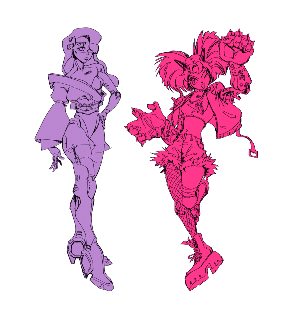
𝗖𝗵𝗮𝗿𝗮𝗰𝘁𝗲𝗿 𝗔 is an heiress to a mega-corporation, loves fashion, is loving to her best friend but otherwise has had a cold and serious upbringing.
𝗖𝗵𝗮𝗿𝗮𝗰𝘁𝗲𝗿 𝗕 is a street kid that loves to brawl and fight, is passionate and lively despite having to be forcibly independent from a young age.
CHARACTER POSES
Poses can be used to help portray the story or mood of a character. I imagine Character A to be a sleek, fashionista who’s sort of snooty, whereas Character B is a street kid that is tough but cheerful.
How can you make your poses reflect your character?
Let’s take a look: Character A is someone refined and elegant. Action lines can help us visualize this. Elegant poses often are tall and straight.
Even though she’s supposed to appear tall and stand straight, it doesn’t mean her pose needs to lack dynamism. I have 5 poses above, and on the right side I added a red line of action, and other curves to show the flow of the body. Subtle, flowing curves convey 𝗺𝗼𝘁𝗶𝗼𝗻!
In comparison, Character B is cheerful and rowdy, so the pose needs to be energetic. Continuous curves help contribute to a pose with good flow!
Drawing some gestures gives you some options, and lets you know what pose might feel better, or fits a character more than others. I’ll pick the two below, and sort of refine the poses a little! (Things are still in the sketch/brainstorming stage, keep an open mind to change~)
CYBERNETIC ENHANCEMENTS
Cybernetic enhancements might be the biggest indication of a cyberpunk world, mostly as it portrays huge leaps in advancement of technology and science. There can be really creative ideas for bodily enhancements, as they are meant to “improve” original bodily functions!
Let’s take the arm as an example. If you lost an arm in a cyberpunk universe, it’s probably easily replaceable! What would be its function? Would it be purely aesthetic, or would it have some practical use? Does it look expensive or cheaply put together? The design can tell a lot about the character!
We can use the arm’s existing anatomy to inform how we might design a cybernetic arm. Below I’ve drawn some basic shapes that represent the arm’s skeletal structure, as well as muscle structure.
Essentially, we should think of each muscle and bone shape as a part of a cybernetic part!
You can end up exaggerating some aspects of the cybernetic arm, like size, or you can even reference other kinds of machinery to add other kinds of functions. I had a lot of fun making these designs hehe~
The arms I drew above are merely an example. You could even consider enhancements not limited to the human form! I'll give some examples in these sketches below:
I'll just roughly draw some cybernetic enhancements over my characters. Referencing various machinery and anatomy together will help you a lot!
For Character A, I'm thinking of these keywords: 𝗦𝗟𝗘𝗘𝗞 // 𝗦𝗧𝗥𝗘𝗔𝗠𝗟𝗜𝗡𝗘𝗗 // 𝗦𝗘𝗫𝗬.
For Character B, I'm thinking of these keywords: 𝗕𝗥𝗔𝗪𝗟𝗘𝗥 // 𝗕𝗘𝗦𝗘𝗥𝗞 // 𝗕𝗢𝗟𝗗.
Remember to think back to the STORY of your character. What activities do they do? What kind of person are they? How might their cybernetic enhancements fit with their personality?
You could even consider someone who is devoutly against “enhancing” their body, and make them work in a cyberpunk society. Your enhancements don't even have to reference human anatomy, they could be animalistic or weapon-like in nature too.
FASHION
In more ways, fashion is a step up from cybernetic design. Fashion can portray a character's culture, societal class, and personality. It can be a loaded part of character design!
The cyberpunk genre is based in an urban setting, so a lot of the fashion that comes from it will lean towards more modern styles. I recommend looking up street fashion for inspiration. I'll list some styles and accessories I can think of that fit into the cyberpunk genre!
- Street Styles
- Gothic (Leather, all-black, chokers, fishnet tights, platform boots)
- Punk (Chains, spikes, ripped clothing, faux fur, plaid)
- Tech-wear (Anorak jackets, work boots, gray or black, layered)
- Luxury (Logos, blazers, formal, tailored, patterned, jewelry)
Military utility (belts, bags, harnesses)
Graphic elements (Tattoos, typography, decorated/illustrated clothing)
Fashion Sneakers (Large and chunky, brightly decorated, strange shapes)
Neon and glowing lights
So how do clothes reflect a character?
For Character A, she's an heiress, which means that her family has a long line of ancestry and tradition. She merges traditional fashion with more modern elements, and all of her clothes are rounded and rather straight, giving her an overall clean look.
Character B is more rowdy and she often fights, so her fashion is easy to move and run around in. Big fists and big boots create a contrast to her smaller body, and with the added spikes she looks more deadly than she lets on!
FINALIZING CHARACTERS
Now that we have all the elements of our characters, It's time to finalize and finish everything up! I'll go through my steps:
𝗟𝗜𝗡𝗘𝗔𝗥𝗧
Here is where all I do my design refining! A lot of details are more fleshed out from the sketches. Make sure to keep your lines loose and free!
I usually block in the character silhouette so it's easy to color in with clipping masks on CSP. You can see how different the silhouettes look - one is more rounded and streamlined whereas the other is spiky and wild!
𝗖𝗢𝗟𝗢𝗥𝗜𝗡𝗚
Though the cyberpunk aesthetic is rooted in more gothic and dark color schemes, more modern media have popularized the use of more vibrant colors which I personally enjoy using!
Picking color schemes is hard too. I didn't quite have a vision of colors from the start, but keeping certain shapes on separate layers can help you decide colors by changing the hue.

𝗚𝗟𝗢𝗪
As a finishing touch, I added another layer and set it to [ADD], and airbrushed in some areas for glow effects!
PRESENTATION
Presentation is often overlooked to show off your final character designs. You can use a few simple techniques beyond a white background to create a more interesting presentation of your characters.
#𝟭 𝗕𝗔𝗖𝗞𝗚𝗥𝗢𝗨𝗡𝗗
Here I chose a yellow background color, which is taken from Character B's clothing colors, whereas the light floral motif is taken from Character A's clothing pattern! At this stage, I also added a shadow block beneath both characters.
Try to keep the backgrounds simple so they don't distract from the main characters!
#𝟮 𝗚𝗥𝗔𝗣𝗛𝗜𝗖 𝗘𝗟𝗘𝗠𝗘𝗡𝗧𝗦
Graphics and text are a great decorative element, and they often speak to more modern aesthetics. Here I decided on some names for my characters: Hanako (A), and Oniko (B). Chinese characters/Kanji always looks so good in design because of their pictorial quality!
I drew out their names with the pen tool in a blocky and graphic fashion.
#𝟯 𝗘𝗫𝗧𝗥𝗔 𝗘𝗙𝗙𝗘𝗖𝗧𝗦
Though you could technically stop at that last stage, just as a fun extra I added a bit of chromatic aberration to the characters for texture and that added cyberpunk flair, and some crosshairs for visual interest.
Here they are below in their final glory!
FINAL WORDS
Thanks for looking at this tutorial!
I hope that my process helps you be more thoughtful about your character design process, and that you'll make some cool characters!
- Luckyqilin


Comment