
What if, you wake up in the morning, went to your computer to finish your final page for your comics so that you can send it to your client before the deadline. And then you realized, the files has been corrupted and you only save jpegs of your comics without any colors, and the worst thing is... The deadline will be tomorrow! And those jpegs aren't even full black and white because line art has colors and background is not white. What will you do now?
Well, I am here to the rescue! to help you guys to be able to color your comics efficiently, and finish them before the deadline!
So let's begin right away!
1st step: Correct the Page Color to 100% Black and white
--------------------------------------------------------------------------------Turn everything into grayscale
Go to Edit > Tonal Correction > Select the Hue/Saturation/Luminosity
and make the saturation go to -100
It should turnout like this.
--------------------------------------------------------------------------------
You have to zoom in first to check the line quality while adjusting the contrast.
and then go back to Edit > Tonal Correction and by this time, select the Level Correction.
Slide the right indicator from right to left and slide the middle one closer to it.
It should turn out like this.
Now you have your page black and white! And you can work easily from here.
2nd Step: Know your colors
You can skip this if you're literally chasing some deadlines.
Otherwise, please listen to this little and quick knowledge about Color Theory.
--------------------------------------------------------------------------------To have a good looking color, you need to have a proper knowledge of it.
Thinking of what color you should use next could suffer more of your time, so here i am now, telling you that you could speed up your decision in colors with the use of color harmony! or color theory or whatever you call it.
This will help you to think of colors right away that compliments each other.
Colors can affect the entire art, so if you choose color randomly, it messes up everything and subconsciously confuses the person where to look because colors can be use as part of a composition too.
That is why, for some reason, you don't wanna use too much saturated colors to the background because human brain easily attract to saturated colors, or sometimes, it's distracting.
--------------------------------------------------------------------------------Hue is basically all the colors of the color wheel
--------------------------------------------------------------------------------Saturation will adjust the intensity of the colors
--------------------------------------------------------------------------------Value is adjusting the tones from dark to light like a pastel color.
--------------------------------------------------------------------------------Use saturation to help your audience to get its attention to the subject.
--------------------------------------------------------------------------------Use Value if you want a good separation of the foreground and background.
--------------------------------------------------------------------------------There's also a color combination.
from the name "harmony". We use the colors like it matches each other.
There Are 6 of it.
1. Monochromatic
2. Complimentary
3. Tetratic
4. Analogous
5. Triadic
6. Split complimentary
--------------------------------------------------------------------------------1. Monochromatic
1 color but in different values. Good use on post apocalyptic look
--------------------------------------------------------------------------------2. Complimentary
The most popular use of 2 colors of warm and cool, opposite to each other, red and green, purple and yellow, but doesn't necessarily to be perfectly opposite, you can use blue, one of the cool colors, and red for the warm colors.
--------------------------------------------------------------------------------3. Tetradic
Use of 4 colors, Imagine the complimentary but in pair. Doesn't need to be equal amount of use.
Let's say, make the subject red and orange and the background is dominant to entire canvas of blue and green. Of course you can use different color combinations other than the color i am using right now.
--------------------------------------------------------------------------------4. Analogous
Use of 3 colors that are very close to each other like Green, blue-green and blue
Like the sea and the sky.
--------------------------------------------------------------------------------5. Triadic
Uses 3 colors that are evenly spaced around the color wheel. Doesn't need to be equal in use like 2 colors dominates and 1 is just the subject.
--------------------------------------------------------------------------------6. Split complimentary
1 color is opposing 2 colors on the color wheel.
Sunset would be the perfect example for this
--------------------------------------------------------------------------------
So that my friend is the Color Theory.
No shame if you needed a guide, coz i do too.
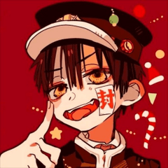
You can quickly think of a color you gonna use because of this like my thumbnail of this tutorial.
So now let's proceed to the coloring efficiency.
3rd Step: Background
Add new layer and name it to "background"
put it in a folder
change the blending mode of the folder to multiply
color the entire background into flat colors, no shade, no shadow, just midtones in -one layer, don't mind about the panels for now
4th Step: Color the main subjects
Add new layer on top of the background
rename it into Subject, or characters
color those characters into dark gray so that it will be easier for us to see it
I recommend to use lasso tool for this one but if you're not comfortable using the tool, you are free to use the Mapping Pen.
--------------------------------------------------------------------------------But whenever you are using the Mapping tool, try this method
Make sure to close all the gap on the sides
Magic Wand the Center but make sure you've selected the "Refer to editing layer only" option
Then "Expand the selected area" by 1
Then click the "Fill" tool on the top to fill in the gray
and now you have the sillhouette
Repeat the process to all of the characters or subject in one layer.
--------------------------------------------------------------------------------Add flat colors to the subjects
But to make things easier, apply transparent lock to the Layer so that whenever you color it, colors won't get through to the edges of the sillhouette.
Remember the "Color Harmony"
You can open a color wheel reference for it
5th Step: Polish your background
Before we proceed to shadow, we have to finish the background first so that it can balance the character's color value
This is a freestyle, you can finish it whatever you want but here's some little tip, use magic wand to select those flat colors. In that way, it will be easier and less worries on overlapping colors.
--------------------------------------------------------------------------------On selecting shadows, don't just go straight ahead to dark area of the color palette. Make sure to tweak the hue towards the area where the color of the shadow should be.
Color pick the area where you want to add the shadow
The shadow should be a little blue so the hue is sliding towards the blue but not completly going 90 degrees rotation. Just slide it a little to get a little darker brown of the color.
--------------------------------------------------------------------------------
Do the same on the highlights as well. eye drop the original flat color
Then slide the value towards the white
and slide the hue towards the light color, in my case, it will be yellow.
Basically, this is just the same as the shadow.
--------------------------------------------------------------------------------Now we can see the before and after
6th Step: Adding the shadows of the Character Subjects
Add another layer on top of the characters
Rename it into "shadow" and change the blending mode of this layer into "Multiply"
pick any shadow color your wish to have. In my case, I'll gonna pick Purple
I am still using "Lasso" since it's always faster to use this tool
--------------------------------------------------------------------------------If you don't like the shadow color, you can always repaint the area and choose a different color to it.
--------------------------------------------------------------------------------Whenever you lose the shadow color you chose, just use the eyedropper tool and select the area where you've applied the shadows.
But make sure that you've selected the "Pick up color from layer" so that it will color pick the correct color.
Now we can clearly see the before and after progress
big changes in just 3 additional layers.
7th Step: Those Highlights
Add another layer on top of the shadow
Do the same thing we did to the background highlights but a little different with the use of airbursh and Lasso
Select the area where you want to add the highlights, then use the airbrush softly to the edges
--------------------------------------------------------------------------------Some helpful tips to use the Lasso Tool quicker.
To add or extend more selection, Hold "shift" on your keyboard and select the area you wanted to add to your selection (You must see the "+" sign on the cursor when doing this)
To deselect some areas, you hold the "alt" on your keyboard and select the unwanted area.
(You must see the "-" sign on the cursor when doing this)
--------------------------------------------------------------------------------Now seeing the before and after the highlights
8th: Cleaning up the Panels
Make sure you've selected the drawing layer (JPEG)
Make sure to close all the gaps of the line
There should be no gaps between lines
Then select outside the borders using the Wand Tool
You can also select inside the Text bubble, and if ever there are text inside, just add selection manual by using the Lasso
and expand the selected area by 1
--------------------------------------------------------------------------------Then select the Folder Layer
and click the "Create Layer Mask"
It should add a Masking Layer on the folder
--------------------------------------------------------------------------------Then press "Ctrl + I" on the keyboard to invert the black and white of the Mask
--------------------------------------------------------------------------------
with the use of additional 4 layers within a folder, with some basic features of the application, things can be done so quickly, possibly within an hour.
The Color Harmony is very important. Even you choose one random color and pair it with other colors that fell within the 6 combination, it has a greater chance to end up a best result of your colors.
Users who liked this post


Comment