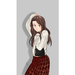
¡ÁNIMO PAPÁ! (Critique: KADOKAWA)

-
 MVP ◆This user has contributed greatly to the management of the community, by posting many great responses to the questions asked. Once every three months, MVPs are determined based on the points earned during that period and will be recognized accordingly.
 -
 New Valuable Player (NVP) ◆These are the next-best contributors to the community after MVPs. This is awarded to users who have not yet won an MVP award, based on the number of points they have earned.
 -
 Official Expert ◆Chosen out of all MVP awardees, who are already proof of excellence, this is a testimony of outstanding correspondence in the community. After careful screening, they are appointed by CELSYS and assume their position.Note: Formally called “Evangelists”
 -
 CELSYS official moderators ◆Moderators are official CELSYS staff members who are fluent in Japanese as well as various other languages. As moderators are not experts on software or creative work, they will not be able to directly answer your questions. However, moderators will provide communication and language support to ensure that everyone can smoothly communicate with each other.
 -
 CELSYS officialThis is the official administrator account.
KADOKAWA provided its detailled critique on "¡ÁNIMO PAPÁ!", one of the entries to the International Comic/Manga School Contest 2021.
View entry
¡ÁNIMO PAPÁ!
Pen name: Konata
School: Escola Joso
Country/Region: Spain
Language: Spanish
View Critiques
Pages 2-3
1. A good facial expression to start the story. If we had to nitpick, we would have preferred the ears to be drawn in more detail.
2. Following the character through their morning routine is a good way to convey emotions, but we think it would have been better if there had been one shot of the father's face switching to something else before talking to his daughter in the last panel.
Pages 4-5
3. We liked that the absence of dialogue shows the daily routine and the feelings that this hardworking father has to go through every day. Having only visuals makes it for a very relatable scene.
4. This is an easy way to understand the passage of time, but the clocks are a bit clunky compared to the rest of the backgrounds.
5. Implementing these little stories, like having your umbrella ruined, are a great way to show how life is not always easy for the dad.
6. The father's expression could have been a little more affectionate here. As parents ourselves, we understand that raising a child often doesn't go the way you want it to, but a child's smile is the best reward of all. That's why we think it's important to emphasize the father's gaze of love and affection towards his daughter in this panel.
Pages 8-9
7. Maybe it's because of the page limit, but it would have been more effective if there had been more panels to show how deeply the father is moved after hearing his daughter's words. For instance, add a panel that follows the change in his expressions, such as his mouth or the way he brings his hand to his chest.
8. Again, if there had been no page limit, it would have been great if the story was a bit longer. The story could have ended on a higher note if the composition was the daughter's speech clearly illustrated and the entire last page of the father and the daughter embracing.
9. This might be superficial, but considering how the father's hair was drawn at the beginning of the story, we thought it would make the story more realistic if the daughter's hair matched his to some extent. It was clever to show that her hair resembles her mom's in the picture (although her hair could be a bit more frizzy, too), but we thought the daughter's appearance was a bit cartoonish compared to the father's character. You should unify those details so that the reader can focus on the story without being distracted.
10. Overall, a well-crafted story with great direction and detailed visuals. It had the potential to be an even more moving story, had it had more pages.
KADOKAWA
International Comic/Manga School Contest 2021 Winners
Users who liked this post


Comment