選擇 (Critique: KADOKAWA)
KADOKAWA provided its detailled critique on "選擇", one of the entries to the International Comic/Manga School Contest 2021.
View entry
選擇
Pen name: 詠無湮
School: The Affiliated Senior High School of National Taiwan Normal University
Country/Region: Taiwan
Language: Chinese
View Critiques
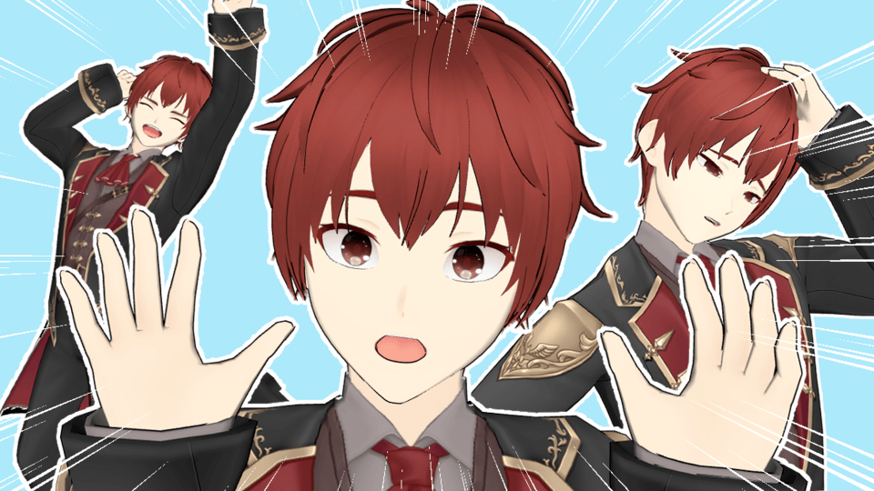
1. While simple, this image is a great way to express Hu Ye's strength as a god.
2. We wondered if these were the right pictures to begin the story with? It would have been more exciting if you had used your characters in a more powerful setting to draw the reader in, such as a temple or a cute little tiger sitting under a table.
3. Drawing a chibi character at the beginning is cute, but we think it would have been less confusing if the page had started with a similar art style to the first picture since we were already captivated by it.
4. To connect this page with the incense drawing on the next one, it would have been better if there had been some faint incense smoke drifting over the jar in the middle.
5. The smoke, representing a stick of incense is a good idea. It fits well into the story and uses the vertical format well, too. The flow of the smoke going to the right and the left is too pronounced. You should have made it more vertical to better direct the eye of the reader.
6. It was a clever idea to draw a connection with the ground and the passers-by in the background as one big perspective. However, if you want to show a contrast between them, show the characters with a pronounced gradient or insert patterns (such as smoke from the incense sticks) for a more complete picture
7. Is the lack of incense burning a symbol that the protagonist, now a young man, cannot see Hu Ye as a god anymore? It was a little difficult to understand, and we felt it was too ambiguous and left everything up to the reader's interpretation. If the incense is burned, but the protagonist has forgotten about him and is just passing by, it might be better to have a silhouette of Hu Ye looking at the protagonist.
8. As for the layout, it would have been best to place the drawings a bit on the lower side for a better balance between the panels. By doing this, it will connect with the scene where the protagonist starts talking about his dream.
9. If the main character's joys and dreams are the keys here, the colors should have been brighter and fancier. Introducing more colorful pages in your work will illustrate the contrast between the pages that are full of dark colors, such as the feelings of worries and depression in the second half in this case, and deliver a more powerful impact on the reader.
10. This bit that connects the previous page to the rest of the story uses the vertical format to perfection. However, it would have better to make more connections between them and lengthen the text vertically.
11. Is this scene a continuation of the right page? Or does it show the character waking up from a dream?
12. From here on out, the format is not vertical anymore but rather a series of singular panels that cut to different shots to express loneliness and distress. It's effective to a certain extent, but there's not enough rhythm in the flow of the composition.
13. It would have been better to continue the direction with a series of independent panels, make the scene where the picture is interrupted larger, and then emphasize the loneliness of the amulet in a single panel.
14. And then the frame of the amulet gets smaller and smaller and is wrapped by the smoke of the incense on the next page to transition to the next scene.
15. We didn't understand why the main character was now facing Hu Ye when the next scene follows up with the grandmother's death. We wondered what the connection was. If we had to guess why, we'd say it's because he was walking in front of the temple's gate at the beginning of the story, his thoughts got mixed up, and he met Hu Ye once more.
Whether the format is horizontal or vertical, the difference between the flashbacks and the present can be hard to translate without some kind of direction (such as changing the lines of the panels), so be careful. However, it doesn't mean that the thoughts and story of this work are incomprehensible as we can fully understand it. That's why we think it would have been excellent if it were better organized.
16. The depiction of the background does a good job at expressing the protagonist's anxiety, but you could have created a more powerful panel if the colors faded to darker ones or if you illustrated more of the protagonist's worries through colors and drawings.
17. Since the story is illustrated in a vertical format, the visuals would have been improved if the smoke from the incense sticks drifted down to the bottom of the screen in a thin line.
KADOKAWA
International Comic/Manga School Contest 2021 Winners


Comment