
INTRODUCTION
(5 -10MIN READ)
Hellow welcome to my first ever tutorial! For this guide, ill show you how you can draw eye designs that looks pretty and believable (also made you say pretty unbelievable).
A QUICK DISCLAIMER BEFORE ANYTHING ELSE: This is not completely a step by step tutorial on how to draw pretty eyes. This is more of a guide handbook to sharpen you design sense when creating sets of eyes. I want to make this guide short and straight-forward as possible for beginner and intermediate artists.
THEORY AND LIMITATIONS
‣Structure
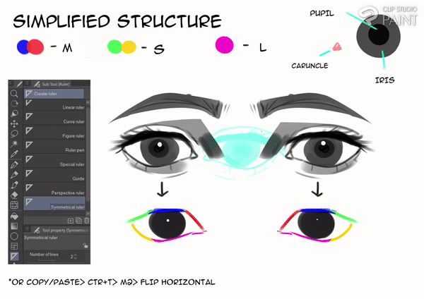
I think that if you understand the structure of the eye, you can easily spot your errors. Regardless of the style, you should try to keep in mind the ratios of the outlines; what portion should you bend, what should you straighten, or what should you remove. Learning this won't take an hour, I just wanted to say that if you feel like your design is wonky or looks weird, even with the eyes looking sparkly and colorful. You should try taking a step back and learn a bit of the simplest structure. Lucky for you! This guide does not require you to learn all the parts of the eye, just really the basic ratios that we will use for the guide.
CSP TIP: Use the symmetrical ruler located on the side bars of the "ruler(U)" tool.
‣Choosing a style
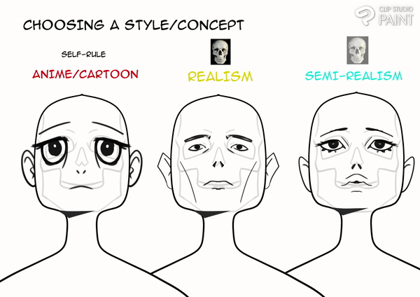
Before we start any modifications, this is a quick introduction to the general idea of limitations through the use of choosing specific styles.
◦ If your style leans towards more of an anime or cartoony style, you can honestly go crazy about the sizes (ALSO KEEP IN MIND ABOUT THE SPACING IN BETWEEN: IMAGINE ANOTHER EYE INBETWEEN).
◦ For realism, respect the landmarks of the eye sockets in the skull. (You should probably learn about skull landmarks if you're into realism)
◦ For semi realism, you can go about making the eye twice as big, but not too crazy that when rendered out it would look out of place.
If you already have a current art style that you're happy with, that's honestly great, but i highly suggest trying out other styles; its good to put yourself outside your comfort zone for you to adapt specific tasks.
THE KEY IS SIZE MANAGEMENT.
ANGLES
‣Upper Angle
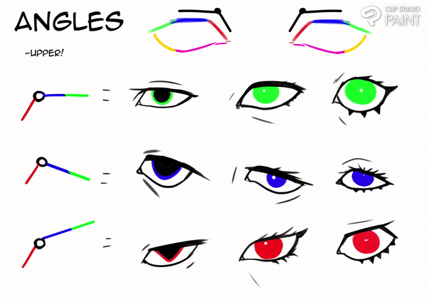
This is the foundation of the guide. I strongly believe that angles play an important role in portraying a character's personality. The way I think angles work is because it create dynamic shapes that can be easily made without drafting sets of shapes. I mostly only focus on modifying the upper portion of the eyes because I think they are responsible for the dynamic impression they give the eye. The illustrations above speak for itself:
row#1 shows a neutral, calm, and collected look.
row#2: shy, cold, and disinterested.
row#3 expresses a deacon of energy, anger, or even a villanious look.
Regardless of me describing each of their personalities, I believe that even beginner artists could easily sense what personality their characters have even if they cant describe them with words. So if you want to make anything specific, make sure you get the sense of the personality first glance.
‣Lower Angle
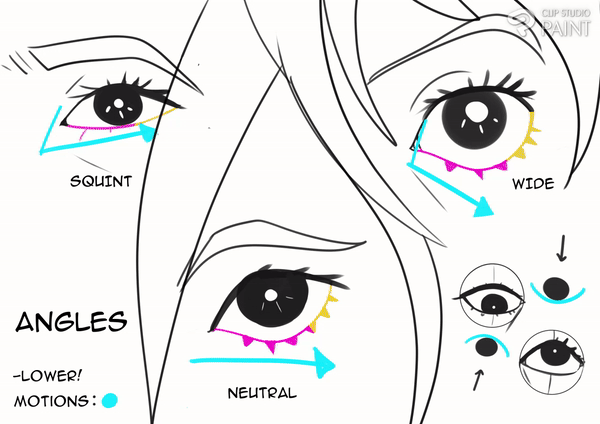
For the lower portion, this is where you can play with how strong the emotion is through playing with how wide or squeezed it looks. Also keep in mind the motion of the eyeball, it creates a pushed curve to the eyelids within the chosen direction (e.g. lower right of illustration). I believe this part is the area of rest; it carries the rounded form of the eyeball and adds a variety of contrast against the upper portion.
EYELASHES AND FOCAL POINTS
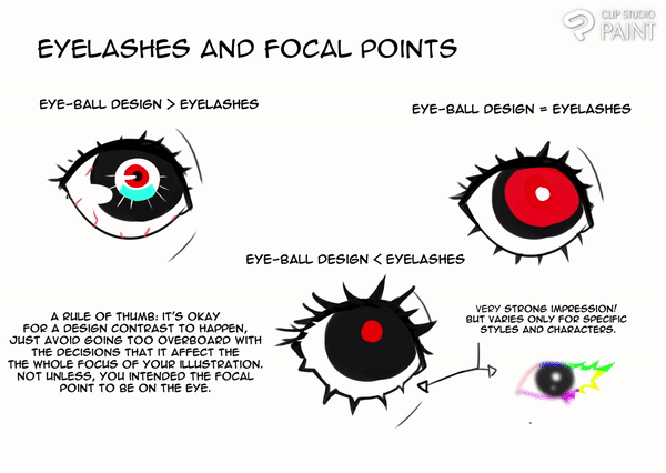
I strongly suggest learning how to vary eyelashes from person to person, this is one of the most attractive part of the drawing besides the eyeball render. It can differentiate a gender of a character, and most importantly; balance certain types of contrast happening in the eye.
Here are some examples of how to vary them by thinking of the focal points:
A RULE OF THUMB: it's okay for a design contrast to happen, just avoid going too overboard with the decisions that it affect the whole focus of your illustration. Not unless, you intended the focal point to be on the eye.
HIGHLIGHTS
THE CHERRY ON TOP. This is the most exciting part of every eye drawing! You can create strong personalities even with the average eye angle, so learn how to use these and you'll make your characters breathe into life! To further explain, I'll example you a kid in different highlight designs; showing how even with a poker face, you can still alter the overall mood of the illustration by using the correct highlights.
COMMON DESIGN EXAMPLES:
◦ QUICK LIFE- An easy way to add life to your character with basic shapes to show the bare minimum of reflection to the eye.
◦ ENVIRONMENT- Imitates the lighting towards the eye is facing. (e.g. a bright window with strong lighting)
◦ MOTION AND ENERGY- Objectively a lighting, mostly the lightest saturated colors that represents the current energy of the character. I Just wanted to show an example for animation. (also applicable for concept art)
◦ EMOTION- A fairly common technique for cartoons/animes to heavily express emotions. (e.g. a fire shape expressing motivation or anger)
CSP TIP- Use a "Hard Light" Layer for the highlights.
Notice how without highlights, you can make your characters scary and chilling; now that's pretty cool if that's what you intended to do. Whereas with the highlights, it's the total opposite. Even an innocent looking kid can look like he's about to go bad with the right design choices.
Keep in mind that you can go extreme with these kind of stuff, it could unknowingly mess up the focus of your figure if you made them too detailed. Try to zoom out every once in a while to check your focal points.
PERSPECTIVE
Perspective! Don't worry, this is not as intimidating as you think it is. I feel the need to include this segment just to make sure our eye designs can be placed in cool poses and dramatic positions. It's very important that we are aware of the previous information that we learned and apply them in even the simplest form of perspective.
‣Front to Side View
Like the upper ratios of the eye, we simplified the eye through grouping them in 3 groups.
In this way; our thought process can already tell which plane should be getting the most exposure to the camera and what should be away. As you can see, the planes are constantly changing sizes for every turn. This technique is very easy and should help you with placing your thoughts into perspective.
‣Up and Below
This is also very simple, if the closest down or upper plane is to the camera; it loses its curve while the the farther plane gains a rounder form. On top of that, the eyebrow placement could get either far or closer to the eye depending on the perspective of the character (e.g. lower left of illustration). Also keep in mind that the eyelashes that are farther from the camera will have more exposure over the opposite.
EXAMPLE OF BOTH:
As you can see the simplifications works together evenly.
That's pretty much it for the perspective, I hope you think of this simplifications when putting your eyes to some awesome portrait poses.
FOCAL POINTS (ADDITIONAL)
NOTE: This is a tip for character design (and could be in any form of design in general). Once you already learned how to draw them on your own, it's time to learn how to maximize our knowledge and divide focus on our character. We now have the decision what to exaggerate and apply what our main focus do we want for your beloved character.
◦By not adding too much details in the eye, it shares the intensity of the chest. Therefore I think it shares focal points.
◦By adding a lot of details in the eye, it reduces the intensity of the chest. Therefore I think the first read of the viewer directly focus to the eye of the character. You could also do the other way around by rendering the chest and lessening the detail for the eye.
NOT EVERYTHING SHOULD BE EXTREMELY DETAILED.
SMARTLY MANIPULATE YOUR ILLUSTRATION'S READABILITY.
END
This is a fairly easy read, I apologize if it wasn't as thorough as you think it is.
Thanks for taking your time to read this, and have FUN EXPERIMENTING!
TO END THE GUIDE, I'D LIKE TO END WITH A CHEESY QUOTE FROM PABLO PICASSO,
"LEARN THE RULES LIKE A PRO, SO YOU CAN BREAK THEM LIKE AN ARTIST".
Hey, if you like the guide please leave a like or come visit my social. If you don't, that's cool too. I'm pretty new with social media so please be patient with me :>
https://www.instagram.com/kydeai/
EDIT: PERSPECTIVE, PNGS, AND TXT
Users who liked this post


Comment