
INTRODUCTION
Hey guys welcome to my new CSP tip! The new update v1.12.0 released the new feature called "COLOR MIXING". I'm here to show to show you how I use this palette, along with a bunch of color tips that I use for creating my illustration!
OPENING THE MIXING WINDOW
Since this is a new feature, you will have to manually open the color mixing inside the "Windows" tab and under it the "Color mixing" will be present.
◦ And you already have access to the "Color Mixing" tab.
I will only mention the unfamiliar icons:
‣You can change the background in the menu bar.
‣There are a bunch of basic colors located below, those are your color shortcuts. You can add your own by hovering the horizontal wheel and finding the "+" button
‣Brush and Mix tool. The brush tool is basically a hard round non opacity brush and right next to it is the mix brush. You can not bring the brushes outside the color mixing window .
‣The sub tool means that you can you use your own custom brushes on the window: from paints, erasers and even your mixers for efficiency.
‣Others: you can attach it to the workspace, and you can zoom in and zoom out with the alt+mouse wheel.
COLOR PICKING TIPS
Finally I can teach you how I use them in my illustrations, I will start the process by collecting a bunch of references that I want my character to be represented: it could be an animal, environment, or any picture with good color harmony that fits your character. You are also free to create a palette from scratch.
For this example, I will use a simple image of a duck.
Before we start color picking right, here are some tips for you to keep in mind before creating your own palette!
‣60/30/10.
◦This is a simple design rule that I suggest for color picking. The most dominant color group takes about 60% of your palette. The secondary color group takes 30% of your palette. And the accent color takes 10% of your palette.
◦You don't have to be accurate and precise of this rule, just the general idea of balancing dominant colors and supporting colors. Sometimes you don't have to think about this idea, if you find the colors you chose pleasing and works well with each other, you really don't have to follow this rule.
‣ COLOR SCHEMES
If you are color picking w/o reference, I suggest to open the color wheel and explore some unique color schemes!
*Hues are slightly different from the palette because the canvas is tuned. (will be introduce later in the "tuning" section)
Here are some of the most basic examples:
◦ Complimentary
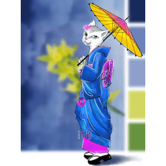
◦ Split-Complimentary (used for this illustration)
◦ Monochromatic
The simple and straight-forward answer is you are free to pick any colors that give you joy, you should not be limited by the rules of colors. However, if you want to maximize the potential of your favorite colors, you might need some knowledge in even the basics of color schemes.
‣VALUES
◦ Values is how dark or light a hue can be.
◦ When creating small color groups or monochromatic pieces, values will be your bestfriend. You should try to atleast choose different values of the color groups. Therefore you can have a variety of contrast to distribute to your canvas and express form and depth. Otherwise, if you cant find different values; just take some from the color wheel.
UNINTENTIONAL DULL COLORS
*Before anything else, dull colors does not mean bad colors. It's only bad if it's not your intention to create that color.
‣ Dull vs. not Dull
◦It could be that the colors that you chose to mix are very far from each other or could be facing each other, they are complimentary colors. They work well with each other as a piece, but looks very different when you mix them and almost likely loses saturation.
‣ Make the colors closer to each other in the color wheel
◦ By making them a bit closer to each other the result shows a slight hint of saturated color, both are very different from each other.
PROCESS
‣ SKETCH
◦ You really don't need a final outline, just really the basic sketch. As this tutorial progresses, you will find that my rendering won't be limited by my sketch. (In the end, it really depends on your art style if you choose to have a cleaner lineart)
‣ FLATS
◦ Even in distributing the colors in my palette, I still try to respect the colors that are dominant and what are the supporting colors.
◦ Try not to go overboard, distribute them in a smart manner that will minimize you problems on the later stages.
‣COLOR MIXING AND APPLYING
◦ Add your soft gradients to your flats and this is where it gets challenging because you have the decision to mix everything around different color groups to create new hues and values. If you don't have enough sets of values to create the lighting and shadows, simply just use the the color wheel.
◦ That also means that you should mix and place your shadows/lighting at your canvas before the rendering stage.
◦ Example for shadows: I want to create a shadow color for his clothing, so I borrowed some of the dark green-ish color with the base color of the cloth to create the cloth's shadow:
◦Example for lighting: I want to create lighting for the hair, so I combined the yellow-ish white and the base color of the hair which is green, therefore creating the lighting for the hair.
◦The different values that you picked should be able to help with creating the shadows and lighting.
◦As much as possible, try to separate your colors when mixing to avoid getting confused.
‣ REFINING
◦ Basically refining with just the eyedrop tool and adding some sharp edges against the soft gradient from the previous stage. You should be able to apply your own rendering skills to this stage, like the art style and brush texture you use.
- Since this is not a rendering guide, I fairly rendered the character not too extreme so it wont confuse you that much.
◦ To really drive home the idea, I only eye dropped the whole canvas without the help of the color wheel. Although I really recommend using the color wheel along with the eyedropper to add more harmonious colors, you don't need to stay true to the palette or the reference.
TUNING
A color mixing guide is not complete if we don't include some time efficient shortcuts! If you feel that your colors does not work well with each other and you have no idea what makes it not work, try doing these methods:
OPEN THE HSL TOOL:
◦ My favorite tool to use when tuning is "CTRL+U" or also known as "Hue/Saturation/ Luminosity", located in the "Edit" tab, and under the "Tonal Correction". I Always use this with the lasso tool, it's very helpful for correcting and experimenting my hues.
‣ Hue/Saturation/ Luminosity
◦ If you set the saturation to a (-100), the entire layer will change into grayscale.
*After seeing how the values interact, I think the values in this illustration looks relatively decent. For the next example, we will tune the illustration.
FIX EXAMPLE:
Let's say that I accidentally made the illustration with unintentional dark colors, now what I want to do is dial down the darkness to make the illustration easy to read.
*These are not true to the previous illustration, it is altered for this segment.
‣ Level Correction
Select the [Edit] menu > [Tonal Correction] > [Level Correction]
◦ Make sure you undo the (-100) saturation so you can change the colored illustration, not the B/W version.
*Left is to make it lighter, right is to make it darker, and the output bar controls the brightest/darkest part of the canvas depending on the direction.
◦ By sliding it slightly to the left it makes the biggest difference, it makes my canvas a bit lighter but not overly uncomfortable to the eye.
‣ Tuning with HSL

◦ I really RECOMMEND this tool, it will definitely help with your post processing and saves you A LOT of time if you try to change the hues manually. These is not only for the whole illustration to use, apply this with the lasso tool and good layer management.
SAMPLES:
#1
#2
#3
- All colors changed because all layers are combined into one.
‣ FINAL CHOICE:
◦ I didn't want anything too extreme but I also want it to look a bit more vibrant.
END
TIMELAPSE:

- PNGs from the Process are taken from each "sketch" to "refining" layer so the time lapse might not be as cohesive as the process screenshots.
This is about it for the Duck Warrior! I hope you liked how he turned out and learned from the tips along the process. Hey, if you like the guide please leave a like or come visit my social. If you don't, that's cool too. Have a good day ahead!
Users who liked this post


Comment